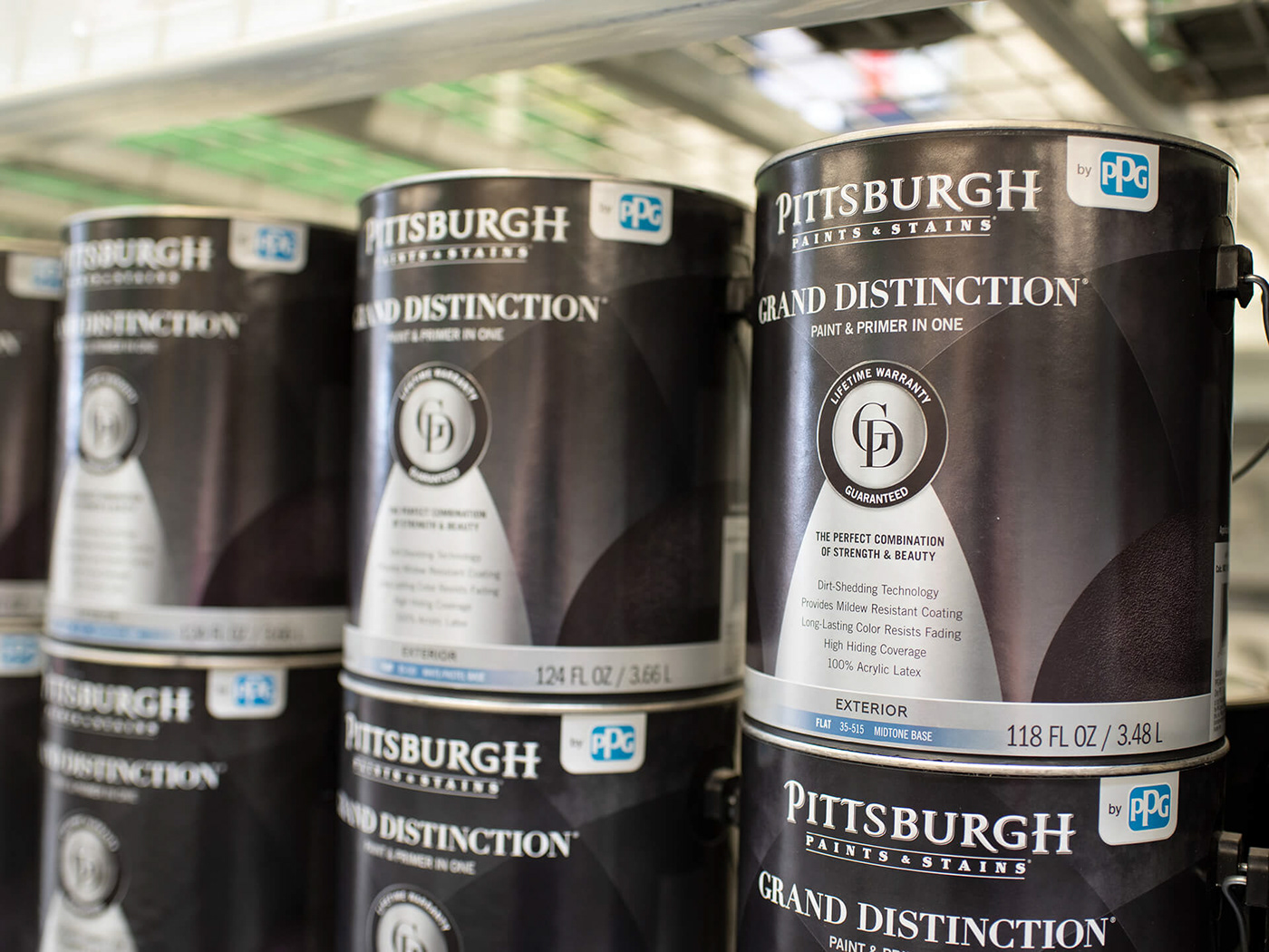
Grand Distinction
The Perfect Combination of Strength & Beauty
“Immerse yourself in the distinctive performance and beauty of Pittsburgh Paints & Stains Grand Distinction interior paint & primer in one. By providing excellent coverage, stain and scrub resistance, and washability, Grand Distinction delivers a rich, long-lasting finish with a lifetime warranty.”
Key Objectives
• Define the visual personalities and archetypes of the good (Ultra) , better (Grand Distinction) and best (Paramount) paint tiers
• Create distinctive and beautiful packaging, which clearly upgrades the traditional positioning of the old labels
• Upgrade and maintain memorable characteristics from previous packaging:
1. Blue is memorable for the Menards employees
2. Must keep the seal in the center
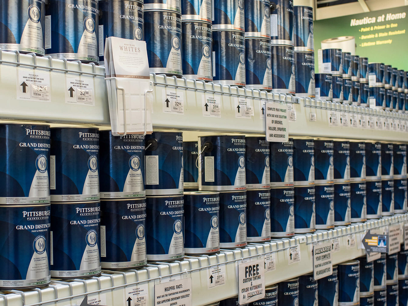
• The final label is to be more cohesive with the Pittsburgh Paints & Stains family while not being too far of a departure from the current Grand Distinction interior design.
• Create distinctive and beautiful packaging, which clearly upgrades the traditional positioning of the old labels
• Upgrade and maintain memorable characteristics from previous packaging:
1. Blue is memorable for the Menards employees
2. Must keep the seal in the center
• The final label is to be more cohesive with the Pittsburgh Paints & Stains family while not being too far of a departure from the current Grand Distinction interior design.
Product Archetypes

Before/After


Label Breakdown

1. The same, rich blue color pays homage to the old GD and aids in product recognition
2. The open circular background pattern communicates washability and protection. By applying this design, GD becomes connected to Paramount and Ultra. Paramount uses a tight triangle grid to represent the strongest protection and coverage. The circles are a play off that but purposefully different to not show the same level of control.
3. Features include what matters to consumers in this price point
4. Creating cohesion across the brand with the sheen colors
5. By PPG tab signals to the consumer it is a product of innovation and quality
6. Updated sizing to make Pittsburgh Paints & Stains the hero and further build brand equity
7. Modern serif acts as a bridge from the data calligraphy to a clean and tasteful new era
8. Refining the seal with thin lines, new typeface and silver color to balance the old and new.
9. The use of sans-serif Trade Gothic ties in to our brand standards and adds modernity to the label.
10. The sans-serif Trade Gothic ties into our brand standards and add extra touch of modernity