


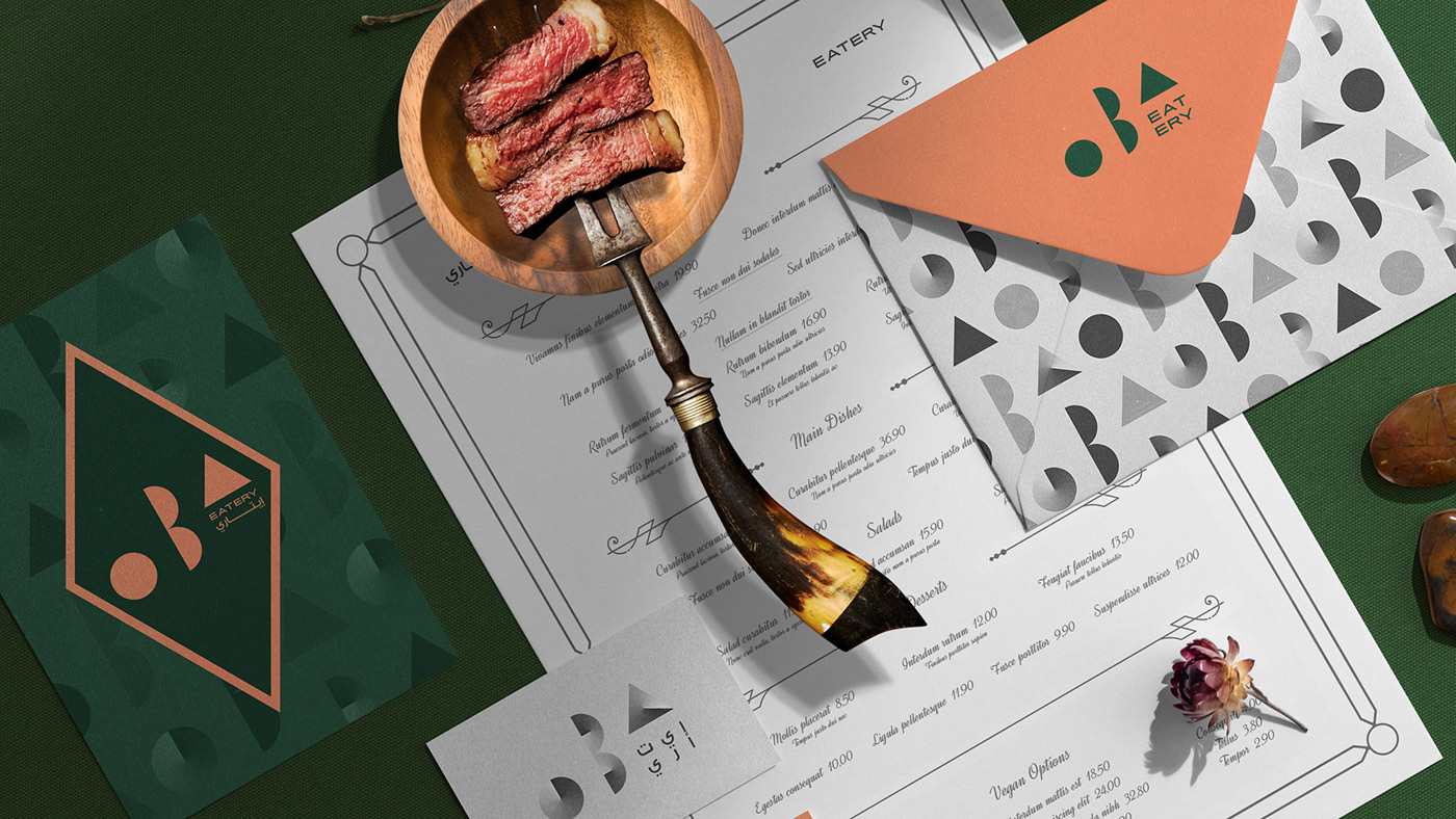


OBA Eatery is a brand new contemporary cuisine restaurant from Saudi Arabia, led by a brilliant head chef and an enthusiastic team.
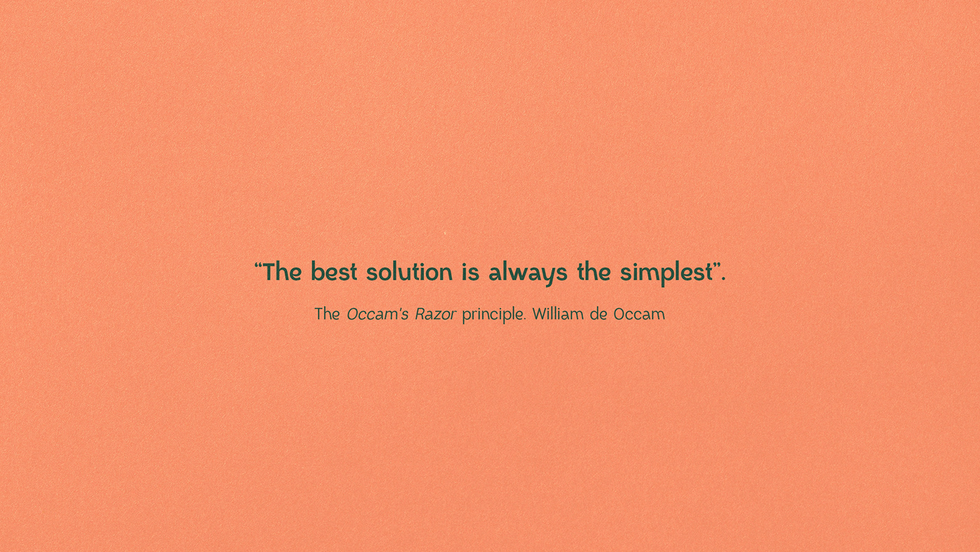
“Less is more”. The proverbial phrase is widespread after the poem of Andrea del Sarto, written by Robert Browning, in 1855, and has been repeated throughout the times when it comes to gastronomy, stating that all you need is the best ingredients and someone who knows what to do with them. We can also mention the logical and epistemological principle "Occam's Razor", which, inspired by nature and its simplicity, states that the best solution is always the simplest, or in Latin "Lex Parsimoniae. Entia non sunt multiplicanda praeter necessitatem". Originally a principle of reductionist philosophy and nominalism, it is today considered one of the heuristic maxims (general rule) that advise economy, parsimony, and simplicity, especially in scientific theories.
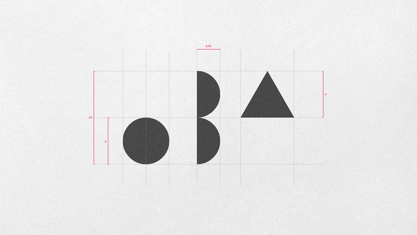
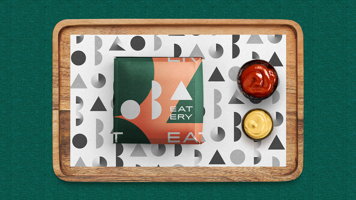
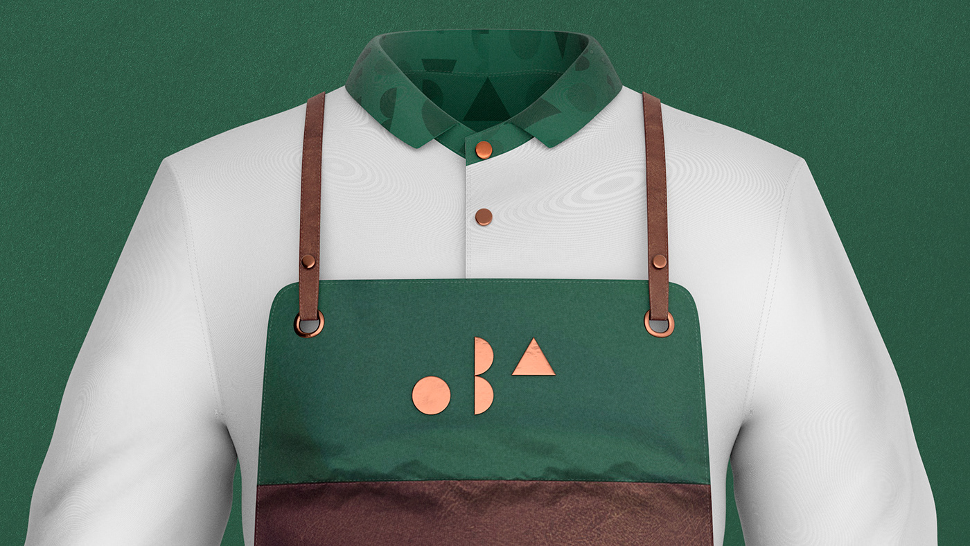
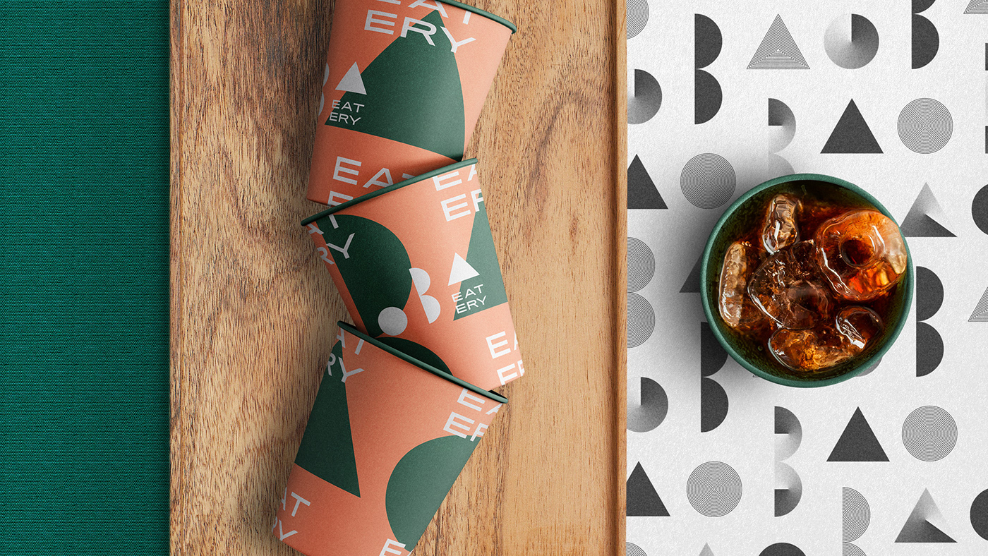
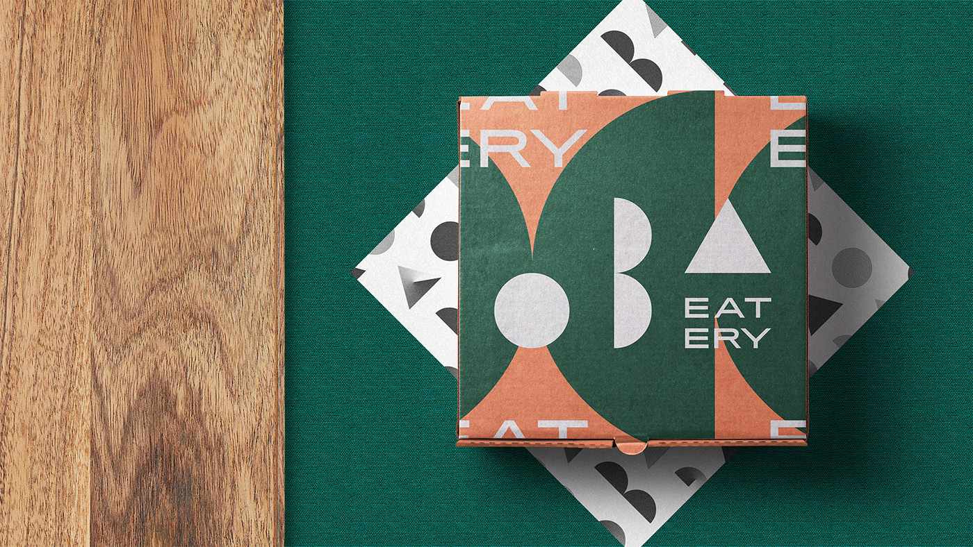
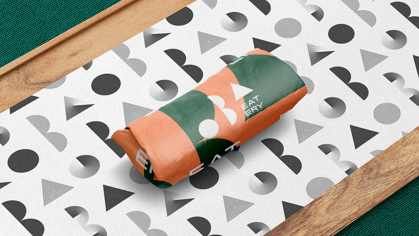
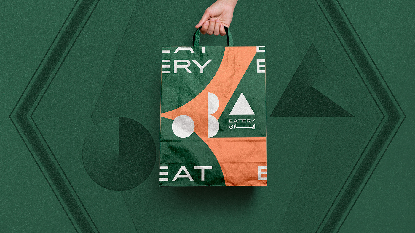
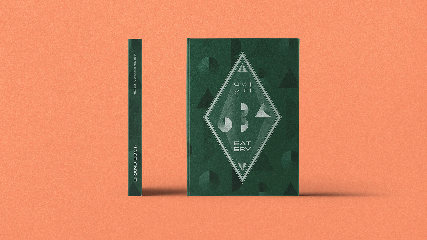
"Simple does not mean simpleton". The brand was substantiated on minimalism, using the most primitive geometric forms associated with some techniques of visual orientation. The Gestalt principles, for example, apply perception and emotion techniques, which result in a clearer and more effective approach. These techniques were founded on the analysis of patterns of behavior and natural interpretation of our brain, seeking to make the elements visually functional for the recipient of the message. It is possible to identify some of these techniques in the construction of the brand, such as the principle of figure-ground, the principle of closure, and the principle of proximity. The brand was also created in an upward movement, symbolizing the growing top-notch gastronomic experience offered to clients, and implicitly represents the natural to the company's expected growth and market share.
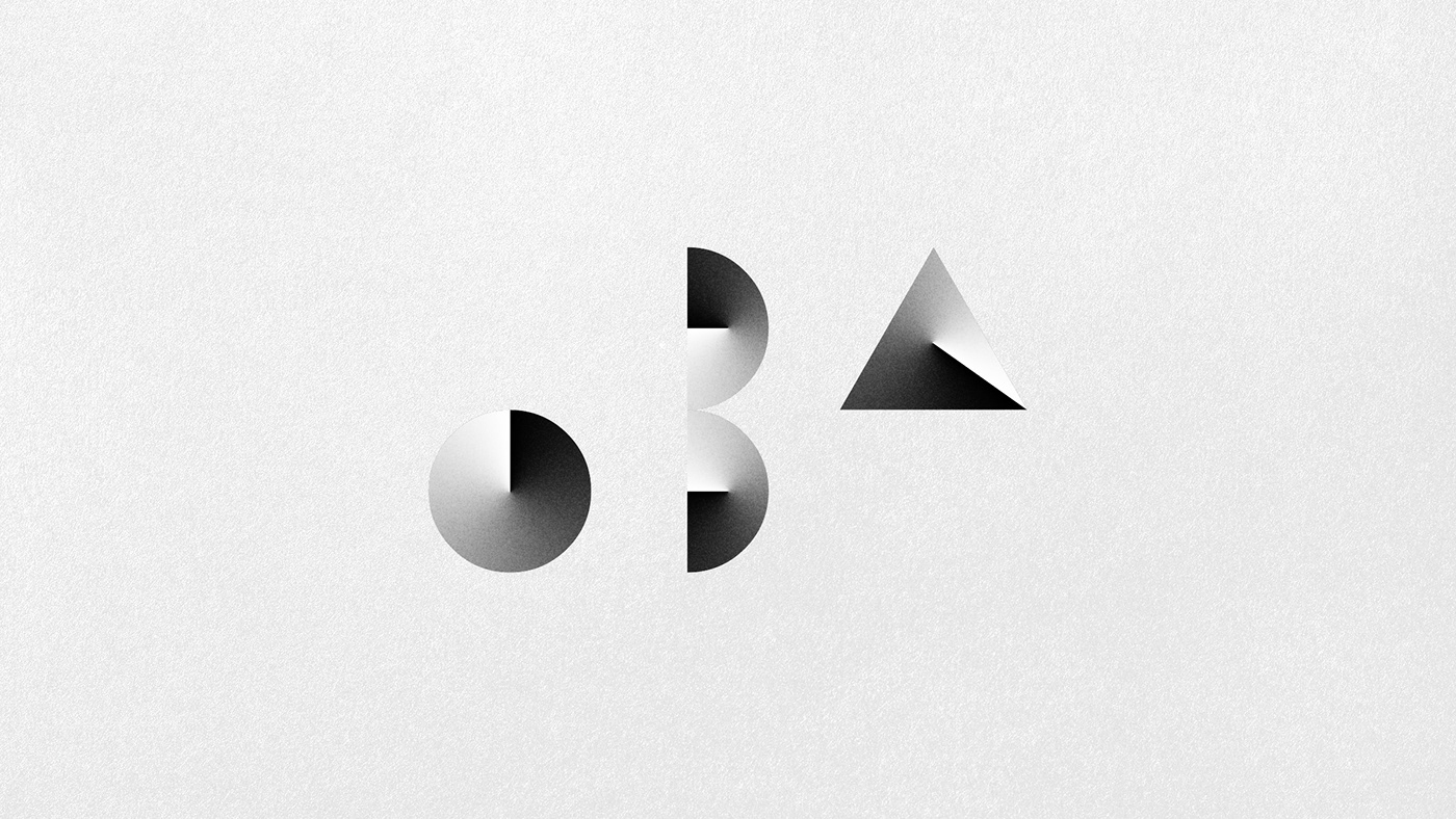
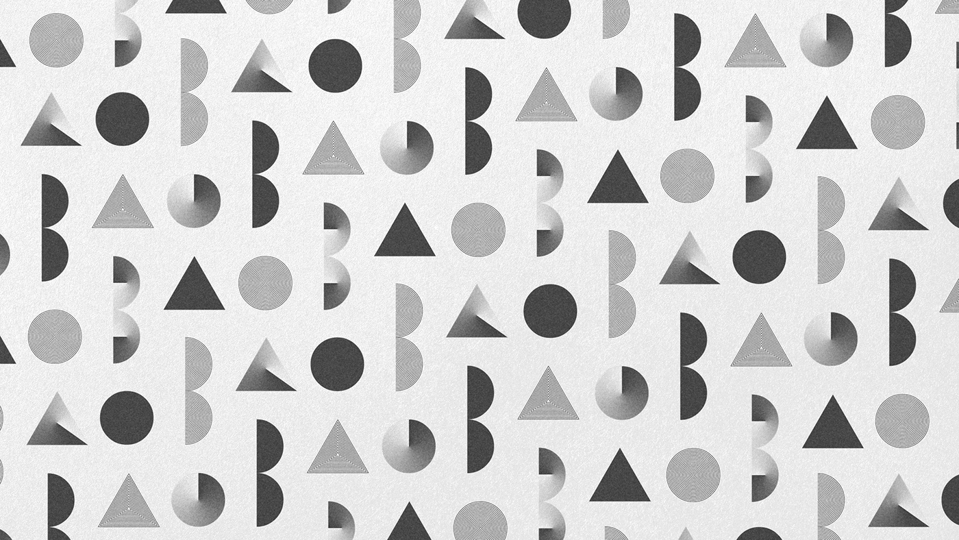
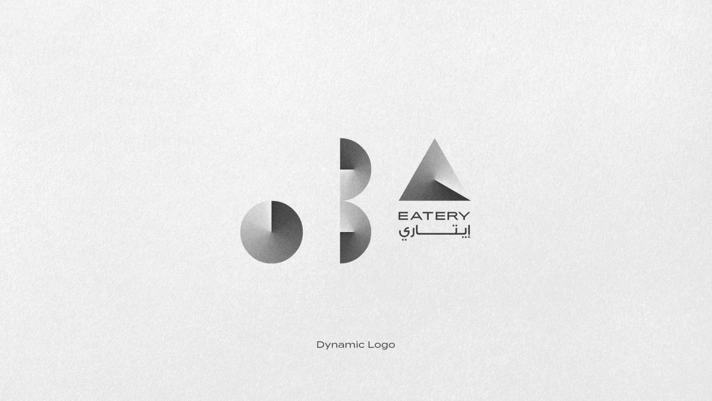
"Equal but different". The dynamic logos are flexible, the design allows multiple combinations of elements with a common brand core, allowing the evolution of the brand without losing its concept and DNA, creating a timeless look. Using this design technique we create a logo that can evolve with the company, keeping it modern and aligned with the brand concept over the years. In this way, the brand can be represented by several graphic elements interacting with the geometric shapes that make up the logo.
Visually represented by a perfect circle, the letter “O” is easily associated with a dish and in the brand identity, it can be replaced by pictures of food, creating a modern and elegant visual for the advertising campaigns. What can be better than a delicious meal? Share it with someone, of course. The letter “B” represents exactly this feeling that eating together is much better. In this way, you elevate the experience, arriving then the letter "A" represented by a triangle, or an ascending vector.