


Shaping the future of insurance
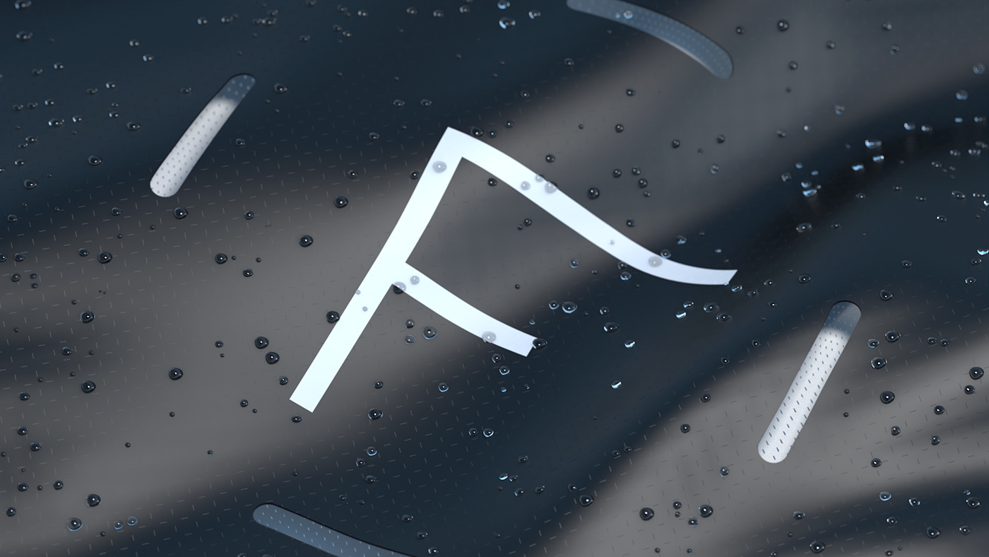
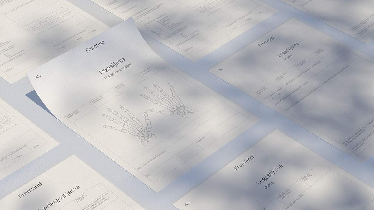
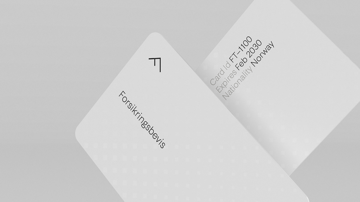
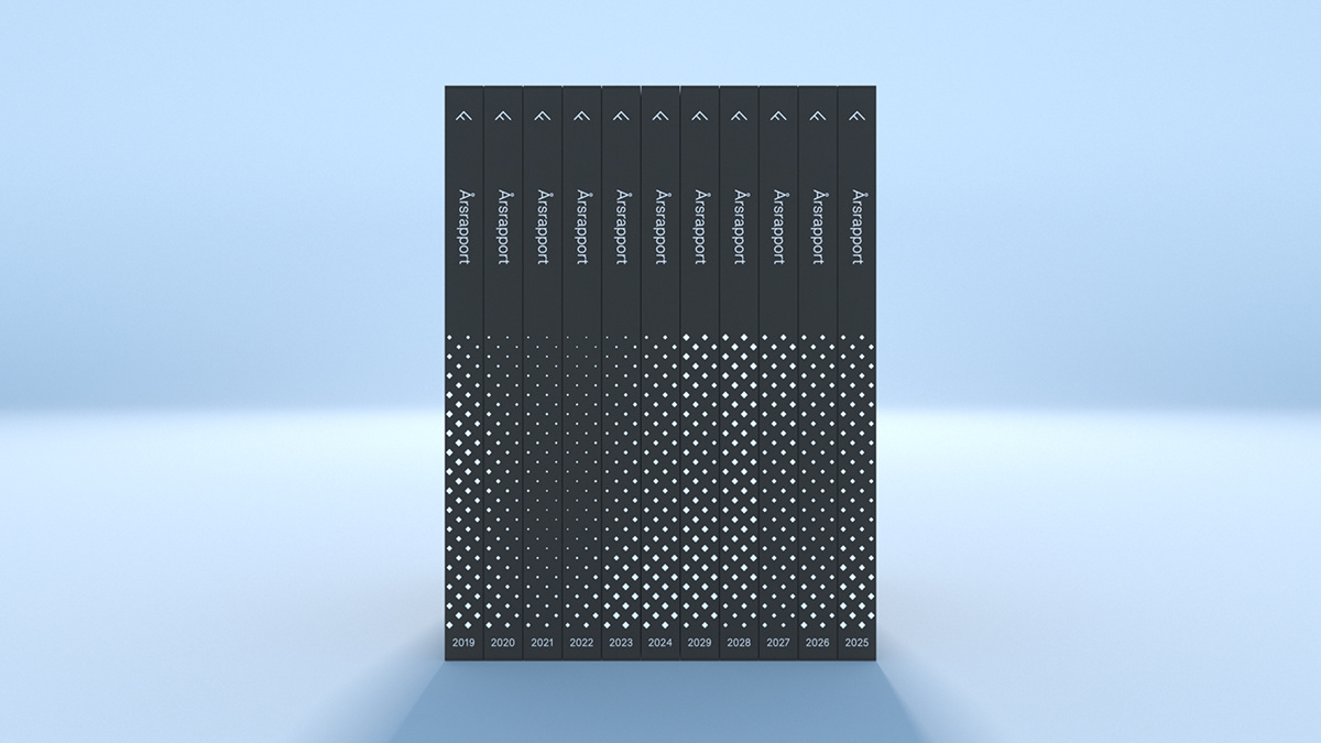
Through a fusion of technology, expertise and knowledge, Fremtind saw the light of day. A new insurance company that came out of a merger between by Sparebank 1 and DNB, two of Norways largest financial service groups. Their aim is to become the most preferable of all competitors, and to position Fremtind as the life insurance company for the future, focusing on digital innovation – rooted in customer insights and needs. Our concept builds on the associations within the name. “Frem” means forward, “Tind” means pinnacle. As the name implies, we need to climb high to gain perspective – to look forward and help customers make good, informed decisions. Striving to reach the pinnacle of clarity, in a business segment commonly perceived as sleazy and complex. The typographic system ensures a clear and transparent design on all surfaces, making the identity simple to work with and clearly understandable for all audiences. The entire identity system is based on the principle of less. To top it off, the imagery adds warmth, love and safeness.


Thanks for viewing!