I normally don't take branding projects because of the massive scale of work and the crazy effort one puts into it. Too much to take on as a solo designer, but Mr.Viet from Alpha Camping changed my mind.
Background
I was captured by Alpha Camping's tagline: Mother Nature holds many wonders waiting for you to explore out there. Originated from Boy's scout practice, Viet and his partner from STEAM education background want to create a camping school that helps children train and practice their explorer skills in a simulation environment, as well as the real nature. The progressive program aims to follow one's journey from a boy to a man, using gamification to track one's development through the years.
Research
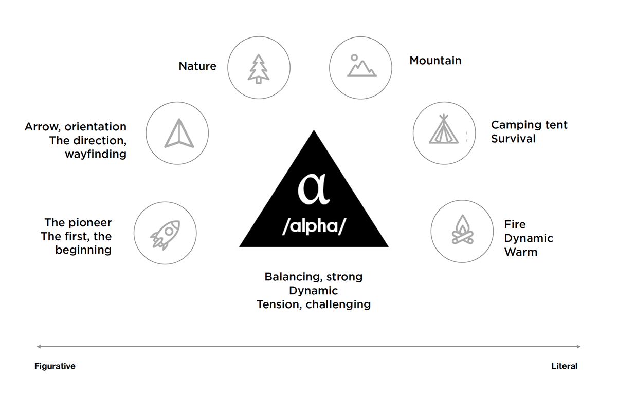
I was looking into ways to represent nature from an explorer's angle.


Initial sketchs

Final concept
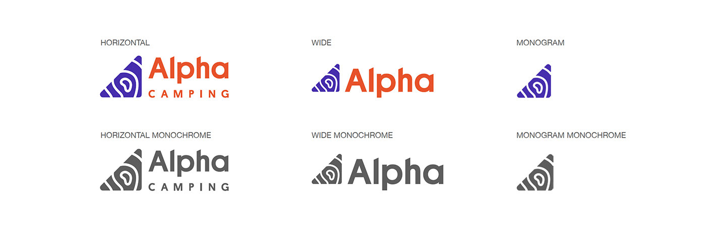
I chose triangle for tension and energy it brought, yet at the same time a right angle provides a stable, strong, static feel - how a boy should transform into. The pattern derived from those contour line on trekking map. It also stands for the flexibility and crafty one can have, represented by the whorl fingerprints*.
*This is a popular belief in Viet Nam that people with whorl fingerprints will be better at crafty stuff.
*This is a popular belief in Viet Nam that people with whorl fingerprints will be better at crafty stuff.

Colour palette

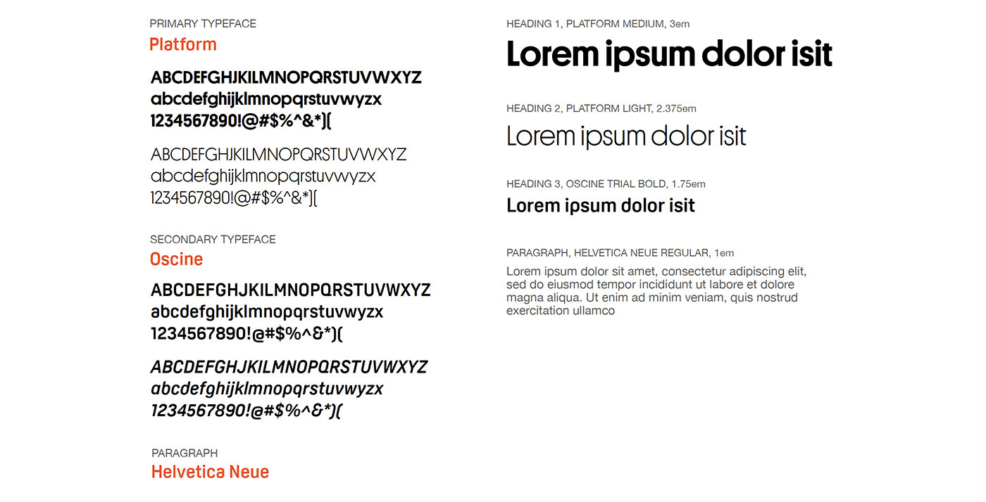
Typography & Font hierarchy