

Brand Identity and Packaging Design for Royal Blend International Teas (Chinese and English)
Objective: To create a distinctive identity and packaging for the generic-sounding name, Royal Blend, a line of international teas to be sold in upscale supermarkets and gourmet specialty stores. The branding and packaging concept must be extendable to any country's varietals.
Hand Illustrations, Design & Copywriting | Alane Marco
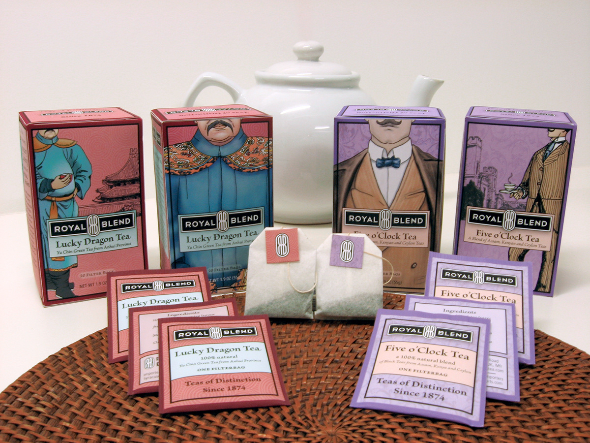
Final Concept: Each varietal's package features a fictional historic character and an anecdote about the character's undying devotion to Royal Blend tea. New characters encourage shoppers to buy each new varietal as the line extends.

Logo lock-up. The clean, Art Deco-style logo draws from Chinese cartouches and British signet rings, and suggests the tea company's long history.
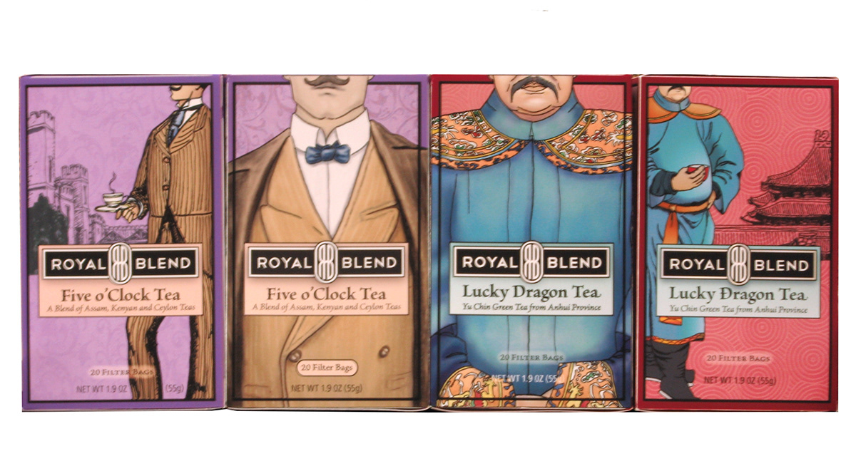
Double-fronted boxes have twice the shelf impact.
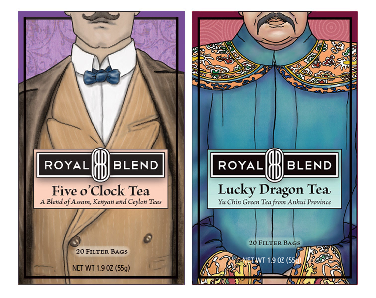
Battle of the Moustaches. I cropped the characters mid-face to emphasize their amusing moustaches. The consumer imagines the rest. Color palettes and background patterns are drawn from traditional fabrics.

Side panels tell why Royal Blend tea never goes out of style.

Chinese packaging.

British packaging.

Shelf appeal. The striking cropped character drawings grab consumers' attention, fire their imaginations and create brand engagement.

Package die-cut.
Development Process

Early concept and logo development: Chinese and British-style palaces, tea cups, and traditional fabrics. All three elements are used in the final design.

Character development.


