


the isro logotype

rebranding

concept and inspiration
The structure of the logotype draws inspiration from the parabolic and hyperbolic curves that govern the graphs in space science, research and exploration. It is also symbolic of the orbital velocity graphs used in satellite and rocket launches.


PROCESS OF DESIGNING THE LOGOTYPE


The process included experimenting and sketching a variety of letter forms that were symbolic of the organisation as well as functional for the given purposes and uses of the identity.

grid drawing
The ISRO logotype aims to be a balanced combination of function and form. The form, inspired from the hyperbolic and parabolic curves that govern the various graphs that are used in commercial launch projects is precise and accurate, given the missions that ISRO conducts. Factors such as power, acceleration and inertia have been shown in the overall visual harmony of the logotype. The logotype has been designed in a way to blend in with the natural environment as well as have an immediate recognition factor for the viewer. It is a balanced and a settling logotype that would be etched in minds for years to come.

graphics standards manual

Visual language standards


stationery

letterhead, press release and technical briefs

letterheads
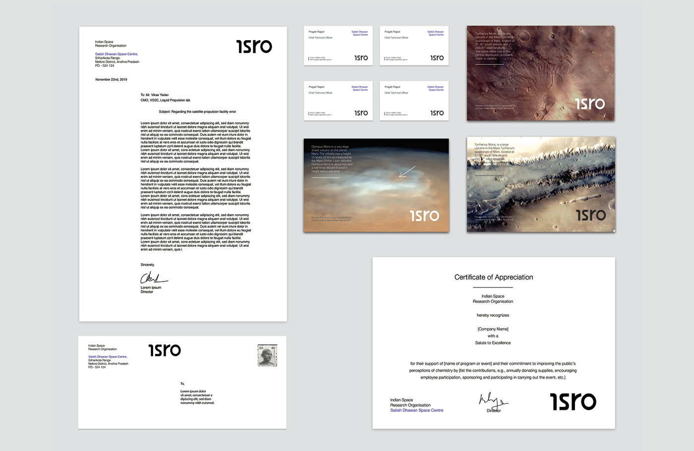
postcards and other stationery

business cards and post cards

poster design

poster design

poster design


SIGNAGE DESIGN VISUALISED


