


Without a doubt, the inspiration for this work is the book Demian by Hermann Hesse. However there is a bit of backstory to why I even read that book.
In 2016, the Band BTS released an album called „Wings“ with a concept that revolved around this exact same book. When I saw the short movies, listened to the songs and watched the music videos it was more than just liking what they did. It captured me and I felt so inspired by this concept.
I didn‘t want replicate what they did. I wanted to create something new. Something in the medium of animation and something I could personally relate to as well. That‘s when the idea of this short movie was born.


When I started off, I wasn‘t really sure what to do. I knew that I wanted it to be abstract. It should be different to BTS but it also shouldn’t be an animated version of the book.
Knowing what I didn‘t want was basically my starting point and from there I started developing ideas what I could show... and what was worth showing.
The first idea was to be very abstract. Showing images that are symbols of beauty being corrupted by darkness. I sketched some storyboards of what that might look like and I quickly realized: That is super boring.
I needed a story. Something these abstract elements revolve around.
I decided to sacrifice some of the abstractness and show a character. From this point on the story basically evolved on its own. From the previous developing stages I already knew symbols I liked a lot and wanted to incorporate.


Creating the character was one of the more challenging aspects since he grows within the story. I decided to make two different main designs: the kid and the teenager.
The kid-version was completely inspired by the Disney version of Peter Pan. It was important to me that this visual of the boy that doesn‘t wanna grow up gets conveyed instantly.
The teenager was more difficult. I wanted to make very clear that he is growing, so with each frame his silhouette gets “more edgy“. At the beginning there are little to no edges but after he painted the bird you can clearly see that his silhouette changed. Defined shoulders, pointy ears and a sharp ears are the most prominent features.
The egg symbolizes the two different worlds. The one within and the one on the outside. They are separated and the world within the egg is protected by a shell. This is visualized by a black and white contrast. The feather serves as foreshadowing.
The apple was the other character in this story. I wanted it to be dynamic. It is the only object that appears in both worlds. It functions as the breach and has parts of both worlds inside. Like Yin and Yang the black and white colors constantly mix.
The snake is an ambiguous symbol. It has positive and negative meanings. It stands for death and bad luck, but also wisdom and eternal life. Since the meaning of death is more prominent in this context I made sure the snake looks hazardous.


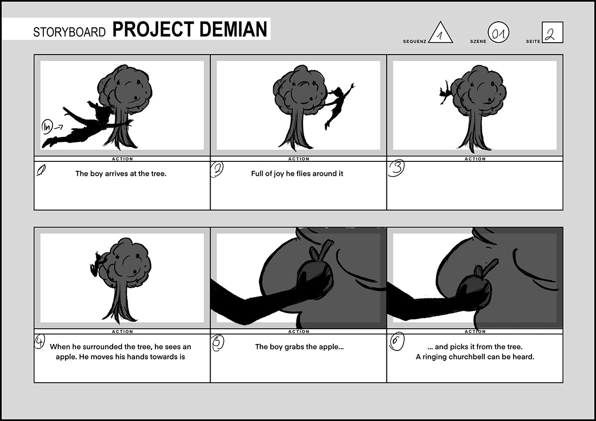
The storyboard was one of the most challenging parts. I knew that - once the storyboard was done - the idea of what I wanted the show would be more or less finalized. But bringing those abstract ideas on paper proved to be very difficult.
Three scenes of that storyboard didn't make it into the final movie. The storyboard was for a different assignment and I kept on working on it after the animation was already done.


The animation is split in different parts, since every element in the movie needed to be animated differently.
I used cut-out animation for this movie. Meaning that I drew all the body parts on different layers so I could move them separately in After Effects. To do so, I had two different approaches.
The first one was to draw all the images in Procreate and import them into After Effects.
While it was fast at first, adjusting the animation in the end turned out to be really time consuming because the files were bitmap and not vector based and therefor I couldn’t tweak them so the body proportions looked nice.
While it was fast at first, adjusting the animation in the end turned out to be really time consuming because the files were bitmap and not vector based and therefor I couldn’t tweak them so the body proportions looked nice.
Eventually I ended up using Adobe Illustrator only. It took a bit longer and wasn’t as intuitive, however, the animation in After Effects was easier and the result was way better.
The movements I created should look natural and therefore references are mandatory. While I also searched for animation references on the internet, some where so specific in movement and camera position that I had to shoot them myself.


The ink was a lot of fun, but also very challenging as there are three different kinds of ink-animation.
01 Within the egg and the apple
The easiest of them was the ink drops inside the egg.
It is a video what uses the shape of an egg as the mask. To add a bit of volume, I distorted the video so it looks like the ink is actually captured in the egg and not just a video placed inside.
It is a video what uses the shape of an egg as the mask. To add a bit of volume, I distorted the video so it looks like the ink is actually captured in the egg and not just a video placed inside.
Ink videos by Mitch Martinez (www.mitchmartinez.com).
02 as paint
The most challenging one was the ink that came from the paint brush and ended up on the wall. Those are video assets as well that I bended and masked so it looks like they are freshly painted. Since the resolution of the footage was very high it took a lot of time to even preview small changes.
03 dripping from the boy and Wall
When the boy tries to erase his work, paint appears which is dripping down and at the same time following his hand.
I used a particle simulator to create many different points. His hand was set as the emitter/source of those particles.
I used a particle simulator to create many different points. His hand was set as the emitter/source of those particles.


After the animation was finished, I rendered out the scenes as PNG sequences. I imported those sequences into Adobe Premiere ans started cutting the video together.
Usually the composition and effects are added before the final cut, however I wanted to use glitches as transitions and from previous rendering tests knew that it looks better when it’s done while adding the filters and not afterwards.
Usually the composition and effects are added before the final cut, however I wanted to use glitches as transitions and from previous rendering tests knew that it looks better when it’s done while adding the filters and not afterwards.
Before applying the filters, I added the vignette effects as well as some glows. After that I used a Chromatic Aberration script by QubaHQ to break apart the colors in the edges. On top of that the effect "Venetian Blinds" for the TV Effect. After that followed the glitch transitions and effects and lastly I added some noise and toned down the gamma of the black and white colors to red rid of the high contrast and make it look more vintage.
From top to bottom:
1. Original File
2. Glow Effect
3. Chromatic Aberration Effect 4. TV-Effect
1. Original File
2. Glow Effect
3. Chromatic Aberration Effect 4. TV-Effect
5. Glitches
6. Gamma/ Curves adjustment and noise
6. Gamma/ Curves adjustment and noise


I am completely new to sound design. I used Adobe Audition before but it was more of testing out the features and playing around. I never actually mixed something.
I started off searching for sound effects. Luckily Adobe has a library on their own, where I could find many useful sound effects. The others were takes from freesounds.org.
To make them work with each other, I mostly used echos and underwater effects in each track, so they sounded at least similar.
To make them work with each other, I mostly used echos and underwater effects in each track, so they sounded at least similar.
For the music I struggled a lot. I originally wanted to use either "Fantasia in F minor" by Schubert or part of Bach’s "Mass in B minor". However, I unfortunately couldn’t make it work with the story. They were too dramatic and pulled the movie into a ridiculous way.
Out of fun I tried using the instrumental of a BTS song called "Lie", which is out of the same album this movie is inspired by. It ended up fitting perfectly.
The sound effects were either from the Adobe Audition Library, freesound.org or made by myself.


Since the movie I created was a very abstract one and rather difficult to explain, I decided to make something to explain it. Another reason was that I love doing print work and haven’t been working on a book since the 2nd semester.
Just like the movie, the design is a rather minimalistic one. I went with only black and white to visually connect it to the movie.
While the majority of the pages is white with a black font, each chapter is visually separated by a double page with a black background and a white font. On the right is the name of the chapter and on the left a quote from Hermann Hesse’s Demian. The quotes are in the same order as they’re printed in the book and are part of what inspired the movie I created.
Each chapter has a slightly different layout, representing the different stages of the creative and the production progress.
Chapter 1 - The Concept
This chapter's layout is rather chaotic. Ideas are flying around with no recognizable structure.
This chapter's layout is rather chaotic. Ideas are flying around with no recognizable structure.
Chapter 2 - Visual Development
The second one is more minimalistic and just like in the creative process, ideas are being clustered.
The second one is more minimalistic and just like in the creative process, ideas are being clustered.
Chapter 3 - Storyboard
Chapter 4 - Animation & FX
Both chapters have a very strict layout, representing the discipline needed for the production stage.
Chapter 4 - Animation & FX
Both chapters have a very strict layout, representing the discipline needed for the production stage.
Chapter 5 - Scene Breakdown
The last one has a completely different layout. Showcasing final shots of the movie like a photo book.
The last one has a completely different layout. Showcasing final shots of the movie like a photo book.


The cover of the book should reflect the world where this movie is playing. Initially I had six different version where I tried out the black and white concept.
Eventually I ended up with a version that combines elements of every version: The Cover is white with black paint, while the back is black with white paint. This way the concept of both realms is carried on, even on the cover.
One problematic area however, was the spine. I eventually left it white since it is the prominent color scheme in the movie.


In retrospect, this has been one of the most ambitious solo projects I've been working on so far. Especially pushing myself to finish that animation all within a rather short period of time was incredibly challenging.
However, I am very happy the way it turned out and especially the things I've learned during the process. Writing down those lines gets me really curious about what my next big project will be... I am very much looking forward to it!


