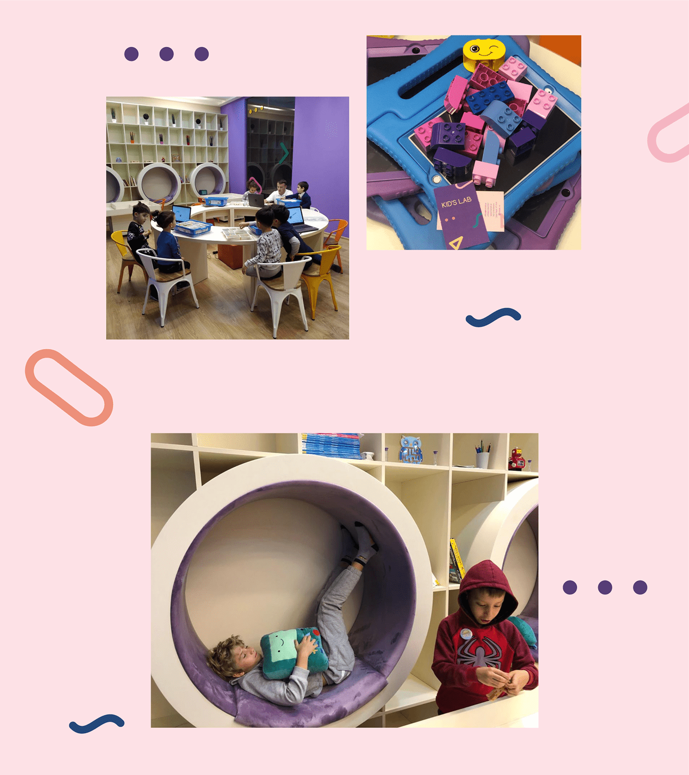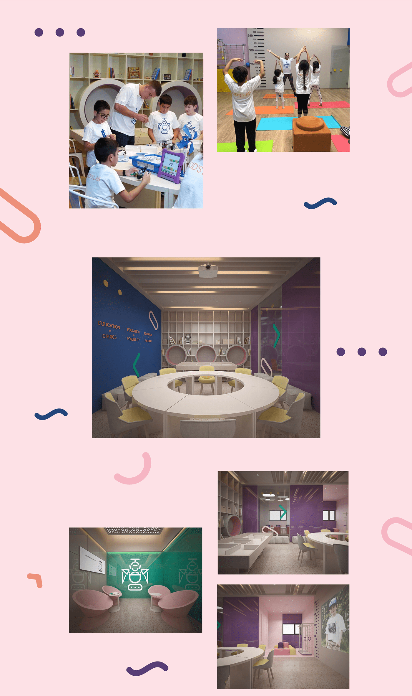


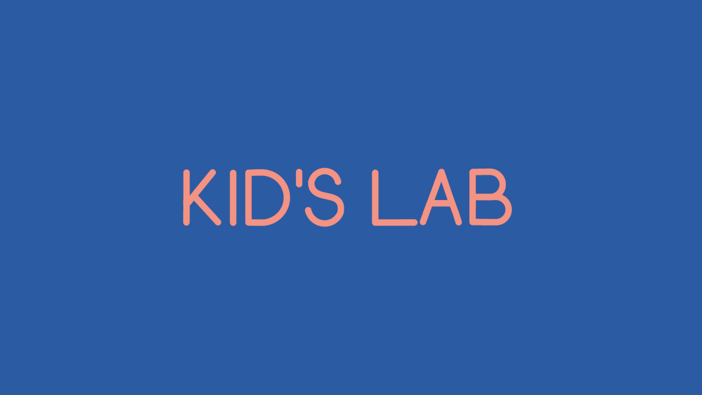
Kid’s Lab is a small story about a big idea. Our client from Azerbaijan really wanted to create such an environment, where every kid would assemble oneself as if a puzzle. Where they could try different interests and realize own small dreams.
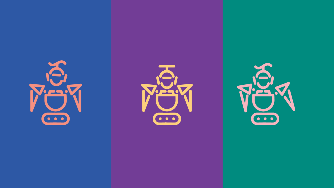
The same as a child consists of a million why’s, hobbies, interests, games, and communication, the same our logo does: a small robot that is assembled from the letters of the name – Kid’s Lab.
The logo reflects the main direction of the activity of the Kid’s Lab company – robotics. The main idea of building it is the transformation of the textual style of Kid’s Lab in the English language into a graphical image of a robot through disassembling into parts and their further recombination, which are the basis for the identity.
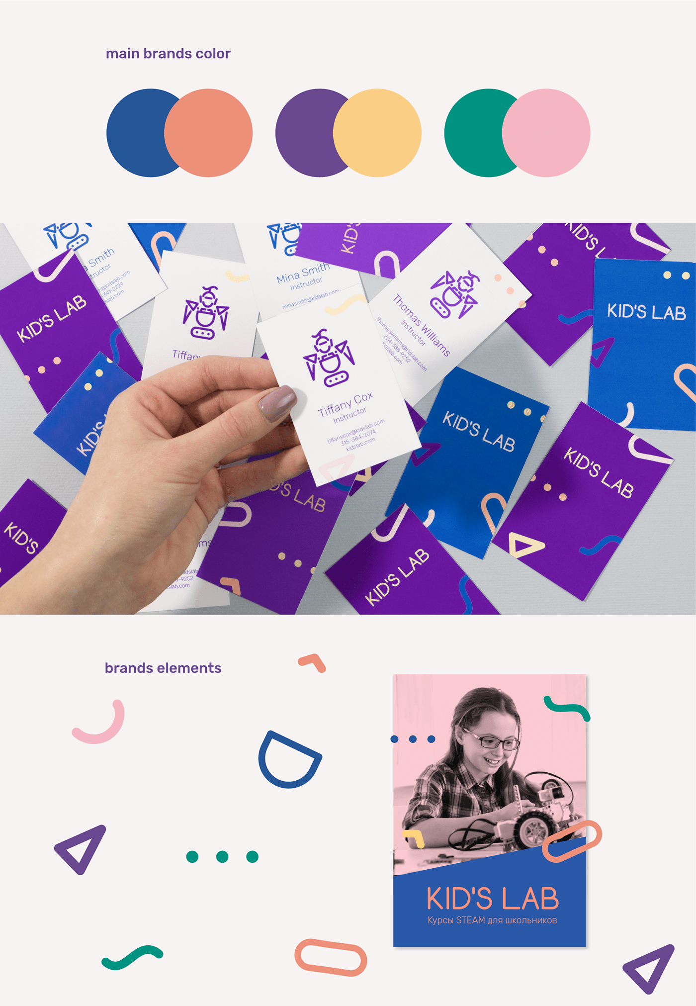
Thus, two equally beneficial versions of the logo were obtained.
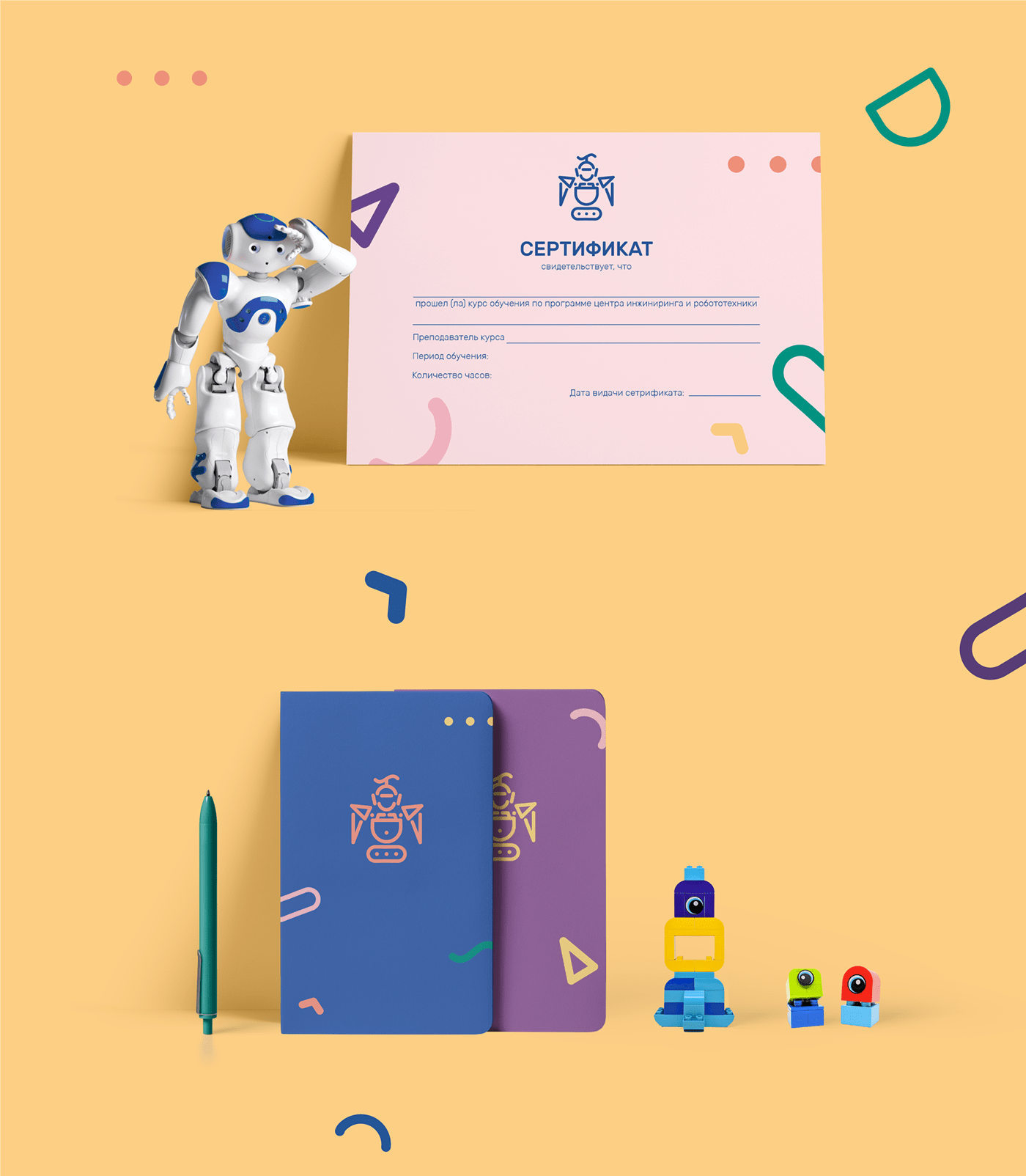
Both versions are equally used in the company’s style and in the realization: in the interior, in elements, and other things.
The Robot (named Kidius, by the way), is the embodiment of the concept that the design together with the idea has soul!