Since I inspire the ACRONYM® brand, I've decided to make a try to create a new design solution for a website on their example. And this is my conceptual project vision.
So, the goal is to make a quite simple interface, userfriendly, adaptable to different devices and screen sizes. As the brand itself makes an impression of futuristic solutions in combination with functionality of the product. A kind of attempt to create apparel of the future today already. OK let's start, hope you'll enjoy the journey.
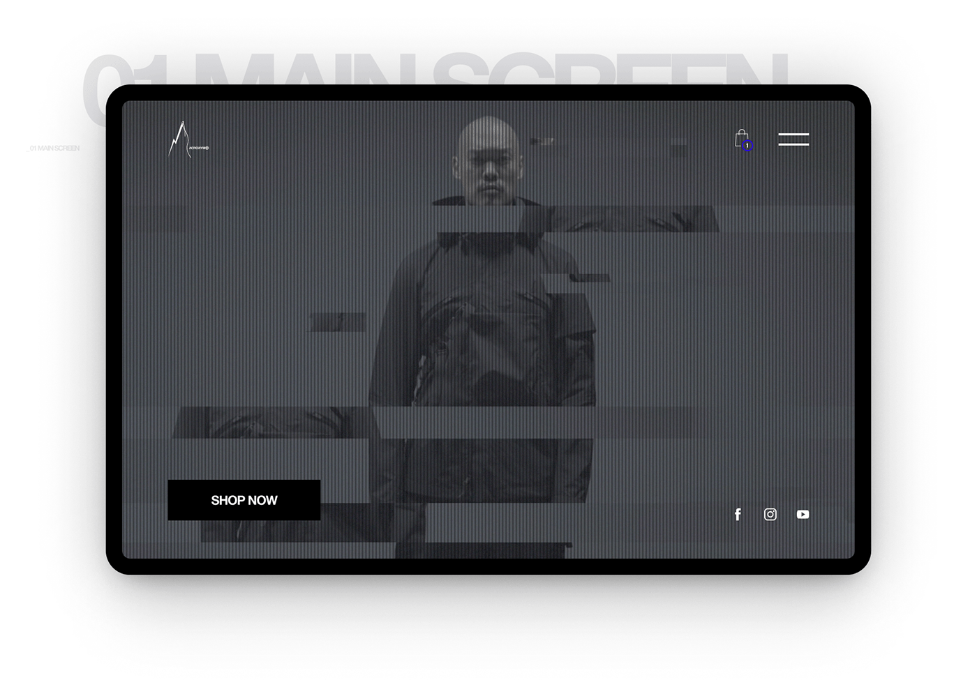
First of all I've took an existing video, don't think, the glitch effects were made by
the guys earlier. I've just added some vhs effects into, to make a little bit of cyberpunk atmosphere. For apparel brands it's always useful and impressively beautiful to make the first page using the video materials of the product. It's a good way to show the product to potential customers. And considering the fact that the video was taken from different angles, it increases interests. Therefore the first screen was made clean and simple as possible, and kept only necessary details.
the guys earlier. I've just added some vhs effects into, to make a little bit of cyberpunk atmosphere. For apparel brands it's always useful and impressively beautiful to make the first page using the video materials of the product. It's a good way to show the product to potential customers. And considering the fact that the video was taken from different angles, it increases interests. Therefore the first screen was made clean and simple as possible, and kept only necessary details.
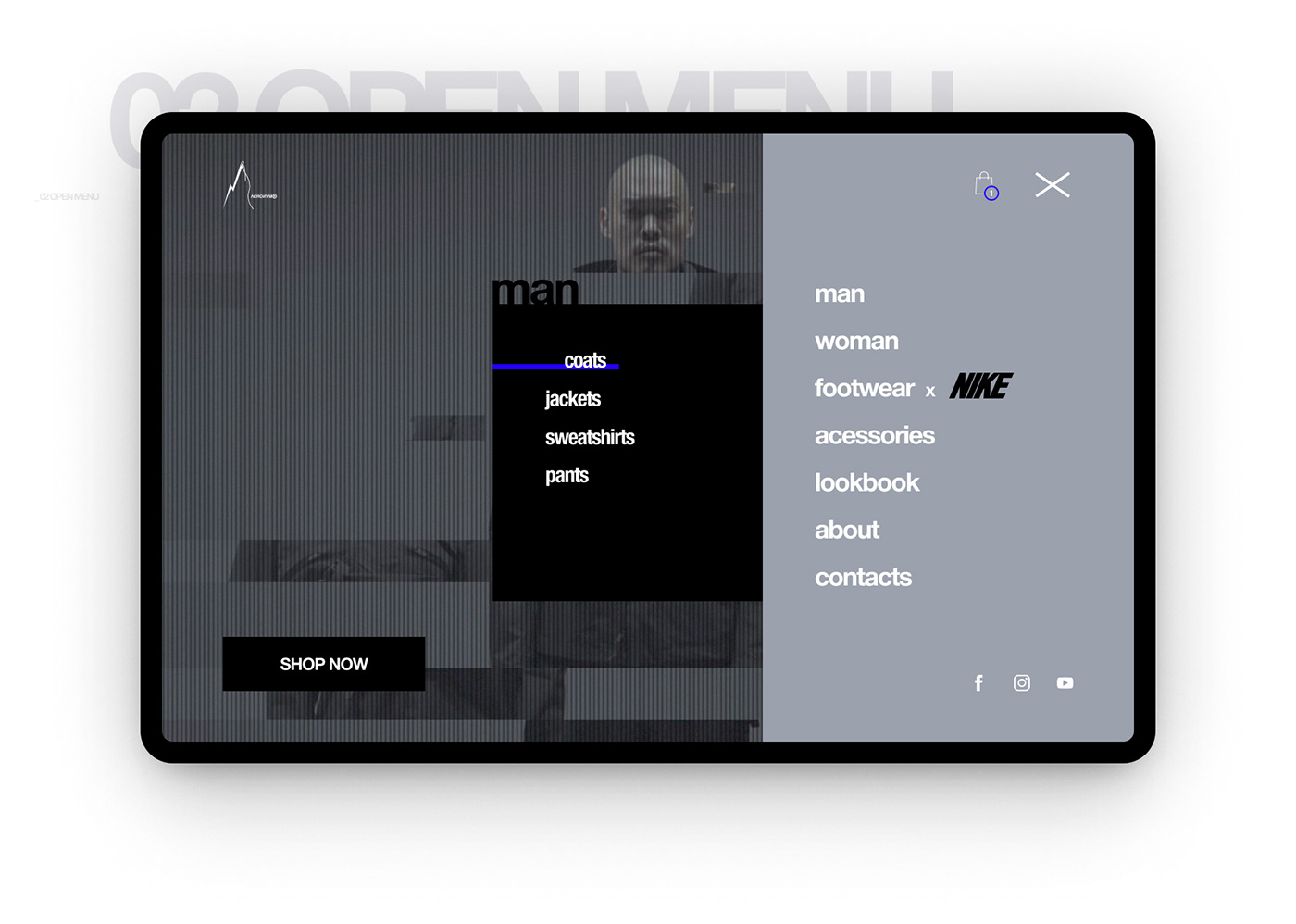
I decided to make a standard menu, just added a nice animation and colour accent.
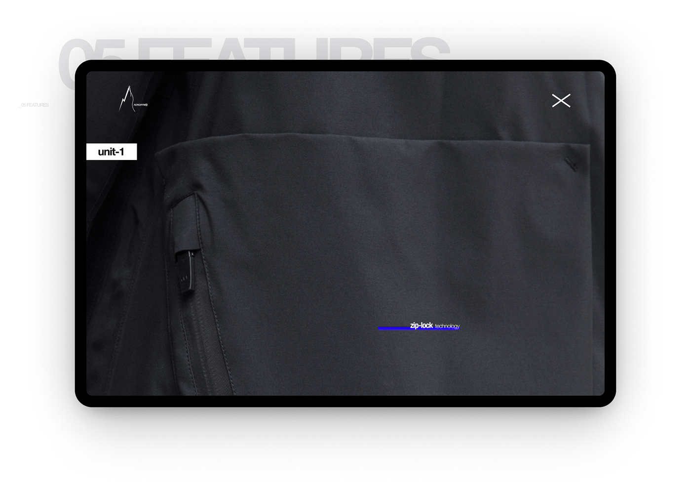
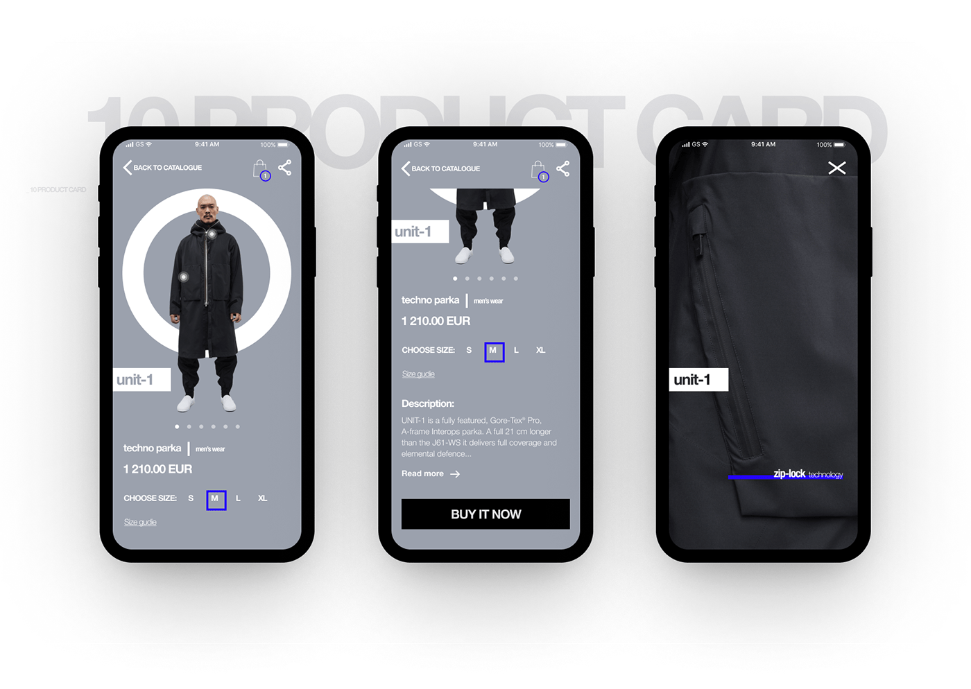
Next I tried to keep the idea of essential simplicity and functionality based on the opportunity that the brand can offer, tell and show.
Since this is a monobrand website, there isn't a huge choice of products, and I wanted to show the products from all sides in the best light.