
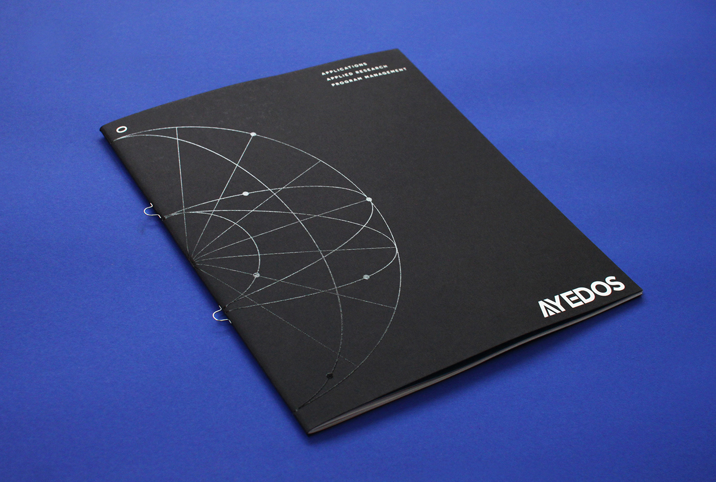
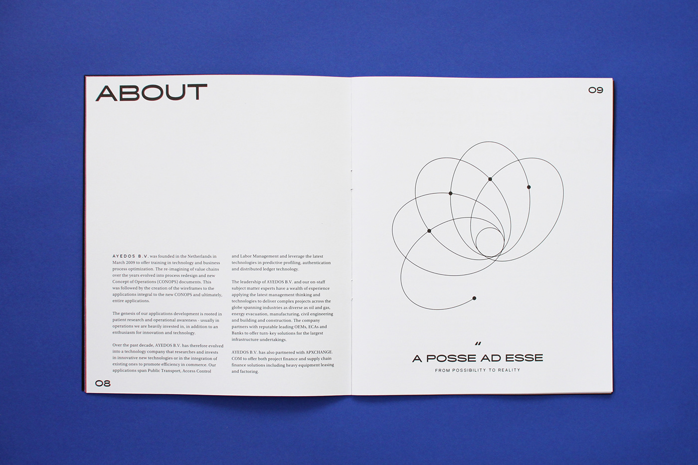
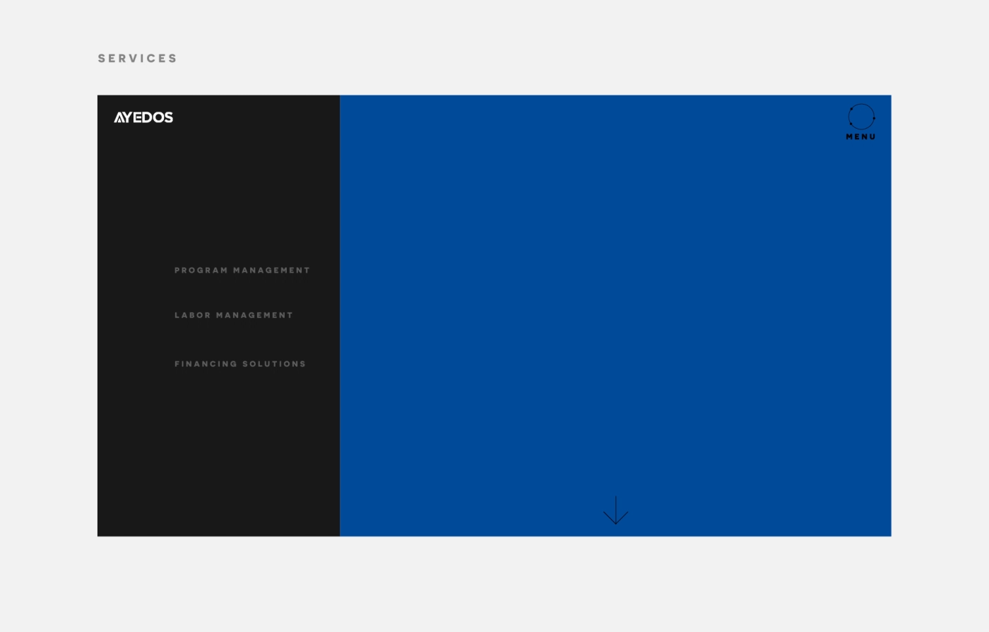
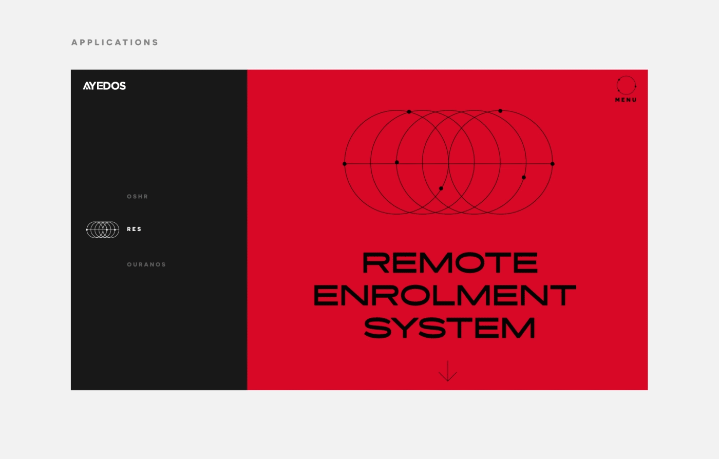
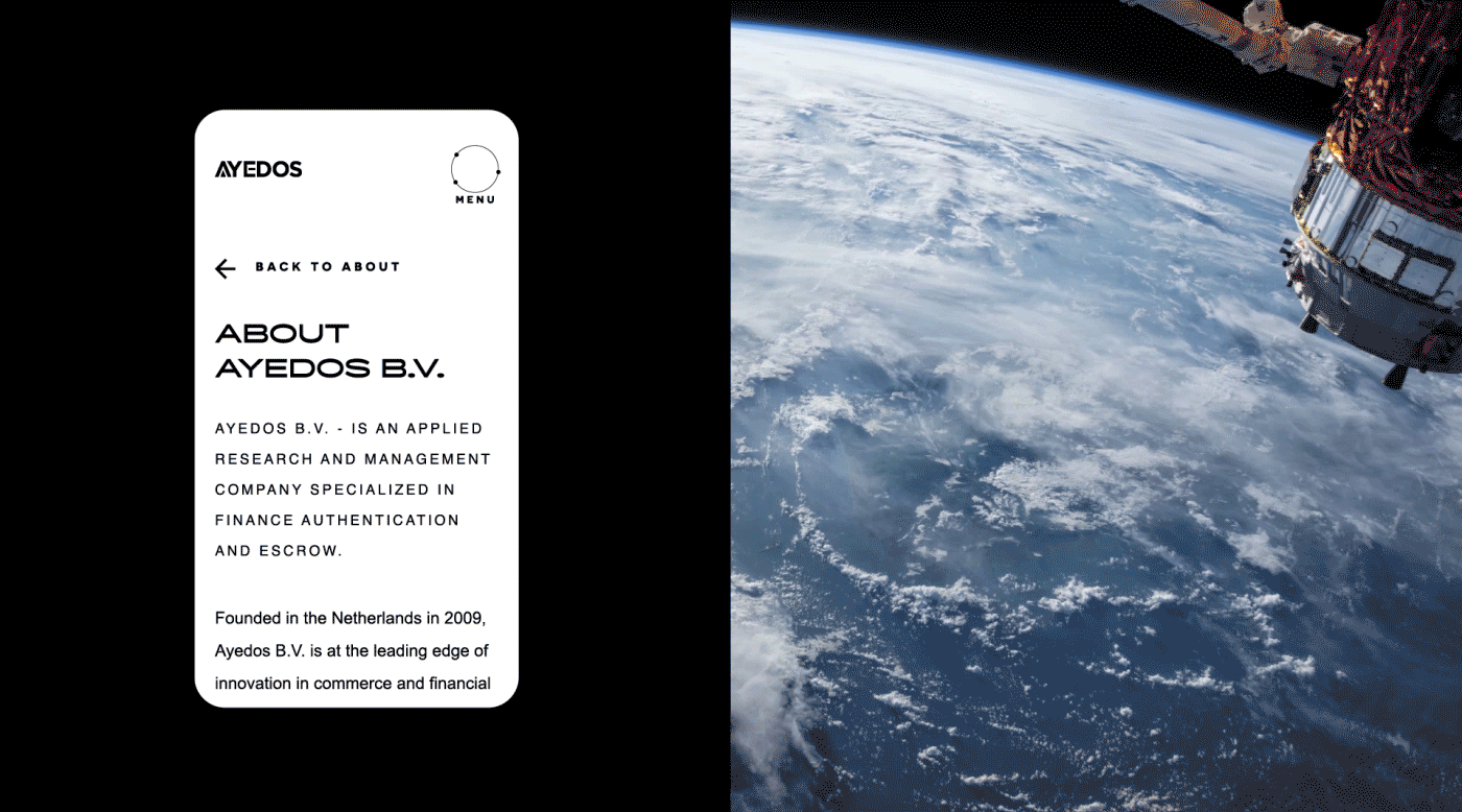
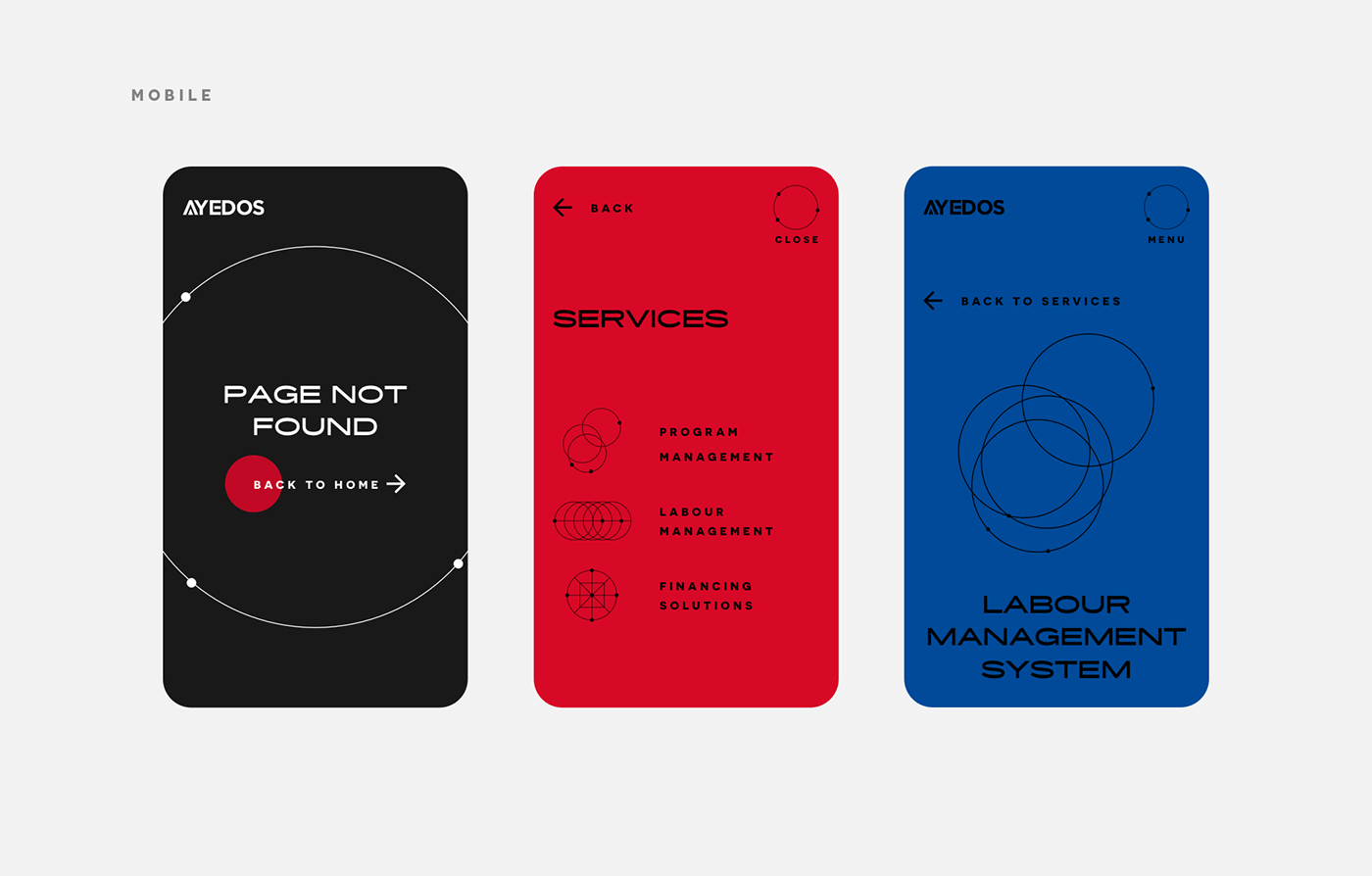
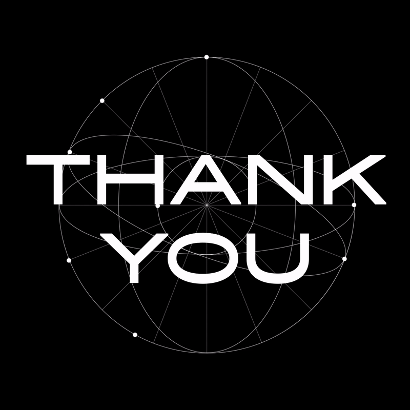
A Y E D O S B. V. is an applied research, applications & program management company. It offers innovative training in technology, business process optimisation and finance solutions. Company’s world-wide professionalism reveals through the use of geometric illustration system with a pinch of scientific feeling, as a sign of identity.
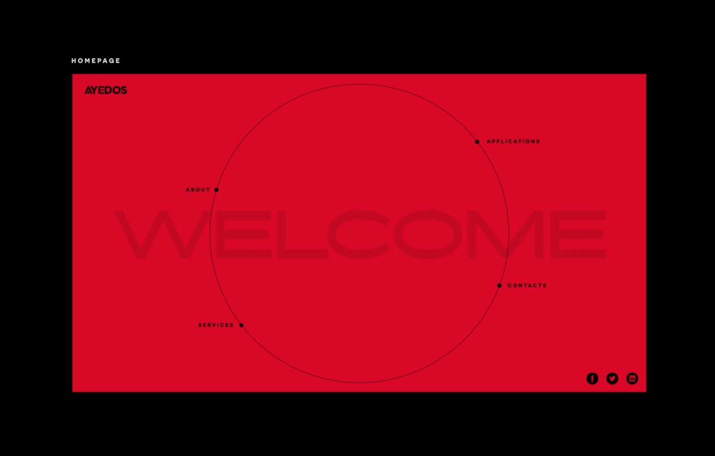
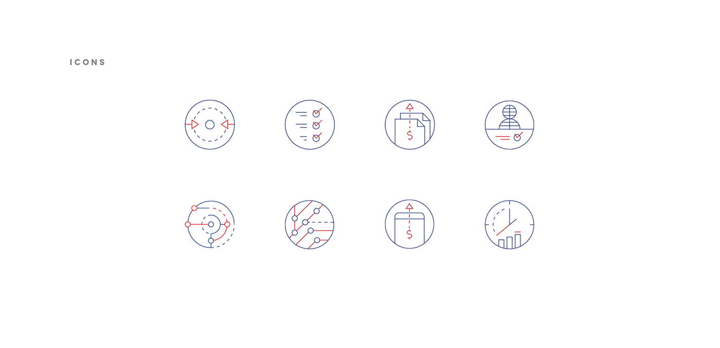
Inspired by atom structures, the circle—symbol of perfection & infinity—was taken as a base form. As a result, different compositions were created—each one revealing different company's services. The use of infinite loop animation supports the idea of professionally managed processes.


P U B L I C A T I O N
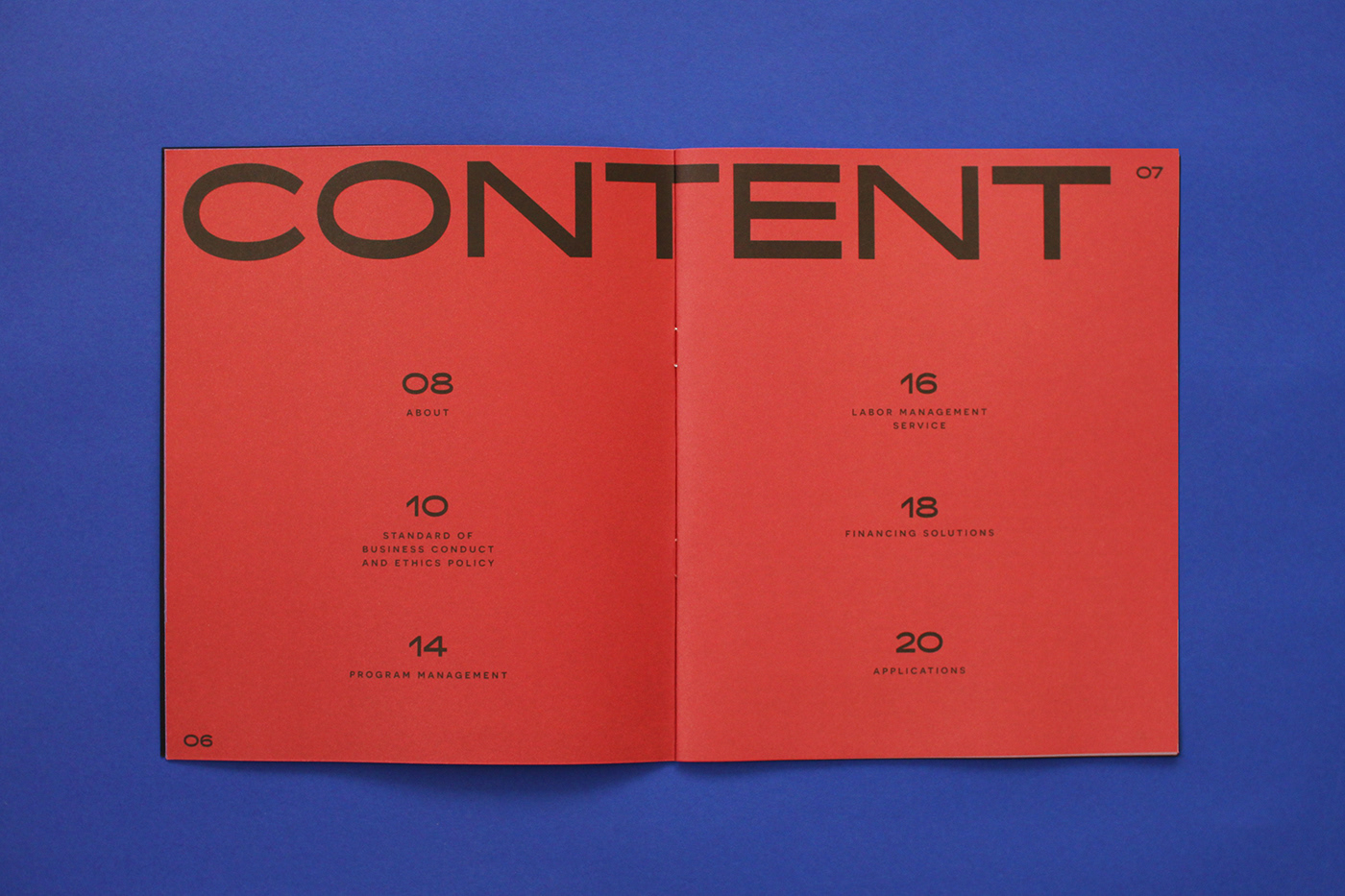
It was important to show the information in a structured way, hence the use of a strict & spacious grid-based layout. Extended grotesque typeface Ace Lift supports the desired scientific feeling, while serif typography brings professionalism and seriousness to the brand. As for the cover—black textured paper with elegant silk screen print.


Client: AYEDOS B.V.
Year: 2019


