
N1 — rebranding of the real estate search service

N1 is a federal real estate search service that is popular beyond the Urals. The brand team wants to expand the boundaries and strengthen existing positions in the Siberian market. To do this, we decided to change the positioning.
Plenum offered to beat regionality and make it an advantage of the brand. Local brands know the city and the people who live in it better, and in the search for real estate this is important. The company has already been represented in 25 cities of Russia, but not in all cities under the N1.RU brand. The new strategy offered to get away from the difference of brands and combine all portals under one.
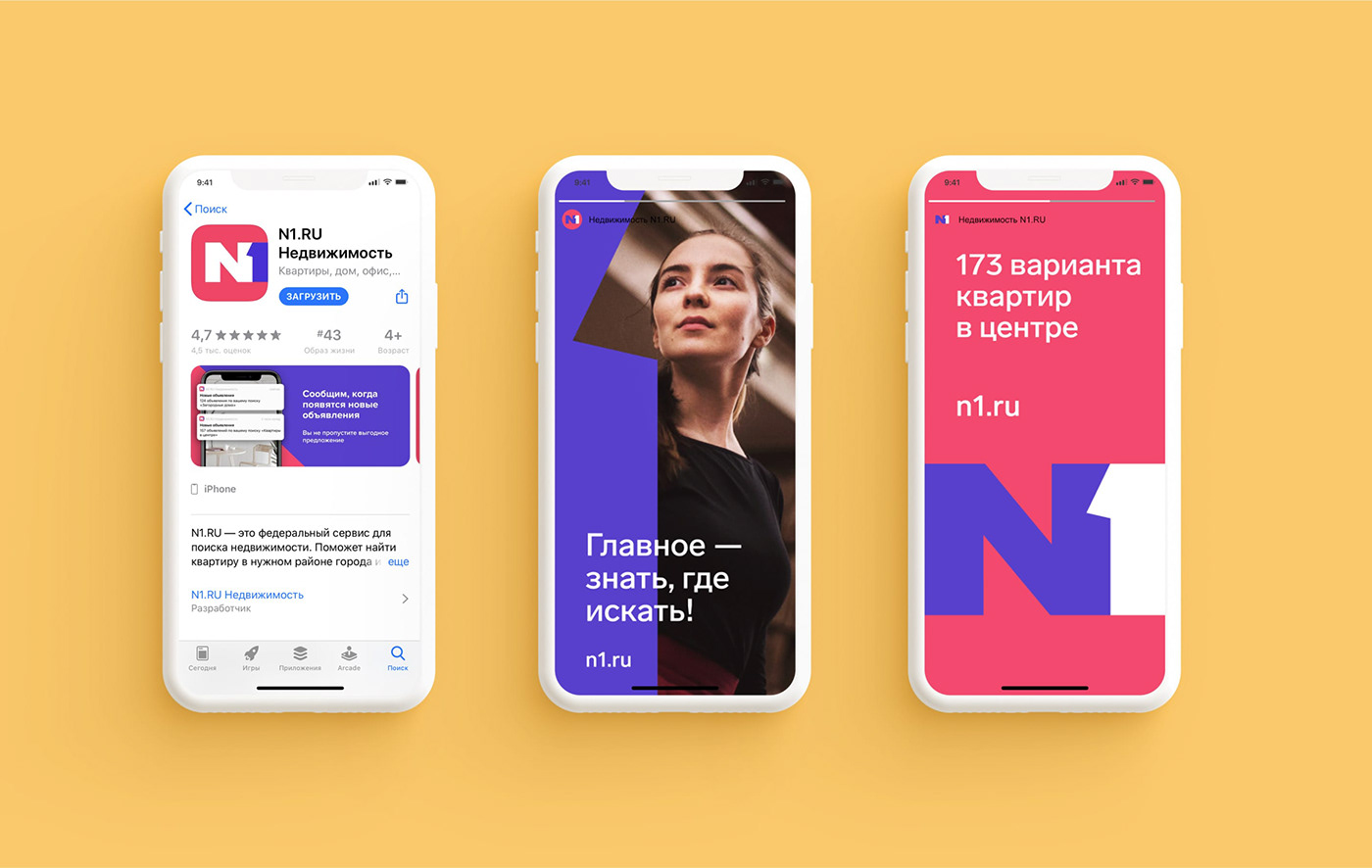
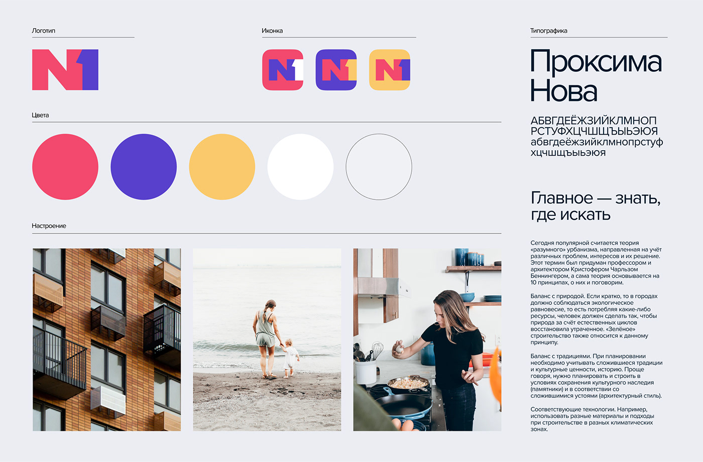
The new logo has become graphic and strict. From such a logo it is easy to build a design system. We have kept the brand face by leaving the name in the logo without losing recognition.
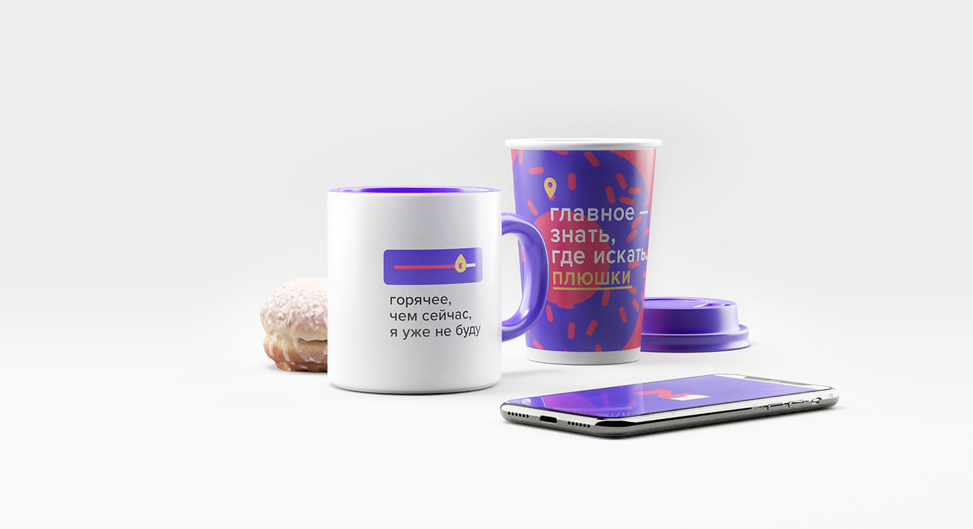
Brands are experts, similar to people, as a rule they are confident in themselves, they do not need many tools to show facts about their knowledge. Realizing this, we proposed that the brand limit itself to a minimum of tools: logo, font, colors, container system and copyright. Together, this enables designers to quickly develop materials.
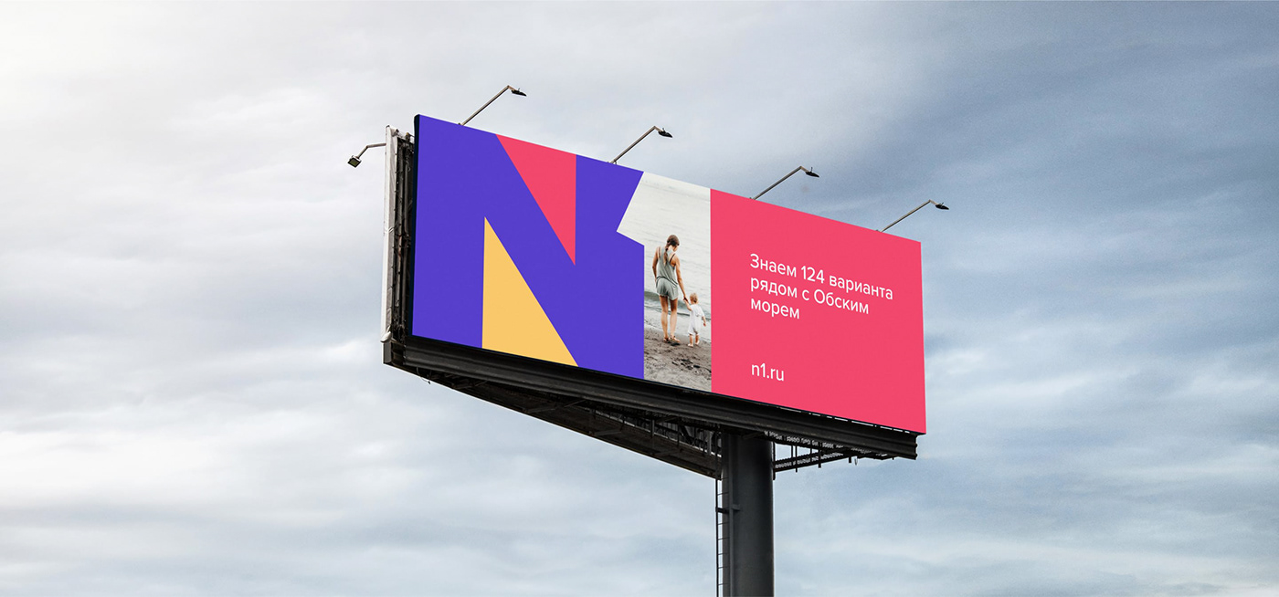
By combining them, the brand could easily write the facts of its achievements, for example, that it knows 124 cool options near the pond.
By combining them, the brand could easily write the facts of its achievements, for example, that it knows 124 cool options near the pond.
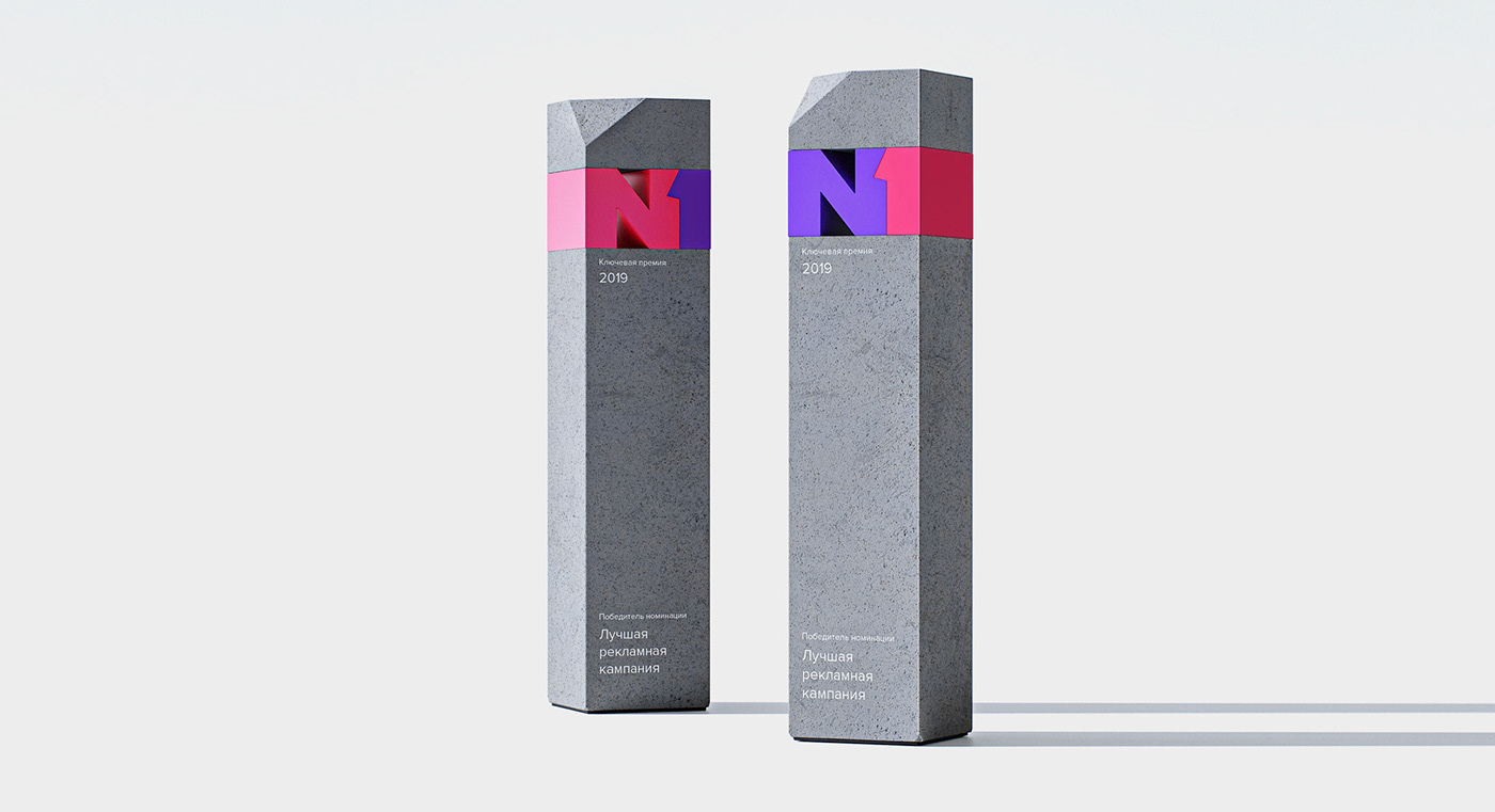

The resulting option was liked by the brand team. It is close in spirit to N1 and they easily considered the design system of the resulting identity. For us, as a design agency, this is important. If the client understands the design of the system, and his team shares its visual image, then they will be able to maintain and develop an identity.


