


Built by three dads who wanted better for their
families and yours.
Three fathers living in Shanghai, got up close and personal with the impacts of urban air pollution. Between chronic respiratory illnesses and weekends cooped up indoors, they saw firsthand how the smog affected both the physical and mental wellbeing of their families and decided to do something about it.
And as you may have guessed, they named the company after one of their children so that they would be constantly reminded of their commitment to their families, and their customers’ families.
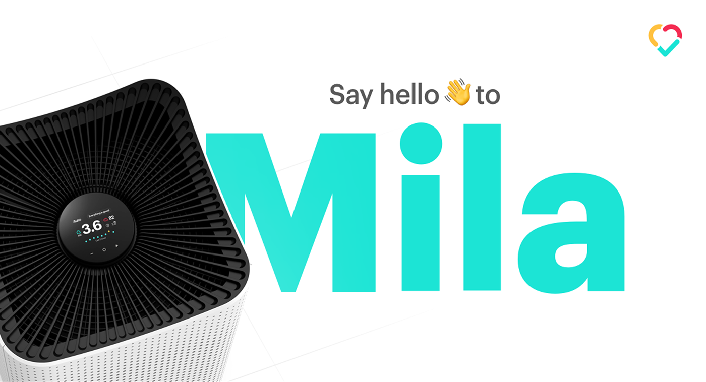
Their goal is simple: to make the absolute best air purifier on the market. That means top-notch performance, design and technology, all at a price every family can afford.
The Challenge
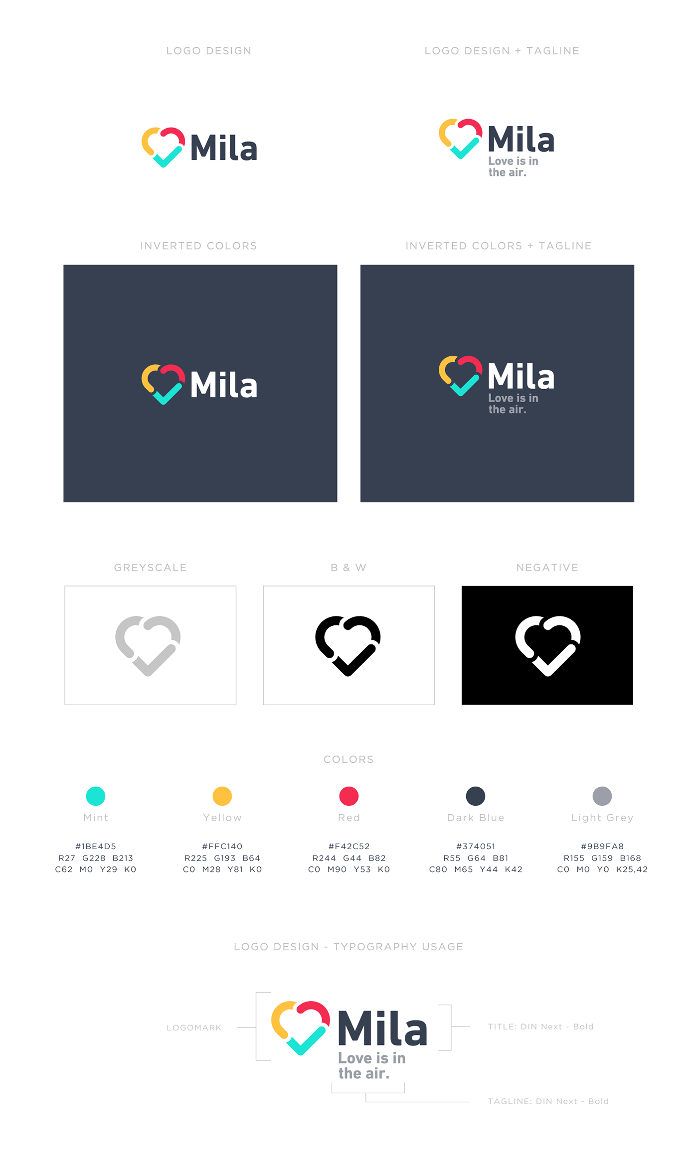
The client asked me to come up with a perfect symbol which holds the corporate but also personal vibe to the brand. I focused on the logo redesign, packaging design and brand assets such as color usage, pattern design etc.
The client asked me to come up with a perfect symbol which holds the corporate but also personal vibe to the brand. I focused on the logo redesign, packaging design and brand assets such as color usage, pattern design etc.
I helped my client to embody their visual story and captured how their products works within a minimal symbol. I love to fix problems with my skills in design and finding the best possible solutions to a concept.
My Approach
After gathering and discussing all the details of Mila and the founders, I started to fully understand what Mila was all about. To make sure I stay on the same page as my client I often reach out and talk through some of the processes I went with. Especially at the start of a project, I try to keep my client as involved as possible as this determines the main core of my client's business identity.
After gathering and discussing all the details of Mila and the founders, I started to fully understand what Mila was all about. To make sure I stay on the same page as my client I often reach out and talk through some of the processes I went with. Especially at the start of a project, I try to keep my client as involved as possible as this determines the main core of my client's business identity.
I helped my client to embody their visual story and captured how their products works within a minimal symbol. I love to fix problems with my skills in design and finding the best possible solutions to a concept.

Visual Identity
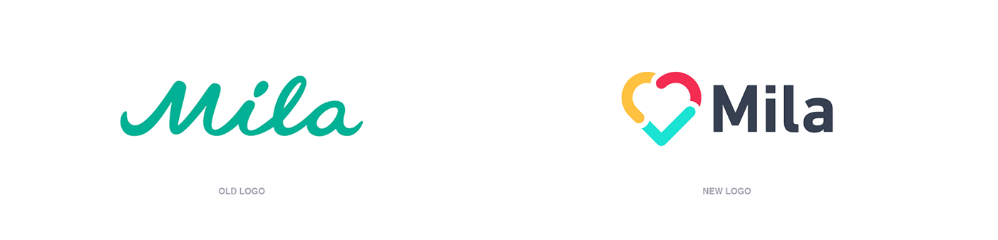
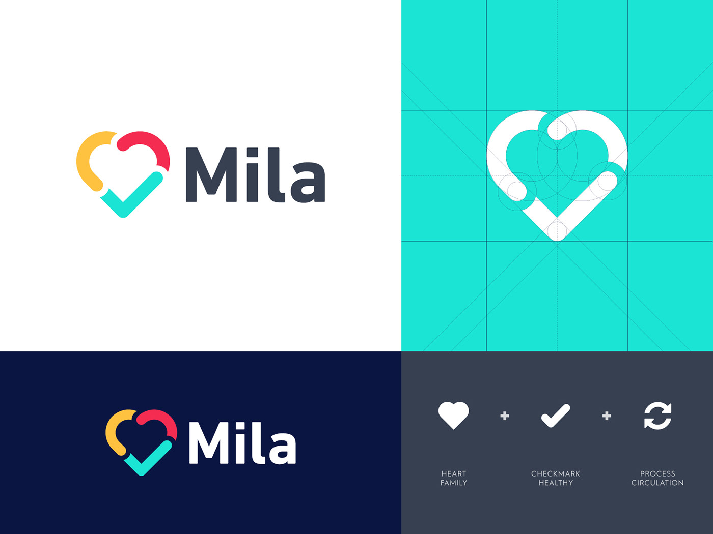
At the start of the project, we already had a strong feeling of using a heart symbol as the Mila identity. But there were some challenges in finding the perfect match which tells a visual story of their product as well. After I had done my research, I focused on multiple elements regarding air rotation, ideas about polluted air to clean air and also M letter marks which hold a subtle reference to the products Mila is providing. Eventually, we stayed with a heart-shaped symbol which turned out the perfect way to use as their brandmark.
At the start of the project, we already had a strong feeling of using a heart symbol as the Mila identity. But there were some challenges in finding the perfect match which tells a visual story of their product as well. After I had done my research, I focused on multiple elements regarding air rotation, ideas about polluted air to clean air and also M letter marks which hold a subtle reference to the products Mila is providing. Eventually, we stayed with a heart-shaped symbol which turned out the perfect way to use as their brandmark.
My love and passion for logo design are a part of my process of finding unique and timeless solutions. Not to only to show off within my portfolio, but mostly because I love to see how these designs turn out to be perfect matches for my clients. It's all about solving problems and deliver meaningful work.


Thank you for your visit!
If you enjoyed this project feel free to hit that "appreciation" button below!
💚
Interested in working with me? Feel free to reach out via below links:
info@jeroenvaneerden.nl


