

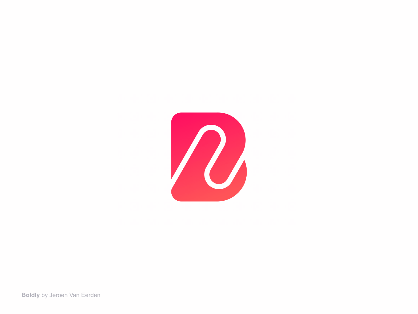
Boldly, Premium Subscription Staffing for Business
The Challenge
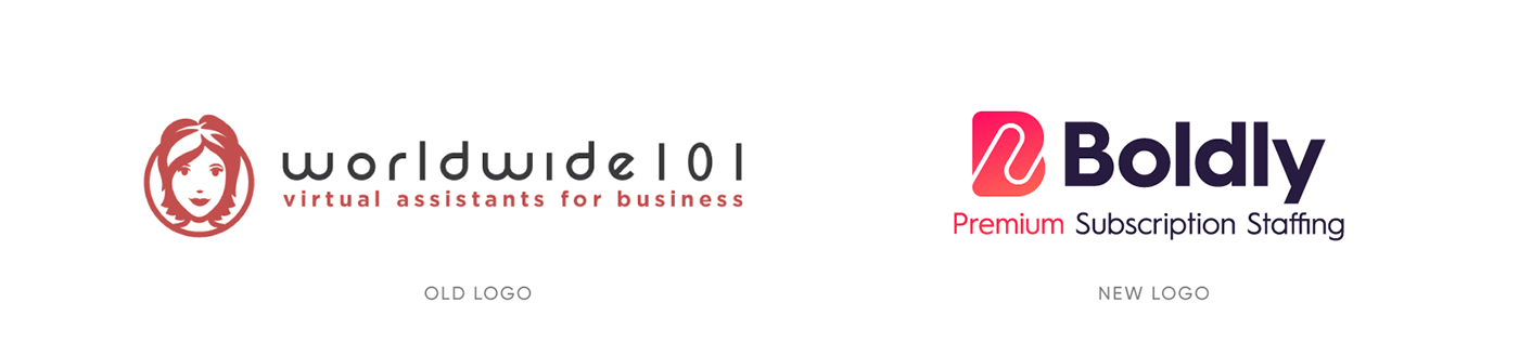
Worldwide101 has been the market leader in the Virtual Assistant space for many years. About two years back (2018), as part of their goal to continually innovate, to lead the industry, and to appeal to customers at larger companies, they changed the way of speak about what they do from “virtual assistants” to “premium subscription staffing”. And the next step in that evolution is changing the company name from Worldwide101 to Boldly.
Services Provided
- Logo Redesign
- Color Discovery
- Typography Discovery
- Brand Storytelling
I helped Worldwide101 to evolve towards their brand new name and identity and embrace their new mission and visions for a better online experience for and with their users.
My Approach
Firstly I always have much contact with my clients about the company, people and what they want to solve with a potential new logo. I always find it important to know the people first so I can find solutions that connect not only with the consumers but also the people who work there. I often start with my research and understand what their current market looks like and if there may be any competitors involved. During the project, I created many potential concepts and talk these through with my client and we’ve been growing towards a perfect mark that captures all their visions and missions and still keeping it human and appropriate.
I'm so passionate when it comes to kicking off a new project and discover potential directions which may be a perfect suit. Sketching out rough ideas and browse on the internet (and books) to help find that spark for new inspiration.

Rough sketches when I dive into a new project. I tried to do something creative and appropriate within a letter mark B.
Visual Identity
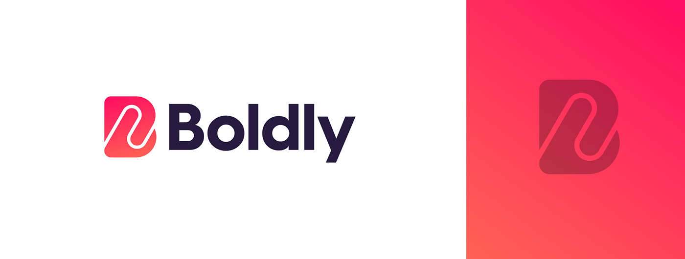
Due to the change of naming of the company we also had to rethink the meaning of the new name Boldly. I’ve been doing research on the company and laid down its plans to evolve its business for the next years. It was key that they wanted a suiting logo for their new name and ideas such as humanity, friendly, handshake, connecting where highlighted at the very start of the project to focus on. It needed to embody the name and also keeping in mind what Boldly provides with their services. I often focus on a mark first. Once the mark is perfect there is the time to find a complimentary typography choice that embraces the whole visual identity. Colors, typography were all cleverly combined to make a perfect match which holds all the energy and joy which the people at Boldly bring to their audience and consumers.
Several high potential marks were invented and closely discussed with my client. I find it important to always stay on the same page but keep room for creativity and bringing in the WOW-factor to my designs.
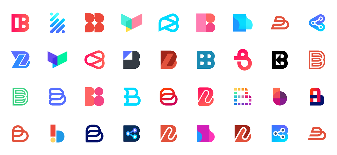
Rough sketches when I dive into a new project. I tried to do something creative and appropriate within a letter mark B.
Revisions
At this stage, my client decided to go with a specific concept. It had almost everything they were looking for but only needed some subtle tweaks to make it work more fluently. After some conversations with my client, we had a clear idea of how this could be improved without losing too much of the initial concept. The client asked me to focus on more friendly forms, warm and vivid colors and also make the mark just slightly better balanced. I got back to my illustrator and looked at how this concept could be improved without losing the vibe and connection it forms.
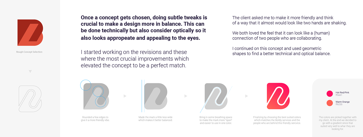
Rough sketches when I dive into a new project. I tried to do something creative and appropriate within a letter mark B.
Typography
When it comes to choosing the right font for a logo, I often focus on what I want to achieve with it. I always look for a font that complements a logo mark. To keep things visually balanced and technically correct, I tend to go with clean and strong looking fonts. Sometimes I adjust the font to make it fit the identity better. My client already had a strong connection with the Hurme font and so I followed his wishes and made it work perfectly with the already designed mark. Hurme is also one of my personal favorites so that was a nice little extra.

I choose the typography which matches a mark wisely so it has a nice visual balance.

Client Review
Matthew Criticos, Co-founder & Technical Director at Boldly, A Premium Subscription Staffing Company.
Thank you for your visit!
If you enjoyed this project feel free to hit that "appreciation" button!
Interested in working with me? Feel free to reach out via below links:
info@jeroenvaneerden.nl
Interested in working with me? Feel free to reach out via below links:
info@jeroenvaneerden.nl


