
HATO
—
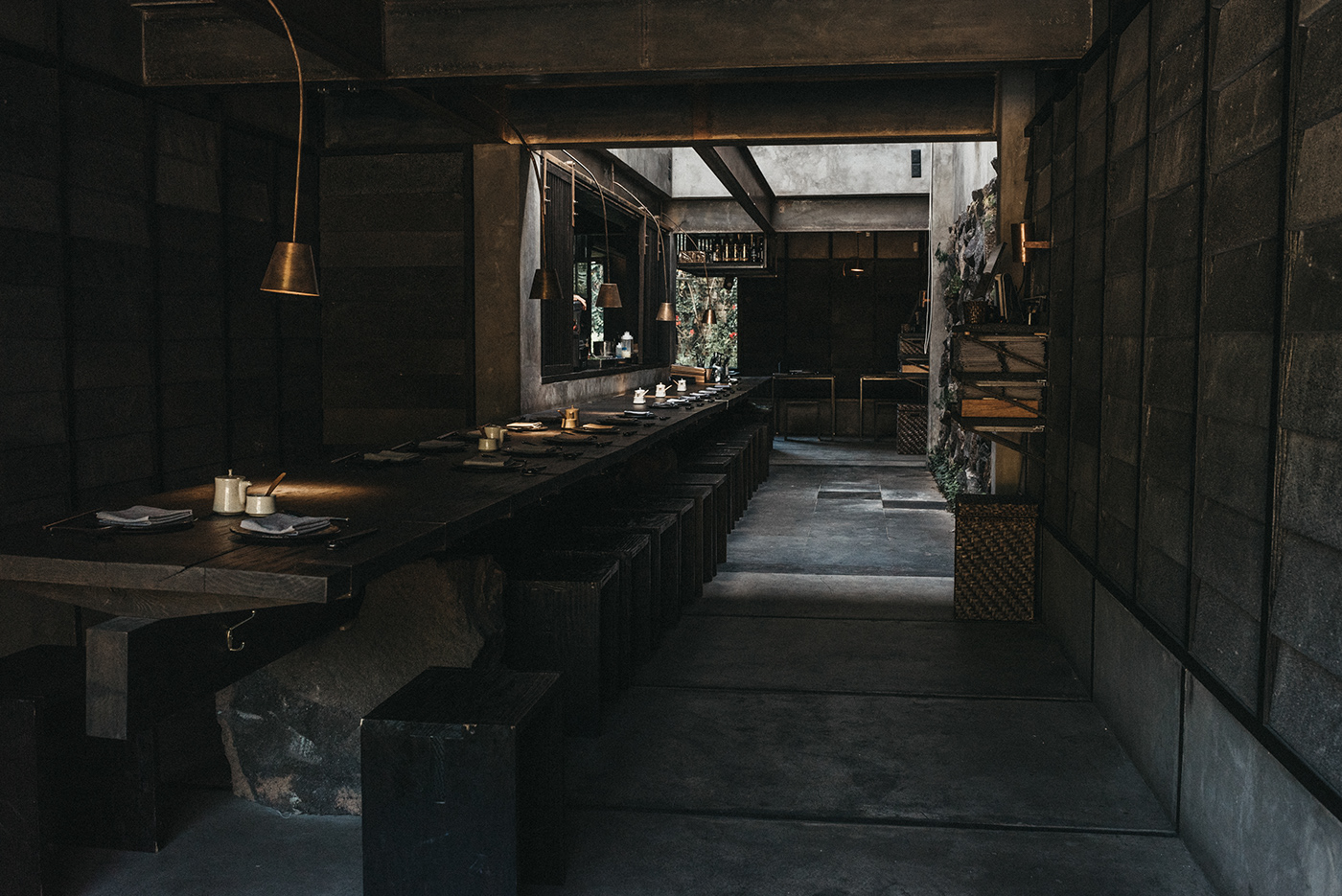
Hato was created based on its experience, not its authenticity.
Since the beginning, we look to establish a concept based on creating an experience for everyone who entered HATO. A places that evoques the Japanese culture in every inch of it, that's why we didn't leave any details unattended.
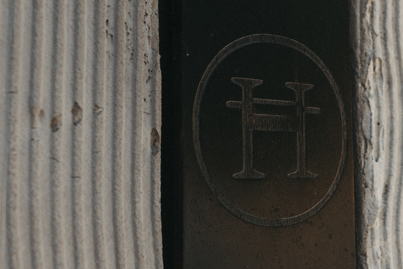
Based on this, the logo was created reinforcing that fusion between east and west, where we could play with all the familiarity, urban and relaxed of a western city with the tradition, fragrance and sophistication of an alley in Tokio.
In such way, the main monogram has an uppercase H with an extra horizontal line, evoking que shapes of a Japanese character, while forming a monogram containing all the western letters which compose the name: HATO.


Proyecto realizado por: Cocoa Branding
Cliente: HATO restaurante
Dirección creativa: Rodrigo Suárez
Dirección de arte y diseño: Rodrigo Suarez
