


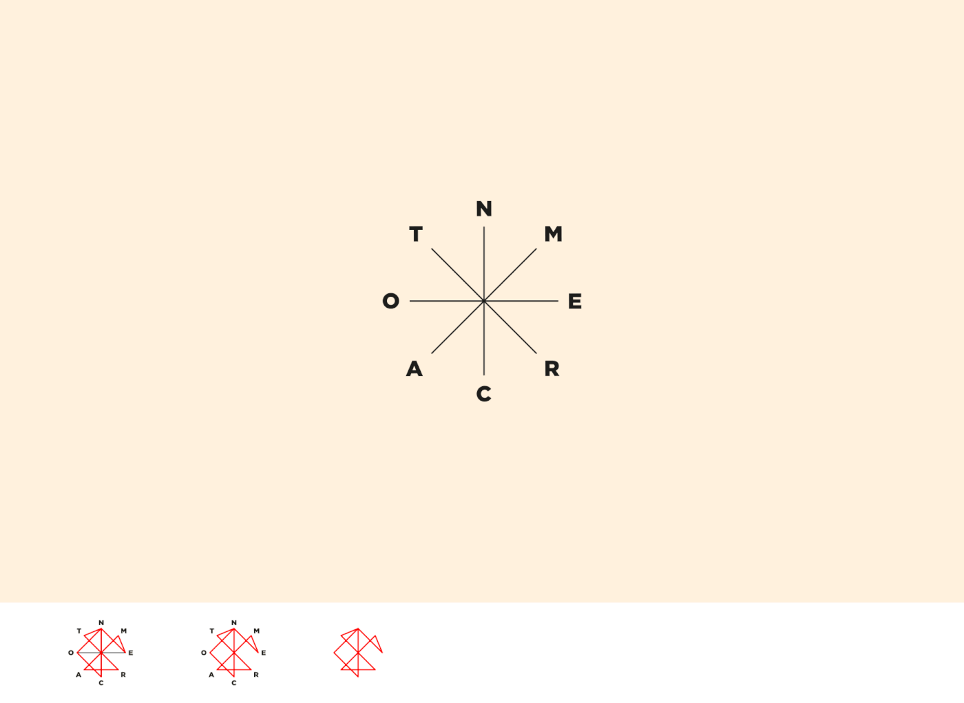
ENCONTRA-ME — A graphic manifesto that consisted of a collaborative puzzle • Academic project — 2013
Encontra-me means find me, in english. The 8 different letters of the name (E, N, C, O, T, R, A, M) are distributed over the 8 main points of the streamlined compass rose, symbolising the 8 points of the manifesto, that traces a path from being lost, to start searching and digging, and to finally find a passion.
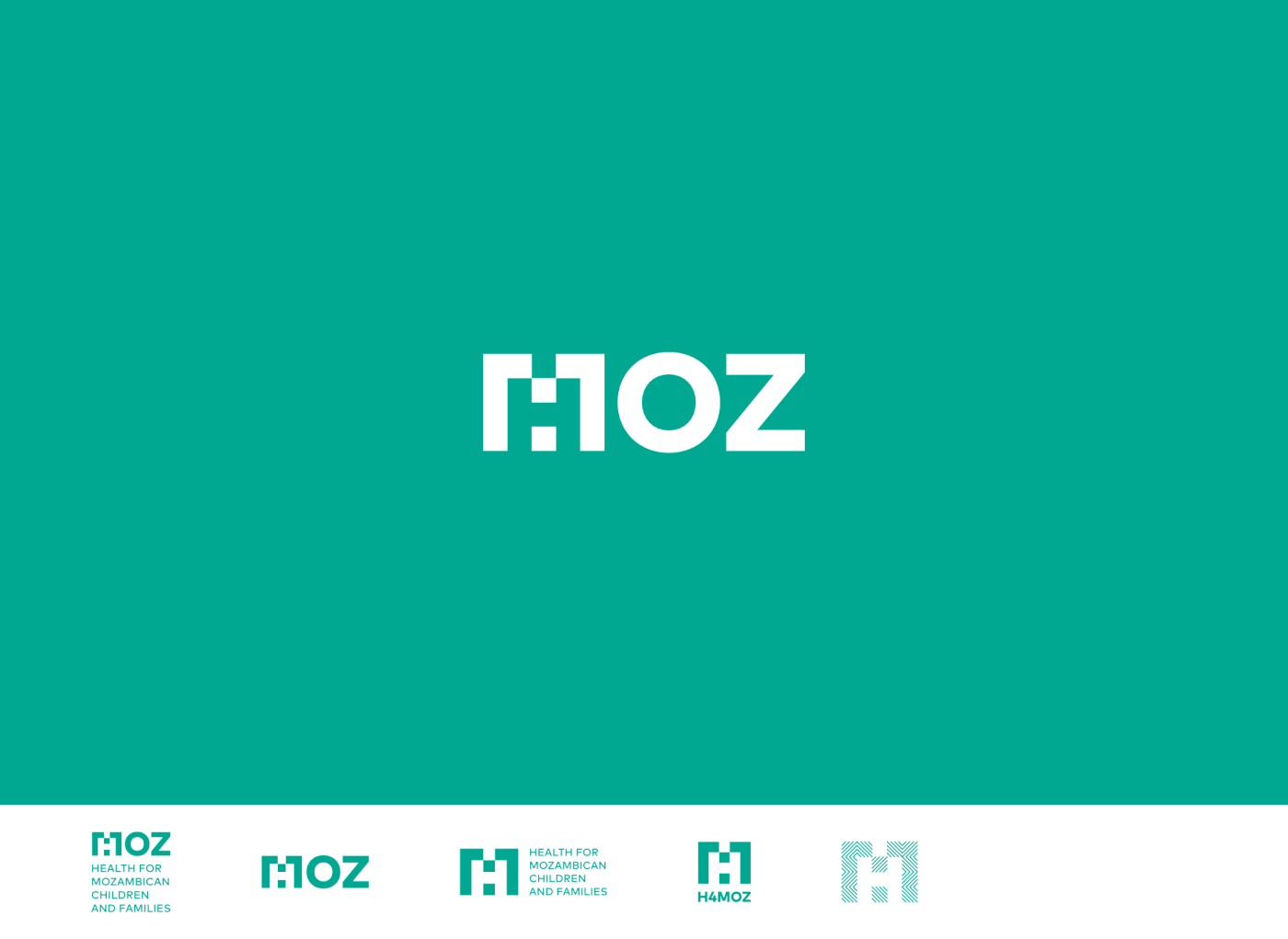
H4MOZ — Non-profit Association providing humanitarian assistance in Mozambique • Academic project (not selected) — 2013
H4MOZ's priority is the promotion of child and family health in Mozambique. I explored the concept of lack / filling, reaching a monogram in which the letter M embraces the letter H, in negative space, symbolising the lack of Mozambique in the area of health.

MARÁCULA — Cultural Association focused on theatrical production • Used — 2013
I’ve designed a symbol that is the eye of the audience, but also the tireless eye of Marácula that always sought for new challenges and new forms of communicating. To make it more playful and versatile, I created seven different custom sets of characters for the name Marácula, that could be mixed and matched.

PI & CRAFTS — Small sewing atelier • Used — 2013
Pi crafts unique necklaces and other handmade accessories with various fabrics, lace, vintage buttons and other materials. Pi & Crafts' monogram combines the characters P, & and C with a sewing needle, and is delicately wrapped in a lacy circle with a dashed stroke, as stitching.

SNACK — Design and Animation studio • Used — 2014
Inspired by the snacks packaging universe, it has a bold typeface in a dynamic pose, with volume and bright colours, packed in a zig-zag container, like a chocolate wrapper. In 2017, the colours were updated and its shape was reduced only to the shadow.

A FILANTRÓPICA — Cultural Cooperative of Póvoa de Varzim • Used — 2015
The simple mark is based on the distinctive arched windows of its centenary building's facade and is a welcoming open window ready to talk about art and culture with whoever wants to join the conversation. The colour and typeface choice honours the 80 years of A Filantrópica and has also inspiration in the Art Deco, that began flourishing by the same time of the cooperative's foundation.
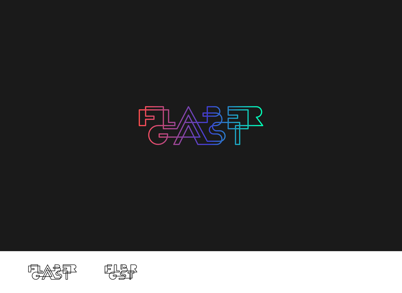
FLABERGAST — Author Progressive Pop band • In use — 2015 (the shortened version was created later, in 2017)
Flabergast is an alternative form of the word flabbergast, that means overwhelming surprise, astonishing, confusion or shock. Having this in mind and getting inspired by the optical illusion principles, the neon signs and the outer space, I explored the idea of loop.

CLÍNICA S. DÂMASO — Health Clinic specialised in Nutrition • In use — 2015
The symbol embodies a heart (related to health and also to Guimarães, city where the clinic is based) and an apple (representing nutrition and healthy food), and subliminally joins the initials C, S and D.

FERNANDO MOREIRA — Woodworker • In use — 2017
I created an F + M monogram that illustrates the act of woodworking and the craftsmanship of this profession, seeking to convey authenticity, hardiness and honesty. The blocky composition is inspired by the technical drawings’ captions.
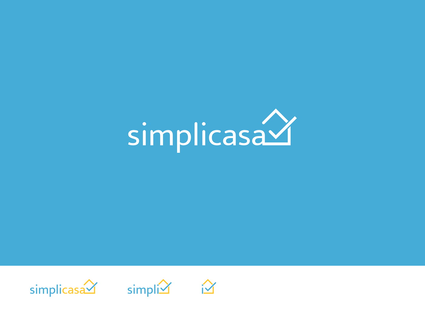
SIMPLICASA — An app that allows you to easily schedule various household services • In use — 2018
Simplicasa results from the union of two portuguese words "simplificar + casa" (in english, simplify + house). I merged the icons of house (embodying household services, well-being and security) and checkbox (representing to-do list, accomplishment and right choice) to create a simple and familiar symbol for Simplicasa: a house shaped checkbox.

LADO B — Second hand store • Unused proposal — 2018
Lado B (in english, Side B) intends to show the other side of the second-hand articles, giving them a second life. In this proposal, I explored the concept of other side / back of the page through a fold in the corner of the logo, which creates a triangle (subliminally, the letter L), from where the letter B appears, forming a heart.
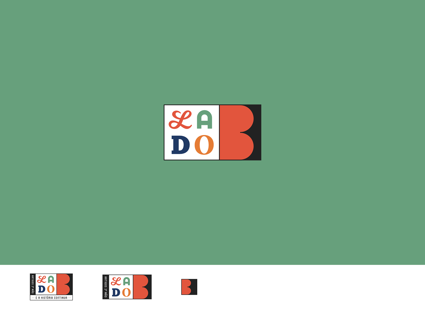
LADO B — Second hand store • Used — 2018
Here I worked a more straightforward concept with vintage vibes, where the B appears from one of the sides of the square, inside which it can be read LADO (in english, SIDE) featuring different typefaces, to show the store’s diversity of items.

AGENTE A NORTE — Actors agency • In use — 2018
Agente a Norte can be translated to Agent in the North. For its rebranding, having in mind the previous asterisk symbol, I explored the idea of compass rose (representation of North, orientation, discovery) and star (figuratively: person who shines, talent, symbol of perfection and quality), to create a simplified representation of the compass rose that places the letter A (for Agent) in the North location.

AL — Personal mark • In use — 2019
I wanted it to be a simple, clean and strong mark, where my initials could (or not) be read, and specially I wanted it to be responsive, adapting to different contexts and supports, like my work bounces between print (various paper formats) and digital (various screen sizes). It also includes in its (de)construction the angle brackets of the HTML tags, to convey my love for coding and my recent adventure in front-end development.


