


PEIXE URBANO VISUAL IDENTITY PROPOSAL BRAZIL, 2020
✦ PRESENTATION UPDATED IN 2024
A minimalist proposal for a consolidated group buying company that keeps expanding its areas of operation.
Peixe Urbano was a pioneer in the group buying model in Latin America. Over time, it evolved its business model and repositioned itself as a local e-commerce platform offering deals in the sectors of gastronomy, entertainment, aesthetics, tourism, and products. The company has just launched a new brand for making virtual payments at affiliated establishments, called Peixe Pay.

SCENARIO
Considering the evolution of the business and the inclusion of a new brand, the company realized the need to redesign its logo to make it more versatile, simple, and connected to the digital universe. Thus, they arrived at the following result, which was not well accepted at the time.
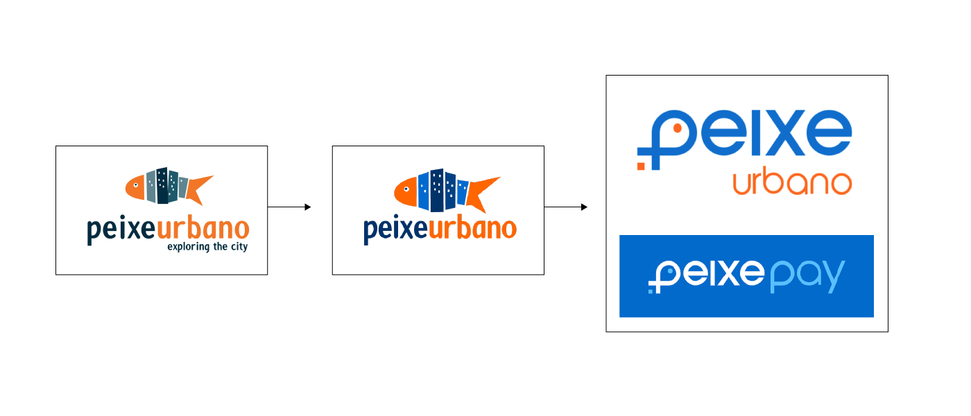
SOLUTION PROPOSED
I proposed a creative exercise of a new design using the same visual concept developed by the company, but with a more minimalist and fresh style. For this, I modified the symbol so that the shape of the fish appeared less childish and removed unnecessary graphic elements. The square used to symbolize the QR Code was incorporated into the design of the fish's tail, making the symbol simpler and more consistent.


