Faró Peñón Identity
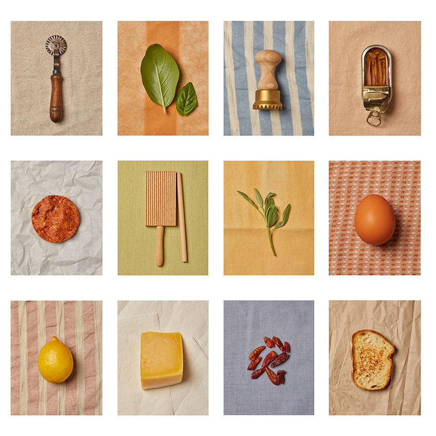
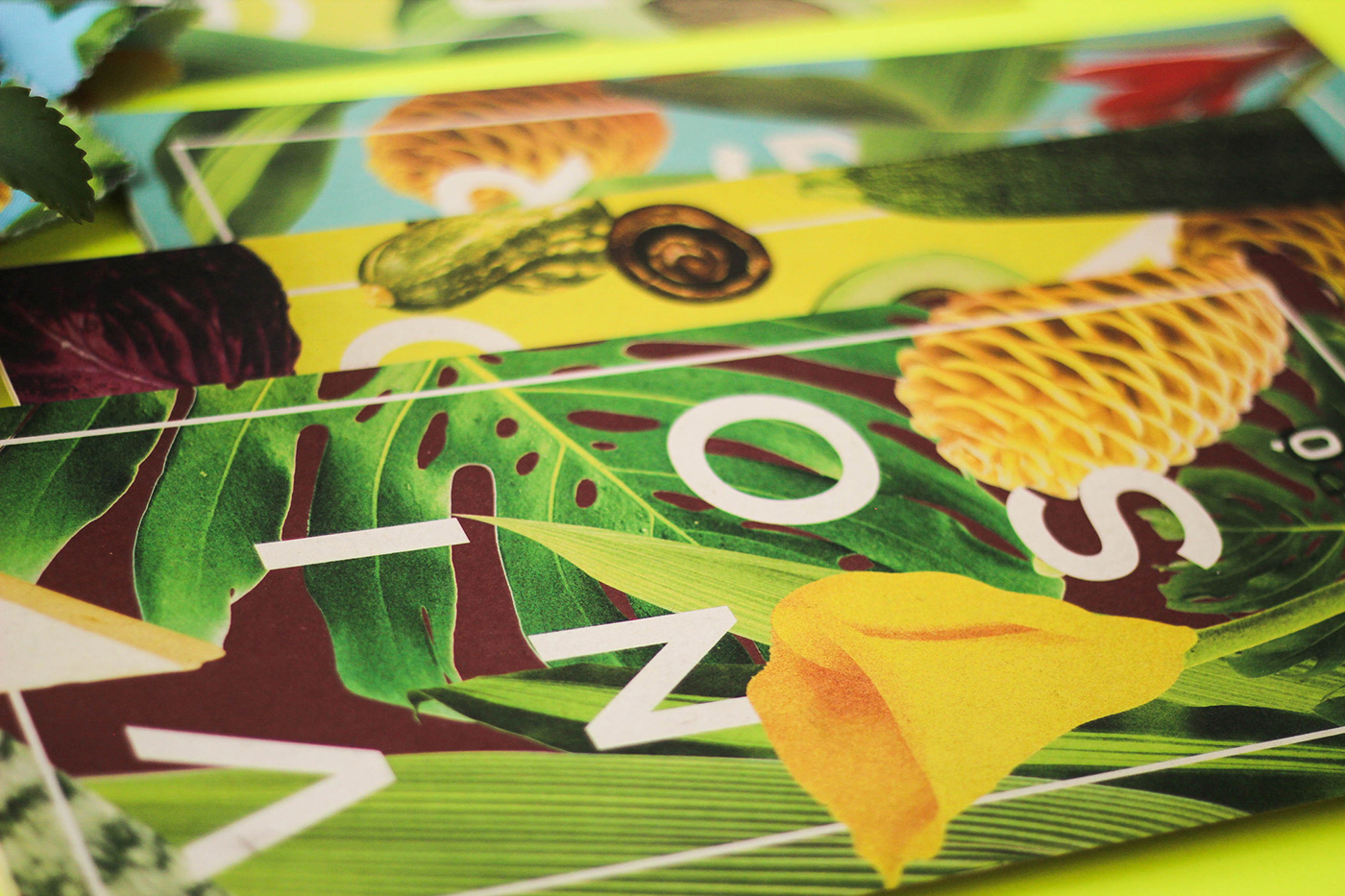
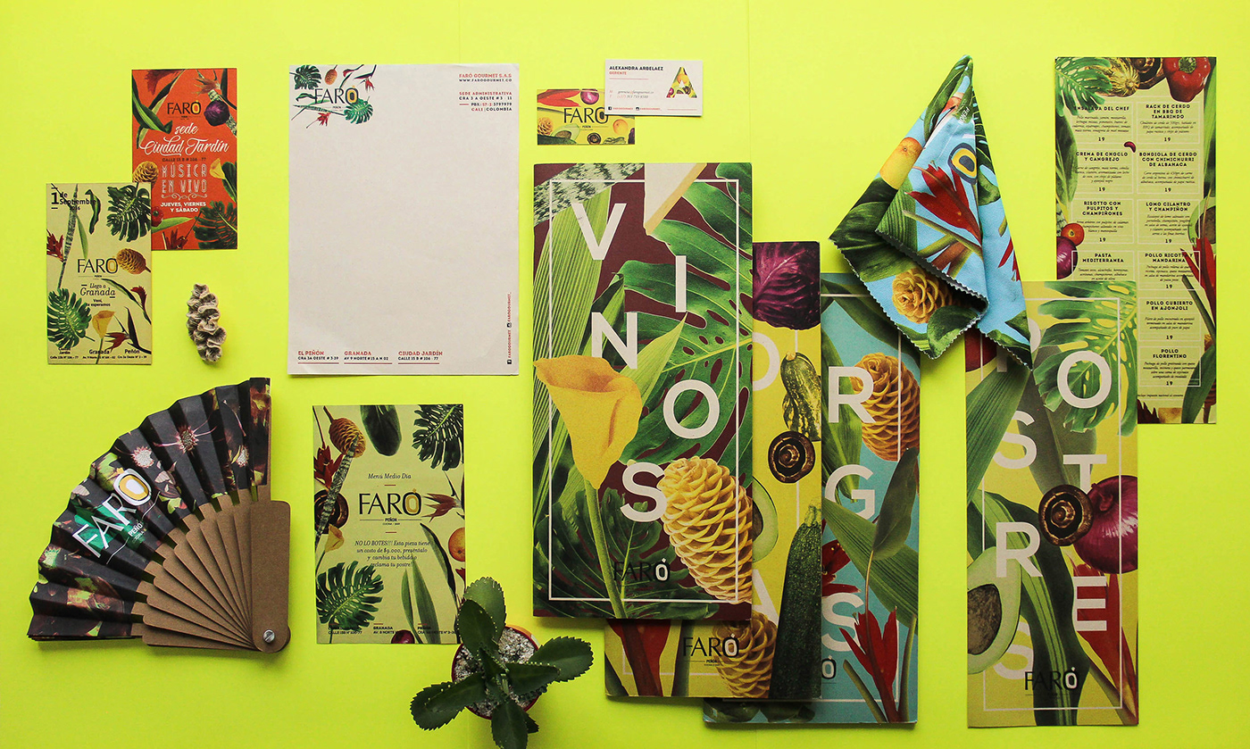
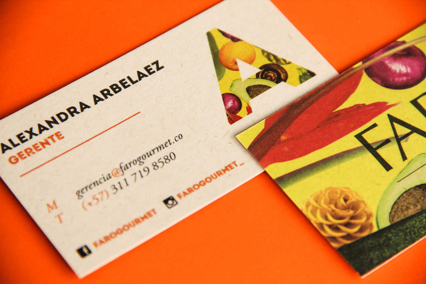
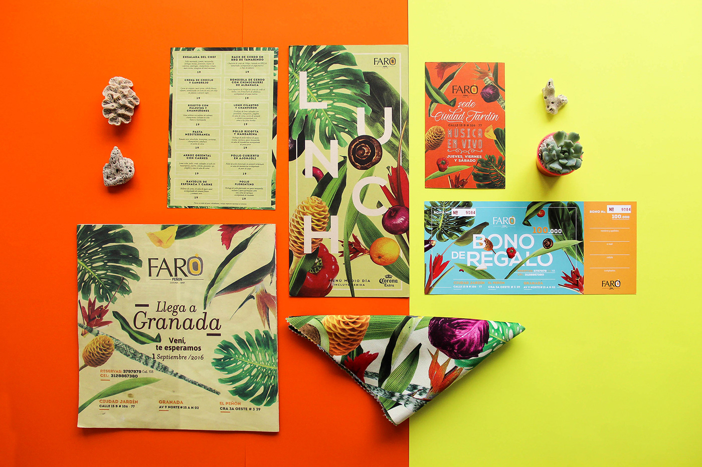
Visual identity created initially as a shoort campaign to communicate the characteristics of Faró´s products and services, their cuisine style and the rich ingredients they use in every dish. The client asked us not to change their logotype, but we trully understood that there was no a strong identity behind the brand so, as you may see, it was developed through the initial campaign.
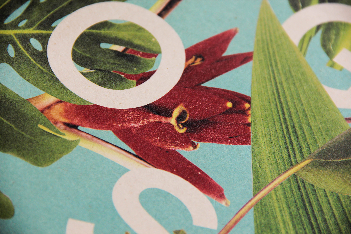
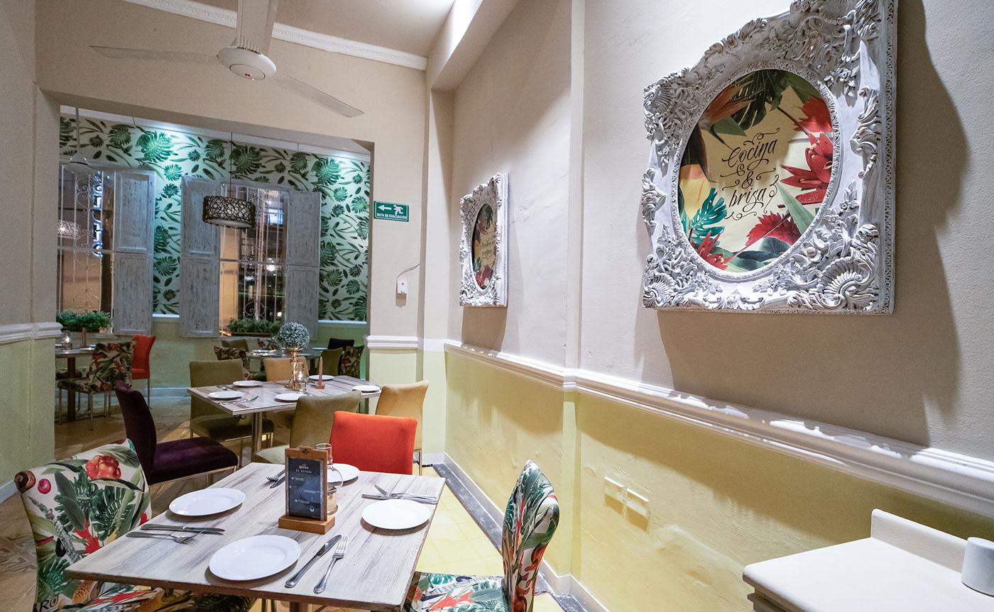
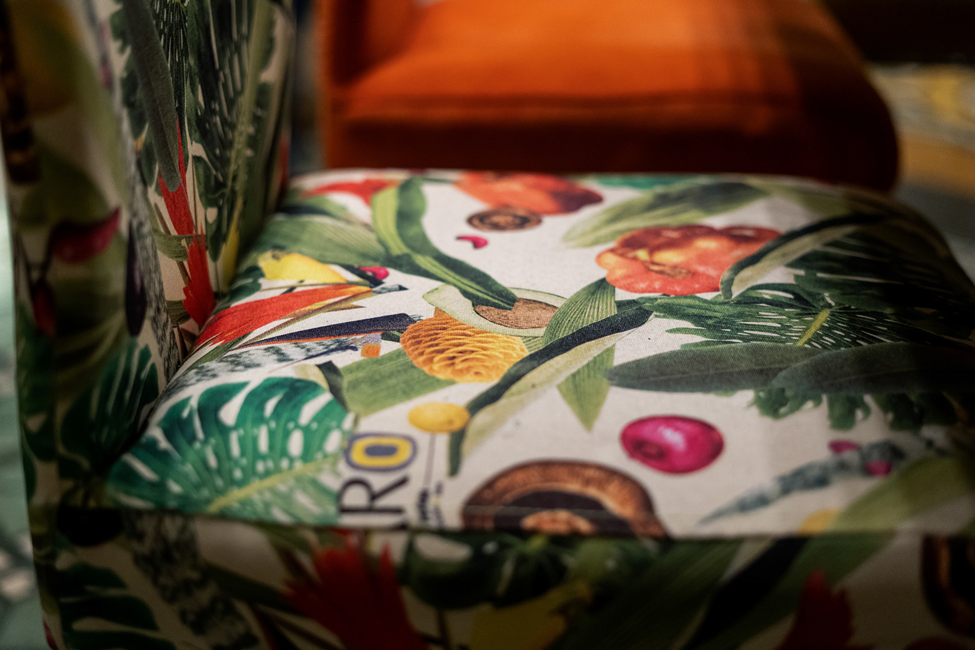
Inspired by the mixing of colombian and italian food, we aimed to represent the trattoria flavors and all the ingrdients from the Colombian pacific food, to create a miture of textures, fruits, colours, plams, beach and fresh air from the countryside.
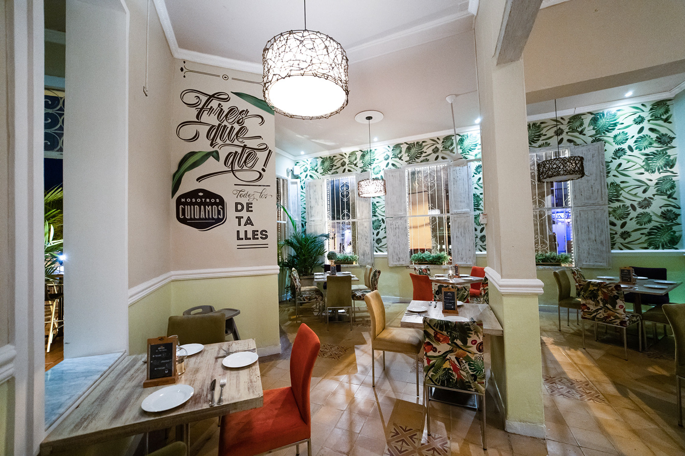
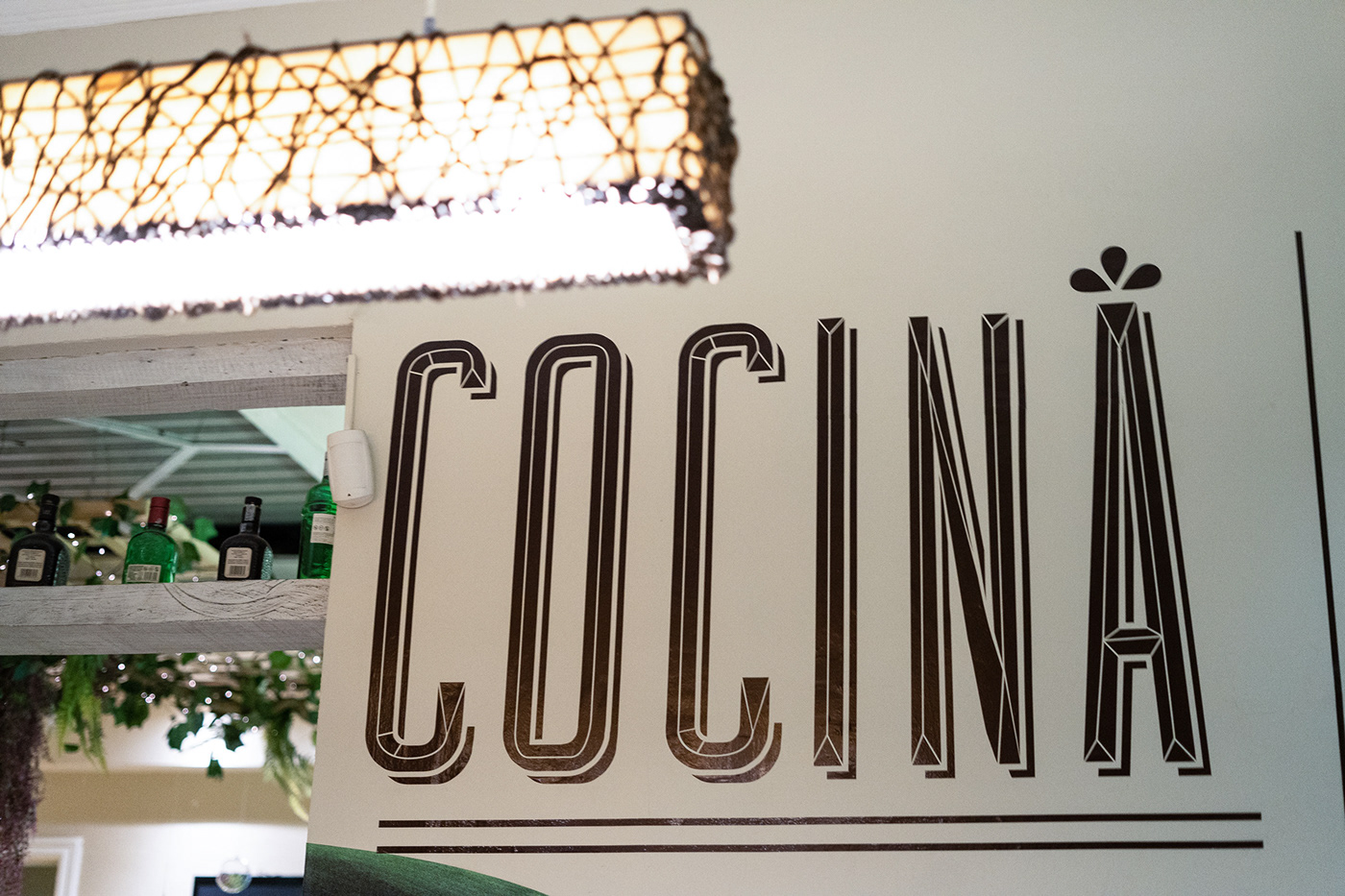
This is the result over the main corporative stationery, menus, promotional stationery, print design, textiles, wallpapers, decoration, chairs, uniforms, etc.





Client:
Year:
2016
Creative Direction:
Executive Direction:
Graphic Design & Layout:
Juan Camilo Castillo, Isabela Cedeño, Simón Londoño, Daniela Gutierrez, Tatiana Bejarano.
Photography:
