challenge
The journal is all about a reflection of myself in the learning process at the university.
solution
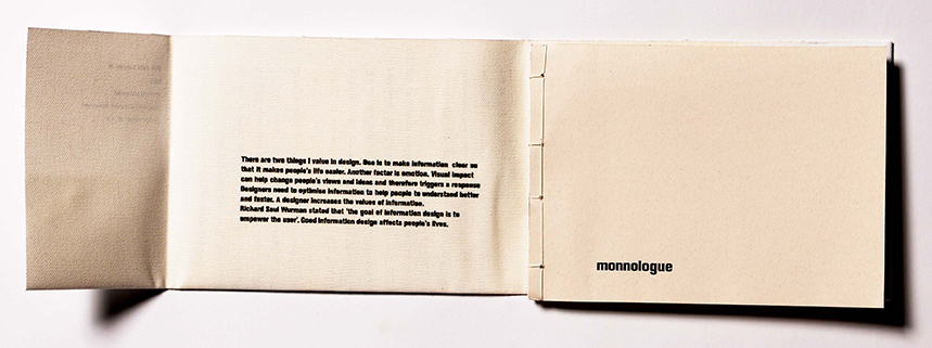
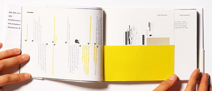
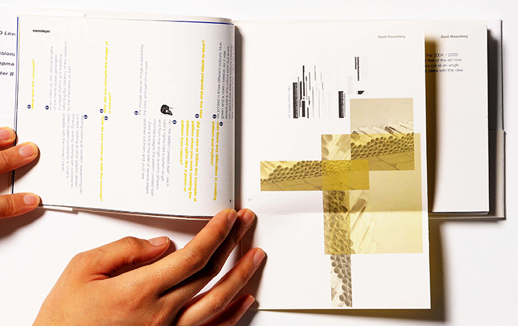
The name of the journal ‘monnologue’ came from my name ‘tomoko monno’.
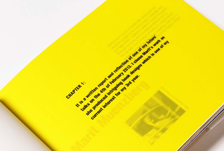
In my country, we first use the family name followed by the first name. e.g. ‘monno tomoko’. The theme of the journal was Emotional VS. Rational. As I mentioned in my manifesto, I believe good graphic design provides emotional value which inspires people and rational value which makes it easier for people to understand the contents of information.
In my country, we first use the family name followed by the first name. e.g. ‘monno tomoko’. The theme of the journal was Emotional VS. Rational. As I mentioned in my manifesto, I believe good graphic design provides emotional value which inspires people and rational value which makes it easier for people to understand the contents of information.
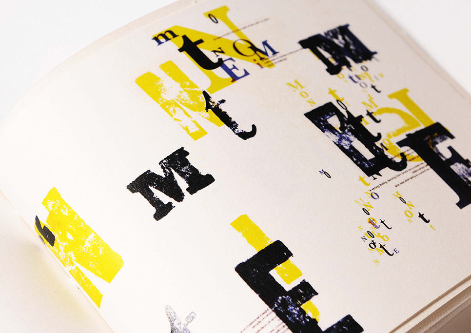
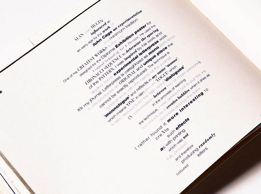
The page is about the lecture by Alan Kitchen. This image was done by letter press expressing the word ‘emotion’.
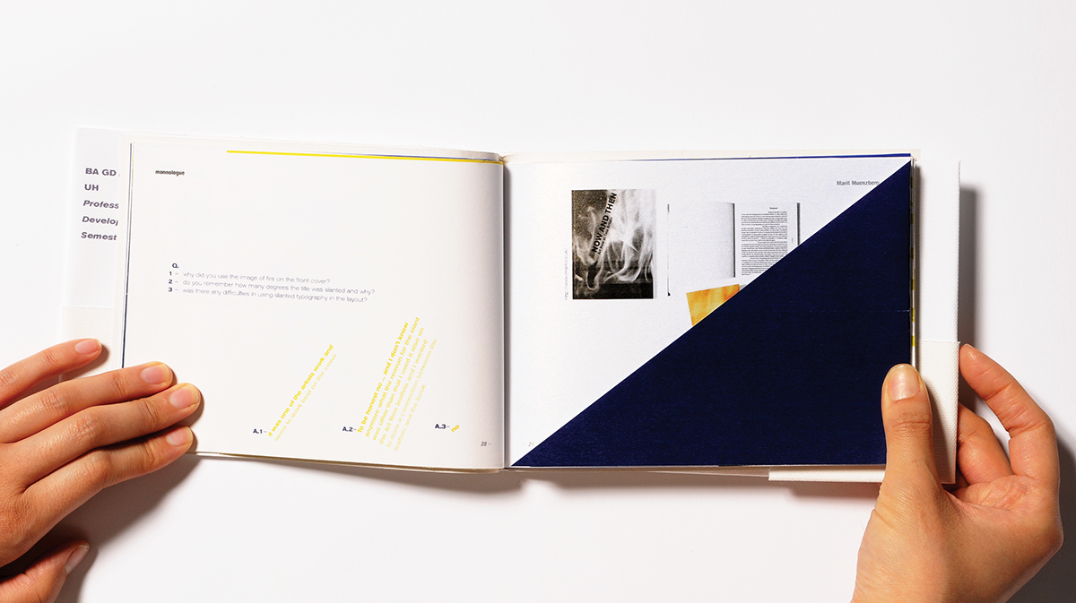
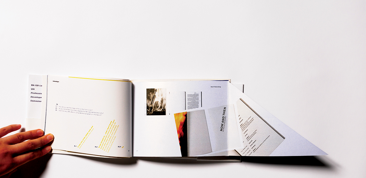
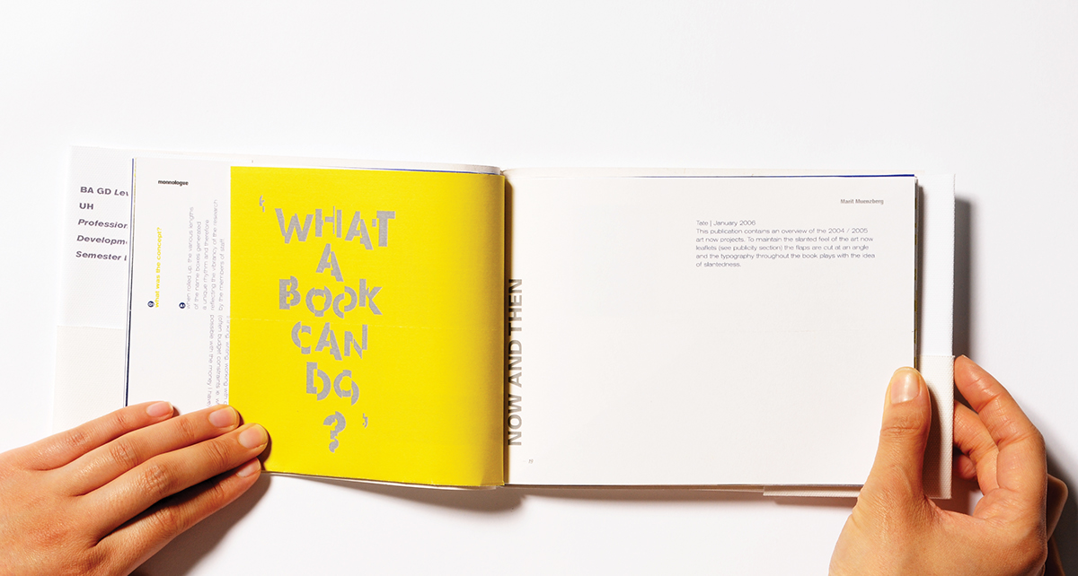
JIS 6 format
Japanese binding
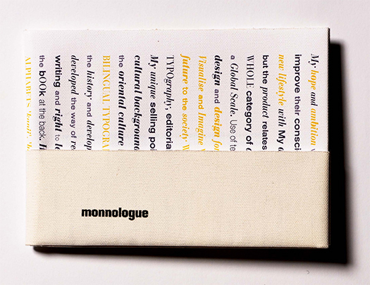
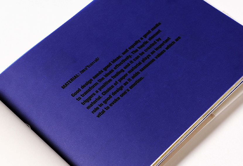
canvas material cover
Japanese binding
canvas material cover

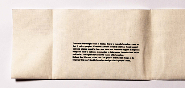
Inside cover – a manifesto screen printed.

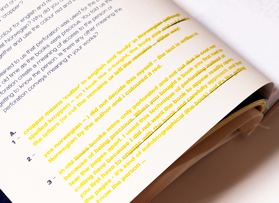
The spread is about the project done by a tutor. The story of cutting a body in this project reflects the body text cut through in the page.
The typography of the spread reflects the concept and design of the project – each poster representing a member of staff with the various lengths of the name boxes generating a unique rhythm when rolled up. Changing according to the diameter of each roll. That was designed by my tutor.

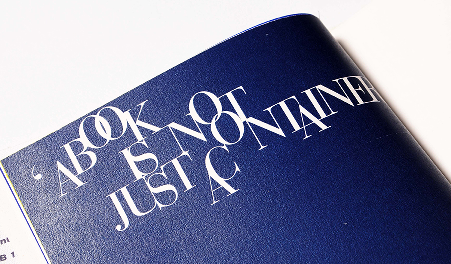
The spread is about the experience in Pin creative. Nigel Davies told me that the important aspect of designing a logo is describing feeling and emotion in a visual language. By using the tone of voice, people must get the feeling of what we are trying to say and get across the idea and feeling. ‘Instant emotion’ was the concept for the London Symphony Orchestra project. I expressed the feeling of instant emotion in typography.