"Founded in 2013 by the creative couple (André Silva and Maria João Pereira), VÉRTICE is a contemporary design studio based in Matosinhos (near Porto, Portugal). Mainly focused on branding, print design, illustration and editorial, we are able to do every kind of graphic design and creative works."

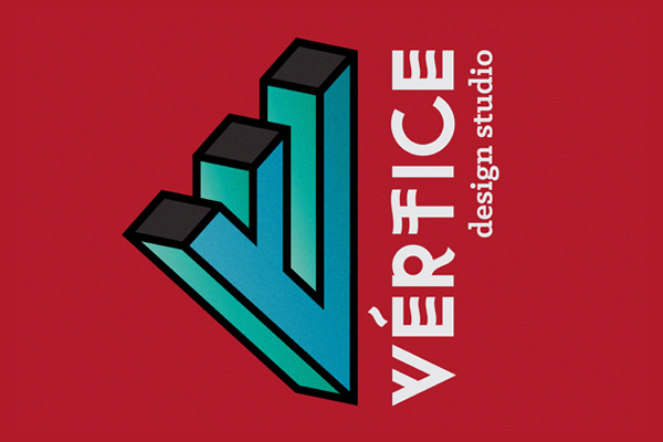
VÉRTICE (=vertex in english) is the point of intersection of two sides of a plane figure or angle.
This name translate the relationship between the studio/designer and the clients. And at the same time, the union of two creatives and the intersection of two different areas. The passion for geometry is also a point of reference and one of the bases from our work and of our name. We try to create a symbiosis between a work with a modern language, comtemporary, dynamic and the exploration of different experimental, manual and traditional techniques.
This way, we draw an exclusive, contemporary, dynamic and fresh typography that translate the personality of this project.
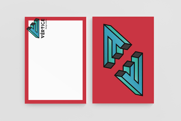
We thought that the typography wasn't enough by itself to express all the characteristics; so we found that the letter "V", in volumetric perspective, can be the "missing piece" and the perfect way to translate our relationship with geometry.
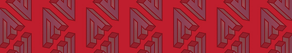
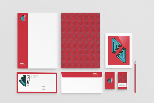
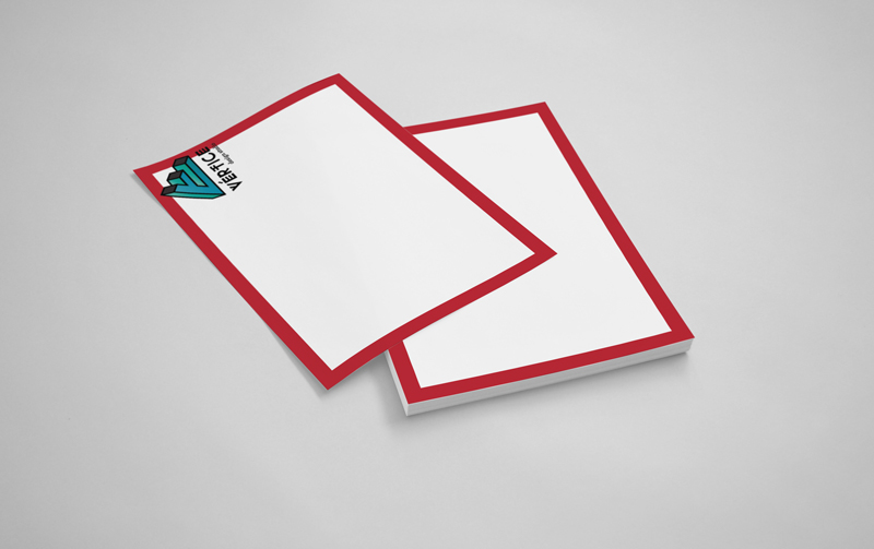
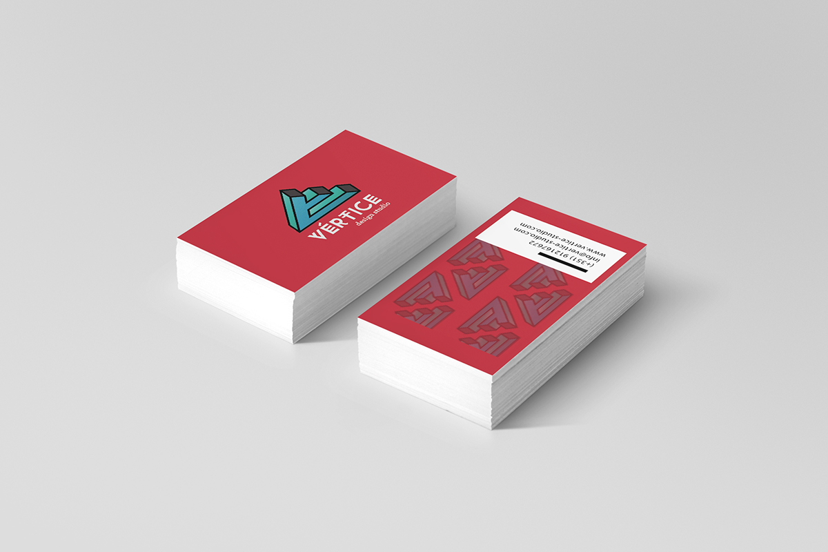
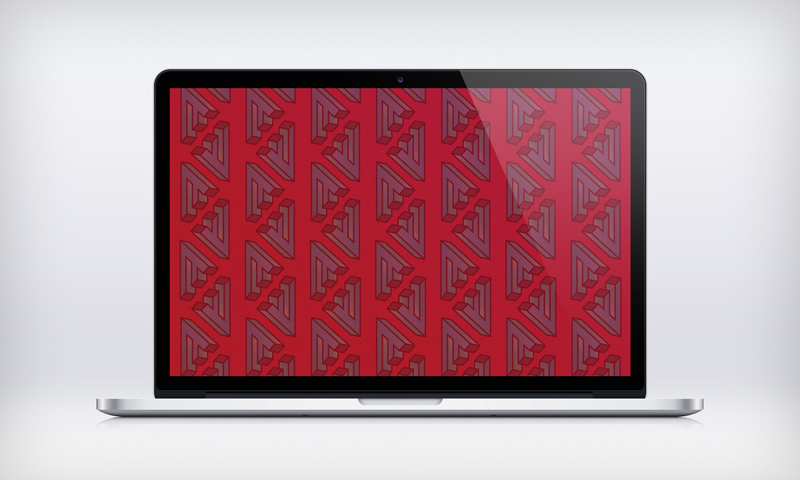
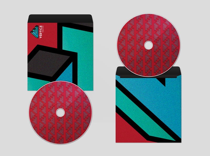
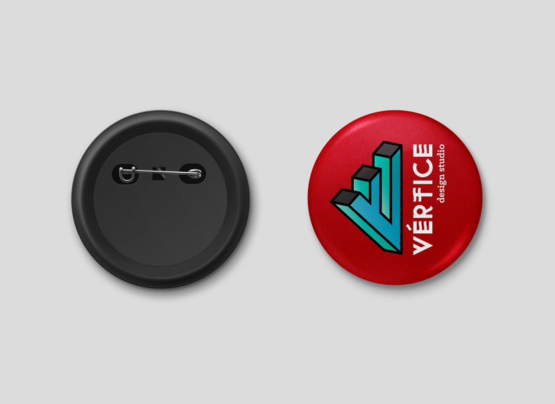
We think that the identity is not only about the "logo". Also the pattern we made with it, the frame used on the stationery, the colors and the way we use them can also have an important role.

Typography

Exclusive typeface designed for this project.
Logo / Identity
Stationery & Applications


Appreciations & comments are welcome!
Thank you!!
Thank you!!


