
TILIX
Brand Identity Design for Financial Technology company - owned by PagSeguro Group, Brazilian online payment sector pioneer and leader.
Tilix approached us with a clear intention to prepare for their future ahead in the financial technology sector. In an ever changing present - our work began with the proper understanding of the financial products sector and contextualizing Tilix's current product along with it's vision for the future.
Everything about Tilix expressed organization, objectivity and the hability to control with a creative mindset. Our goal was to establish the most straight forward metaphor to enable all the potential the product has and make sure they are prepared for an ever changing future fintech scenario in which the only certainty is: the most valuable currency is time.
Deliverables
Brand Positioning
Brand Identity Design
Custom Iconography
Illustration Language

Approach / Throughout the segment research phase we understood many of the things we had to avoid, especially the relation to money and finance would easily lead to visuals metaphors related to what is common in the segment. IE. Using financial related symbols like money, coins, or anything literal.
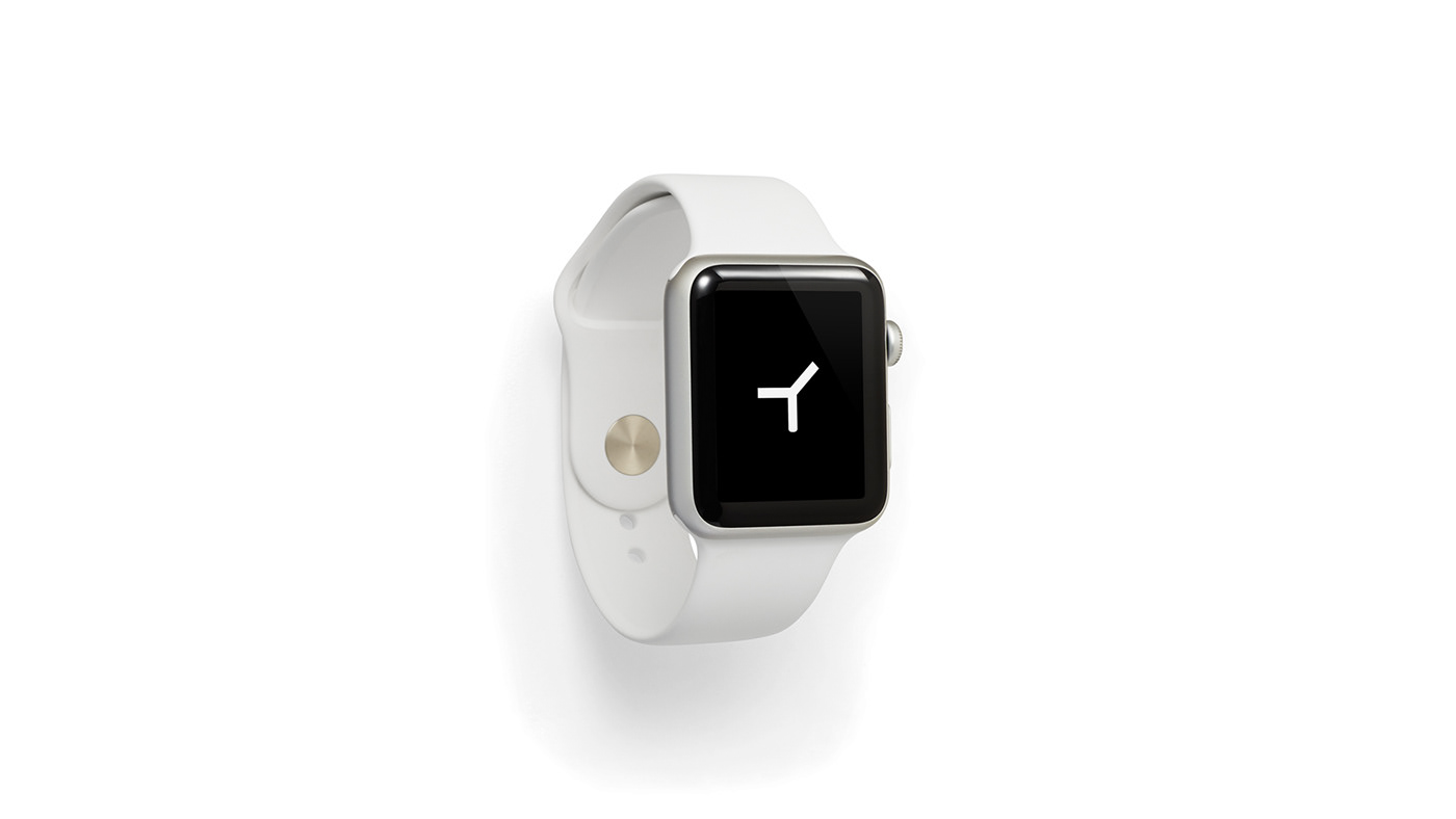
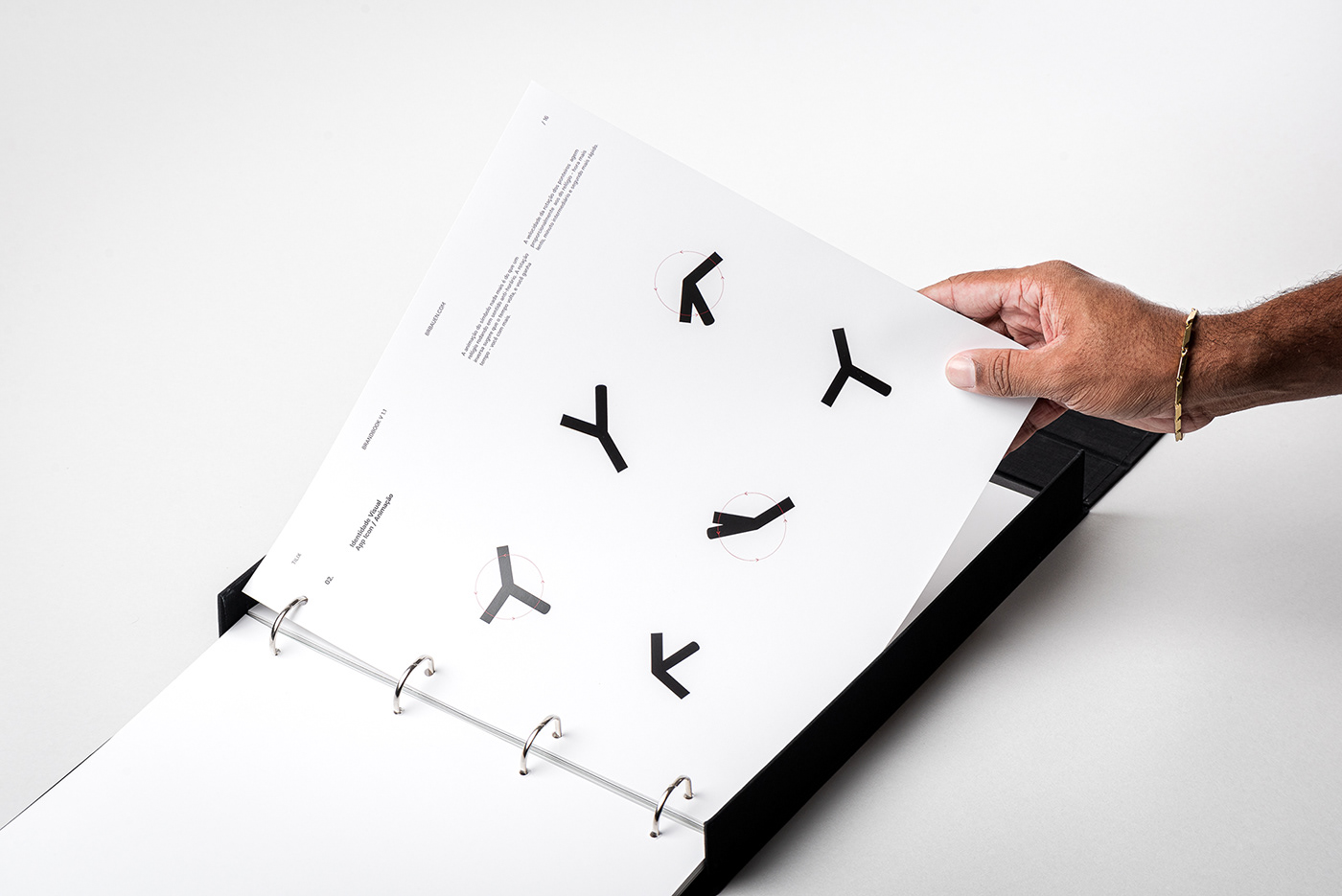
Through a deep understanding of the path forward, we understood that Tilix's contribution to the financial sector was not simply about organizing one's bills and payments - Tilix's way forward is to optimize people's time through thorough and simplified finance organization - that was the main insight to design Tilix's app icon: a watch that rotates backwards - the symbol animation speed was developed following the movement proportions of analog watches.

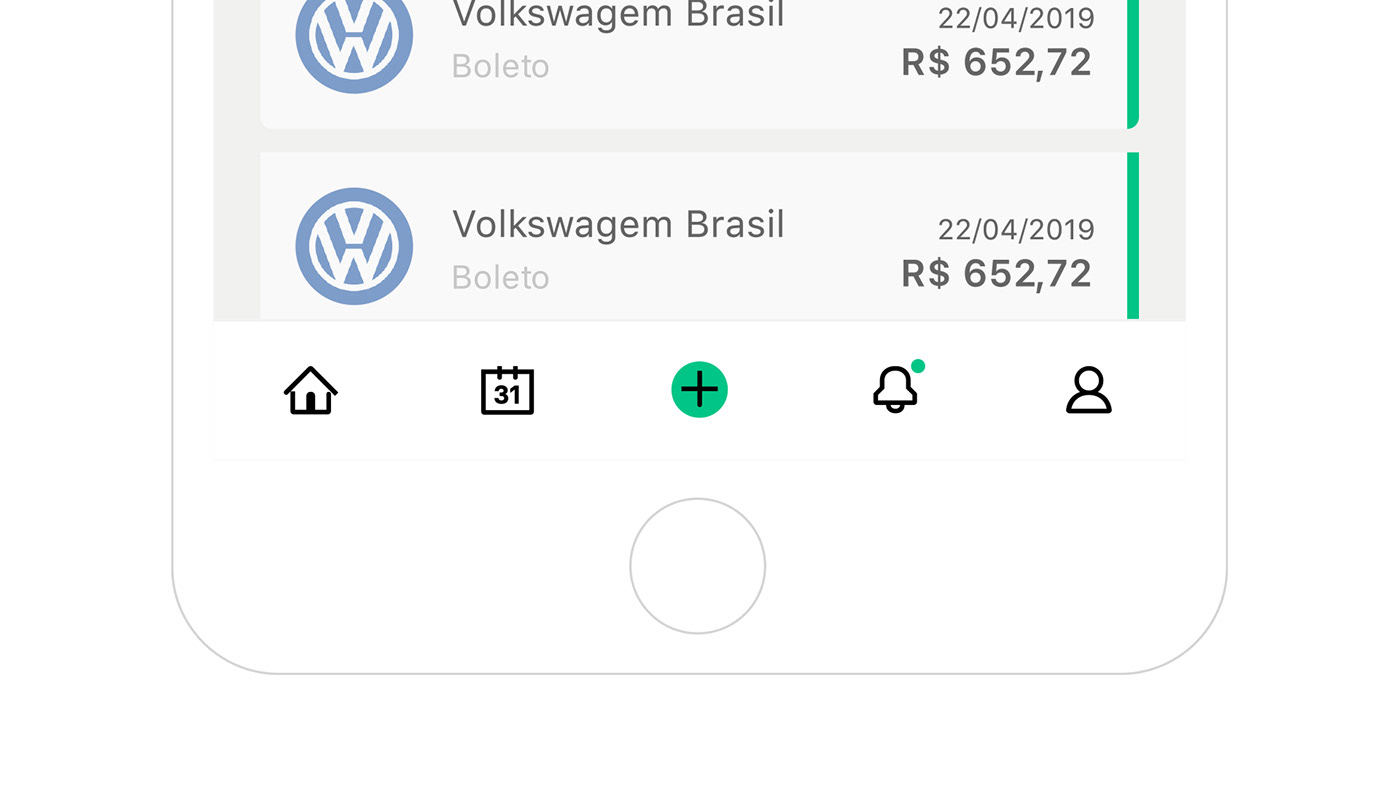
Collecting bills from your e-mail and organizing them in order of due date.After payment you are able to save the receipt for future reference. What about the future? AI powered financial assistants are already a reality, so the outdated bar code reference from the previous brand symbol was no longer able to represent what Tilix could do for it's customers.

Logotype / Early explorations tested aesthetics and legibility in all sorts of ways.
The logotype personality started to seem cohesive when we began a graphic play which explored math signs, using a "+" sign shaped lowercase "t", which was quickly changed to a capital "T" after a series of reading tests.
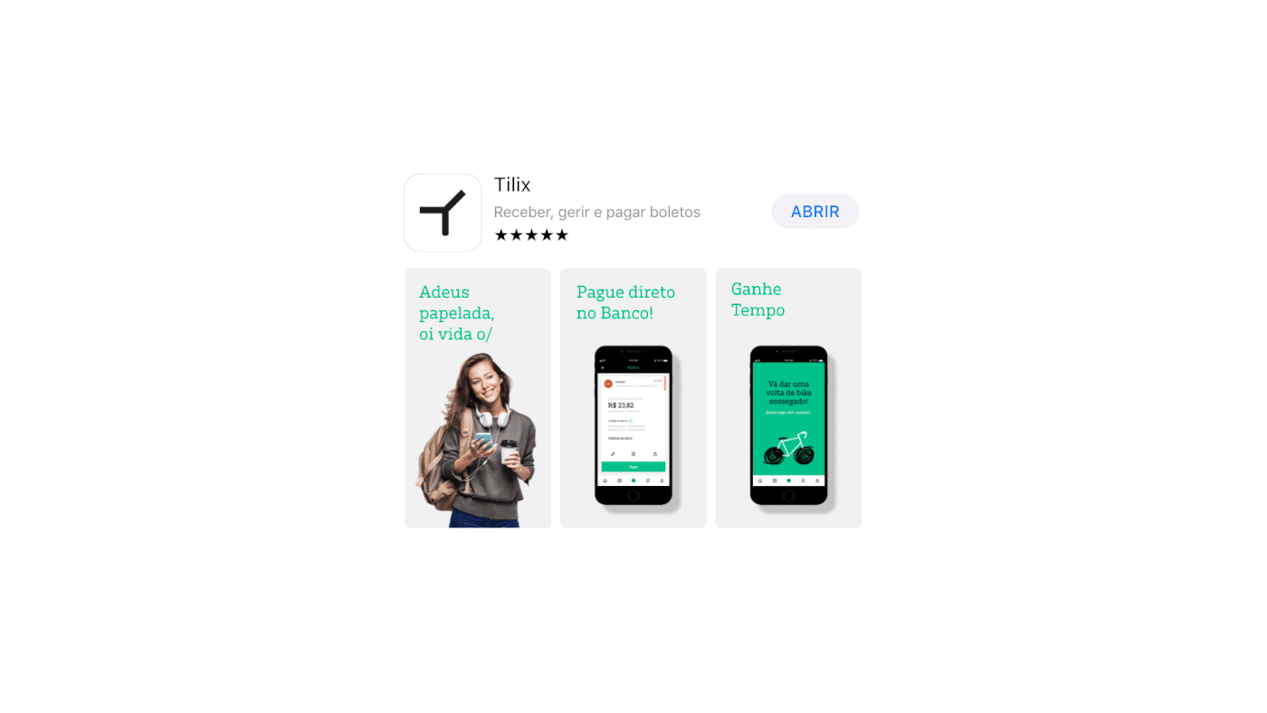
Context / Our work for Tilix had clear standards to meet through design; we gave special attention to how the brand's personality would play out through the most important digital brand touch points: App icon, loading screen, custom iconography and illustrations.


Iconography / Dingbat Variable Font
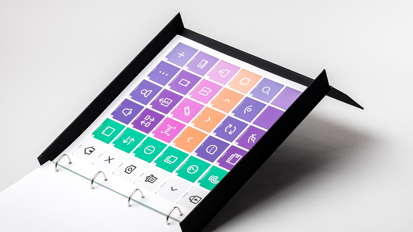
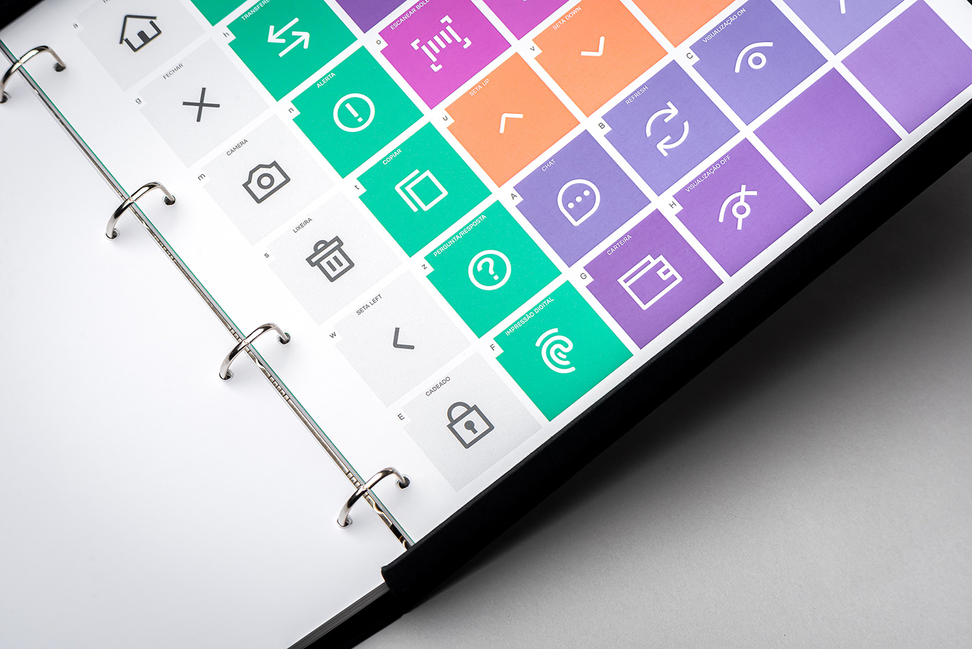
Based on Tilix's logotype aesthetic, we developed an extensive iconography set to accompany all brand efforts that would need some sort of support icon, wether it was for the app itself and all other digital platforms. To enhance Tilix's design team experience while using the icons - we developed them in Glyphs app so the outcome was a dingbat font, which made it possible to control the iconography in point size, plus weight control through a variable font that varied from light to bold.
Based on Tilix's logotype aesthetic, we developed an extensive iconography set to accompany all brand efforts that would need some sort of support icon, wether it was for the app itself and all other digital platforms. To enhance Tilix's design team experience while using the icons - we developed them in Glyphs app so the outcome was a dingbat font, which made it possible to control the iconography in point size, plus weight control through a variable font that varied from light to bold.
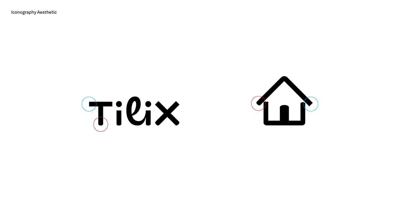


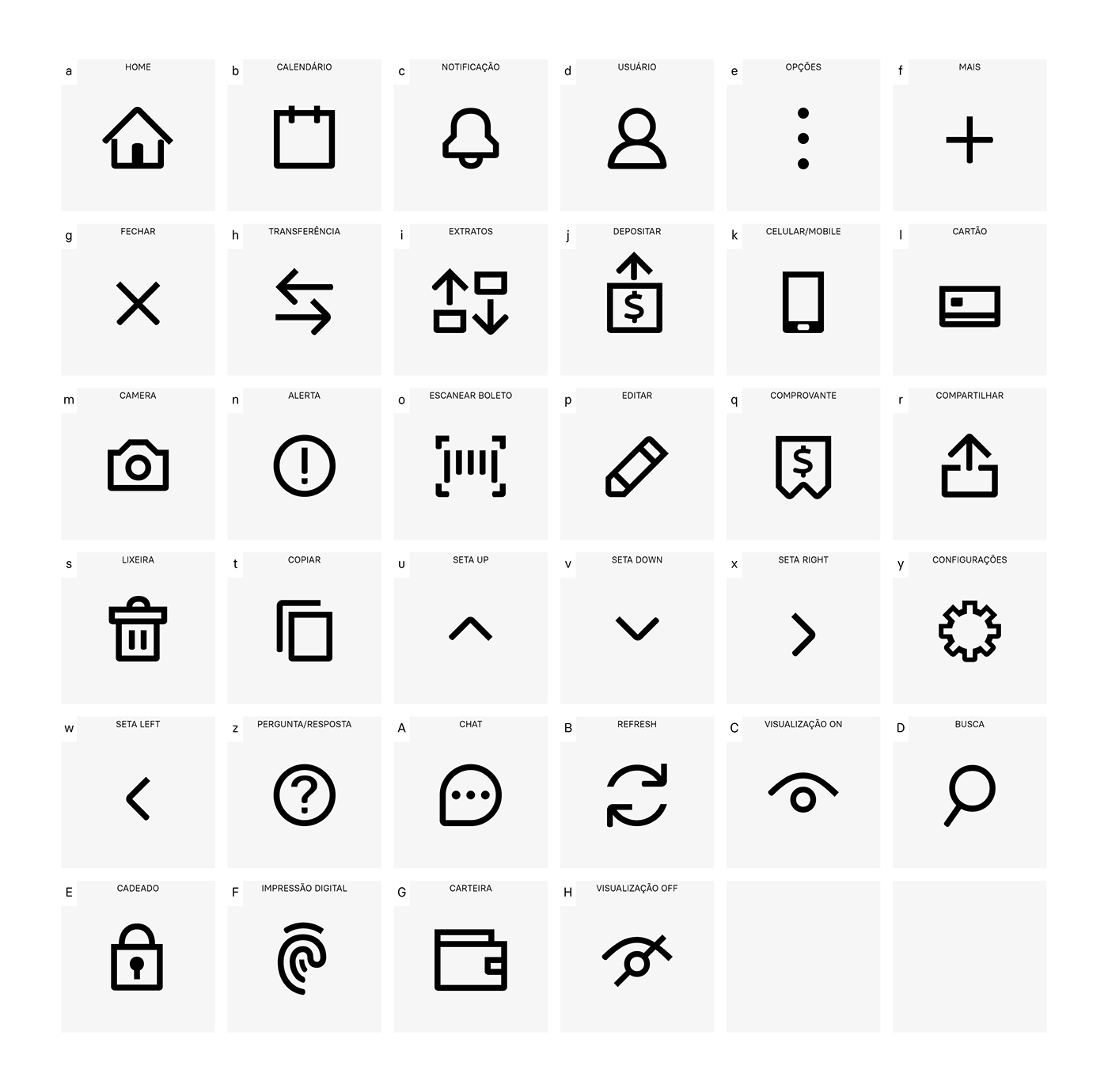


Illustration Language
In order to accompany Tilix's photography direction we created an illustration language that would both be paired with photography and be used by itself for various purposes - the intention was to portray a hand made feel to distance Tilix from the common geometry based illustrations many sector brands use. When animated, those illustrations would also be portrayed in a manner which would differ them from highly polished motion graphics using stop-motion like frame by frame movements.


Design Direction
Rodrigo Francisco
Research & Strategy
Luís Feitoza
Design Development
Rodrigo Francisco, Felipe Carneiro, Luiz Feitoza, Eduardo França, Caio Kondo
Illustration
Verônica Sauthier
Tilix Team
Bruno Stersa, Gustavo Sardinha, Fernanda Santana, Everson Magalhães
_
Follow Us!


