Creating a new identity always consists of two elements “Guiding Philosophy” (in which purpose is driven by values) and a “Visual Translation ”(in which it is led to the creation of vivid description).
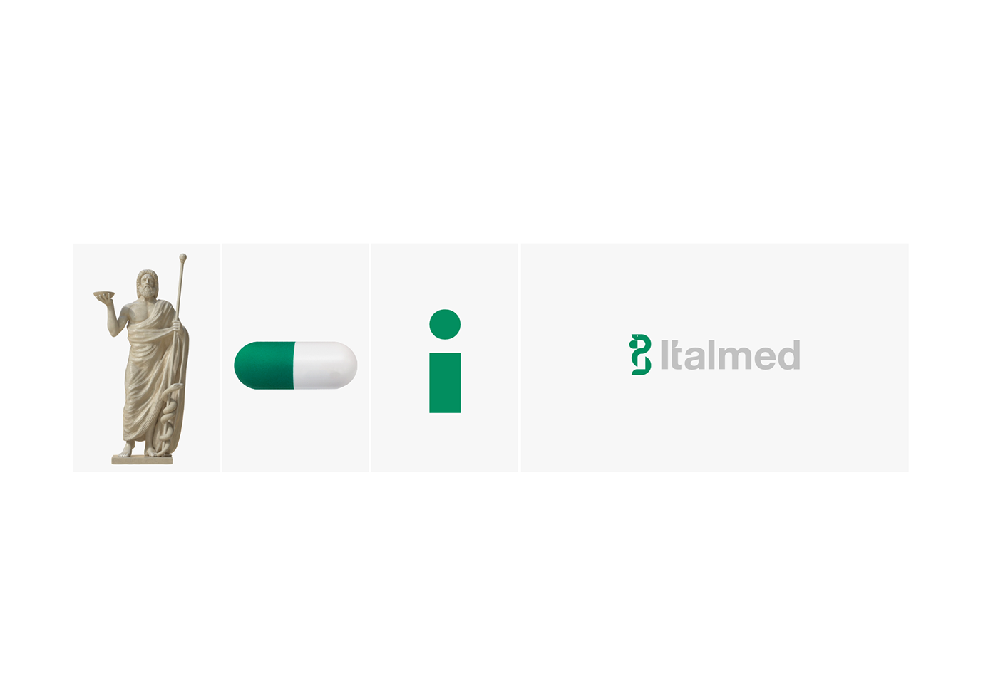
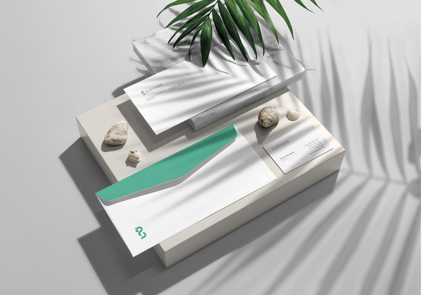
Our Work Philosophy for ITALMED was influenced by both the Research Phase nonetheless the Previous Logo. As a result of research phase, appear that THE ROD OF ASCLEPIUS undoubtedly is the symbol that best represent Healing (which is one of the main components that represent ITALMED). Even the original Hiipocratic Oath began with the invocation: “I swear by Apollo Physician, by Asclepius, by Hygieia, by Panacea, and by all the gods and goddesses...”. A staff or Rod in Italmed’s Symbol was translated into “i” letter”- that represent the first initial.The snake curled around it represent the Healing and Guardianship in modern visual language, which is proportionally created with basic geometric shapes (Circle and Rectangle) and that beautifully complete a part of the Mozaic so called ITALMED.
If we concentrate on upper part “Neck of the Snake” we managed to visualize a Capsule pill which is directly bonded with the Italmed service and modern era of pharmacy. The capsule pill is formed by negative space created by the neck of the snake and a form created by us. The importance of this symbol does not rely only in meaning, it allows us to have even larger and flexible usage in other channels like, print and social media.
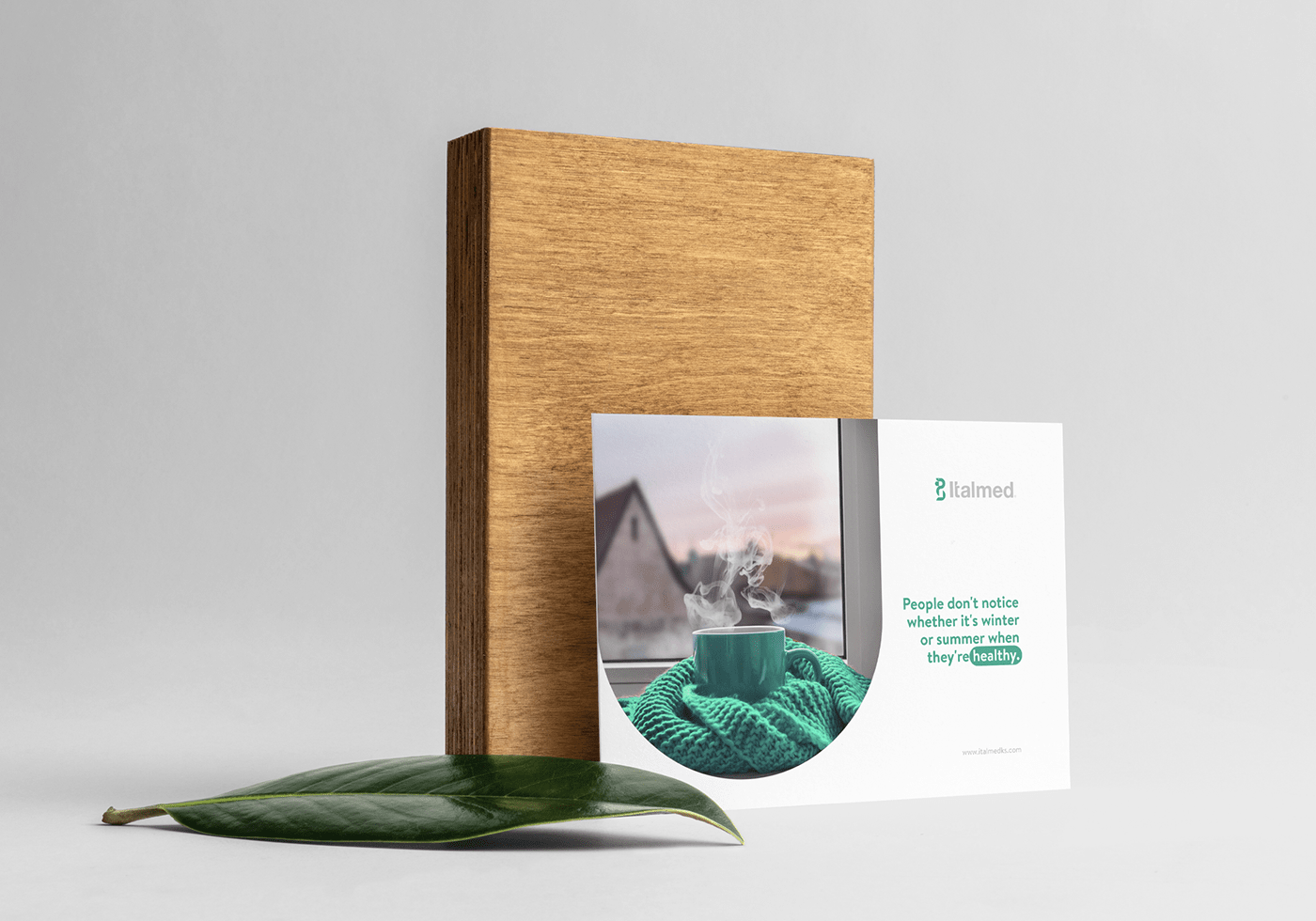
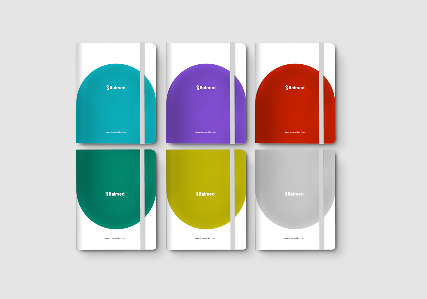
The spirit of green color with a wide spectrum of meaning (Harmony, Freshness, Safety, Fertility ect) made us keep the green color as primary color by giving a little freshness by changing the tone of the color, that suites in both dark and light backgrounds.
To complete our journey of the entire visual picture, we have chosen a Sans Serif Type of Font (Helvetica Neue), by giving a special touch in “t” letter, to make it even more remarkable. From the very first moment you see “ITALMED” word, in between the letters you feel the elegance, luxurious and simplicity, all lined up well with the emotions that are transmitted from the symbol created.
*Brandon text, is a font that takes part in Sans Serif family, and it is preferable to be used in all texts (including Social Media Posts, In/Formal documents, signage, Printed texts ect.)