“LUNA & L’ALTRA” is a pret a porter shop opened in the center of Rome since the end of the ‘70s.
The name”LUNA & L’ALTRA” is a word game based on the mix of meaning of the italian sentence “l’una e l’altra” which literally translated means “the one and the other”, and the italian word for moon which is “luna”.
This name bring in itself an idea of contrast. This feature is a value that can be found in many different aspects of the identity of the brand. It shows a sort of double nature, which is the reflection of the people’s personality that are behind the brand.
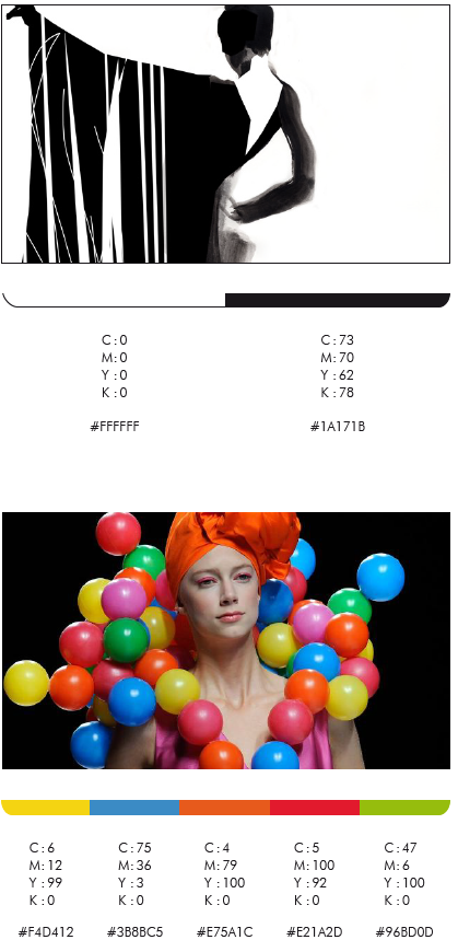
On one side there is the strong presence of black and white; on the other one there is a shocking burst of vivid color.
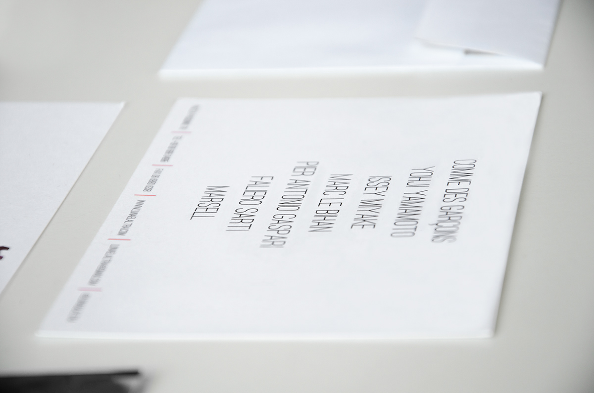
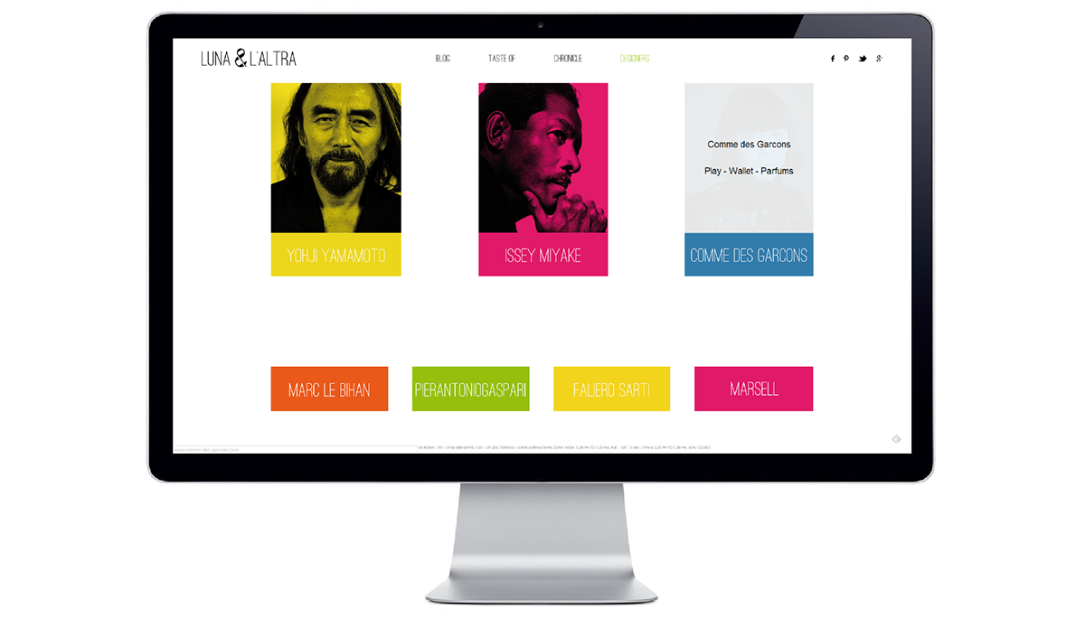
The place itself shows this idea of contrast; it can be described as a mix between a studio and an art gallery, knowledge from different fields, books and industrial design pieces, and amazing dresses from famous stylist as Issey Miyake, Yoshi Yamamoto and Comme Des Garcons.
All those aspects are the reason why customers choose to buy at “LUNA & L’ALTRA” instead of other shops or either on the web. A place to experience the knowledge and the passion of the people inside it and can immerse themselves in the world of fashion.
The visual identity of “LUNA & L’ALTRA” wasn’t coherent with the values embodied in the brand. Our process has followed the coming steps: redefining the brand’s values, re-branding “LUNA & L’ALTRA” and studying a new marketing plan that suits the brand’s peculiarities.
The main ideas behind the brand itself can be expressed using the “Onliness statement model” by Marty Neumeier:
WHAT: The only pret a porter shop
HOW: that made the considers the experience more important that the sells
WHO: for elegant and creative women
WHERE: mostly in Italy and Europe
WHY: who wants to live and exclusive experience and wear fashionable clothes
WHEN: in an era of decreasing style and elegance.
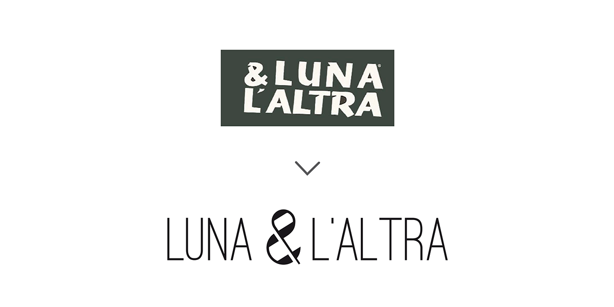
The old logo and the new one
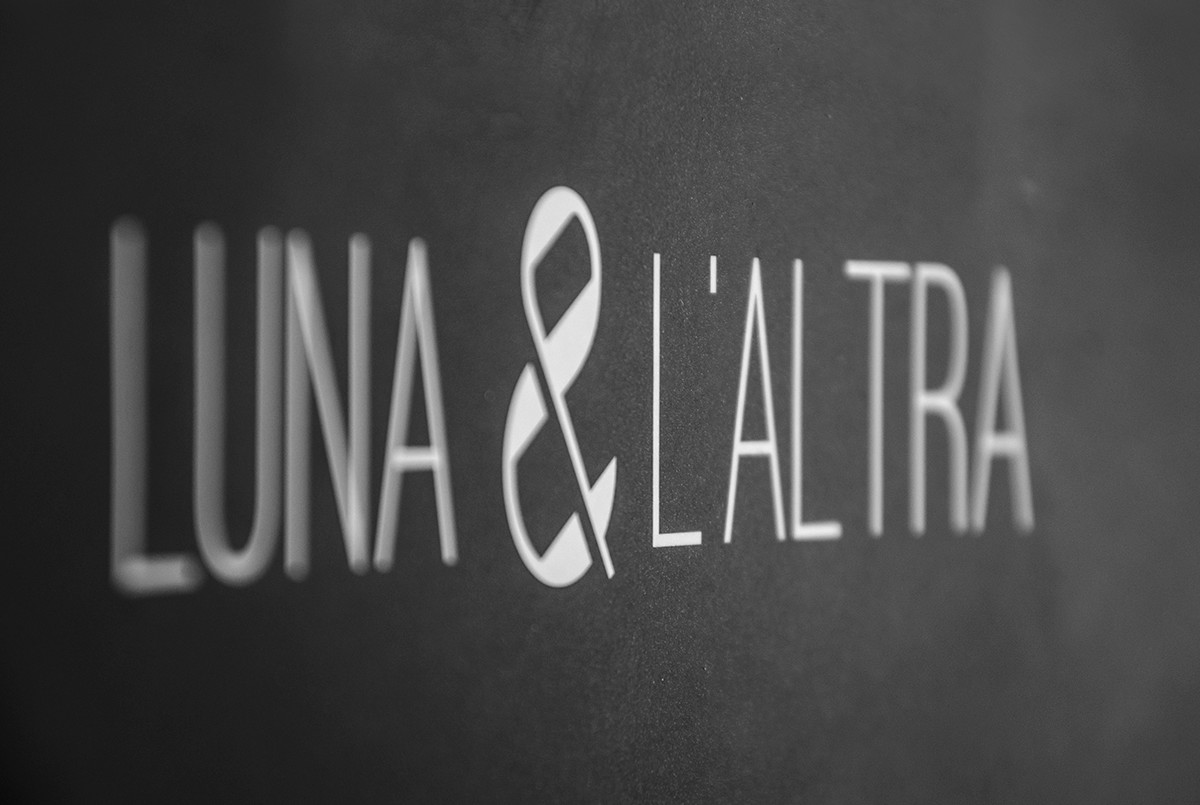
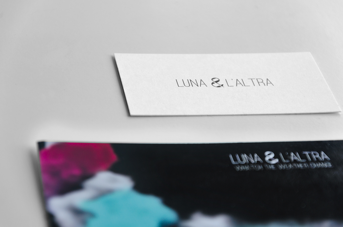
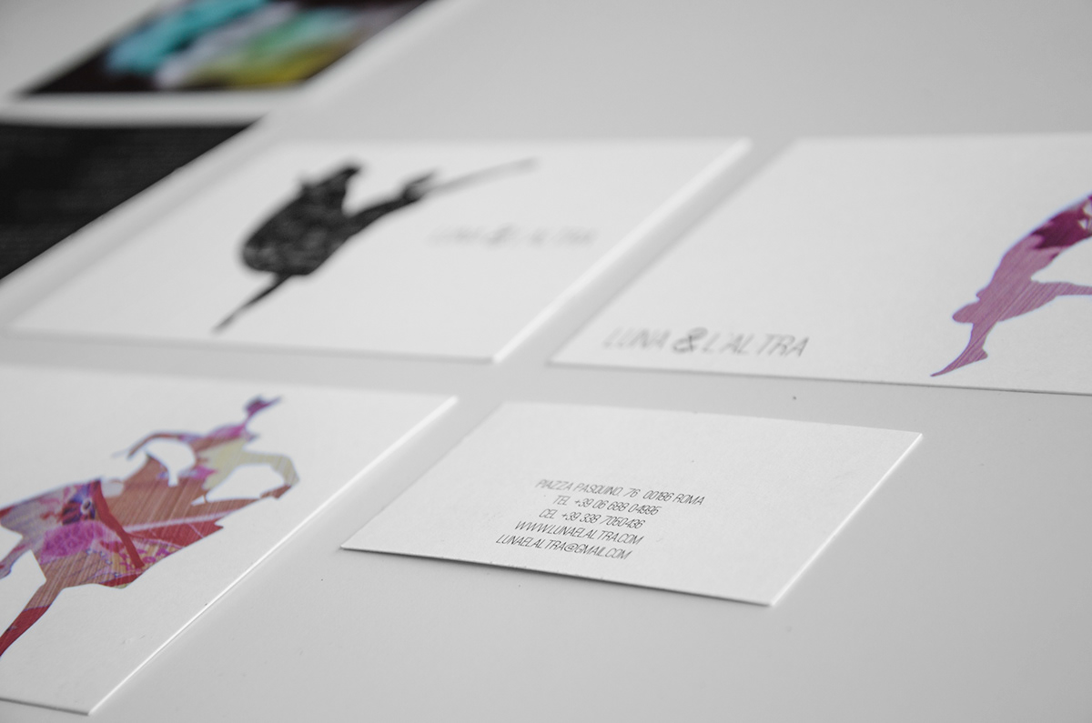
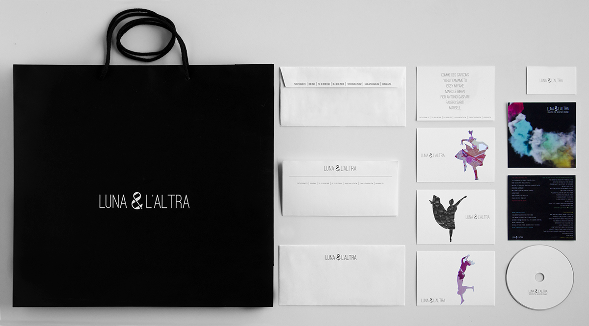
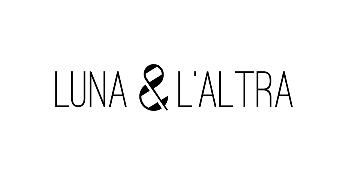
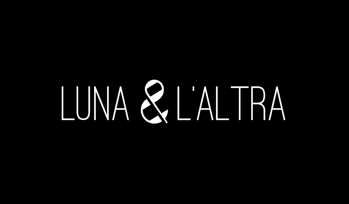
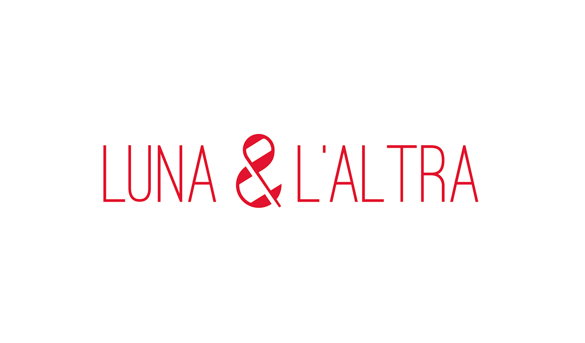
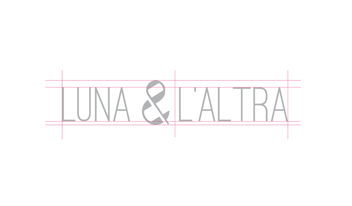
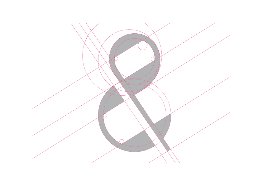
The logo embodies the duality described above: the “&” is splitted in two parts. Its thick lines and big size divide the logo in two parts; this visual duality is the expression of the two “hemispheres” that create “LUNA & L’ALTRA”.
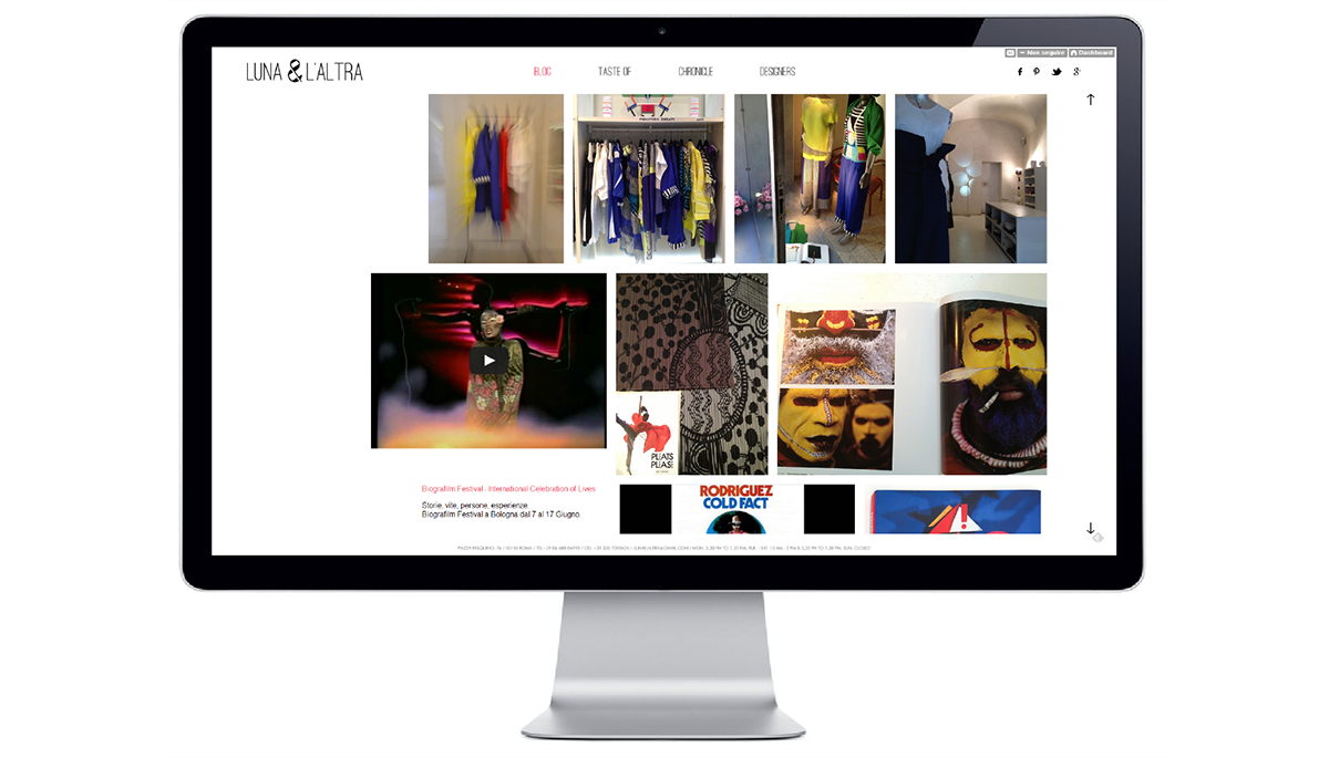
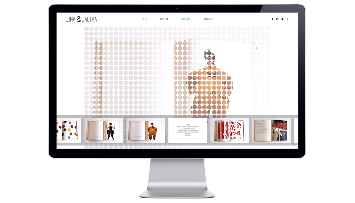
The website tries to recreate in the “online world” the experience that customers live when the are at the shop; is not an e-shop but a lifestyle website. The home page is a blog based on tumblr platform to make easier to update it. Is a web reproduction of the way LUNA & L’ALTRA has always worked during the years. Used to suggest lifestyles and trends, soundtracks and pieces of art or design to its customers in person, now LUNA & L’ALTRA can do it also online.
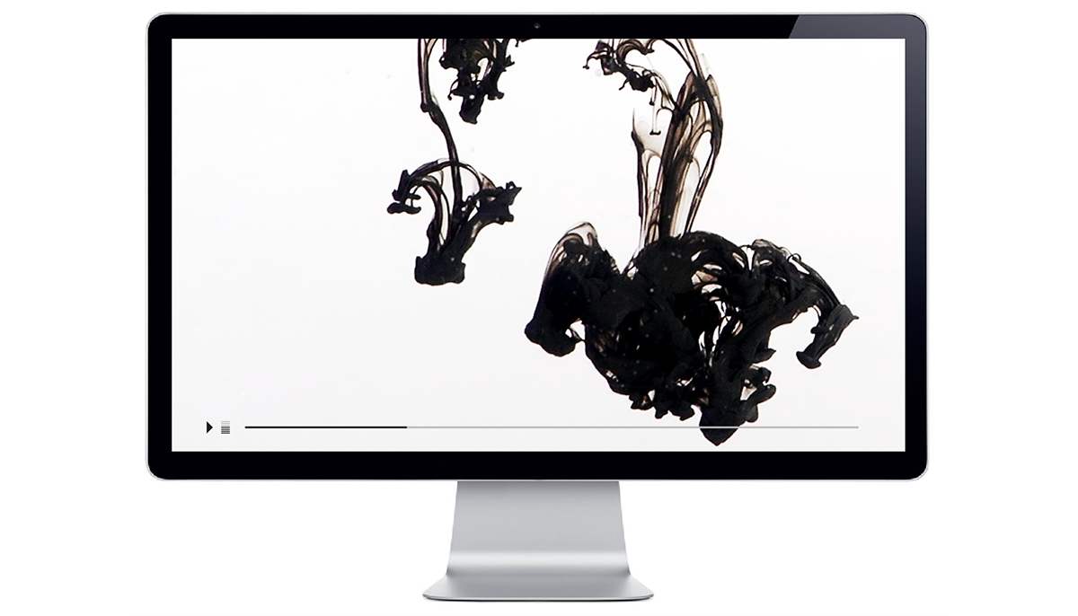
The section “Taste of” shows a teaser trailer, or taste of, of the brand. It express, as the logo does, the concept of duality.
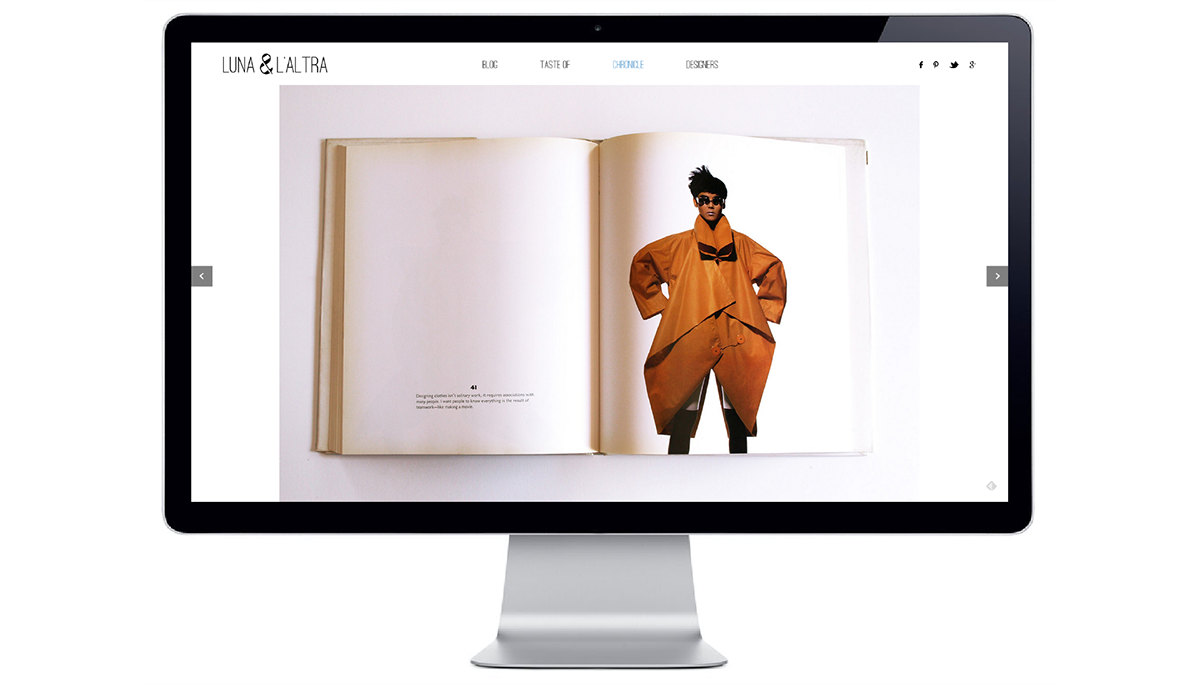
The section “Chronicle” sums up the history of the brand’s choices in fashion design of the last 30 years. This timeline is drawn by pictures of books and of the shop windows of “Luna & L’ altra”. Each picture represent a crucial clothing for the brand.
In the section “Designers” are listed the fashion designers that the brand works with and the collections sold by LUNA & L’ALTRA.www.lunaelaltra.com