Location: City of Santo Tirso
S. Silvestre is a December marathon that happens in several Portuguese regions. Specifically in Santo Tirso, it has been going for 21 years.
The event's communication has never had a strong identity, relying mostly on its name in the forefront, the colour green and a marathon-related photographic art direction. For 2019's edition, I suggested a fresh start that utilized the pop toolkit of other events ("Todos ao Parque" and "Santo Tirso a Cores") but with a sports-oriented and winter feel. Also, it being the 22º edition, I went for the idea of using the number "2" as part of the poster's concept, bringing a new dynamic to the event that could be reused as part of its communication in future events. This repetition would vary from vertical to horizontal media.
In order not to completely forgo the event's previous elements, I chose to maintain the art direction's theme. Neutra sans is used, as usual, due to the client's demand for its own brand identity.
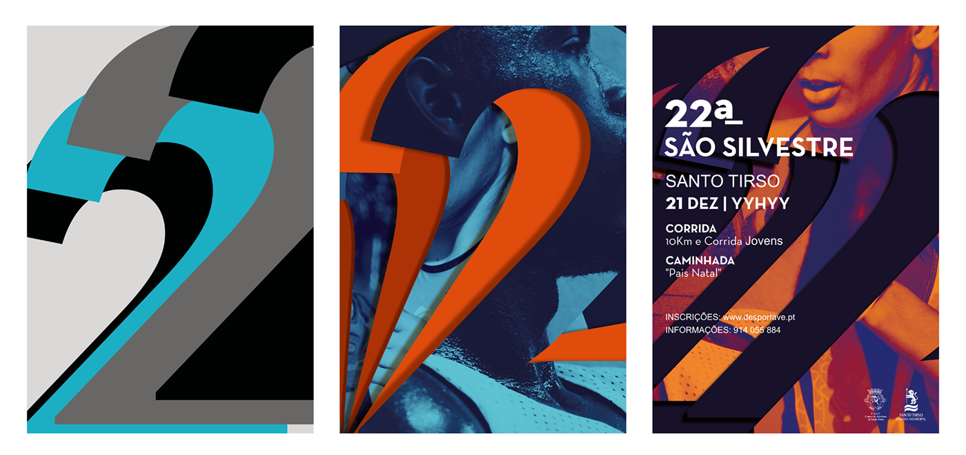
several concepts and text positions were hand-drawn, turned into vector and slowly worked on; the final colours and art direction were defined after the base concept (right side) got approved internally
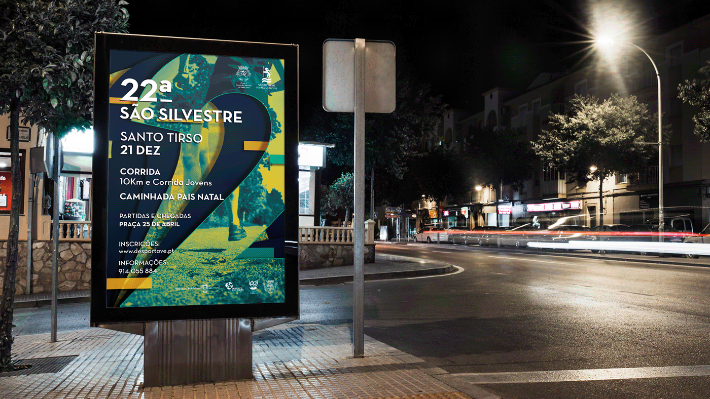
the event's final image: the client specifically requested we used the green because they felt it still represented the event
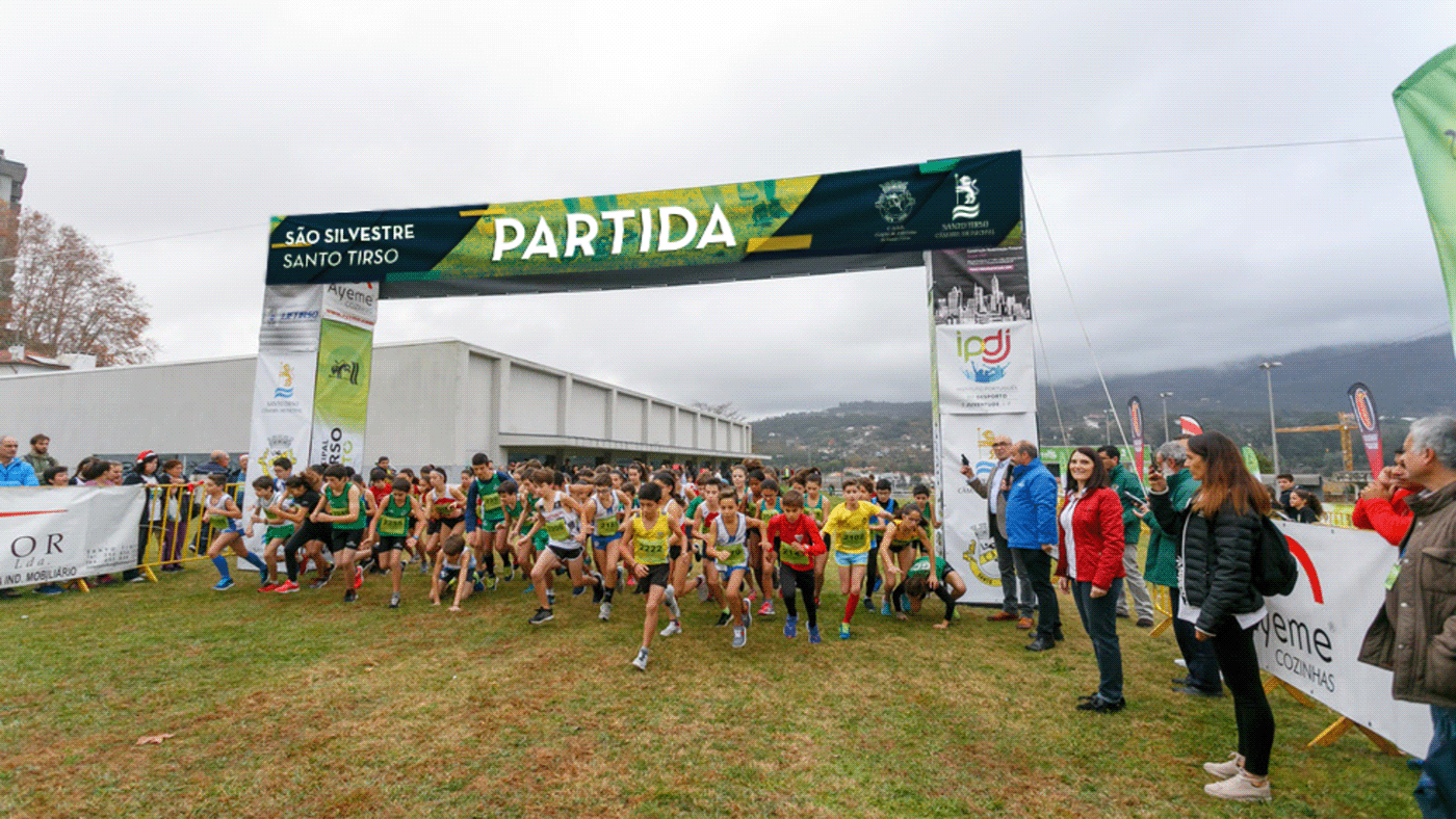
starting line mockup using the event's real setup
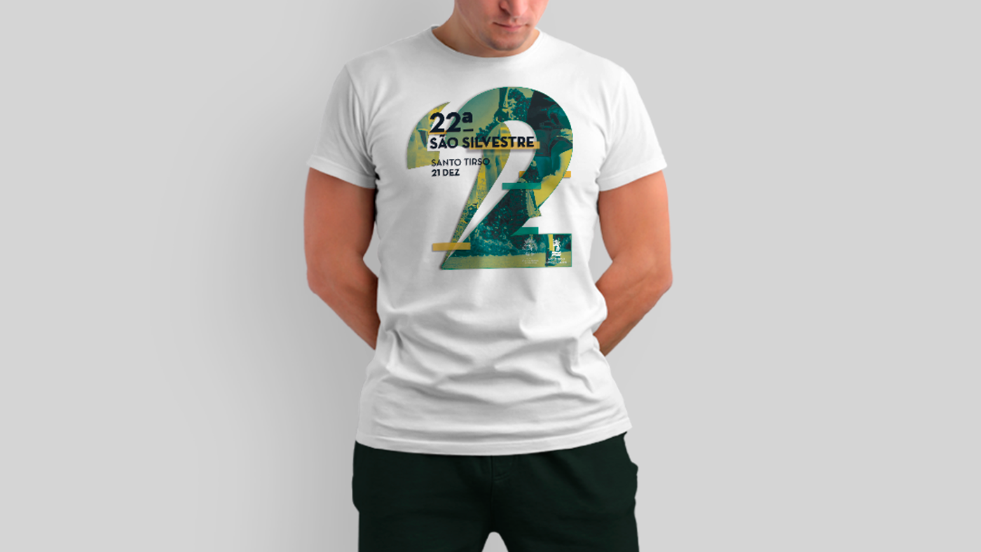
event t-shirt

running bibs with simulated numbering
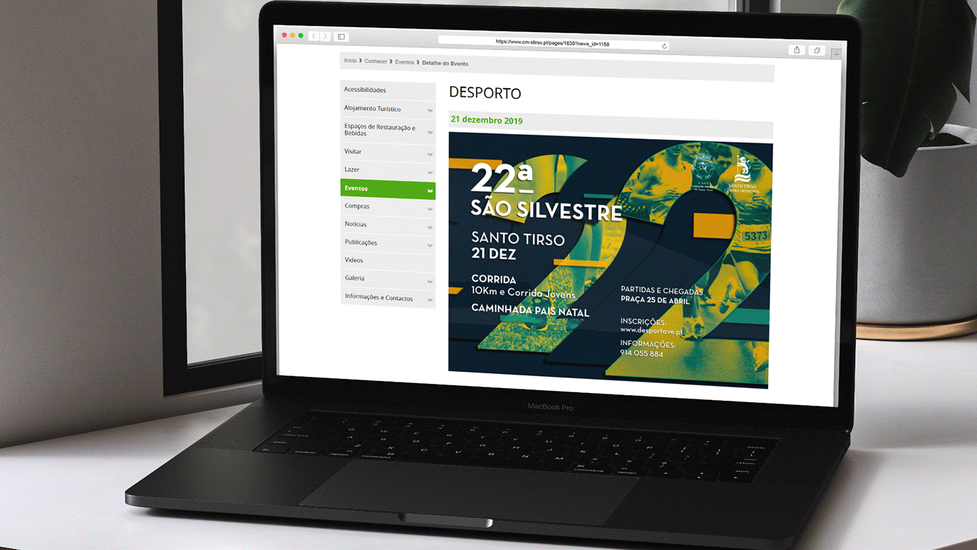
website event communication
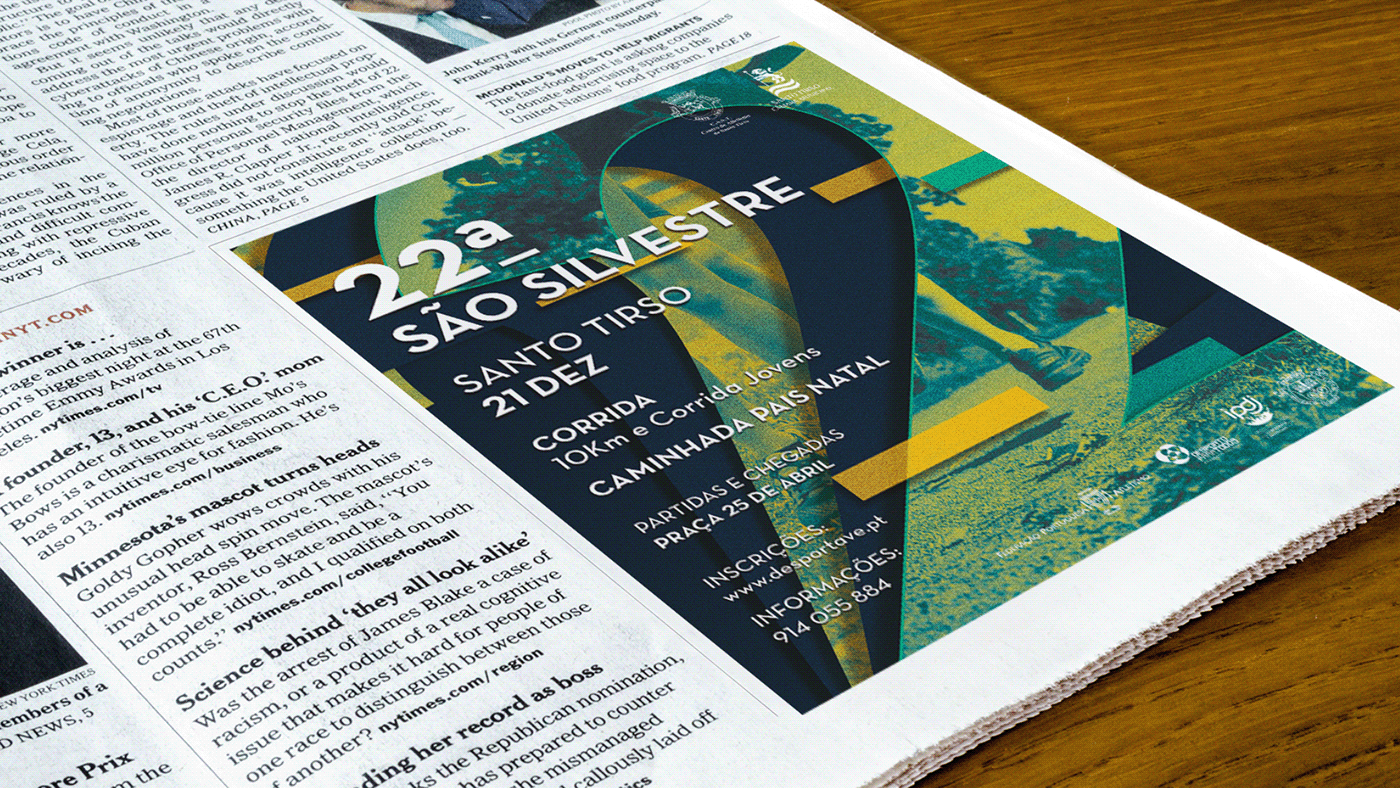
print advertisement mockup
by studium
11 . 19
creative direction . Catarina Rodrigues / Sérgio Magalhães
graphic design . João Desidério / Pedro Sequeira


