


Progetto universitario di packaging
////////////////////////////////////////////////////////////////////////////////////////////////////////////////////////////////////////////////////////////////////////////////////////////////////////
University project for the packaging class
University project for the packaging class
The brief was to develop a new packaging project:
study, logo, naming, pack shape and graphic design.
STUDY
Tea is an aromatic beverage commonly prepared by pouring hot or boiling water over cured leaves of the tea plant, Camellia sinensis. After water, tea is the most widely consumed beverage in the world.
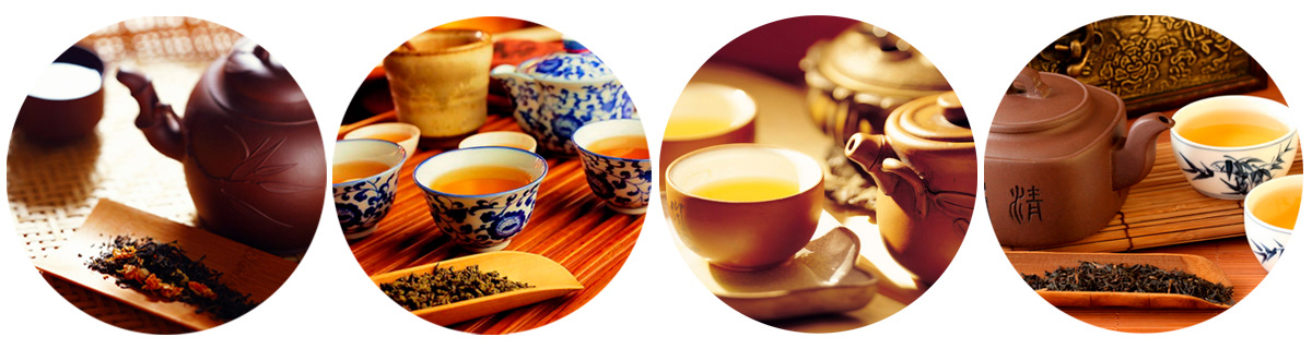

Enjoying tea is about living a healthy, balanced lifestyle.
For many people, fine tea is really about experiencing inner peace and harmony.
For many people, fine tea is really about experiencing inner peace and harmony.
And for connoisseurs, fine tea is a pursuit of joy, through taste, texture and aroma.


TYPE OF TEA:
White Tea: Yin Zhen
Yellow tea: Sunon
Red tea: Red Mao Feng - Grade A
Green Tea: White Monkey Pekoe
LOGO

CIRCLE:
Represents perfection, completeness, unity.
SPIRAL:
It is a symbol of renewing life, of energy.
In its multiple meanings, the spiral represents the universe and the infinite, the Sun and its movement.
Therefore, unifying the circle and the spiral, the brand was expressively given a deep meaning, a symbol that recalls not only harmony, but also an intellectual and spiritual dimension.
In China above all, tea is not just a refreshing beverage, but it allows us to satisfy some spiritual needs, to offer our friendliness and to express personal feelings. Tea is the product of a priceless tradition indeed, and the fruit of a both social and contemplative pleasure.
NAMING

Pleasure is a feeling or an experience coming from the perception of a well-being, both physical and psychological. Drinking tea is a ritual connected to a moment of meditation and of self-analysis that hence brings to a state of relax and pleasure (for the person itself).

COLOR VARIATIONS


PACKAGING


3D


