novum 12.19 »accessibility«
It´s the detail that counts
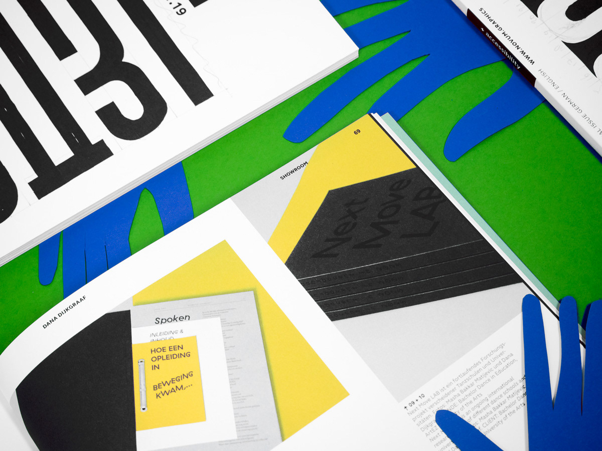
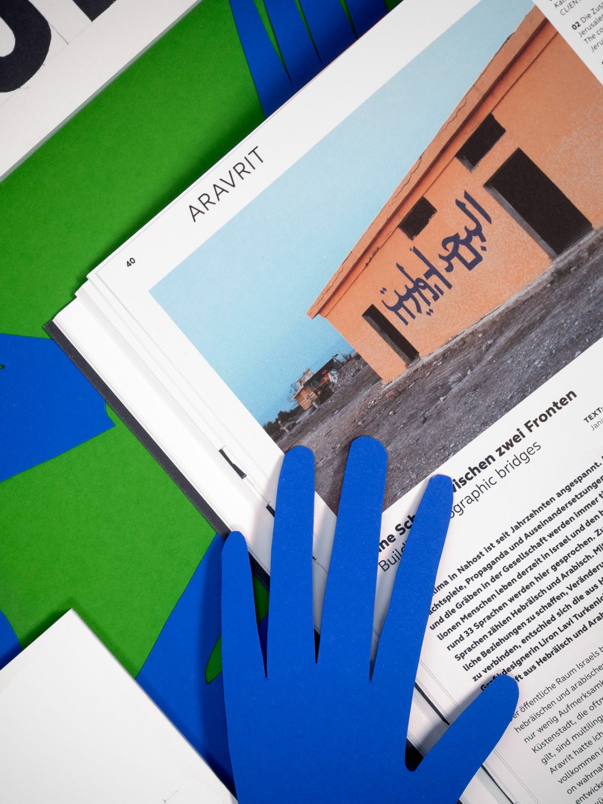
Admittedly, more often than not, we are also in the »more is more« camp, and for our covers we just love to use unusual papers, hot-foil finishes, special printing techniques, etc. etc. But this month’s cover looks at first sight very simple – only when you look closer, do you see just what went into it. As such the cover design fits perfectly with the theme of this issue, because this month it’s about »accessibility«, making things as easy as possible for everybody to access. In the novum+ section we report on many exciting projects and ideas for increasing accessibility for the blind and the deaf, for the elderly and for those who can’t read very well. But the best thing is when design is pared down to the essentials, when it communicates clearly and leaves aside all unnecessary, decorative accessories. When it works for all people, with or without handicap.
Copies of this issue can be bougth here
Offset
Photos
Janina Engel