
Merged from the word infinity and chips, INFINICHIPS aims to sell potato chips, with flavours as its main selling point.
After a series of observation at several major supermarket chain in the heart of Singapore city, the research resulted in: people do not pay much attention to packaging when they are buying for chips. They are merely seeking for flavors. Following flavors, people tend to keep buying the brand they have always been buying. Derived from the research result, comes the idea of selling the potato chips without their packaging. And as people are apparently brand-attached, let's equip the brand with a strong identity!
INFINICHIPS identity revolves around looping lines, curvy and rounded shapes, inspired from the infinity symbol and the curling potato chips. How different can chips look like in pictures? They do not differ that much. Thus, instead of using photography, INFINICHIPS makes use of illustration to attract people, make impact, and fulfill its mission.

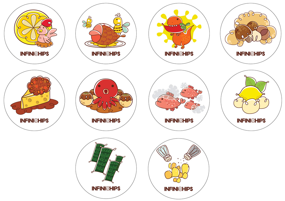
Available flavours.
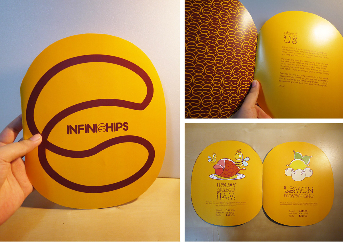
Menu book.

Glass for complimentary water.
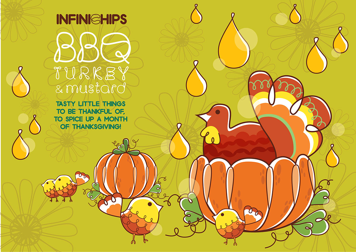
Promotional poster: Thanksgiving special.

Promotional poster: Christmas special.
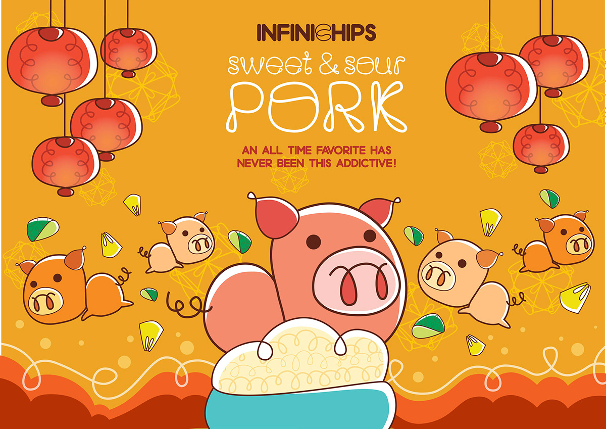
Promotional poster: Chinese New Year special.


