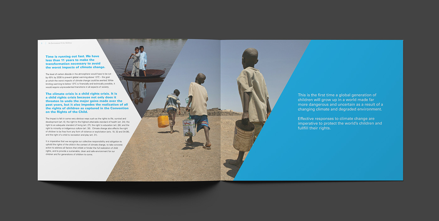
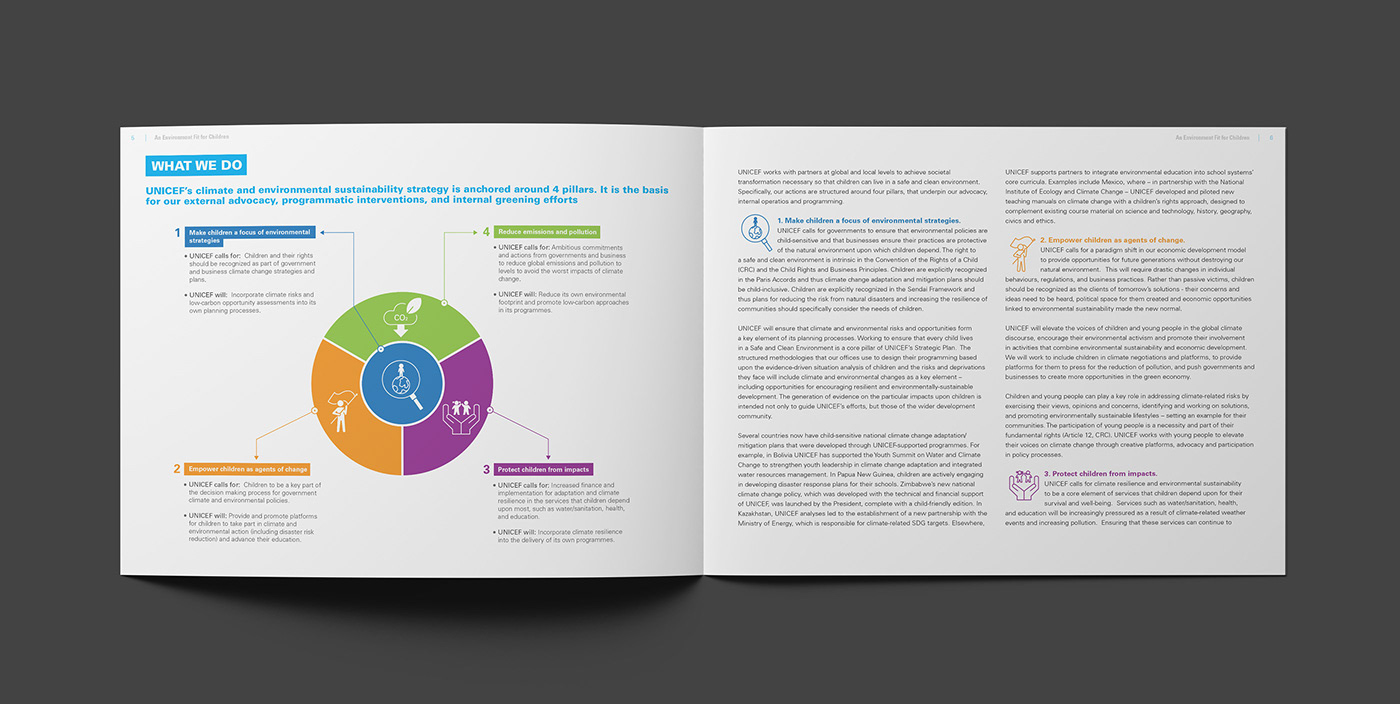
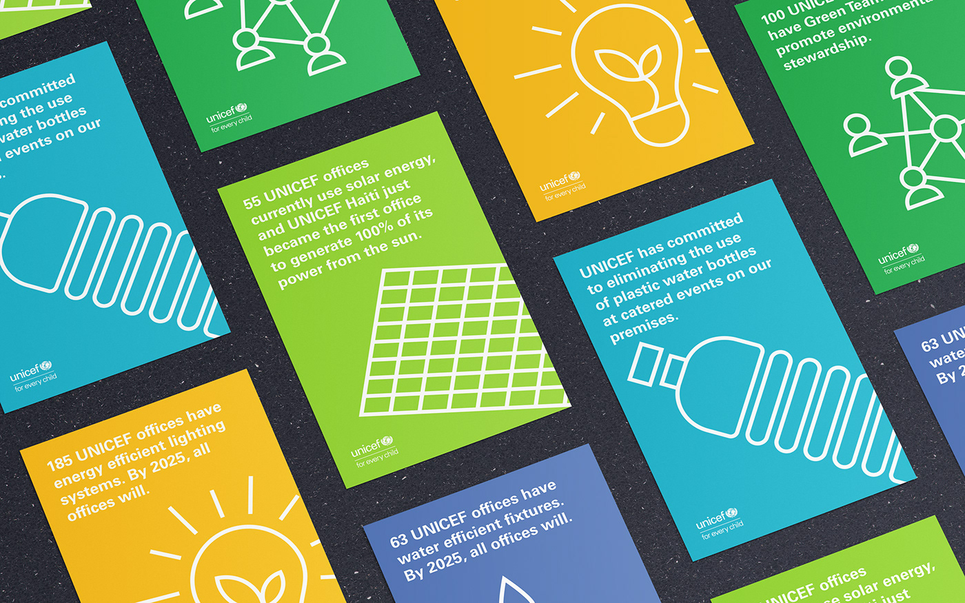
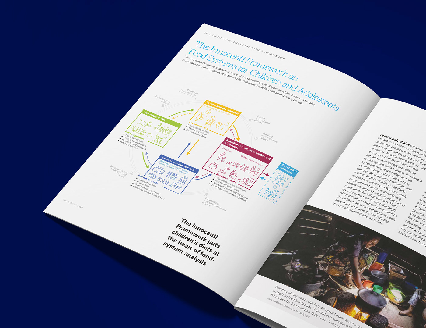
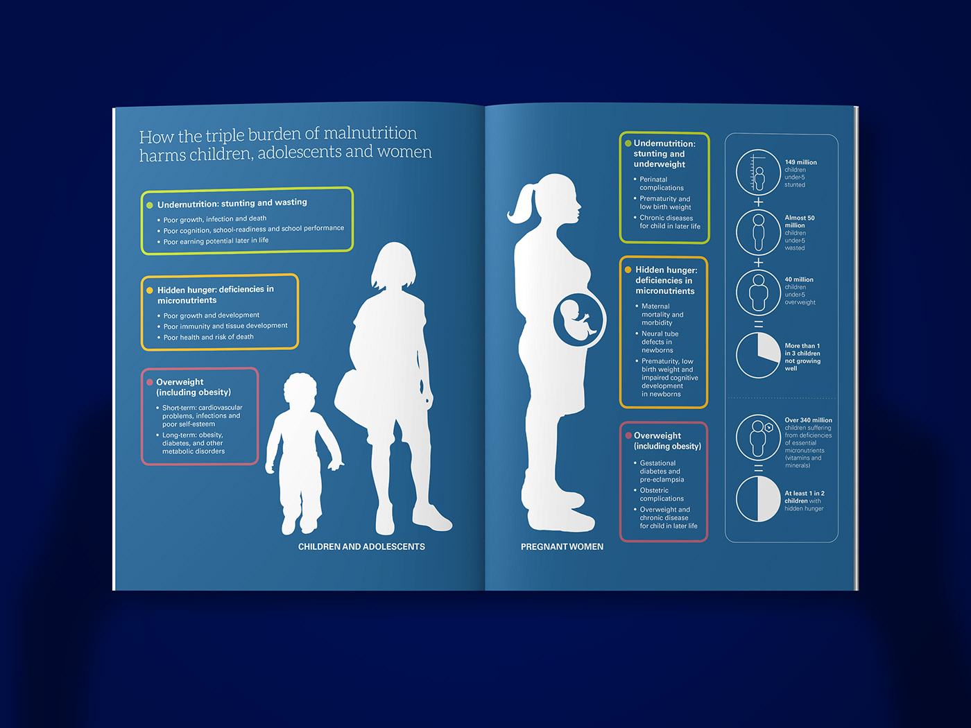
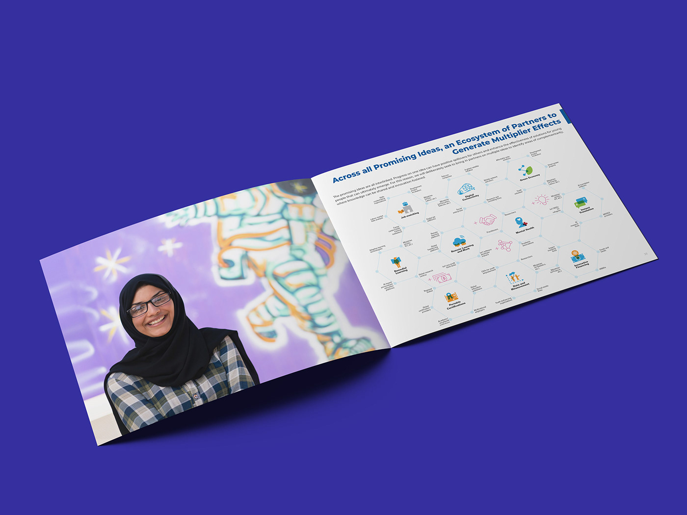
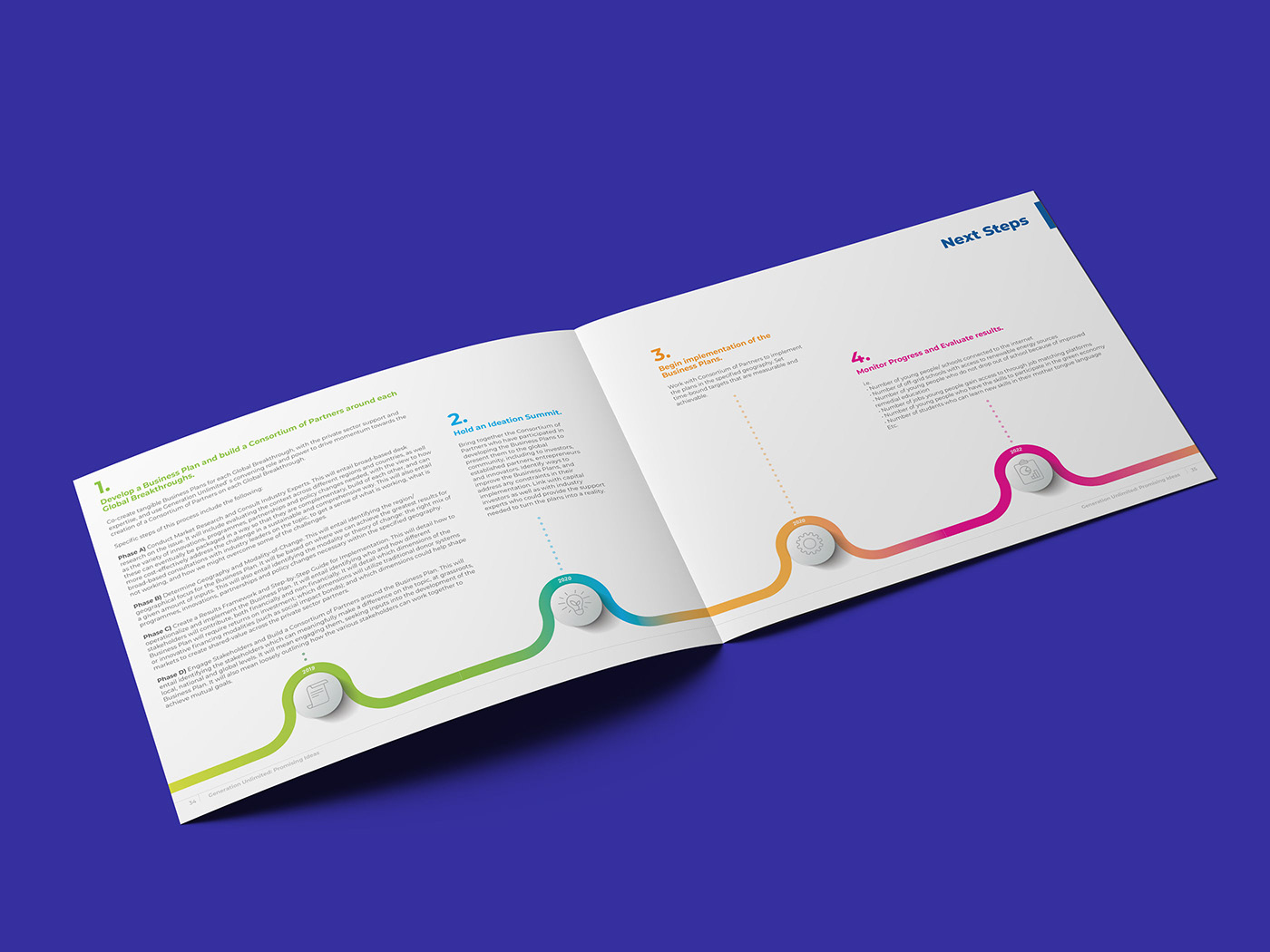
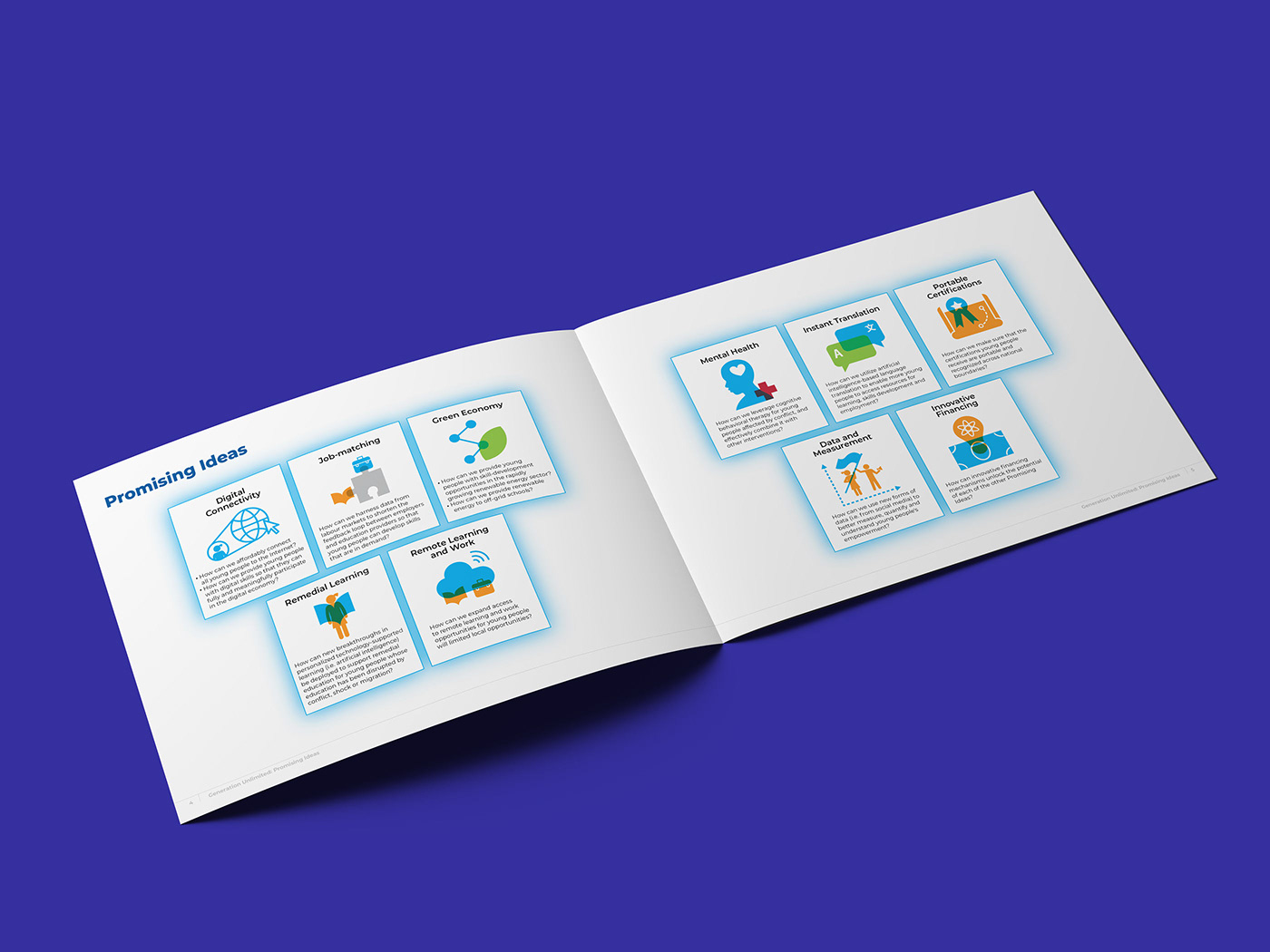
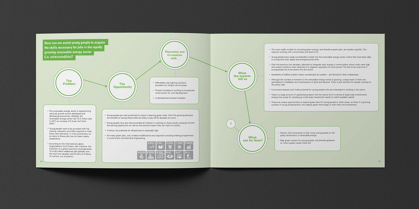
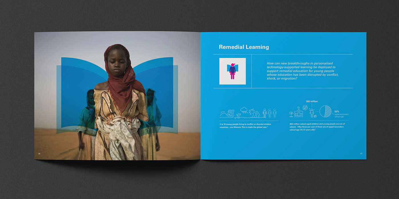
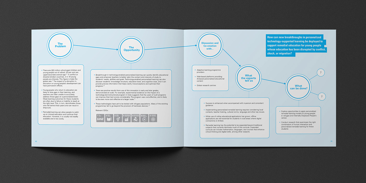
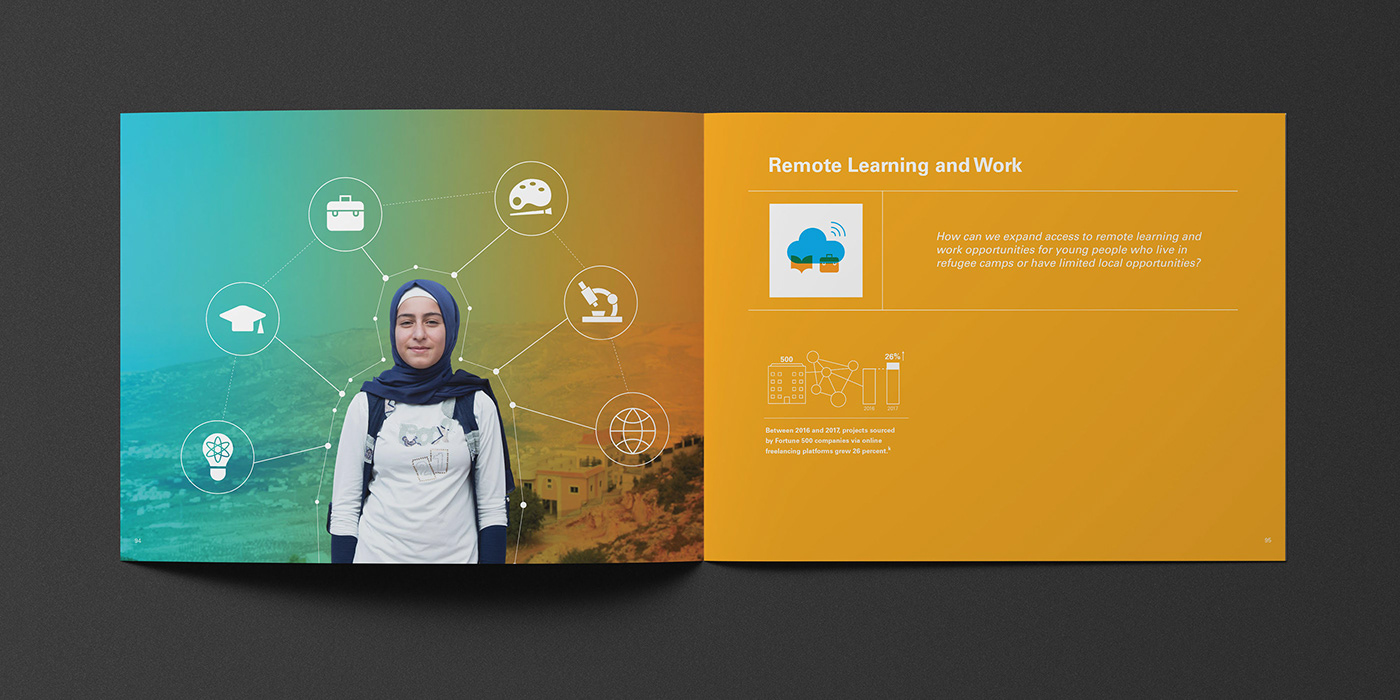
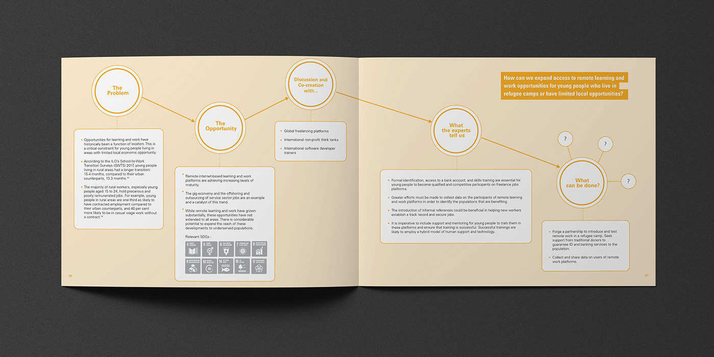
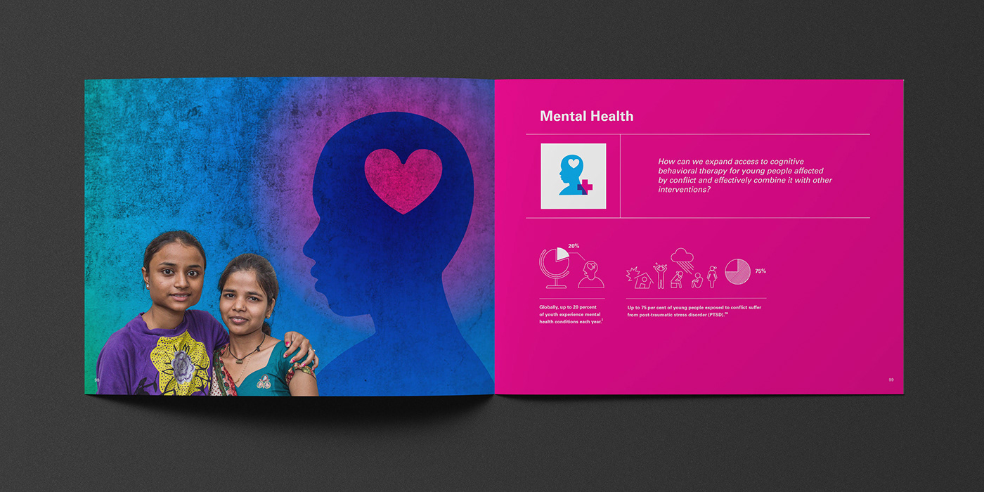
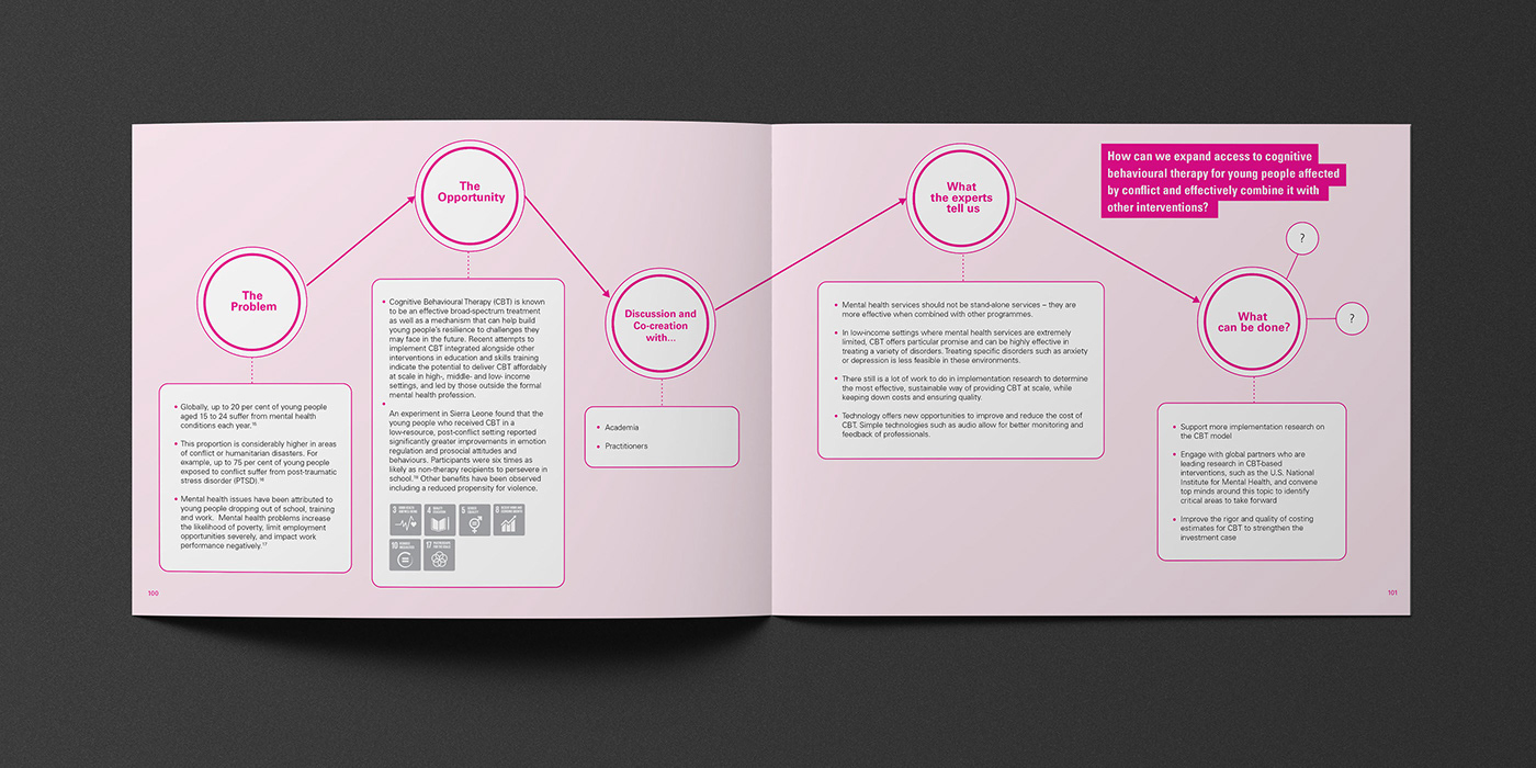
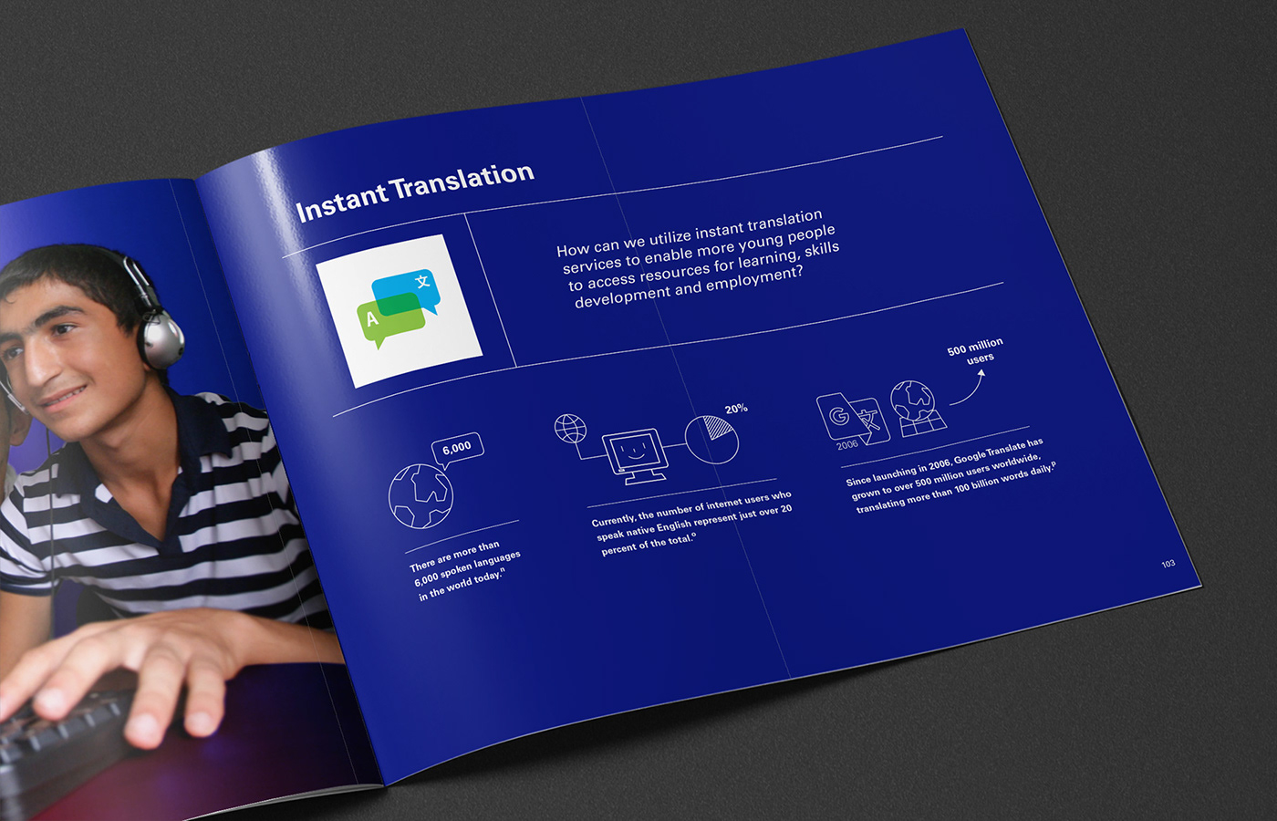
By using visual elements like charts, infographics, and maps, data visualization is an effective to convey non-profit organization's message and ideas. With the purpose of education and storytelling, the infographics in reports can help the audiences quickly understand the background information, and remove the noise from data and highlighting the useful information. Meanwhile, high-quality data visualization helps the non-profit organization to attract more attentions from the public. It helps the organization to promote themselves and influence more people.
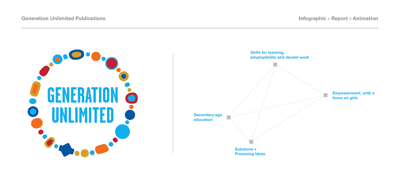
These are infographic I did for Unicef reports and publications. Enjoy it :)
And don't forget to click the "Appreciation" button.