“
Looking out of the window.
”
The Window is a boutique research agency based
in Ho Chi Minh City, Vietnam.
Team: Tommy, Thien An, Jun & Trung Nguyen — by NAR8

Problem
Despite being on the market for 10 years, The Window was known mainly through
word-of-mouth due to its “local” identity despite their industry-standard working process.
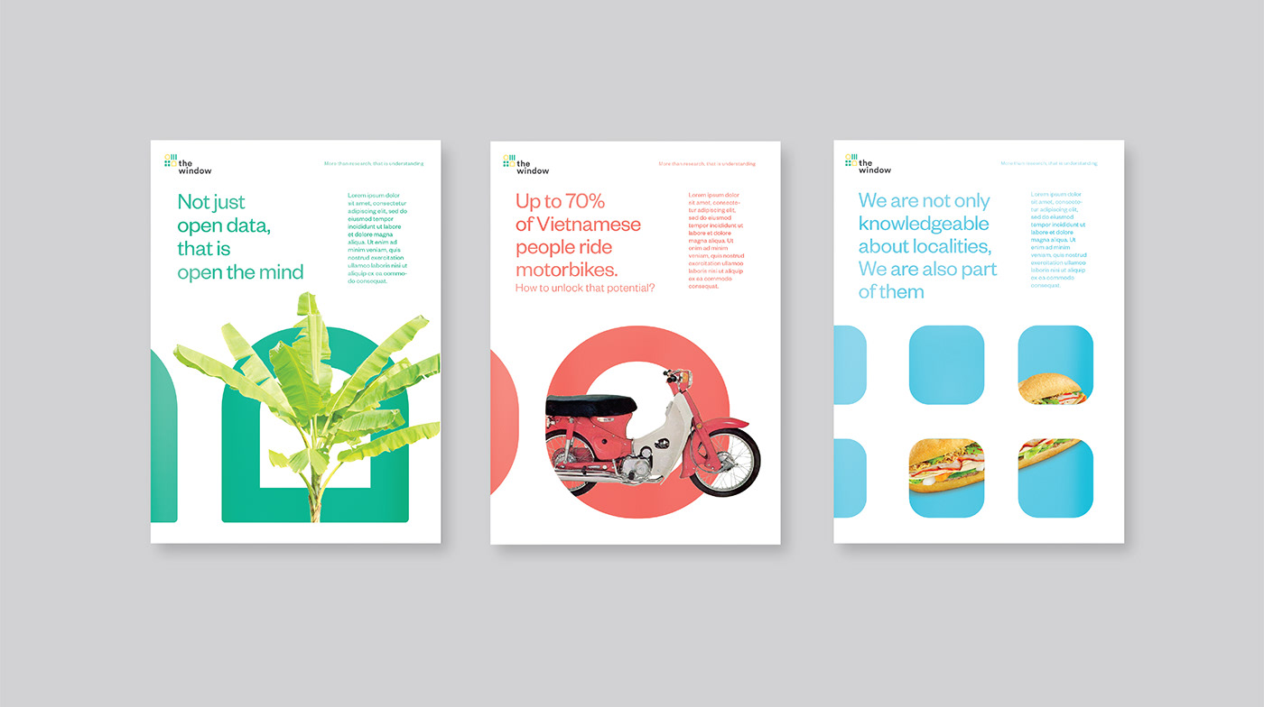
The Window offers human-centric approach in combination with the professional qualitative
research that provide clients with accurate and insightful information.
Creative Concept
It’s time to create a new brand interpretation for The Window,
a “Local Soul, Global Shape” identity, which can captures
the international standard whilst retaining its characteristic: local and humanist.


Visualization
The logo is the centrepiece of the brand identity, which mainly
inspired from today's data-rich world. The shapes replicates different
kinds of charts and tables, meanwhile playfully appears as windows.
Besides, the logotype in lowercase letters with small curves helps the brand
keep its friendly & humanist voice - since a research agency is the bridge
between businesses and the consumers' truest voice.


Due to the complex nature of this industry which often causes the readers
confused and overwhelmed, we developed a specific pictogram
system for each type of information, accompanied by a simple,
neat tables & charts so that the information is more easy-to-get.
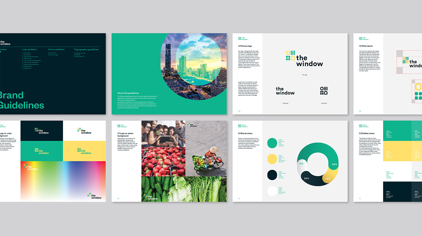


The old green-yellow colour pallette coated in a more pastel tone
might be a bit too young, but it certainly add youthfulness and
friendliness to the seemingly boring & dull data.