

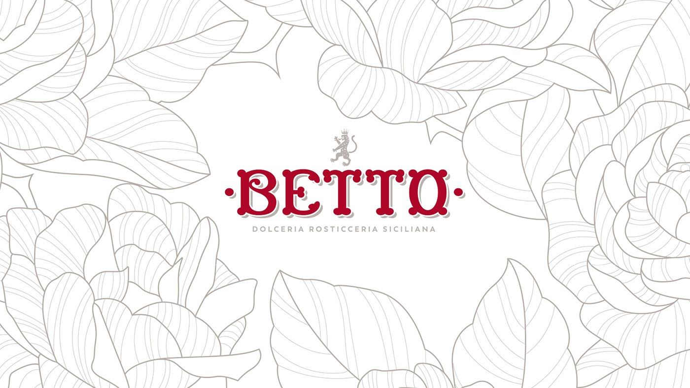
Betto is a Sicilian pastry in Milan.
You must try the cannoli: excellent!
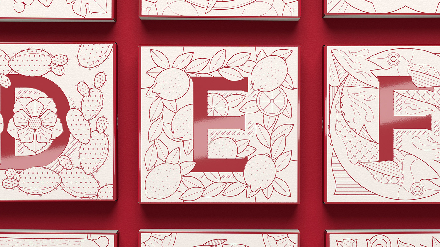
The main need we had to face: increase the take way orders.
Solution: we designed a serie of 26 different packagings, one for each letter of the alphabet.
When a customer orders cannoli, he can also choose the letter.
Once he has a letter, the next step is to compose a word.
And the more the letters, the more the orders.

The graphics are inspired by the traditional tiles of Sicily, redesigned with a modern touch.


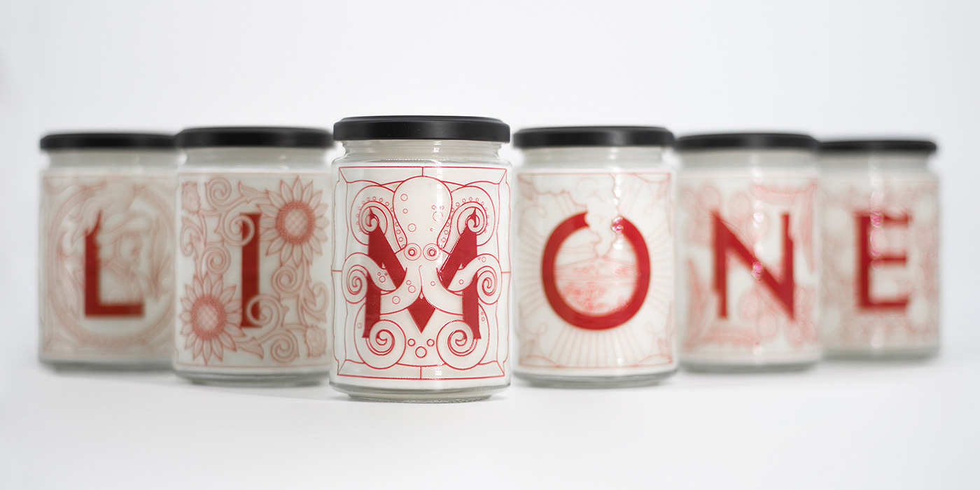
Alright, it’s not only about cannoli.
There’s also the famous typical lemon granita. Print is embossed directly on the jars.


Credits:
Design and concept by The 6th studio
Incubator: Branding Revolution Lab
Paper by Cordenons
Print by Press-up (boxes) and O-I (jars)


