These are a collection of monoprints I created at the Hamilton Wood Type Museum. They go past where I normal work and explore a more artistic examination of the letter forms and application technique of the ink. Please enjoy.
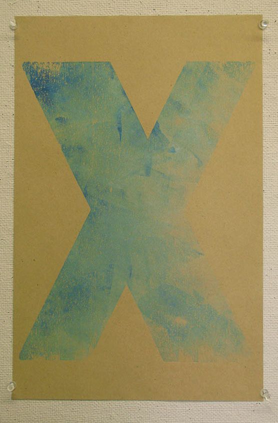

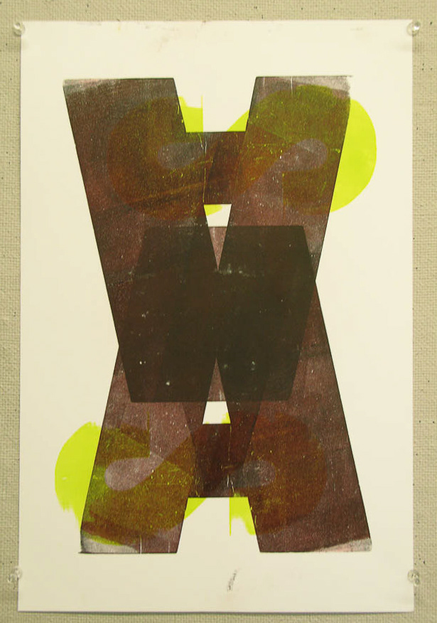
Sometimes we forget that the form can be a window not just a surface. The follwing pieces are executions in that though process. I wanted the color and texture to appear as it would through a window. In this case the window is wonderful X.
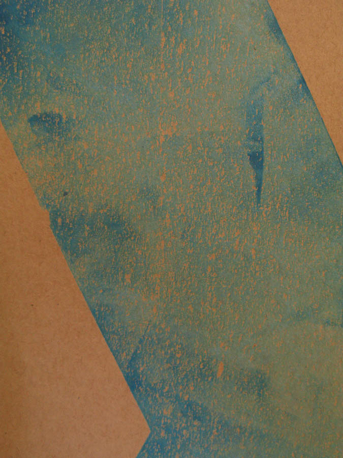
The trick is how to apply the ink, and how much. Sounds simple but the more you apply the less sharp the details and the less ink you apply the less vibrant the colors are.

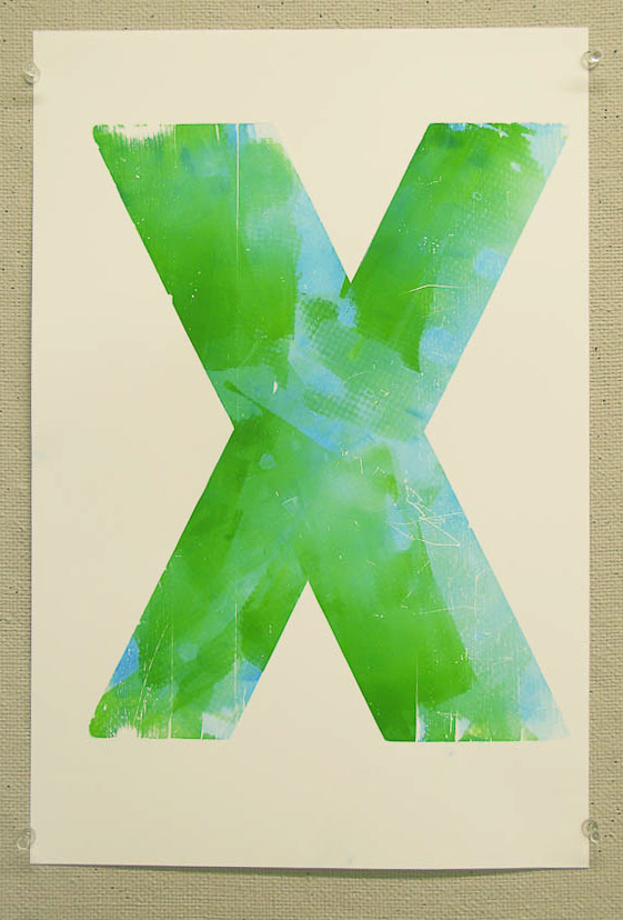
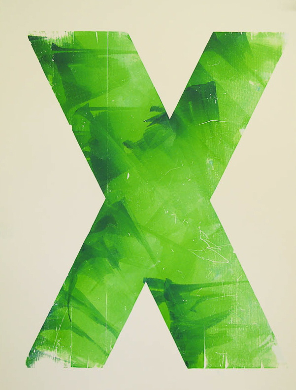
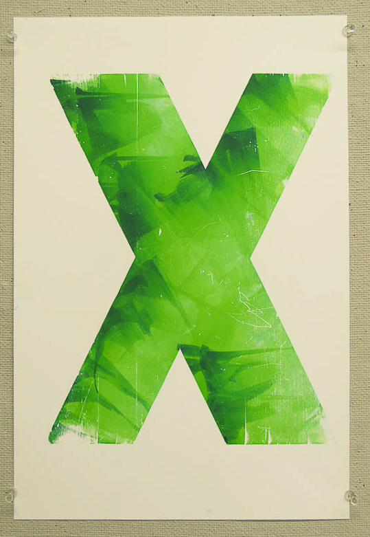
This one reminds me to not blame my tools, I used old and worn out brayers to apply almost a glaze of green over the base of green and blue.
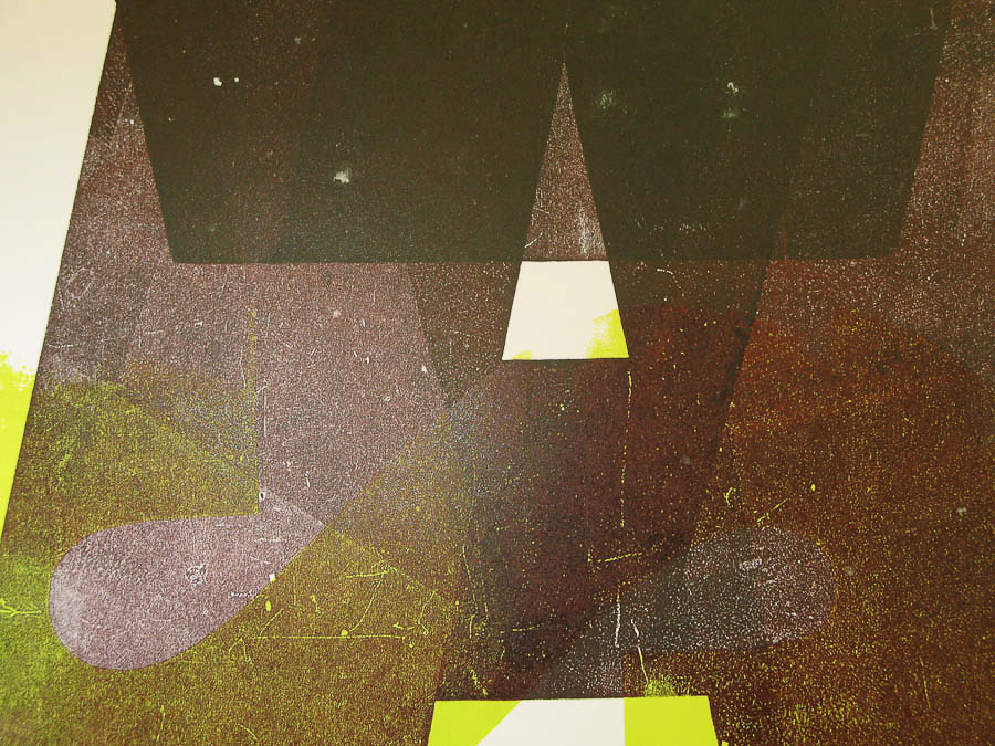
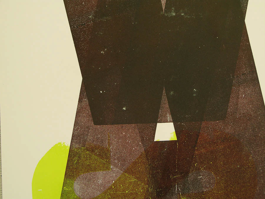
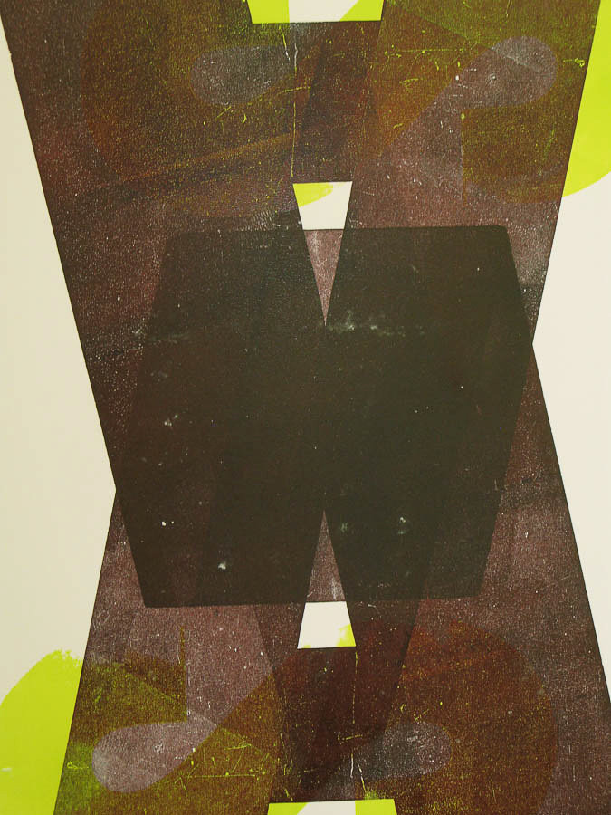
This is an trail at overlay and opacity. I wanted black and I wanted it to be transparent. I tinted the black with magenta.

Thanks for checking out this madness, I hope you appreciated some of my work. If you liked any of my work please follow its just more motivation to publish more work.
Comments are always welcome.
Comments are always welcome.

