Description
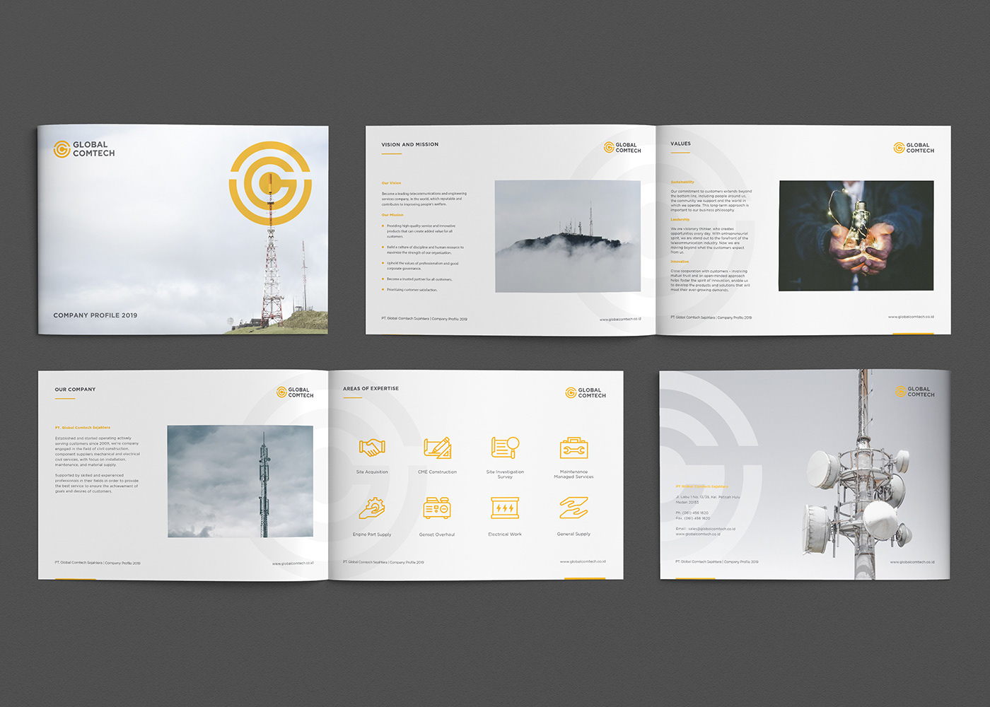
Global Comtech is a construction company that has a strong presence in building telecommunications infrastructure in Indonesia. As an experienced company, which has learned and gained valuable experience in the telecommunications industry.
Challenge
Updating the brand's visual style with a quality logo, without changing the meaning of the logo itself so that it stands out from the competitor.
Concept
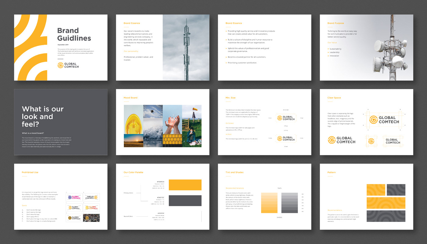
Design a modern identity to reflect the company's industry, with a graphic system that is universal and can be used in both visual identification and indirect brand communication.

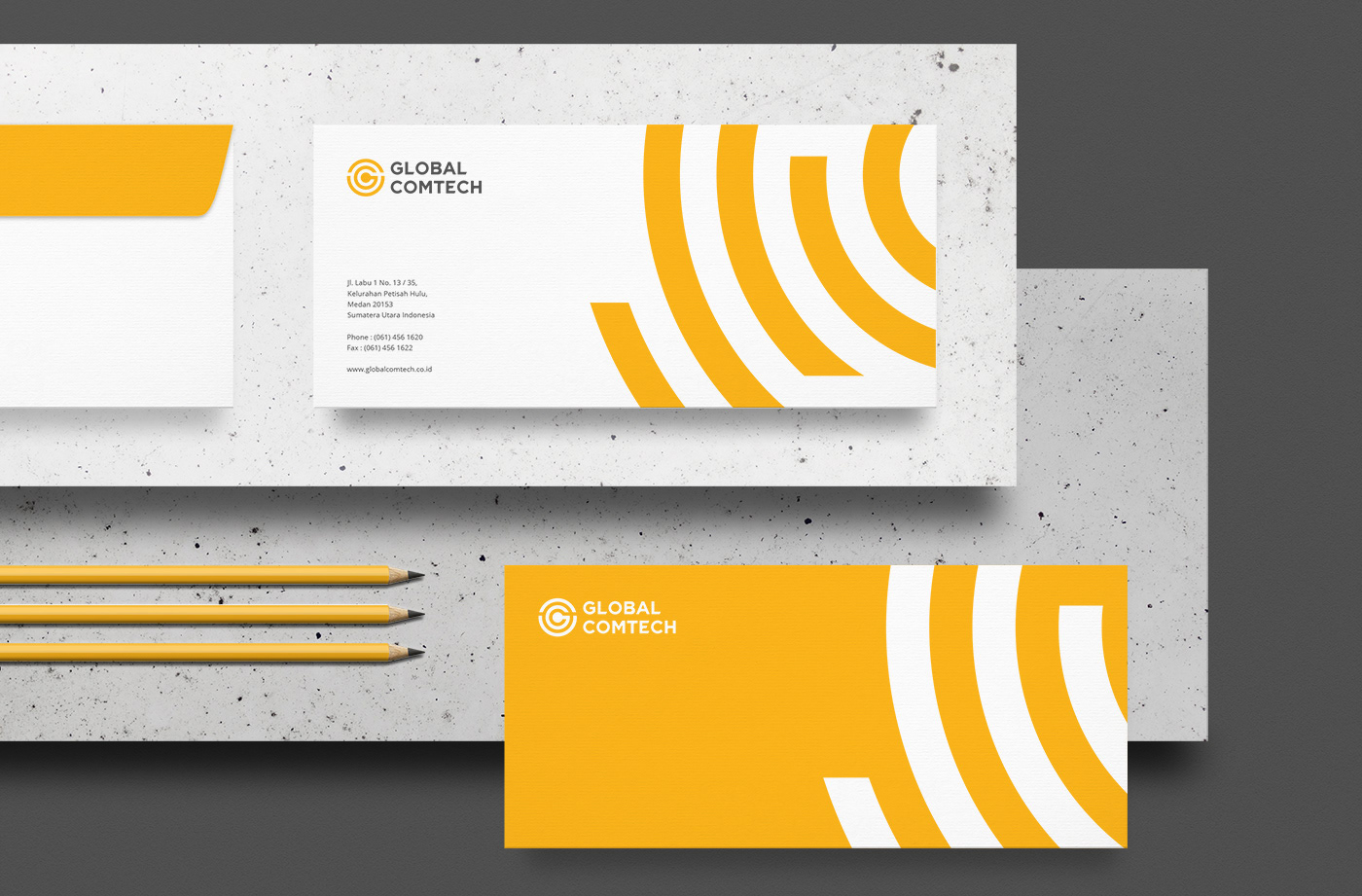
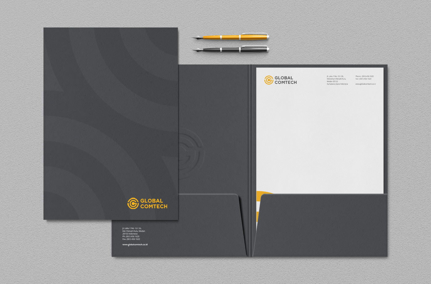
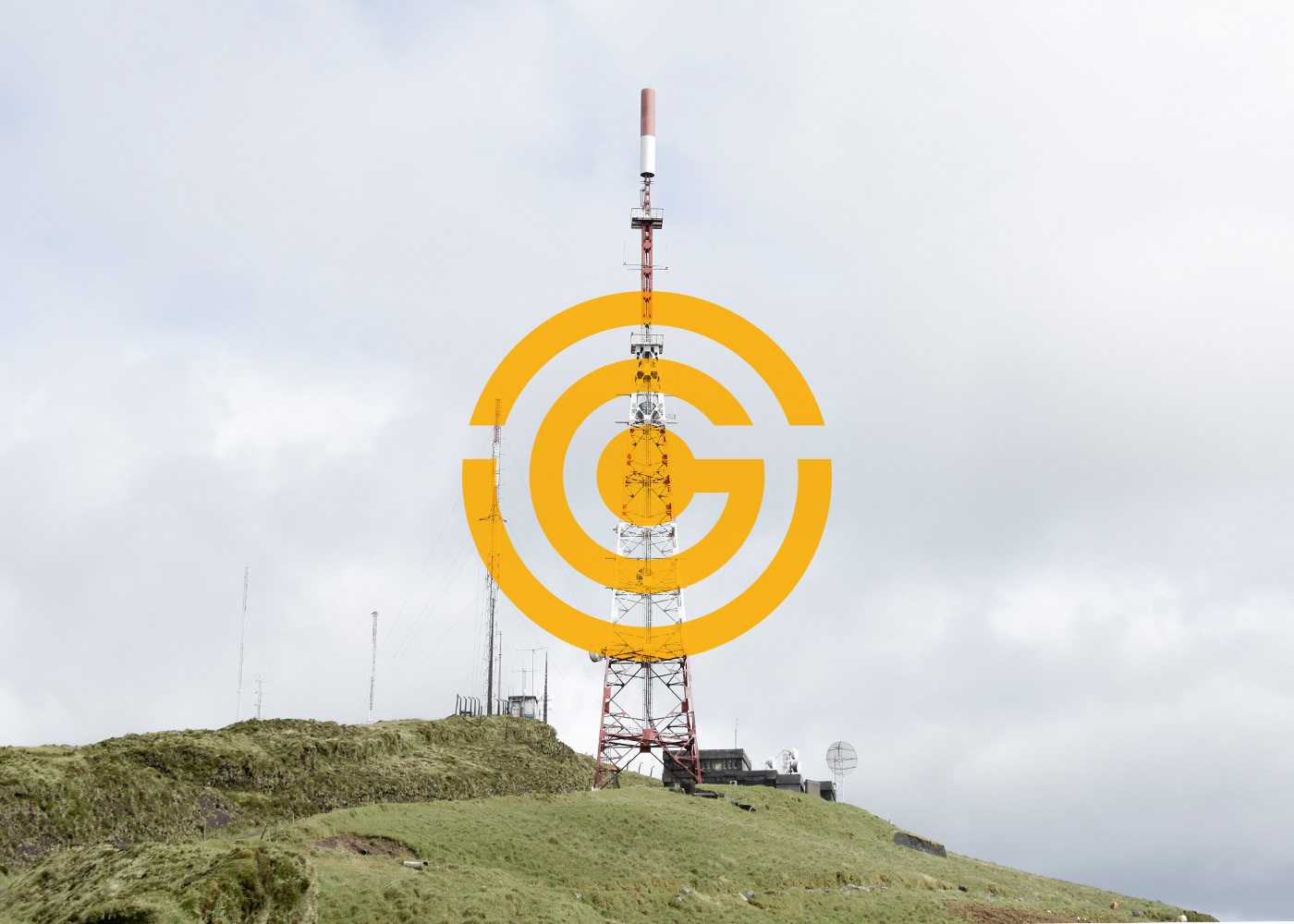
Global Comtech new Identity visualizes dynamic symbols. A sign that refers to the signal and the letter G+C is a new symbol resulting from the refinement of the previous symbol. The shape of the sign can be measured and used as a key visual. The black/white/yellow/gray color palette sets it apart from all competitors with an impressive distinct look and feel.
Modified geometric sans-serif typeface by adding curves and movement to some letters. A logotype that evolves to strengthen Global Comtech brand awareness, and a movement for a better future, and that allows the brand identity to fit better to the new digital area of communication.