

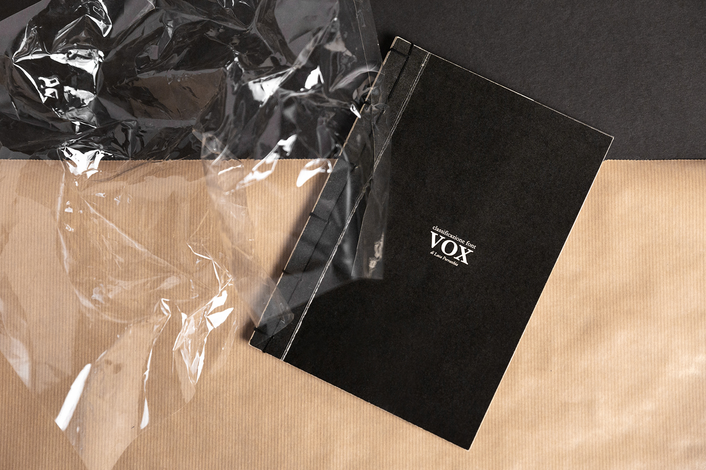
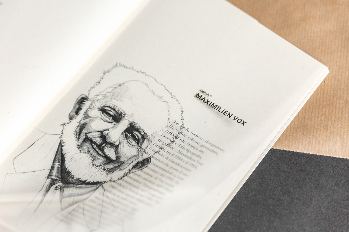
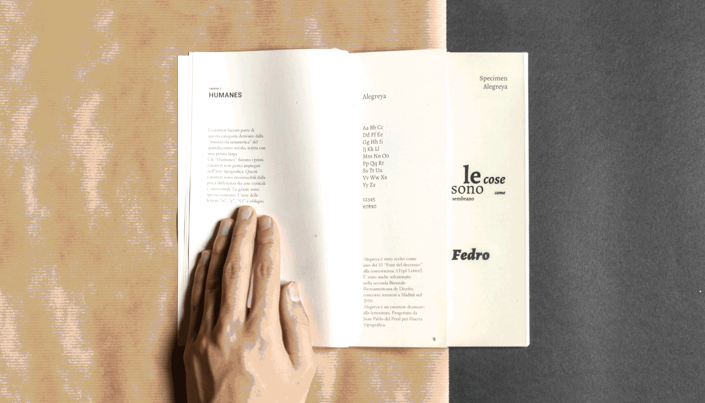
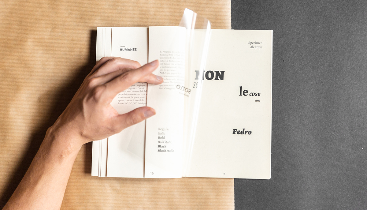
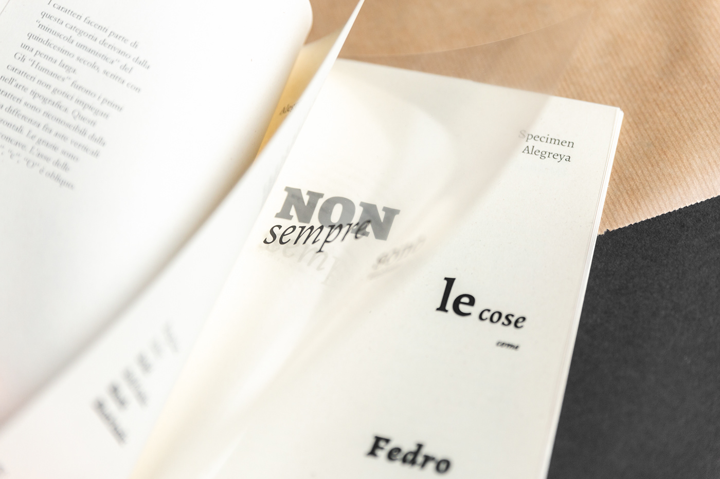
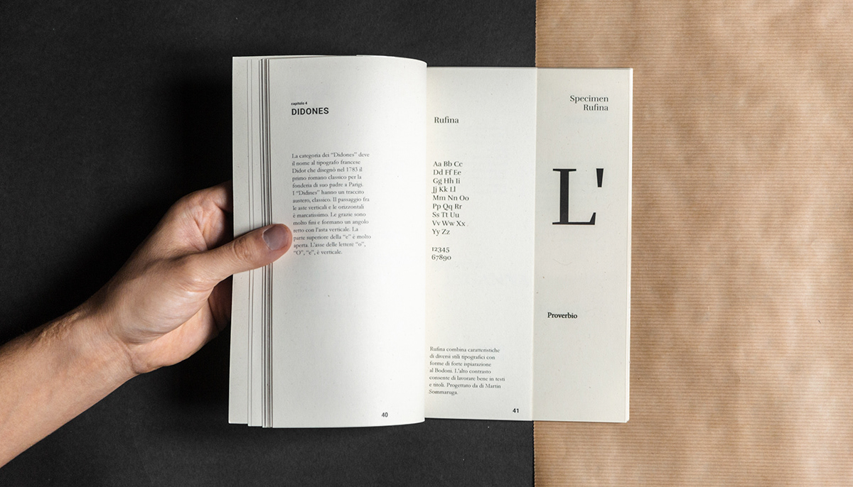
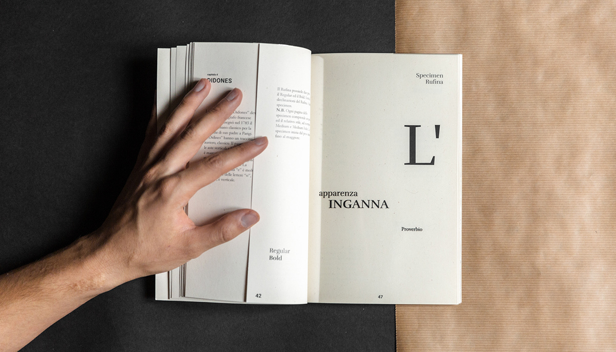
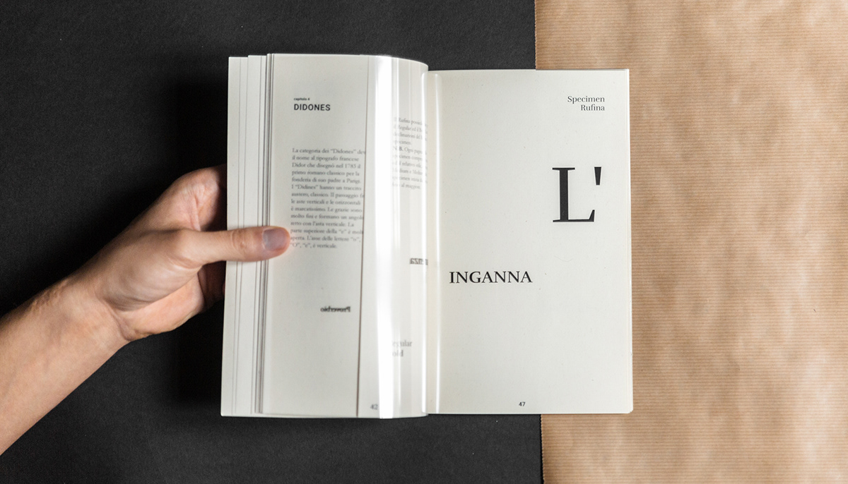
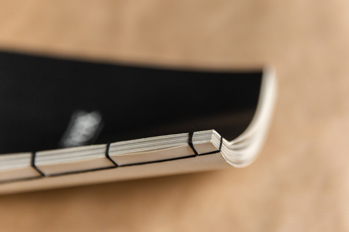
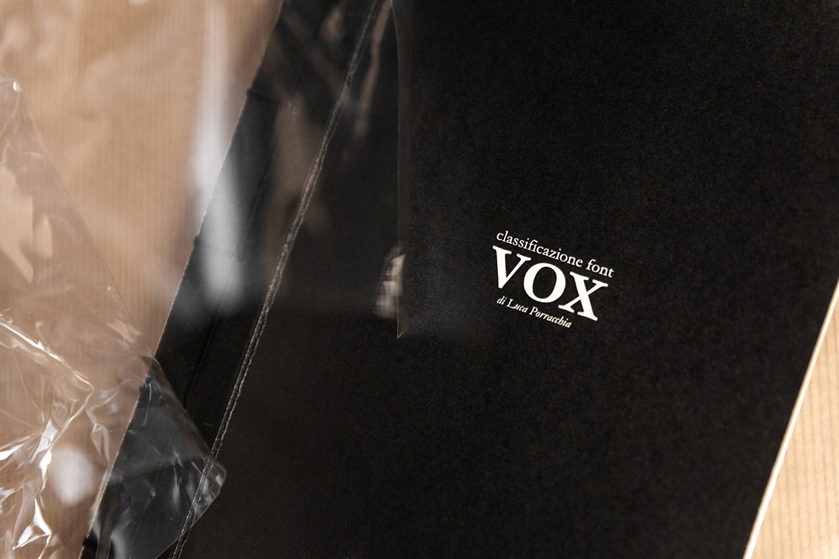
The project analyzes 8 fonts according to the Vox classification. For each of them there are generality, weights, families and a specimen. The leitmotif of the book is the contrast. Among the various weights there are contrasts of forms, so each weight is placed on a different sheet of acetate, which overlapped creates the specimen containing a quote. It is characterized by a double contrasting meaning, given by the half-paper page covering half of the next in acetate. The contrast is also present in the materials (paper/acetate) and in the colors (black font/white paper).


—
Fonts: Alegreya by Huerta Tipográfica, Cormorant Garamond by Christian Thalmann, Rufina by Martin Sommaruga, Arvo by Anton Koovit, Merriweather Sans by Sorkin Type, BenchNine by Vernon Adams, Noto Sans by Google, Poppins by Indian Type Foundry
Photography: Simona Di Nucci
Editorial design: Luca Porracchia


