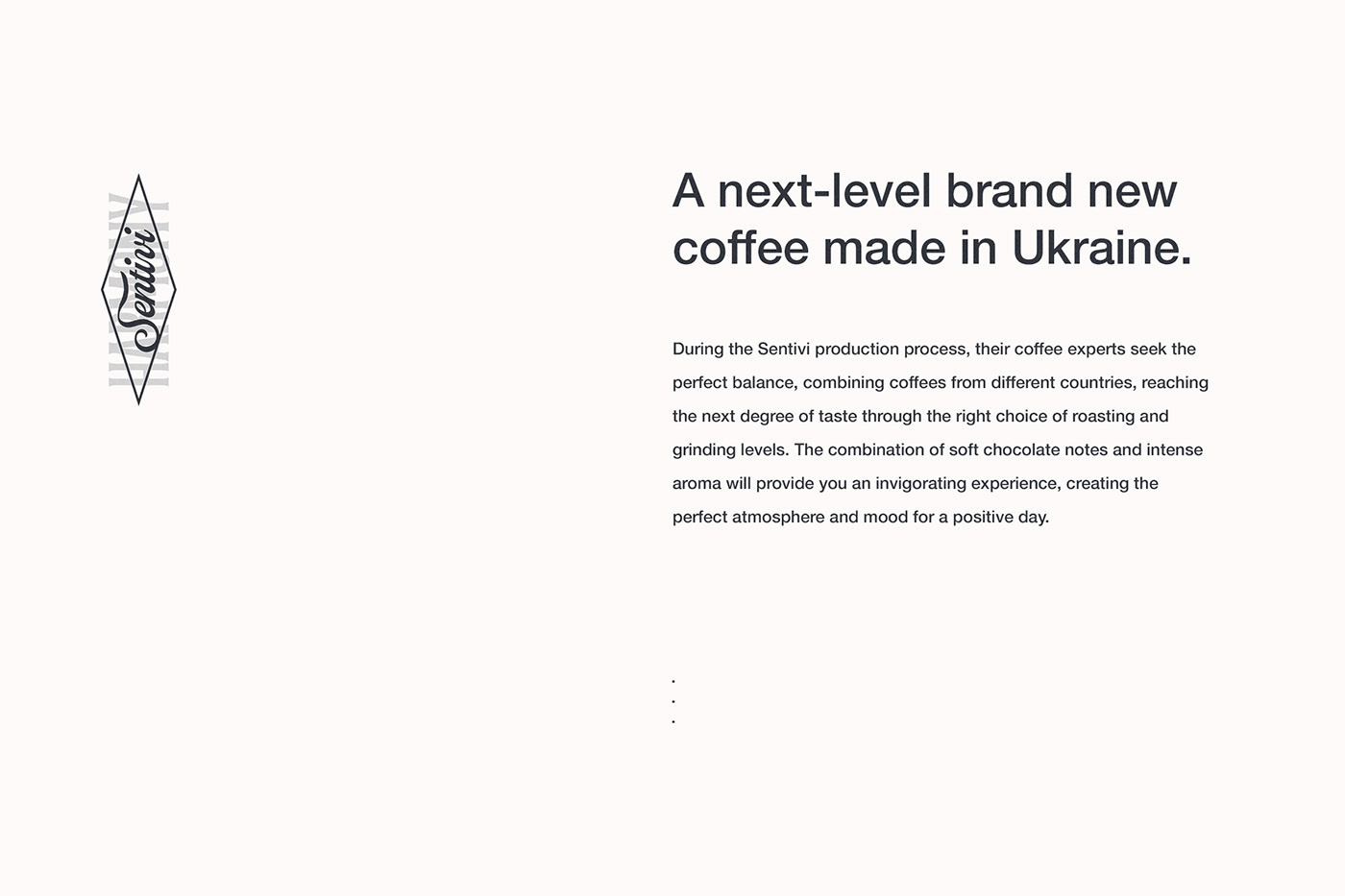

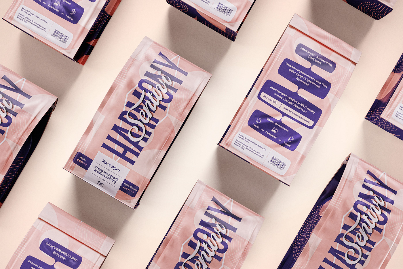
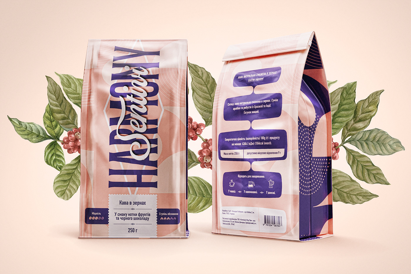
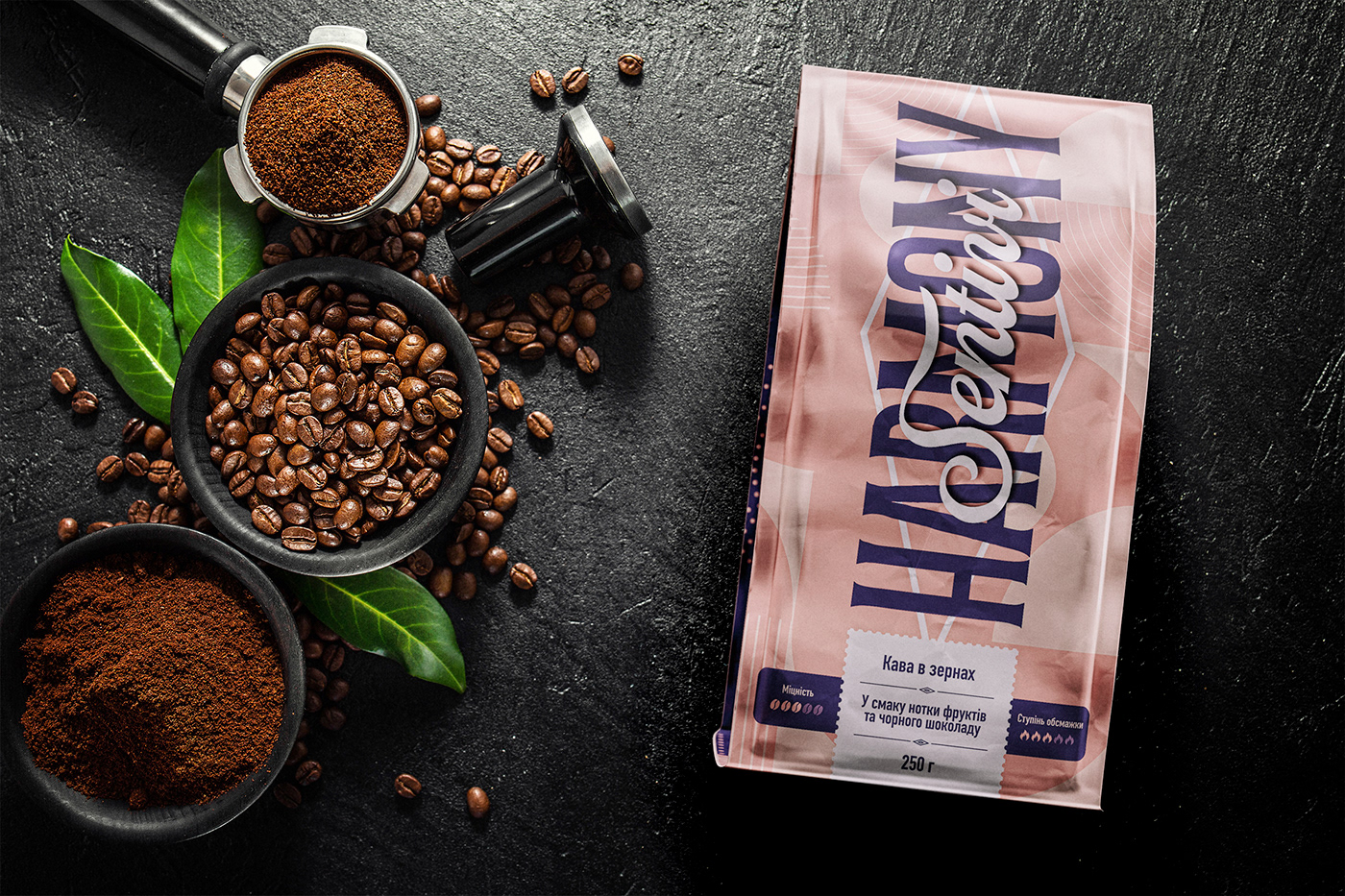
A next-level brand new coffee made in Ukraine. During the Sentivi production process, their coffee experts seek the perfect balance, combining coffees from different countries, reaching the next degree of taste through the right choice of roasting and grinding levels. The combination of soft chocolate notes and intense aroma will provide you an invigorating experience, creating the perfect atmosphere and mood for a positive day.
The briefing describes the target audience as young townswomen (25-35) with good erudition and knowledge of English. She is powerful, loves to travel, and is versed in good products. As a modern young woman, she values bright and pleasant moments, preferring an interesting new unforgettable experience than material things.
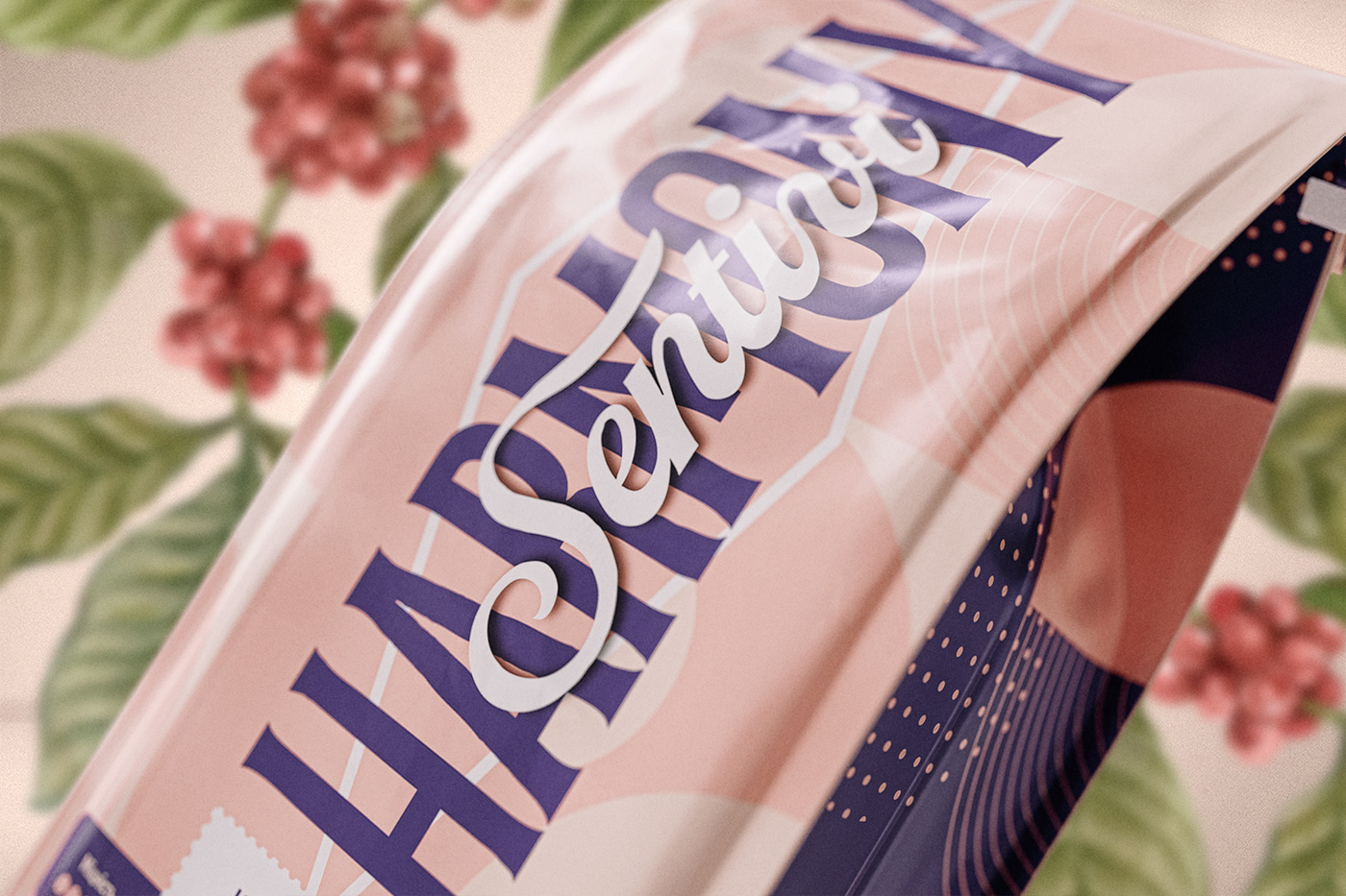
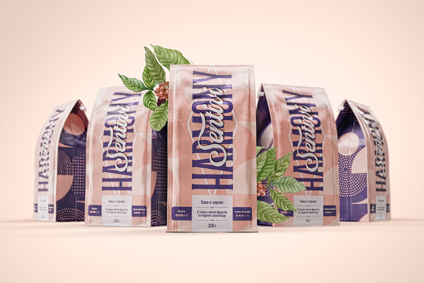
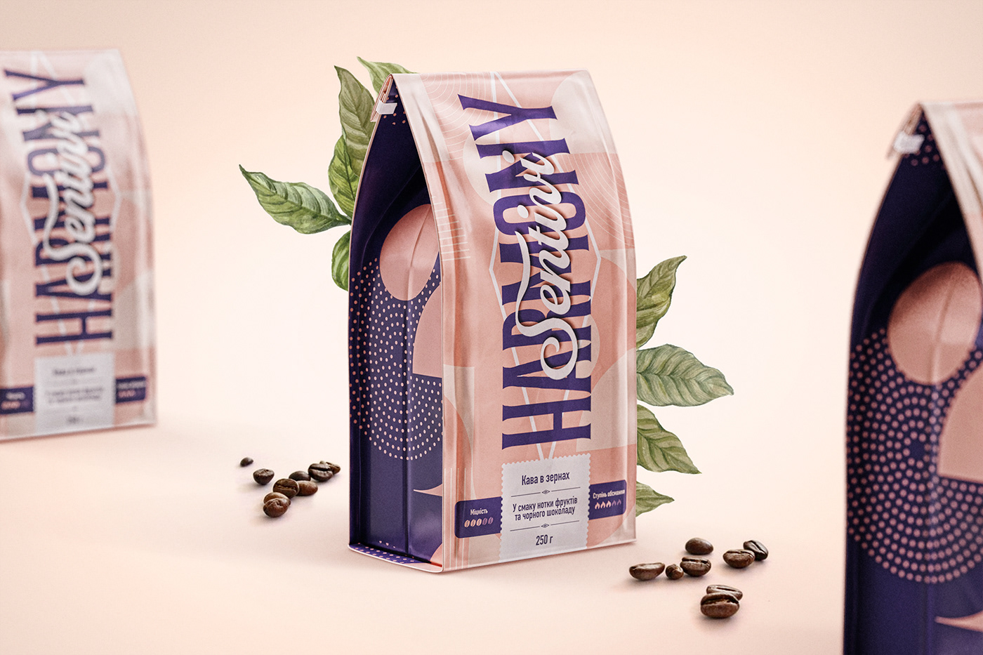
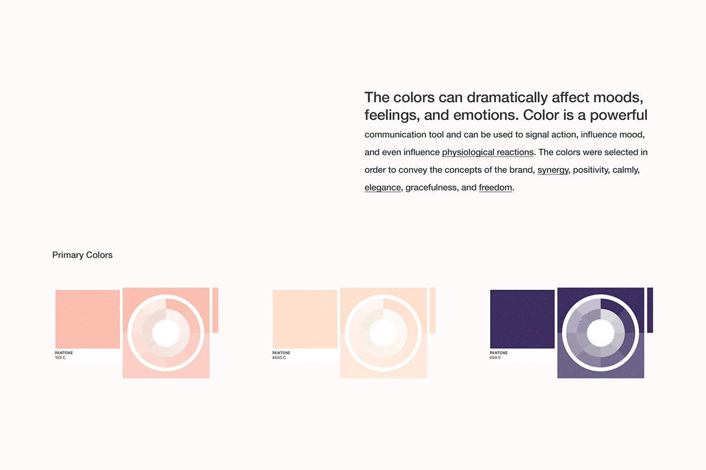
The colors can dramatically affect moods, feelings, and emotions. Color is a powerful communication tool and can be used to signal action, influence mood, and even influence physiological reactions. The colors were selected in order to convey the concepts of the brand, synergy, positivity, calmly, elegance, gracefulness, and freedom.
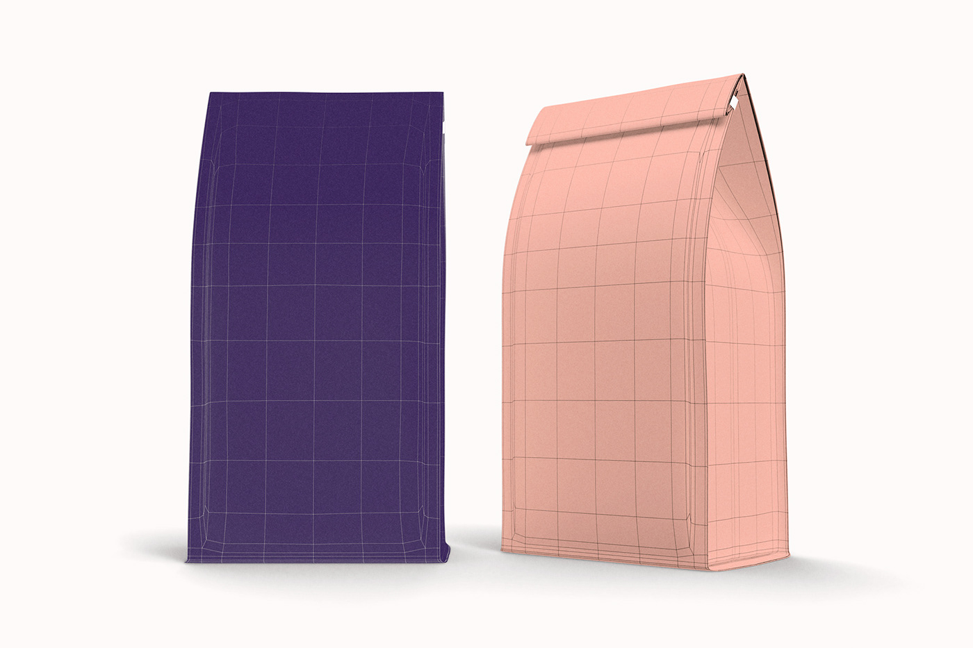
The packaging was designed in Adobe Illustrator and after that were modeled in 3D using Foundry MODO. The scene was illuminated exclusively with HDRi light. Some other softwares were used for specific functions, like Adobe Dimension. Post-production on Adobe Photoshop.