We worked hand by hand with Blackbook Winery to bring their brand to life.
Blackbook is a British urban winery based under the train arches of Battersea, in London. They have a simple motto, tradition with innovation. They aim to place British wine production on the map by offering a high-quality range of wines.
The logo was born by unifying the concept of a book, the two Bs that define the brand name and the arches in Battersea where the wine is produced.
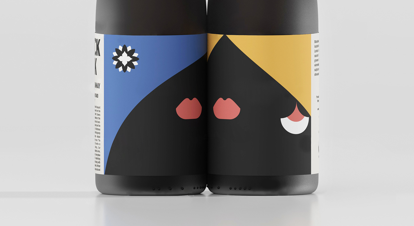
The bottle labels personify events or people relevant to London history, in this case, the Rosé wine is a homage to the Suffragists, this lady is wearing a flame in her hair inspired by decorations in the facade of the Carreras factory, an iconic building that welcomed the first working women during the war. The Chardonnay bottle with the blond hair is an acknowledgement to all those immigrants that define every day the eclectic culture of London, her earrings are inspired by the geometric shapes in the central Gallery floor at Tate Britain, a center for the arts in the city, the new Chardonnay bottle, a new edition from 2020 represents performance arts in the cities, her blue hair is decorated with a flower from the Royal Opera House in London and its rich flavour will make you want to sing.


