

Nibo Conference 2018
Transforming Brazil through accounting and entrepreneurship
Design Team: Renato Paixão, Valeria Grevy
Role: Lead Designer, UX/UI, Copywriting
Year: 2018
The Landscape
After the first edition of Nibo Conference in 2017, the brazillian accounting world was never the same. An event putting entrepreneurship and accountants on the spotlight was never done and it was needed. The event was so successful that it created a community after. Facebook and Whatsapp groups were created by the accountants that did not want to lose conection with those like minded individuals they met at Nibo Conference 2017.
The Challenge
Since our competitors were also creating their own events trying to take our spot, we needed to show that we were unique not only from a value standpoint, but also from a visual one. For the second edition of Nibo Conference we had to out-do ourselves. And so we did.
The Challenge
Since our competitors were also creating their own events trying to take our spot, we needed to show that we were unique not only from a value standpoint, but also from a visual one. For the second edition of Nibo Conference we had to out-do ourselves. And so we did.

The Strategy
When we were thinking about the message, of how we wanted NC18 to look and feel like, I felt like we needed to learn from our costumers. We needed to know what they loved about the first year's edition and what they thought made us different. So, I came up with a quick Guerrilla Research quiz in order to understand how our public felt about our event.
Words like young, dinamic and vibrant came up a lot on our User Research forms, and that gave me a lot to work with.
The Visual DNA
So we went on a dinamic, vibrant visual language and we added the sense of community to mirror what we saw happening with the accountants that went to the first event. We had our visual DNA nailded down and we started working on the site and colleteral visuals.
We had a lot of content to put on the website, and it would only grow with time. So it was imperative to create a visual that was compeling and interesting for our users. It went through several iterations while I was trying to understand the best way to show the content, provide an enjoyable user experience and that also make it easy to buy and find tickets.
There was a lot of A/B testing involved to understand the best layout for the website that would elevate our chances for convertion.

Setting the tone
When it lauched, the vibrant colors and friendly comunication were a shock for the accounting world. Our clients were used to a more clinical tone of voice and when we came it a fun and friendly brand persona, they felt embraced by the event.
Our use of gifs to make our communications lighter and also more human were a bit hit. Every e-mail and social media post was full of movement and it immediately caught our public's eyes. I was presented with a new challenge: write the copy of every e-mail. I love writing and it was a bit scary at first, but it gave me a chance to flex my UX Writing muscles and made me find new ways to engage and impress our public.

Social media was a big part of our communication strategy and we had a big challenge this time. Our competitors started their own events and they wanted our spot. We brought our friendly tone and our funny gifs to social media to create a conversation.
It was also imperative that our content was engagement worthy, so we also created a facebook group and event for people who were going or wanting to go. And we were always creating content for them, feeding them great information and making the aanxious about the event.
The viral-like quality of our content, the colors and the tone of voice set the personality for our event. And it was something our clients were craving for.

Crafting Visual Experiences for 1500 accountants
We also needed to create a great experience for our clients once they got to the event. We had a huge space and I was responsible for the signage and wayfinding. It was another chance to create an atmosphere with the visuals and evocke emotions on our clients. To bring our joyfull personality to the wayfinding in a inovative way I had to work ovetime with the cenographers and lighting crew.
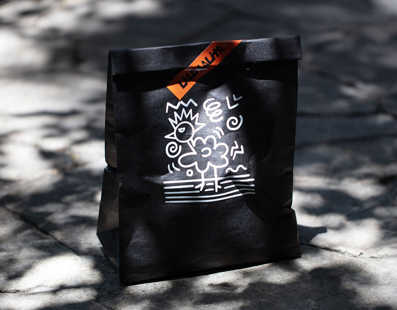
There were also the gift bags! So we thought of the most amazing stickers, notepads, bottons and totebags for them to carry home and tell everyone about the event, strenghtening our brand.


The results
The event was HUGE success! Before, during and after the event we witnessed a great engagement with our public and we felt our value skyrocket. It sold out and we had to acomodate more people and ended up with 1700 people on our event (we only had 1500 planned).
We built amazing relationships with sponsors, conected with people and created a great brand in the process.


Conclusions
This was my second time being the Lead Designer on the event, but this time the stakes were higher. We had a lot more people to please and impress, I had to write all the copy and think of how the content I produced would conect and engage our public. It was also my first time guiding another designer and acting as a design director of a project.
It was a lot of work, but I loved every second of it.
It was a lot of work, but I loved every second of it.


