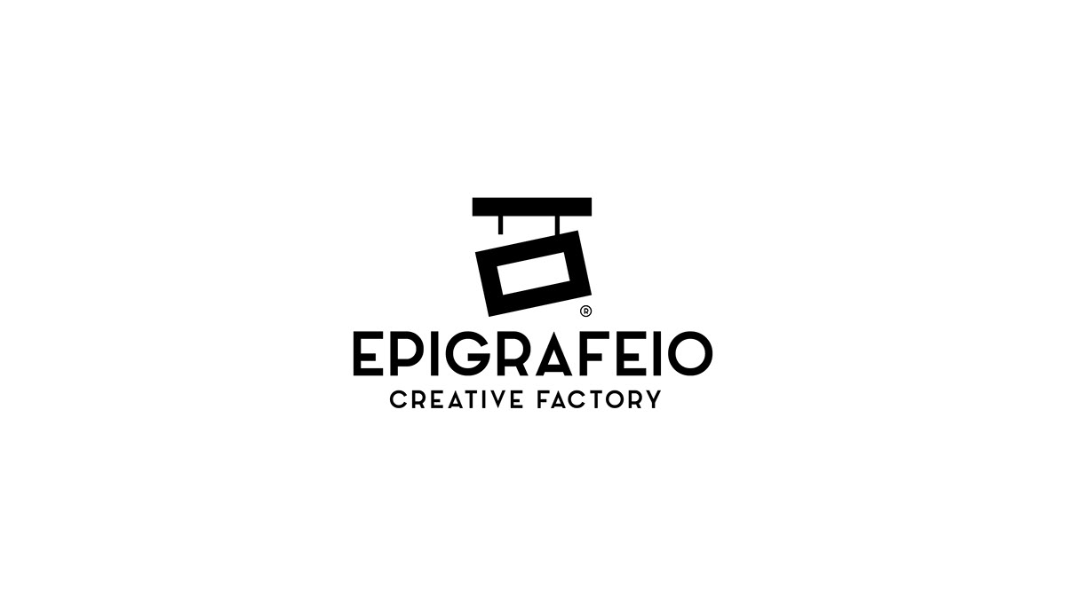
Epigrafeio® | Creative Factory (Corporate Identity)
The logo symbolises a hanging sign in the most simplistic way. The left side of the sign is broken to symbolise the small imperfections or visual corrections that every project needs and make it unique. The name "Epigrafeio" comes from the latin word Epigraph that means sign. It's also a newly created word by us to replace "Epigrafopoieio" pronounced /Epigrafopi-í-o/ that means the place that makes Signs & Epigraphs in Greek.
© 2018
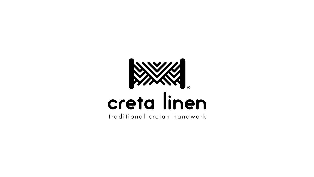
Creta Linen® | Traditional Cretan Handwork
Creta Linen® is a local souvenir shop in Rethymno, Crete. The logomark was inspired by the shape of the yarn due to the variety of traditional linens and tablecloths the shop has to offer. The chosen typography is lowercase and was created from scratch to accompany the lines of the logomark.
© 2019
Raffaello Junior® | Kid's Clothing
Raffaello Junior® is a well established kid’s clothing business located in Rethymno for more than 20 years. Source of inspiration for the logo symbol was the child with it’s characteristic flock. The child combined with the bow tie aims in the depiction of high quality clothes and services the shop has
to offer.
© 2019
Soho | Grill House
The name "Soho" derives from its location called Sohora, Located in Rethymno, Greece. It's a traditional grill house serving a very finite amount of people at a time to ensure the quality of the food and the overall experience is optimal. For the rebranding of the logo we opted for Greek calligraphy style of typography to keep the old school and traditional feel.
© 2020

Pc Club | Internet Cafe
The logo was inspired by the most characteristic symbol of gaming - the console controller. The typography was created to accompany the logomark, slightly angled at 8˚, same as the controller to enhance the logo and give the sence of action as most games have.
© 2019
Cronos® | Luxury Patisserie (Corporate Identity)
Cronos® is a family pastry shop located in Rethymno. Symbol of the logo is planet Jupiter (Kronos) with it’s ring made from wheat - the main ingredient in most puff pastries. The chosen typography is uppercase in order to convey credibility and validity.
© 2019
Wood Market | Quality Furniture
-
© 2019
Aeraki | Seaside Restaurant
Inspiration for the naming was the seaside location of the restaurant that you can hear a calm breeze in the summer and given the tourist - aimed nature of the place, the name is friendly and easy to pronounce word for them. The symbol of the logo was inspired by the greek column in Ionic order that also resembles the breeze. The typography created is lowercase to convey friendliness with the letter “a” ressebling the symbol of the logo.
© 2019
Eleni Deredaki | Institute de Français
The logo was inspired by the most characteristic symbol of France - the Eiffel tower which also resembles the the name of the owner.
© 2019
Paihnidoupoli | Children's DayCare
The name "Paihnidoupoli" derives from the Greek words Paihnidi/Game and Poli/City. The symbol of the logo is based on children playing and holding hands but also resembles the polpular kids activity of making paper people cuttout chain with scissors.
© 2020
Paihnidoupoli Cares | Charity Events
Paihnidoupoli Cares is a charity organised by Paihnidoupoli DayCare with the main goal of helping children not so fortunate, have the childhood they deserve by selling drawings kids make at day care. The symbol of the logo sustains the essence of the main logo with the kids holding hands but emphasizes mostly on love and happiness they spread.
© 2021
Just 4 Pets® | Training & Goodies (Corporate Identity)
Just for Pets is newly opened pet shop located in Rethymno that offers a variety of pets, services and goodies to choose from. The inspiration for the symbol of the logotype came from the number 4 (for) that the owner chooses to spell the aand the 4 different kind of animals you can find at the shop (birds, fish, reptiles and mammals). The animal in the negative space of "4" is not specific so everyone can see something different or identify with his or her own pet.
© 2018
Vicki Kyriakaki | School of English
The logo was inspired by a well used pencil that also ressembles the mosti iconic British landmark - the Big Ben. This was done because the school teaches British English. The lines of the pencil also form a book with a bookmark, symbol of learning.
© 2019

Apithano | Honey Exhibition
Emerging from the word apis; the Latin name for “bee” and “apithano” meaning incredible in Greek. It is a traditional honey brand in Melidoni, Rethymno. The symbol of the logo represents the bee in a minimal form combined with the chosen typography.
© 2020

Mathesis Online | Online School
-
© 2020
Mantadakis | Aluminum & Metal Works
-
© 2020
Kentitiki Kritis | Embroidery Business
-
© 2020
Enertek | Engineering & Innovation
-
© 2020
Plymakis Family | Traditional Cheese Making
-
© 2021
