Brief: To develop a brand, identity and packaging design that will get people to believe in an indulgent product as truly healthy AND with taste credentials to match any premium ice cream.

Om&nom has a single ambition to reach and improve the lives of everyone living with a sweet tooth!
How you ask? Easy we say! By creating the most healthy ice cream in the world without compromising
flavour. We have scoured the world to find healthy superfood ingredients that pack that extra
punch, Flavour! To allow you to om&nom on&on&on...


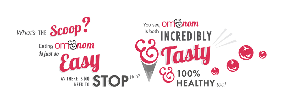
Om nom: An onomatopoeical adjective based on the sound emitted
when something is "Oh so tasty".
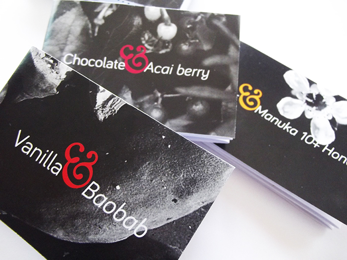
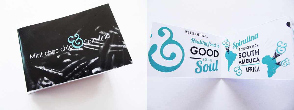
Ampersand: Represents the duality of Healthy & Tasty. Represents the
fact that the customer can essentially eat the ice cream
on & on & on because it is so healthy. Represents
a scoop of ice cream.

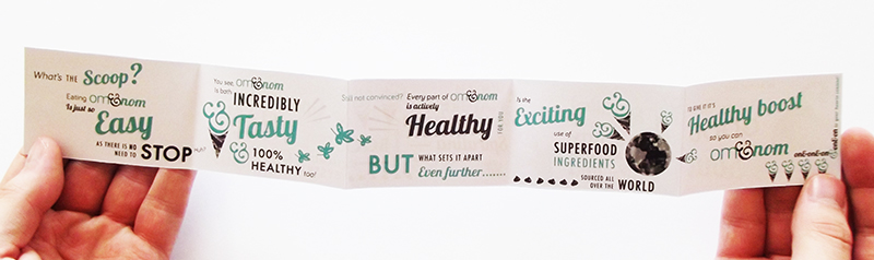
Language. The tone of om&nom is fun whilst being incredibly genuine and true. Each flavour has its own set of infographics describing the USP of om&nom; the exciting flavour combinations, the new superfood ingredients and their health benefits. This way the customer can learn more about the benefits of the ingredients and where they are sourced.


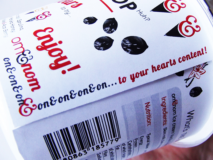
Packaging. The om&nom ice cream is packaged in circular tubs. Each has a unique, vibrant colour to differentiate the flavour and to stand out on the shelf. The packaging is bursting with exciting information about the healthy and tasty benefits to persuade the customer to try it.
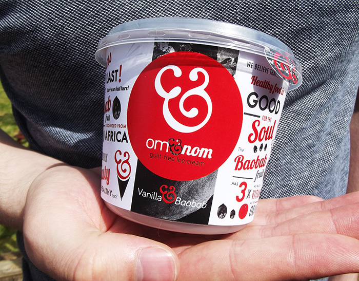
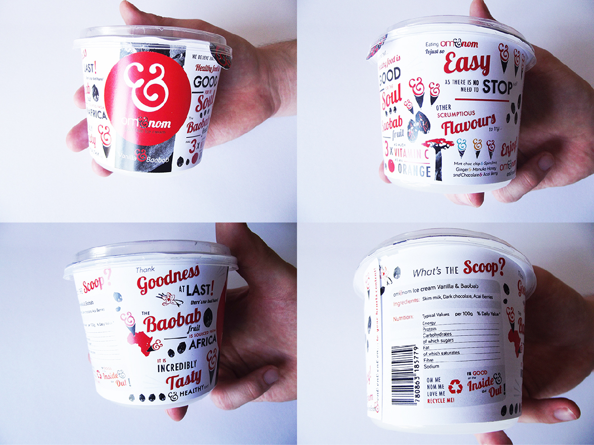
The tub can be rotated on & on to reveal more information about the ice cream.

Each lid utilises b/w photograpy of the superfood ingredients so that the customer can get an insight into what the superfood looks like.

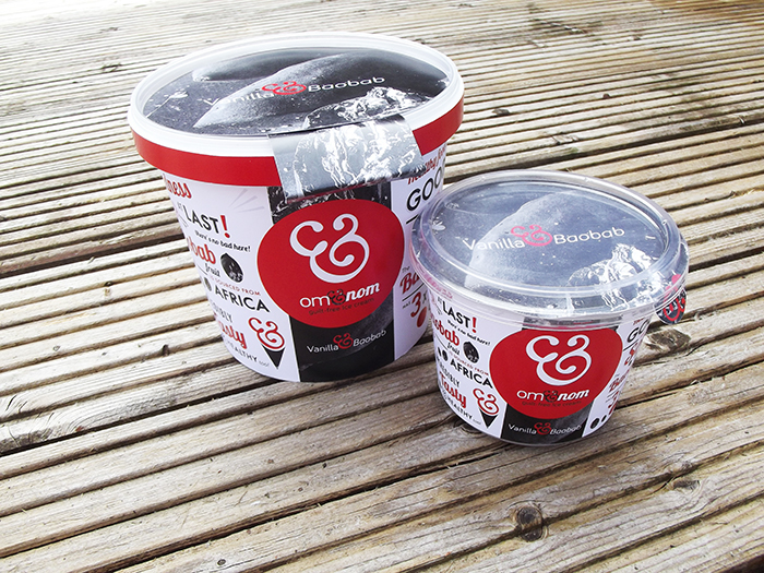
The om&nom ice cream is packaged in two sizes depending how much the customer would like to om&nom on & on & on. The tub can be opened by pulling the ampersand tab or tearing the label.


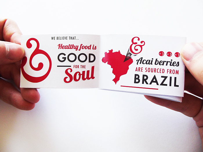
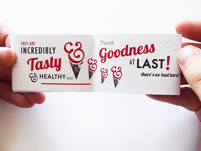
Booklets. Small booklets are provided with each om&nom ice cream flavour with more information about the new superfood ingredients and the brand. To develop the brand concept, each booklet unfolds 'on & on & on' to reveal more information.


Promotional. Tester pots have been designed to hold scoops of each flavour of om&nom for people to try. Each pot has its own message to utilize the creative language and its own colour scheme to differentiate each flavour.


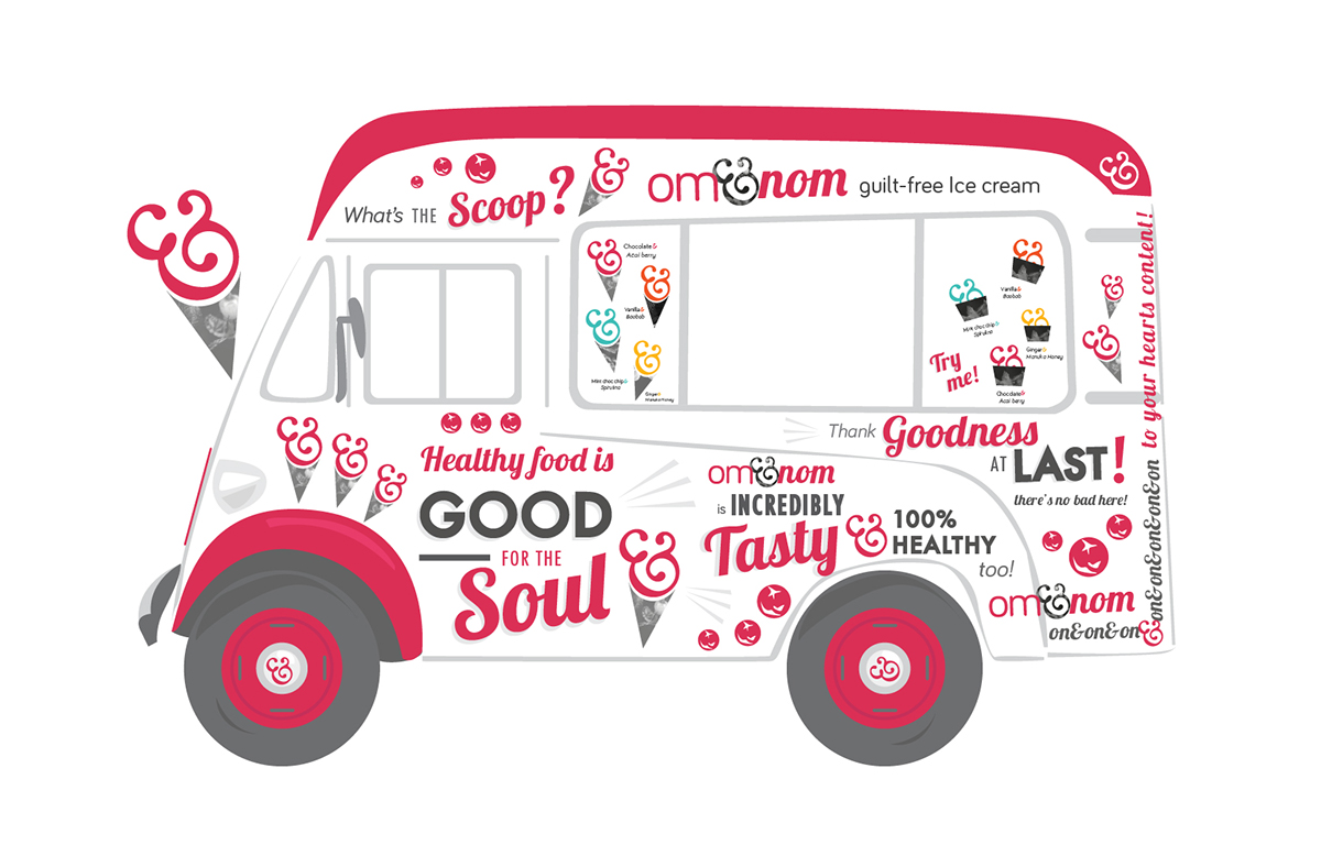
An ice cream van will travel on & on & on handing out scoops if the new ice cream to promote om&nom. The ice cream van is designed with the creative language to describe om&nom ice cream.

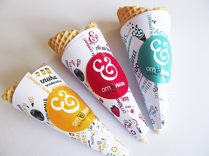
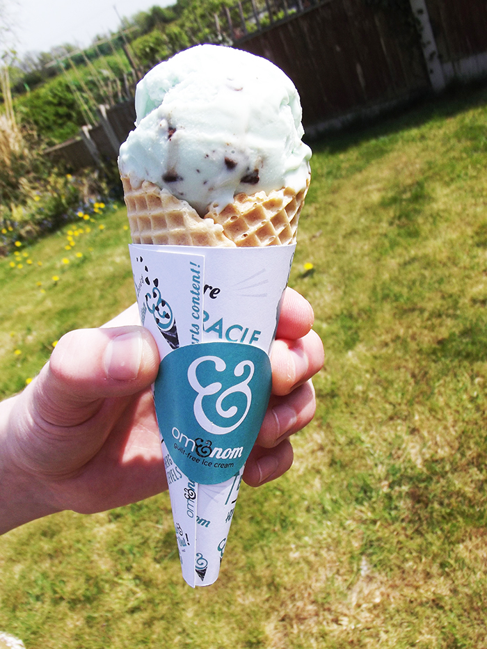
Ice cream cones. As part of the promotion of om&nom, ice cream cones holding a scoop of ice cream will be handed from the ice cream van. Each cone has a wrapper coded to its flavoured scoop holding more information about om&nom and the superfood ingredients.


© Copyright Charlotte Estelle Littlehales


