
Gluten free bread - "Be gliuteno"
A family owned bakery - “Biržų Duona” decided to produce the first gluten free bread made in Lithuania. They have more than half of a century of baking experience and built new modern cross contamination free manufactory – a recipe for great product! We were brought in to design the brand and packaging to make great product into successful.
After a market research two main target audiences and their needs were identified. First of all there are people with celiac disorder and secondly there are 30 to 45 year old urban professionals who are leading a healthy lifestyle and taking care after their families. All of these people have similar expectations regarding quality and ingredients, they demand to know the origin of the product, whether it’s organic and ecological or not and assurance that there won’t be any wheat cross contamination.

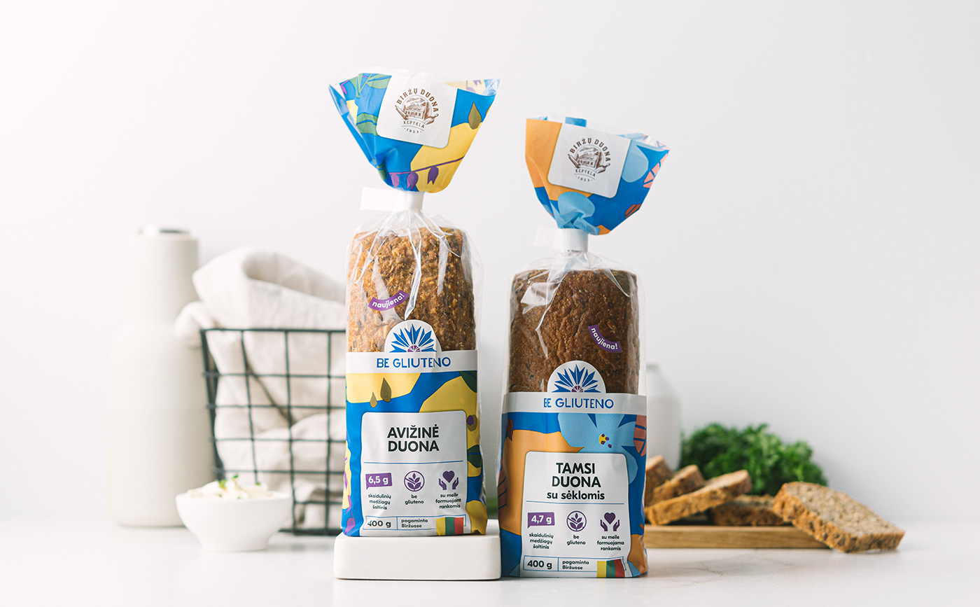
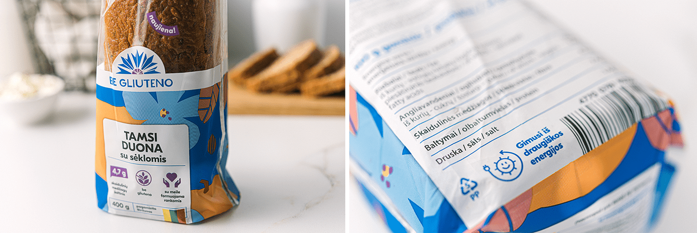
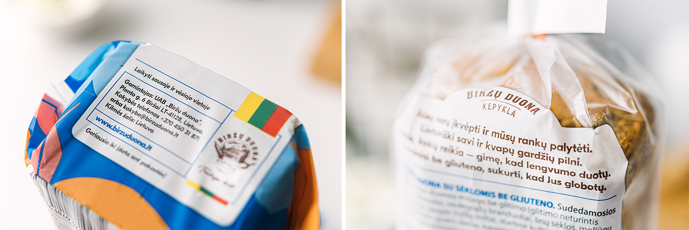
Target audience analysis led us to insights that transparency and clearness are most important things to consider. Hence the name “Be Gliuteno“ (eng. Gluten Free) - simple and plain. In packaging design we’ve followed the same concept by placing the most important information in white background and big print. Both sides.
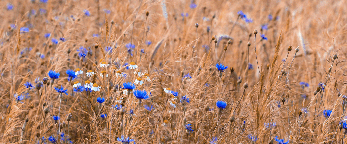
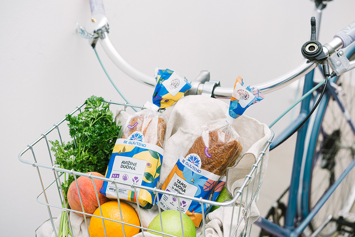
The producers’ aim was to make a gluten free bread by keeping with the Lithuanian bread-making means in order to have the distinguished rich flavour of traditional bread. This mix of new technology and ancient traditions were translated into a logotype - cornflower was selected as a metaphor for this duality. Its inseparable part of any cereal crop field and metaphorically related with cereal through connotations in Baltic folklore.
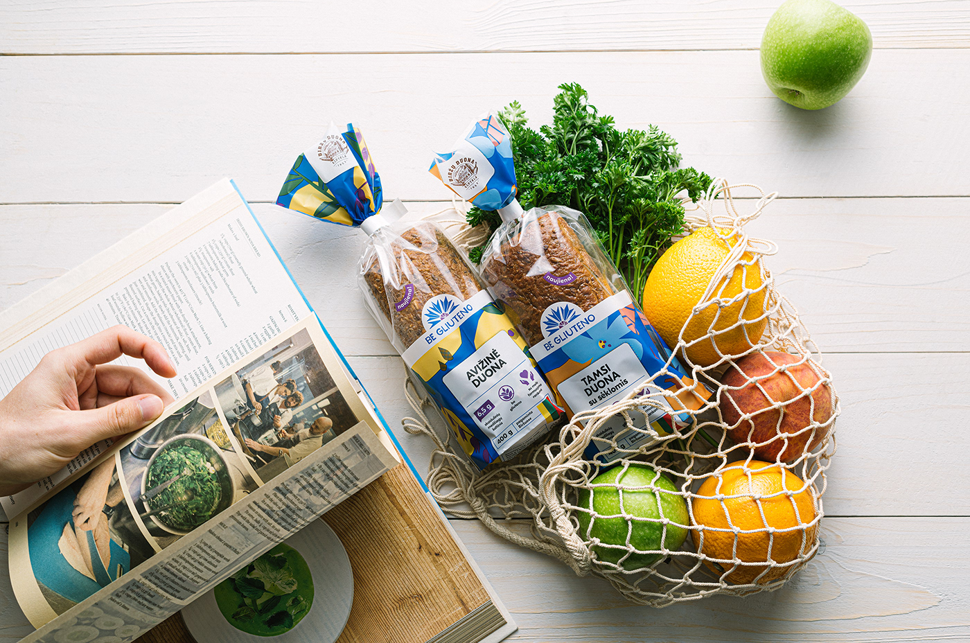
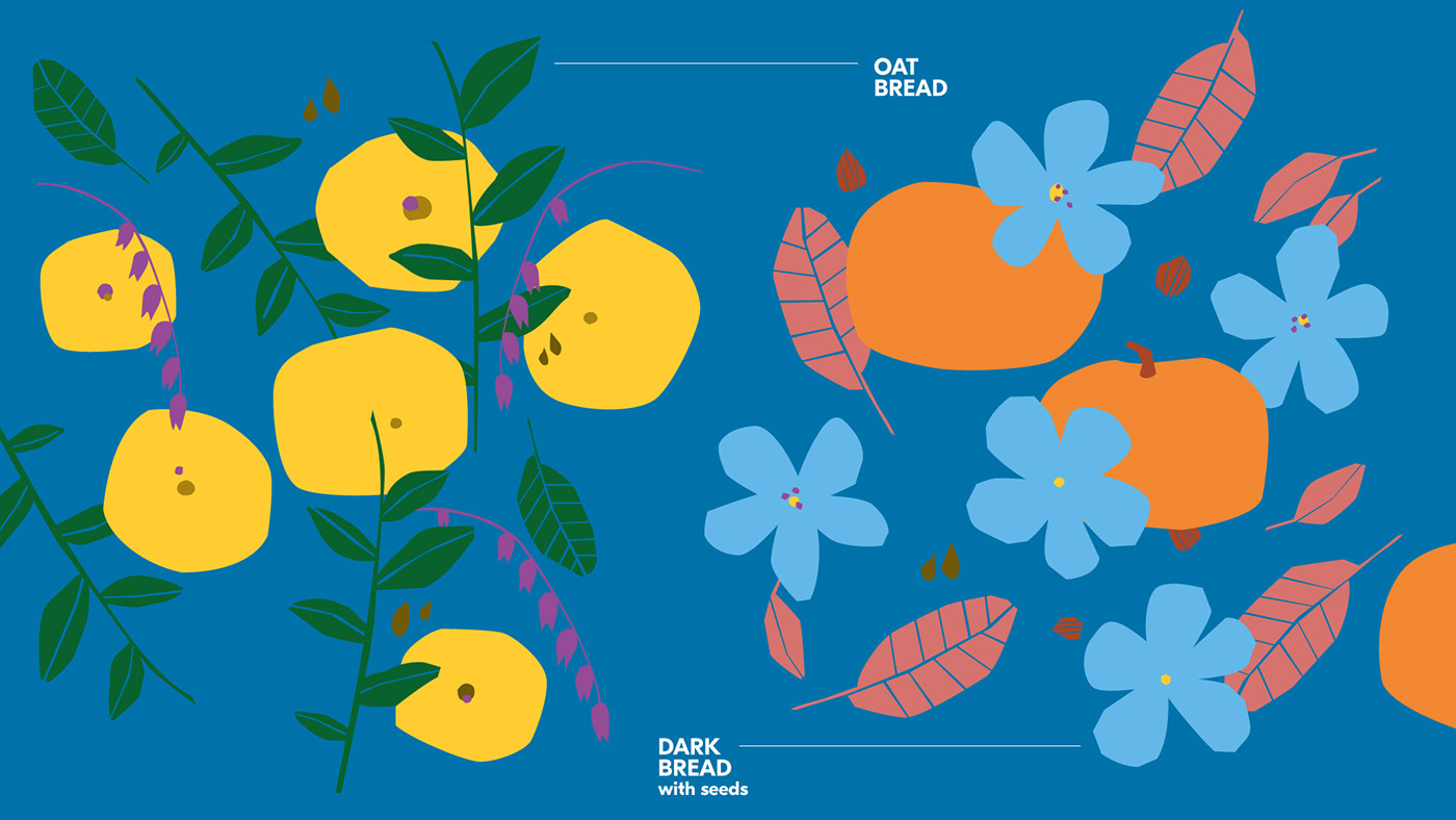
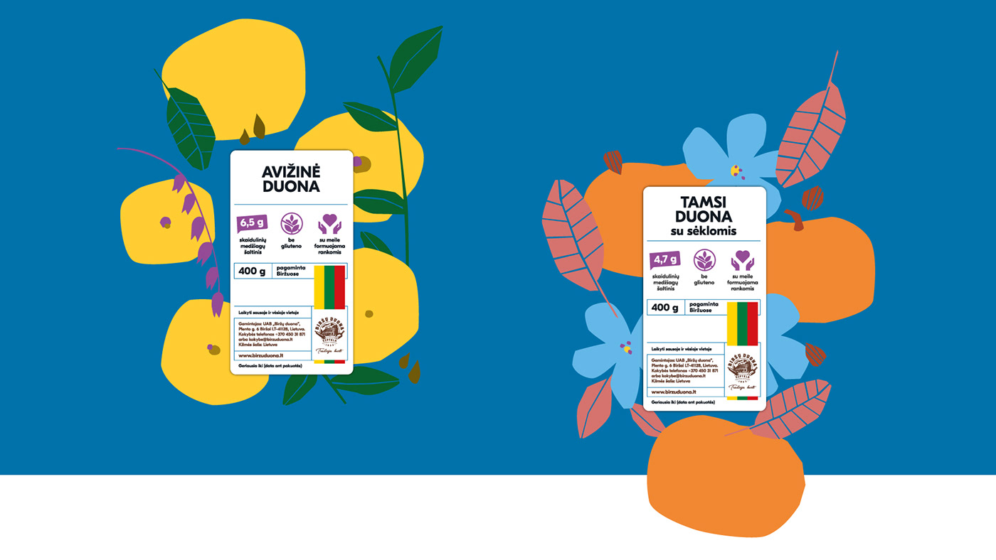
Clearly distinguishable on the market shelves are the combination of blue colour and bold artwork. A bit irregular illustrations are reminiscent of analog cutout technique. It was designed to refer to the hand-work used to form the bread as well as to communicate the added ingredients and to help with product differentiation.
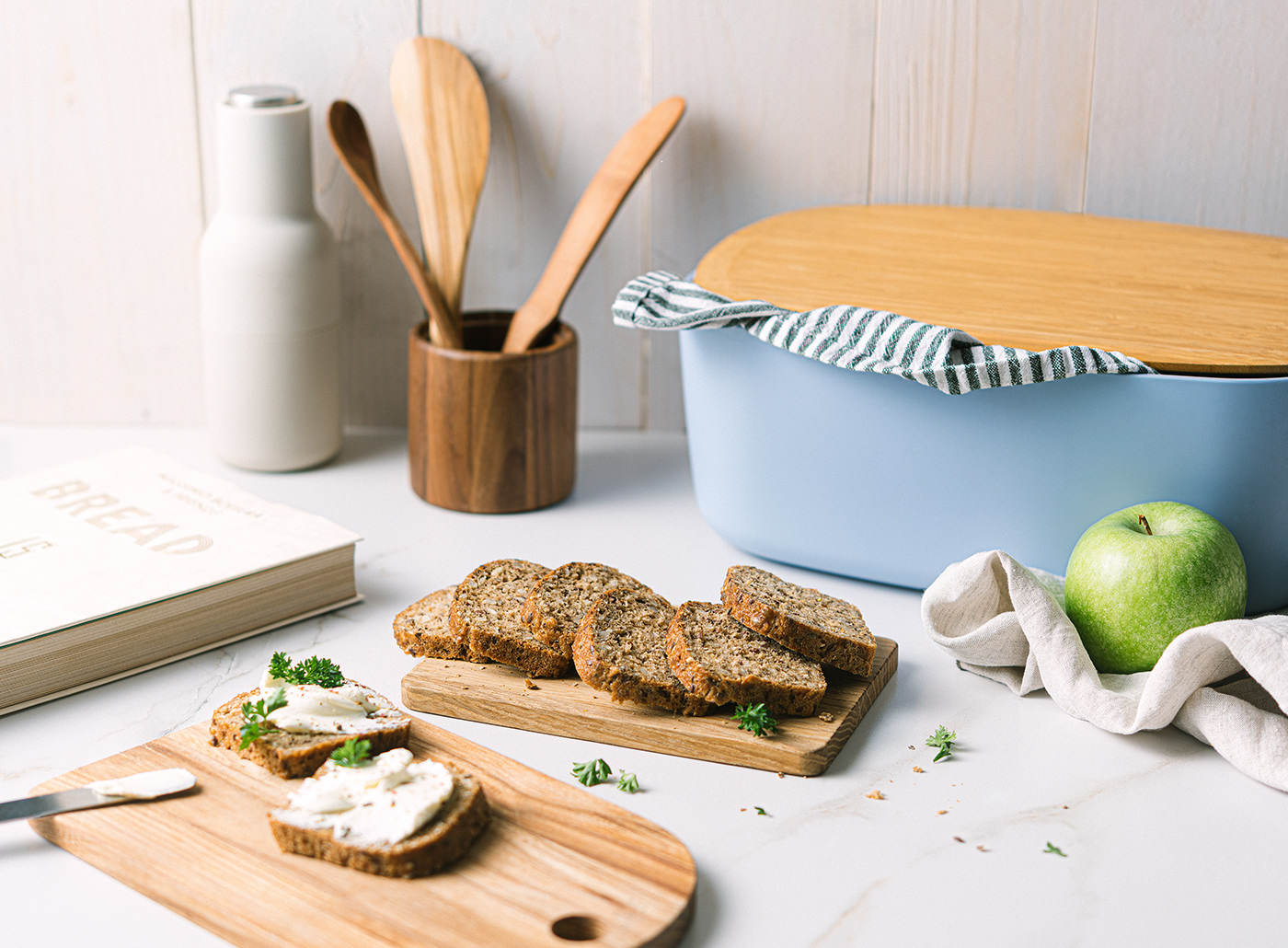
We’ve strived for clarity in information architecture, got crafty with the artwork, therefore created overall feeling of warmth and playfulness. We believe its what sets “Be Gliuteno“ bread apart the competitors.


Client: "Biržų Duona"
Photography: PACKSHOT (www.packshot.lt)
Year: 2019


