


CERASP | Brand Identity


Le CERASP, Centre d’expertise et de recherche appliquée en sciences pharmaceutiques est un pôle d’excellence en innovation pharmaceutique qui se caractérise par le foisonnement d’idées créatives.
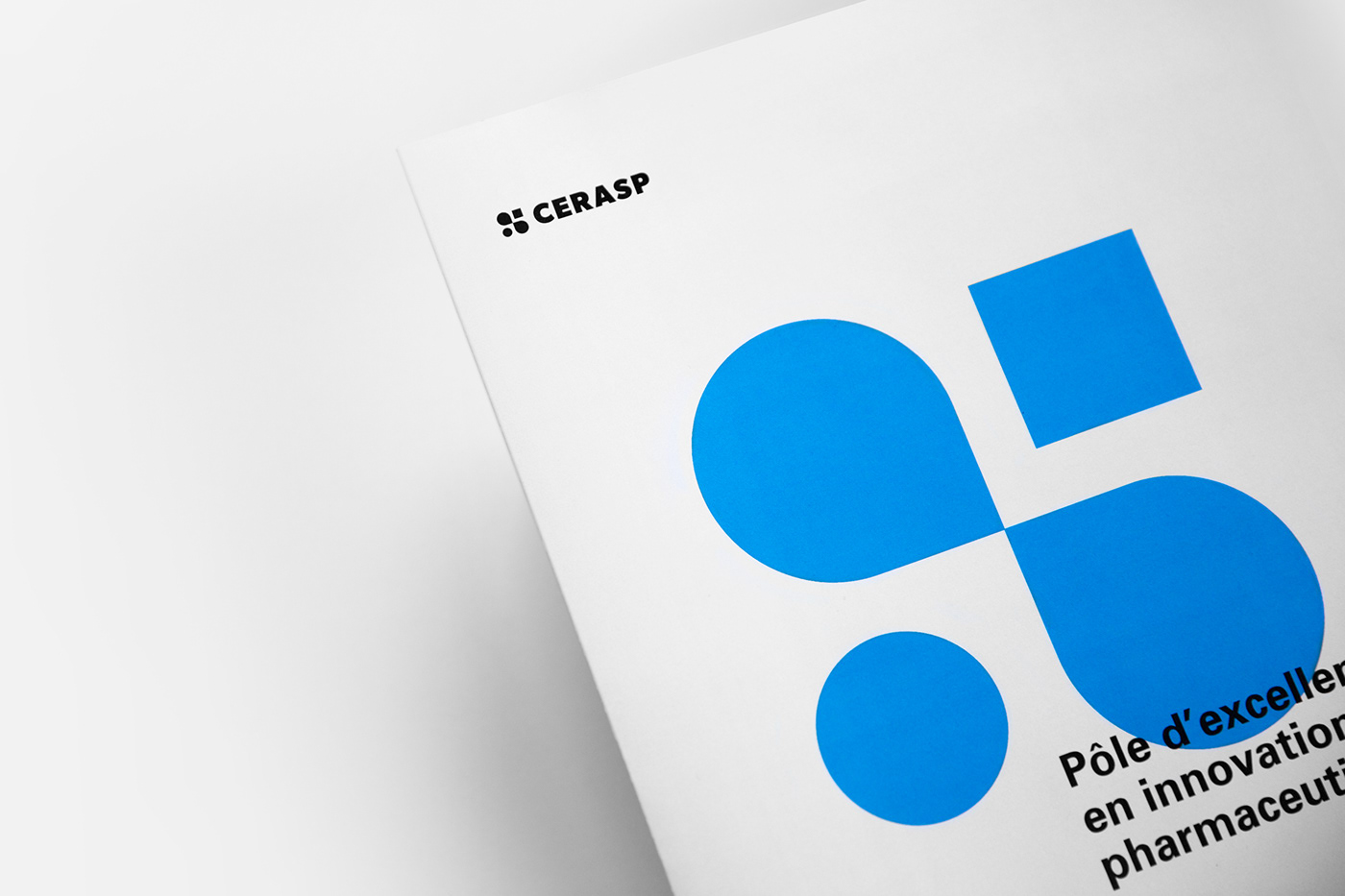
Le symbole du centre est composé de quatre éléments graphiques représentant l’échange, la collaboration, l’encadrement et la formation. Le signe de l’infini illustre bien l’effervescence scientifique perpétuelle qui occupe ce lieu unique au Québec, mais aussi la volonté de poursuivre ses idéaux par la formation continue. Placés dans un angle ascendant, le cercle et le carré tendent à montrer le partenariat entre les étudiants et les différents acteurs de l’industrie. La typographie, forte et intemporelle, a été choisie pour bâtir et faire durer la crédibilité du CERASP.
__________
The CERASP, a centre of excellence in pharmaceutical innovation, has as its mission to develop and support applied research, training and technology transfer related to the discovery, development and evaluation of innovative solutions in the pharmaceutical field.
The center symbol is composed of four graphic elements representing exchange, collaboration, guidance and training. The infinity symbol clearly illustrates the perpetual scientific effervescence that occupies its uniqueness in Quebec, but also the will to pursue its ideals through continuing education. Placed in an upward angle, the circle and the square signify the partnership between the students and the different actors in the industry. The strong and timeless typography has been chosen to build and sustain CERASP’s credibility, and by extension, Quebec’s future pharmaceutical industry workers.
The center symbol is composed of four graphic elements representing exchange, collaboration, guidance and training. The infinity symbol clearly illustrates the perpetual scientific effervescence that occupies its uniqueness in Quebec, but also the will to pursue its ideals through continuing education. Placed in an upward angle, the circle and the square signify the partnership between the students and the different actors in the industry. The strong and timeless typography has been chosen to build and sustain CERASP’s credibility, and by extension, Quebec’s future pharmaceutical industry workers.
Client : Le Cégep John-Abbott et le Cégep Gérald-Godin


