Context
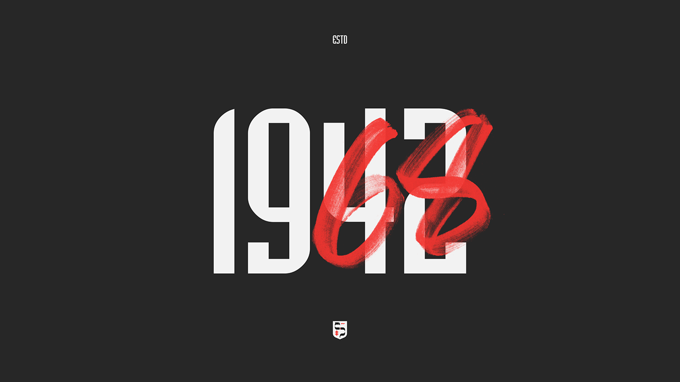
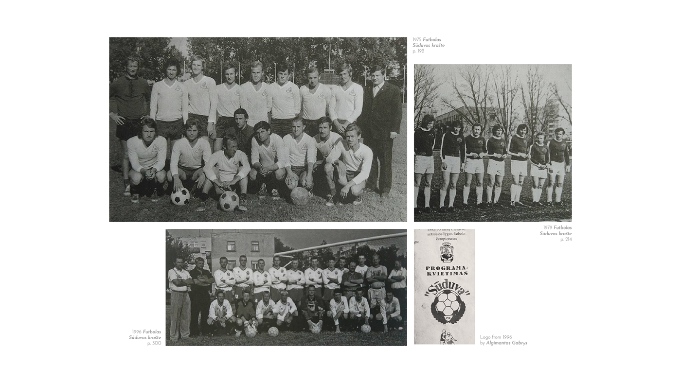
Sūduva is one of the oldest and still functioning clubs in Lithuania. It is not so easy to trace its history, as in Soviet times it often changed names with every new owner that supported it. There was a lack of consistency in team colors and the crest as well - probably the first logo appeared only in 1979. It is more or less agreed that officially this club has existed under the name of Sūduva since 1968.
This fan-made brand refresh explores creation of modernised visual identity inspired by traditional symbols of the city, development of stylish apparel and takes a holistic approach to refining club identity as a brand.
Lack of meaning
It's quite rare to have a football club with a long history that would still be functioning in Lithuania today. That's why current champions of Lithuania, who for the past three years were just a step away from UEFA Europa League group stage, is a pleasant exception.
However the current visual identity of the club does not look professional at all. The current logo, to put it nicely, is outdated. The use of hundreds of fonts and visual styles doesn't help to build a consistent brand image either. If the club wants to move forward not only on the pitch - it is in desperate need of a rebrand. In the next few paragraphs I'm borrowing and translating the words from the wonderfully written fan blog post about the identity of FK Sūduva and its problems, which inspired me to make this project in the first place.
''So even ignoring the design part the main problem is much bigger - current identity contains no meaningful symbols. Yes, the ball represents football in the broadest sense. It's so broad that it says - it's the football team. But it makes no mention of team values, where it’s from and what it can mean for its fans. The current logo doesn't symbolise history nor the region.
This is where we come to one of the essential problems. If we want the logo to symbolise or reflect something, first we need to know what we want to symbolise and reflect. What message we want to send to those who will face the club. And this is a fundamental issue of identity. What is Sūduva? What does it mean to the fans? What does it have to say to a bystander?
As the club itself is unlikely to answer these questions, we will have to continue to fantasise. From what I said earlier, it is obvious that the club crest must first speak to the residents of their city. It would be great if it had an important meaning to the people of the region as well. And even if we wanted to turn the image of this football club to the future (again, with specific goals, visions and missions), we would still need to base it on tradition. Because this is not a club founded ten years ago. Today FK Sūduva basically represents the whole history of Marijampolė football.'' And for the past few years it has been a tiny bit of hope for Lithuanian football fans of a brighter future.
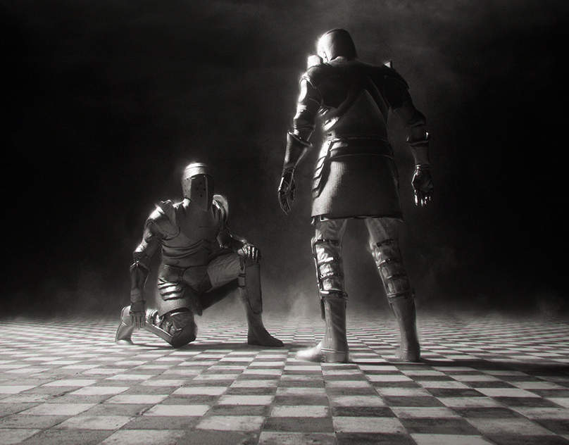
Myth of Saint George
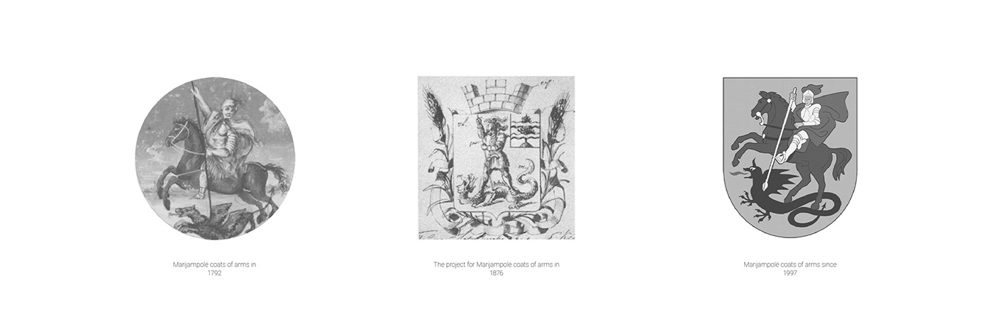
The thing is, it's not only me (annoying, picky designer) who points out the obvious. The club and the fans are aware of the flaws of the current crest as well. It has been discussed many times. Another fan page on facebook shared a great summarised post about the history of club crest and a lack of symbols (which in a way helped me a lot). It was a reason why in the new logo I wanted to represent the city, region and the country club is from. That's how we end up with the myth of Saint George (or Šv. Jurgis in Lithuanian).
The first arms for Marijampolė were granted on February 23, 1792 at the same time as the city rights, by Stanislaus Augustus, ruler of Lithuania and Poland. The arms show St. George, killing the dragon. St. George was one of the patron saints of Lithuania and thus chosen as a symbol for the new city. In the Middle Ages the dragon was commonly used to represent the Devil.
I didn’t want to make another heraldic crest featuring knight on a horse, there are more than plenty this kind of logos already. In the same SDV blog post which is mentioned above, one of the commentators joked that perhaps the club is already focusing on the city's coat of arms - however not on St. George, but on the dragon - all black, club name in red is sticking out like a dragon's tongue. I liked the idea of using the dragon as the main symbol. However, the dragon in the Marijampolė coat of arms symbolises evil / enemy, so if I wanted to keep at least a tiny bit of logic in this project - it needed to be a slayed dragon. At first this kind of imagery seemed kind of grotesque but suddenly it all made perfect sense...
Grotesque [ɡrə(ʊ)ˈtɛsk]
Since at least the 18th century (in French and German as well as English), grotesque (or grottoesque) has come to be used as a general adjective for the strange, mysterious, comic, magnificent, fantastic, hideous, ugly, incongruous, unpleasant, or disgusting, and thus is often used to describe w̶e̶i̶r̶d̶ ̶s̶h̶a̶p̶e̶s̶ ̶a̶n̶d̶ ̶d̶i̶s̶t̶o̶r̶t̶e̶d̶ ̶f̶o̶r̶m̶s̶ ̶s̶u̶c̶h̶ ̶a̶s̶ ̶H̶a̶l̶l̶o̶w̶e̶e̶n̶ ̶m̶a̶s̶k̶s̶ Lithuanian club football.