


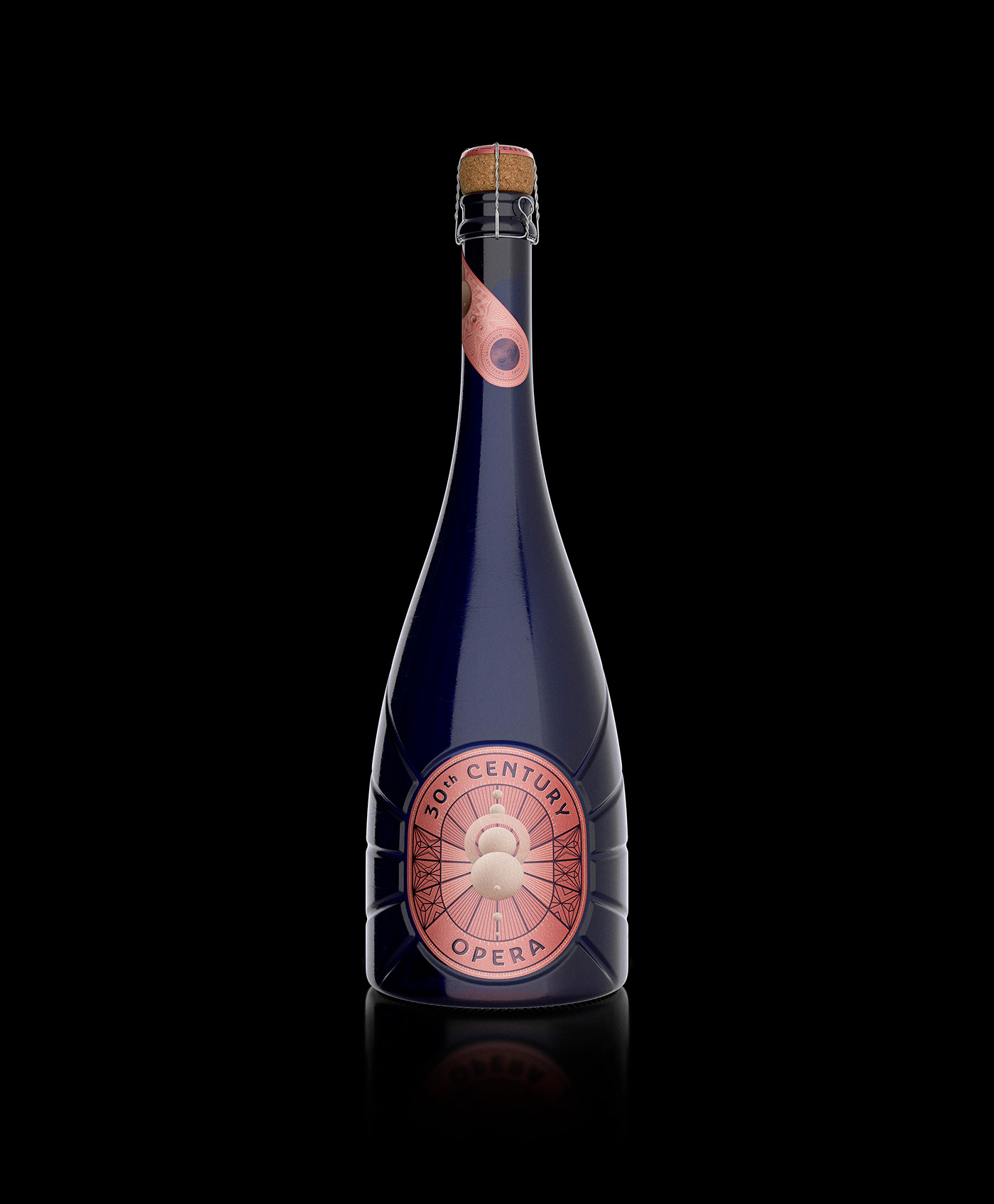
30th Century Opera wine reveals layers of flavors that evolve over the duration of the tasting experience. The flavor starts out as fruity and then becomes more floral and then finishes with oak-aged notes and textured with tannin.
An outstanding wine produced in Napa Valley, California, exhibiting flavors of black cherry, raspberry, as well as blueberry, with all of these tasting notes indicating that the grapes were perfectly ripe when picked.
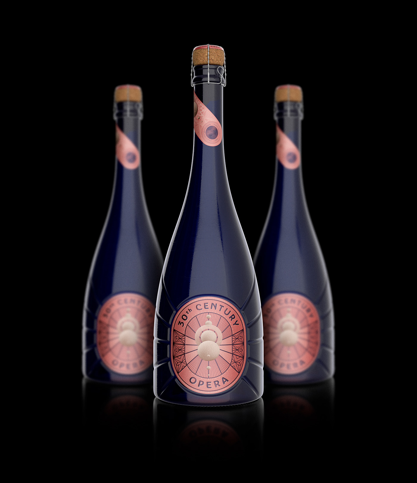
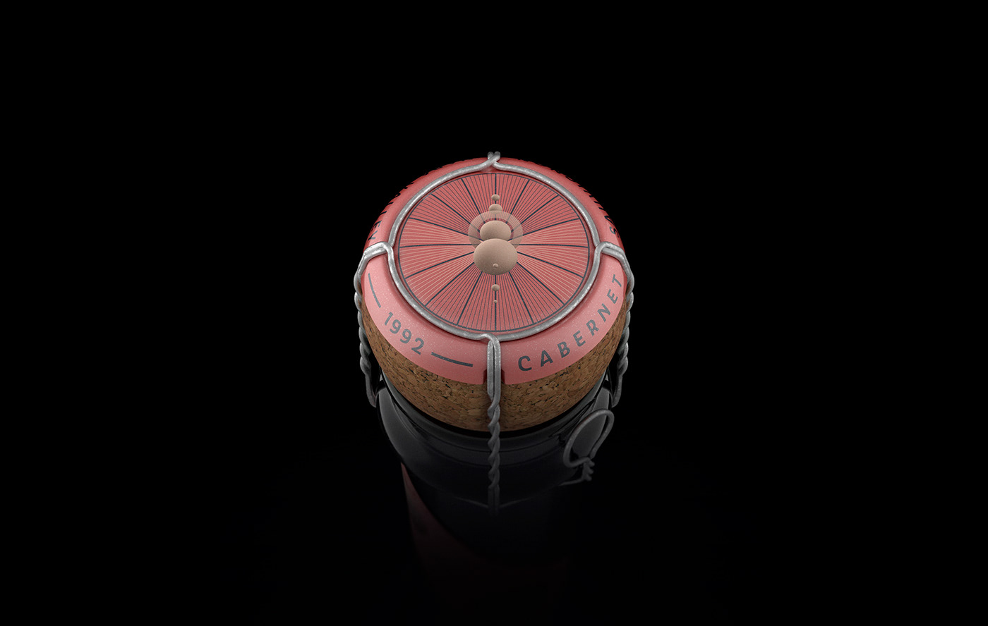
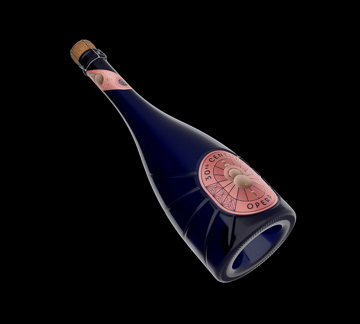
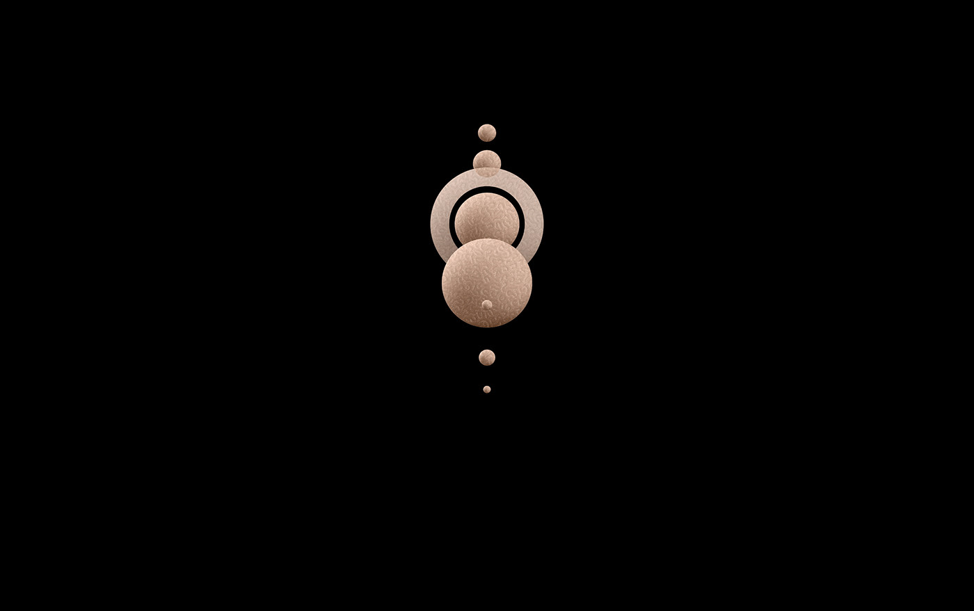
Created to be a product far beyond his time, the brand and package design takes us into the future were the operas transcend the imaginary limits, coming to places never visited before. A truly 30th Century Opera's experience.
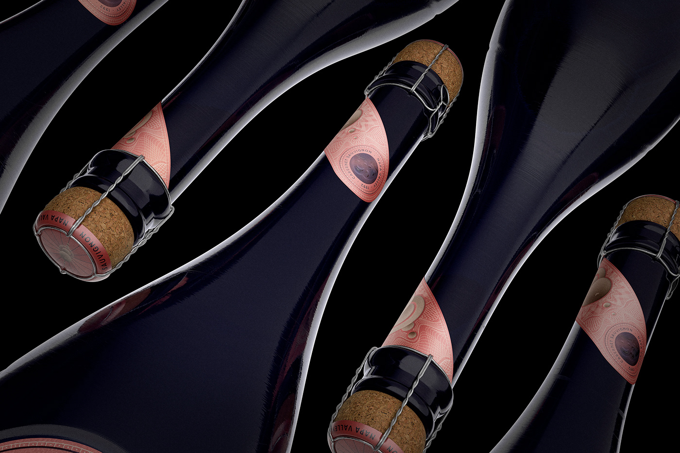
The label was designed in Adobe Illustrator and the bottle were designed and rendered in 3D on Foundry MODO. The scene was illuminated exclusively with HDRi light. Post-production on Adobe Photoshop.