A semester-long project where students are taught to design the identity and promotional items of a mock design festival.
Deliverables include a logo, an A2 poster, and a brochure that is no bigger than A5.
Logo

The concept behind the festival is to portray how design is made of different aspects coming together to form an idea, thus the logo features a head with the 3 primary shapes that make up the basis of all designs.
The tetradic palette presents a variety of colours that symbolises the dynamism of the festival well, and the spirit of vibrancy as well as diversity is connoted through this bright, saturated colour scheme. Balance is achieved with the inclusion of both warm and cool colours.
Poster

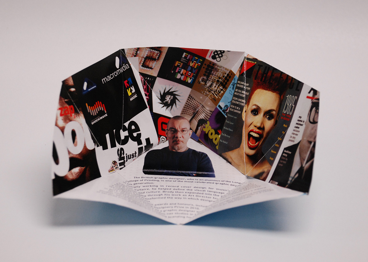
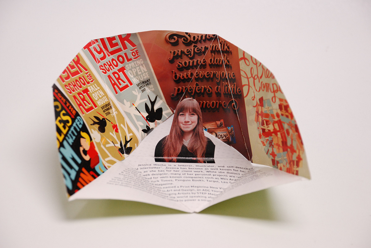
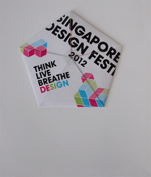
Brochure

We were tasked to design a brochure that fits to an A5 when closed and to experiment with folds.
Aiming to create something different from the usual brochures, I designed a pentagon-shaped brochure with a pop-up designer profile. Each triangular compartment houses a featured designer — Chris Lee, Jessica Hische, Kelli Anderson, Neville Brody, and Siang Ching. The brochure is 336mm by 320mm when fully opened.
Unfolding in action.