Visual Identity
K. friedrich design
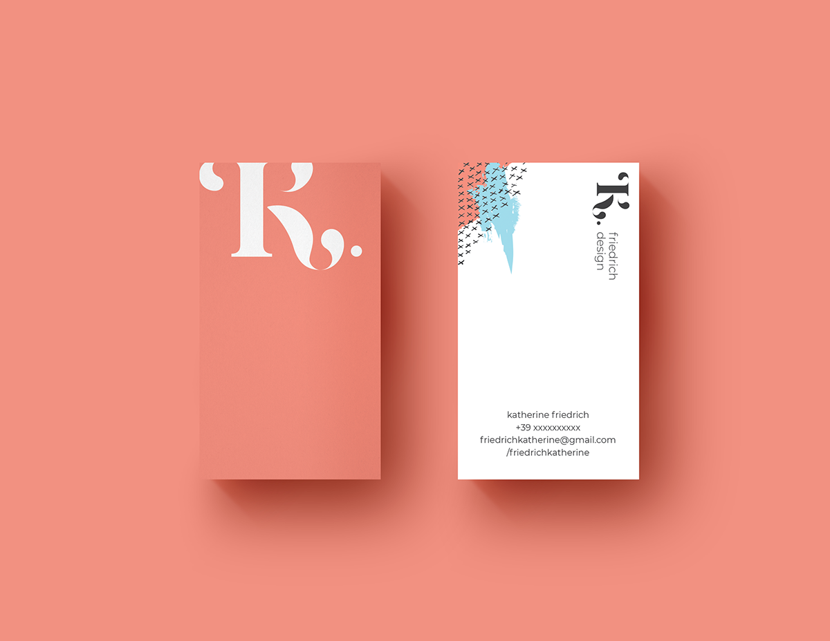
Visual identity for my work as a designer. It has always been very difficult for me to represent myself graphically. So when I decided to make my personal brand I wanted the initial letter of my name to be the highlight.
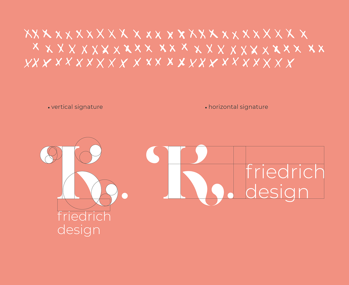
Thus we have the junction of the letter K with my last name, Friedrich, forming the logo. The letter K can also be used as an icon and is easily applied and recognized when viewed.
-
The design should always seek the best result for each project. To do this, we often have to look at opposing and contrasting possibilities. This is why here the concept of the project is based on the contrast of the elements. The minimalism of the logo contrasts with the bright and cheerful colors of the applications. Contrast also appears in the mix of geometric shapes and free and disordered textures. This way of looking at things is also a reflection of my personality.
Client / Personal Brand
Project Type / Visual Identity
Place / Porto Alegre, Brazil
Year / 2018