We are proud to announce the release of Frambuesa, a new sans serif type family designed by Lu Ronderos for Sudtipos.
—
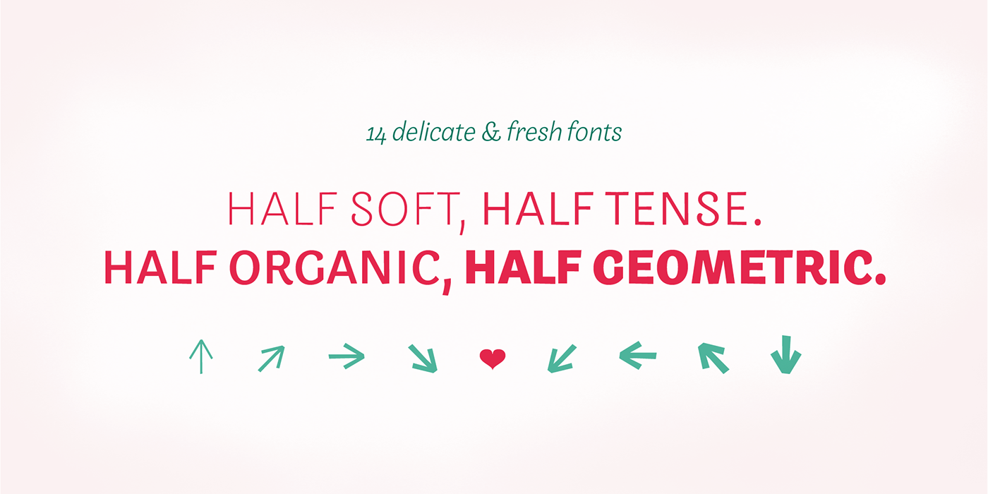
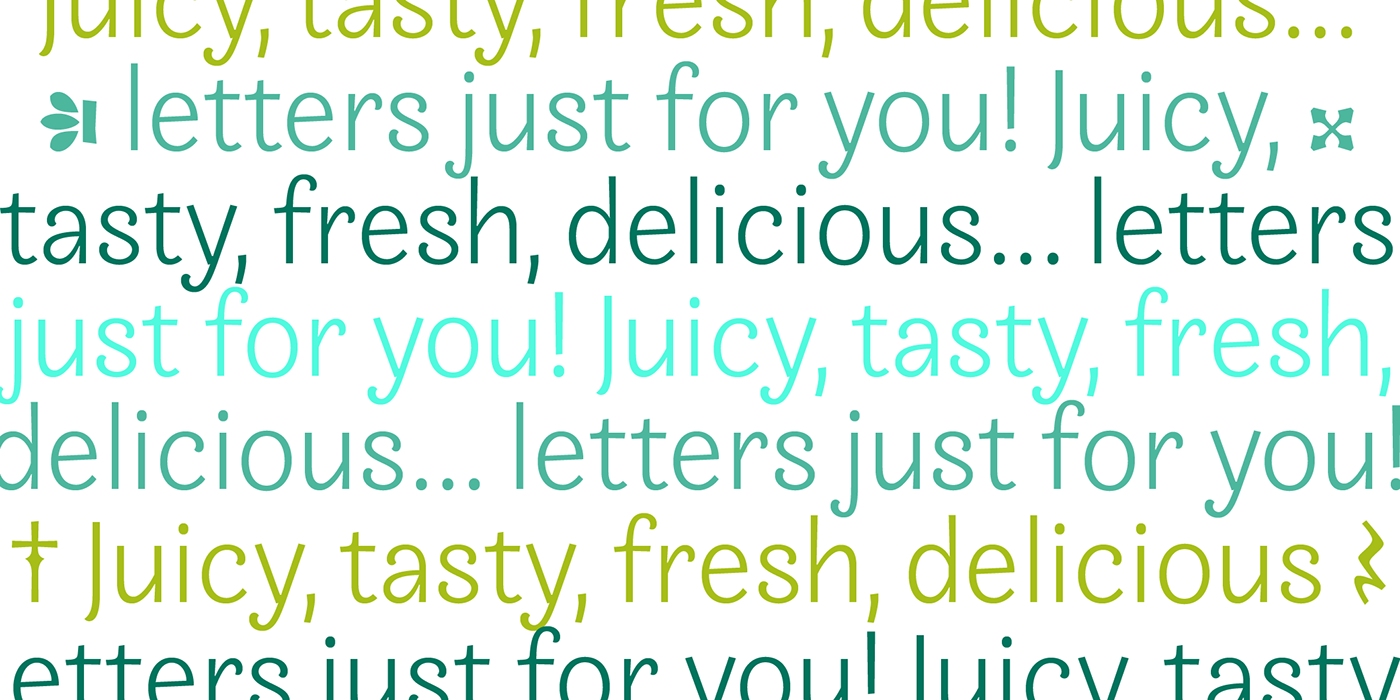
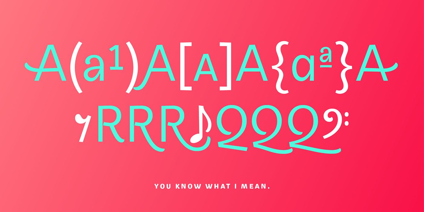
Frambuesa is a half humanist-half geometric sans serif typeface that merges decorative curves with straight lines looking for a perfect balance. As pairs of opposites define harmony in nature, organic versus geometric are the foundations to this new font. The result is a solid, somewhat romantic, nostalgic type program based on the rhythm of a natural melody.
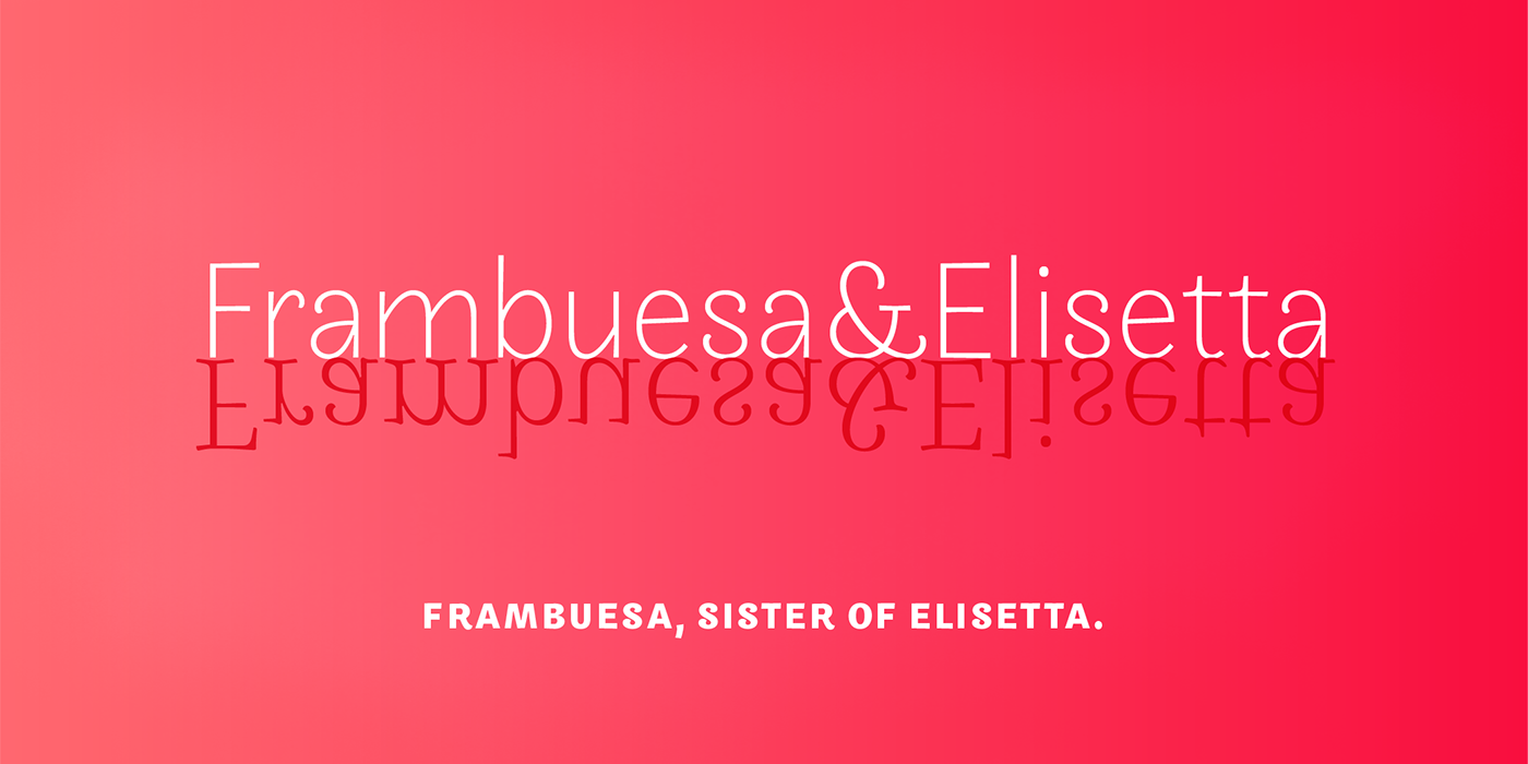
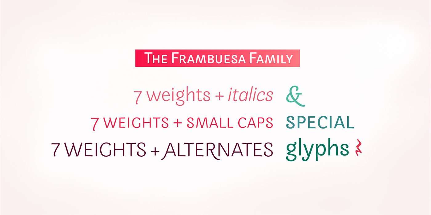
Frambuesa can’t hide its family genetics. Structure and proportions come from Elisetta, her older sister. Regular and italic variables feel comfortable in many contexts and are useful for both texts and large title compositions. All seven weights are carefully adjusted to achieve smooth transitions between one and the other with high levels of readability in complex applications.


