


01
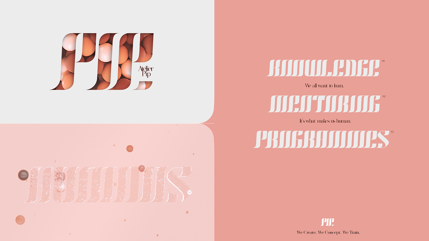
Brand identity for Atelier Pip.
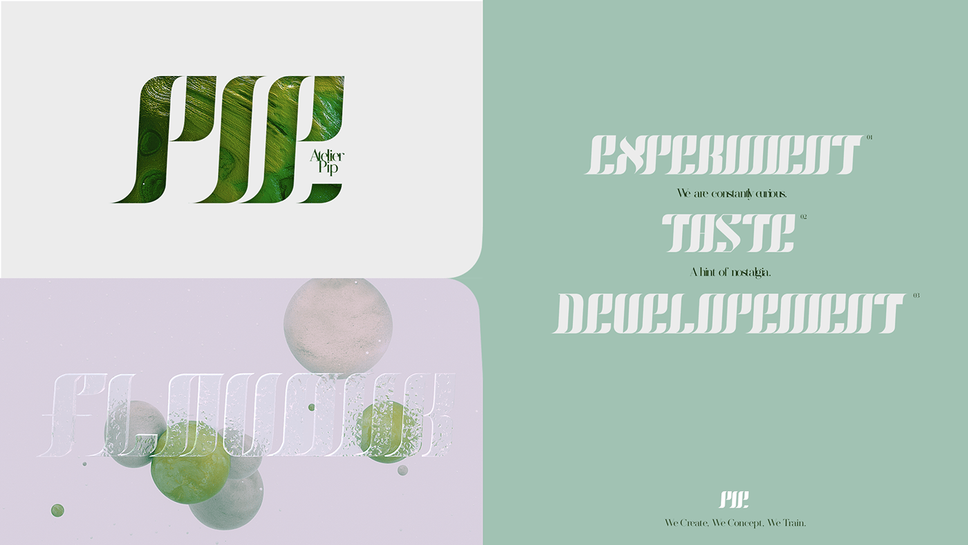
logo + bespoke font and brand world.
20something x Atelier Pip

02
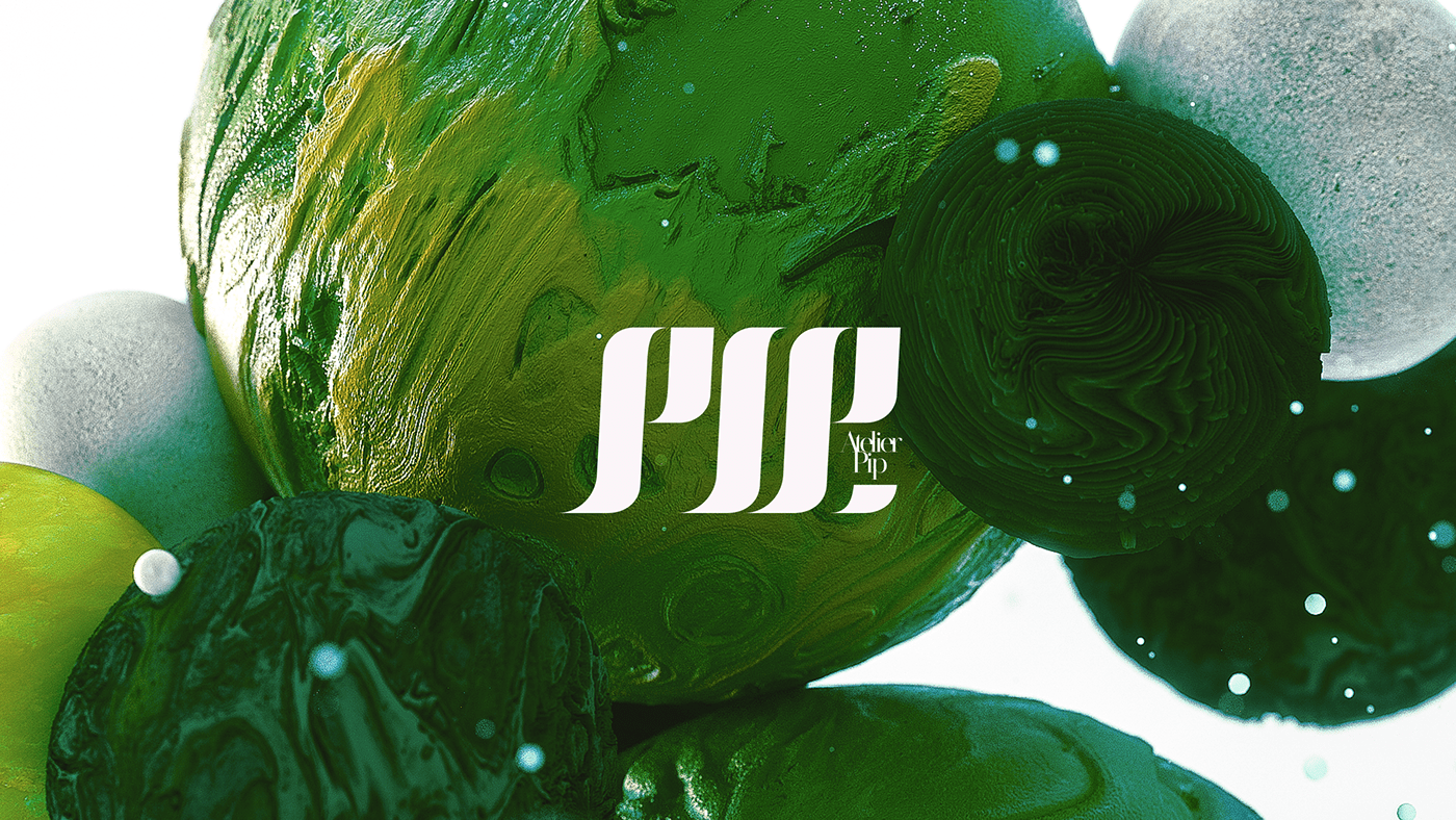
We started with the logo, and developed a hand-crafted bespoke font, inspired by the liquid pouring from a bottle.
20something x Atelier Pip
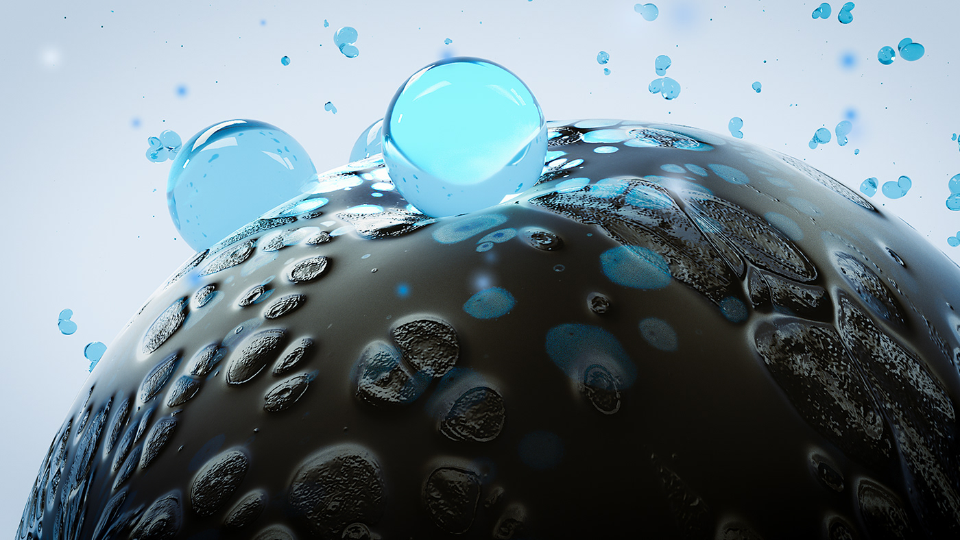
03
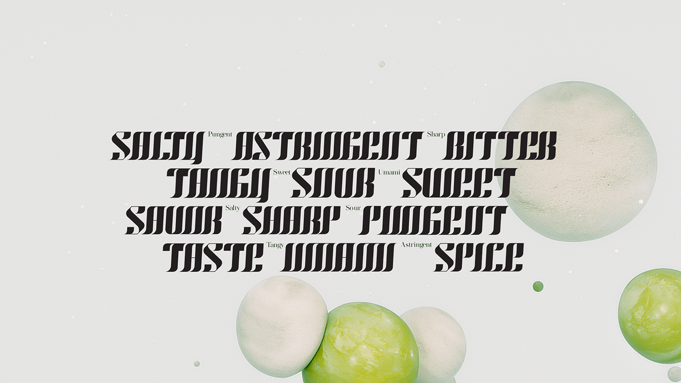
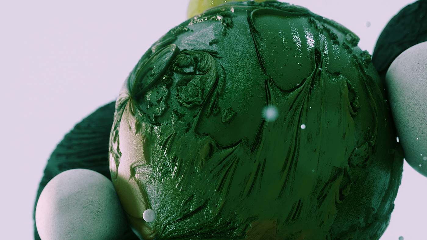
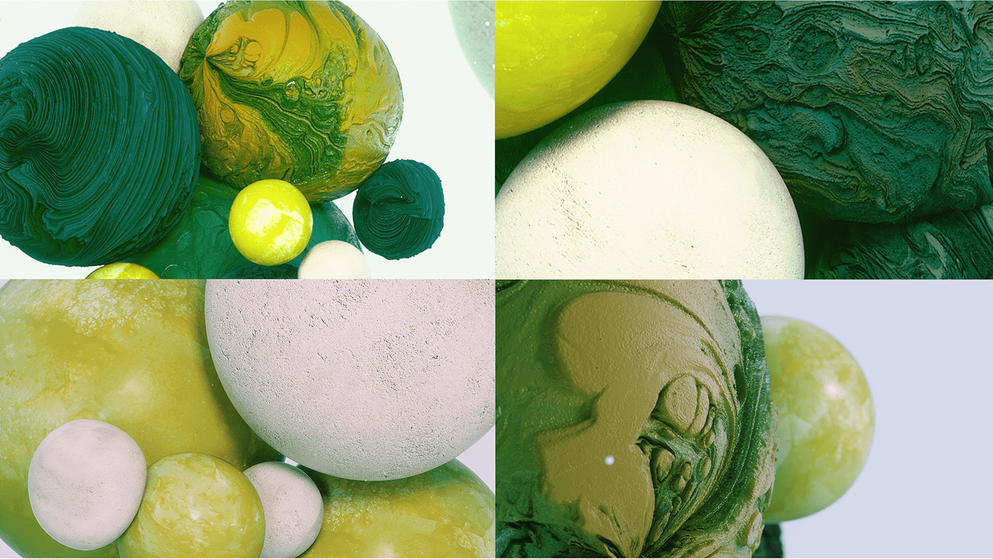
Three distinct worlds were then developed around each core pillar of the company: create, concept, train. The ambition was to create a visceral response, based on the phenomenon of synaesthesia, and to create a visual representation of taste and textural sensations.
Three distinct worlds were then developed around each core pillar of the company: create, concept, train. The ambition was to create a visceral response, based on the phenomenon of synaesthesia, and to create a visual representation of taste and textural sensations.
20something x Atelier Pip
04
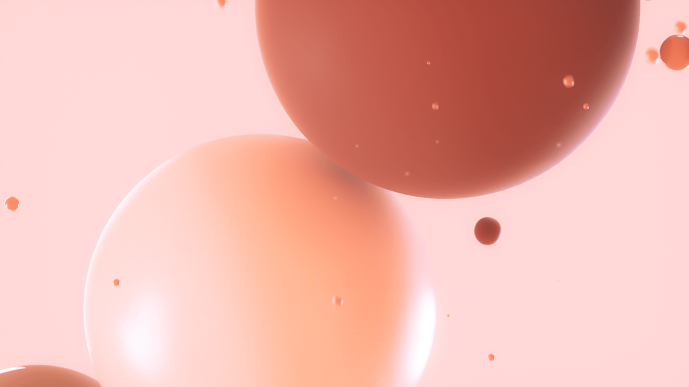
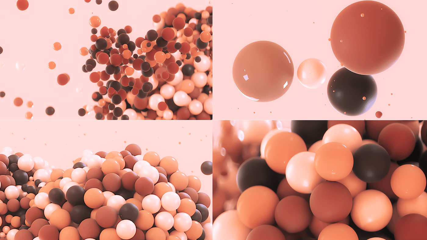
Each area would then be reflected by the core of the discipline: the ‘create’ world inspired by nature, ‘concept’ influenced by science and ‘train’ being representation of people, specifically referencing the broadest spectrum of human skin tones.
20something x Atelier Pip
Each area would then be reflected by the core of the discipline: the ‘create’ world inspired by nature, ‘concept’ influenced by science and ‘train’ being representation of people, specifically referencing the broadest spectrum of human skin tones.
20something x Atelier Pip


05
Credits //
Client: Atelier-Pip
Creative Lead: Will Thacker
Art direction & Design: Samuel Guillotel


