The logo has been designed to appeal to modern, metropolitan men and woman. The lowercase text and absence of an icon reflect our brand strategy of being honest and direct with our customers. The design is intentionally different from competitors. The font is soft and strict at the same time what makes it easy to read and be closer to consumer.


Logo animation is a good way too show some cool things in identity. ONES has three variants for presentation. Each of them can be promo for video or just gif for social networks.


Coming up with a distinct, identifiable logo is one thing. Ensuring that it remains optimized in different environments is another. This part of ONES brand book includes all approved versions of the logo and how it will be used in different platforms, from placement to acceptable alterations.
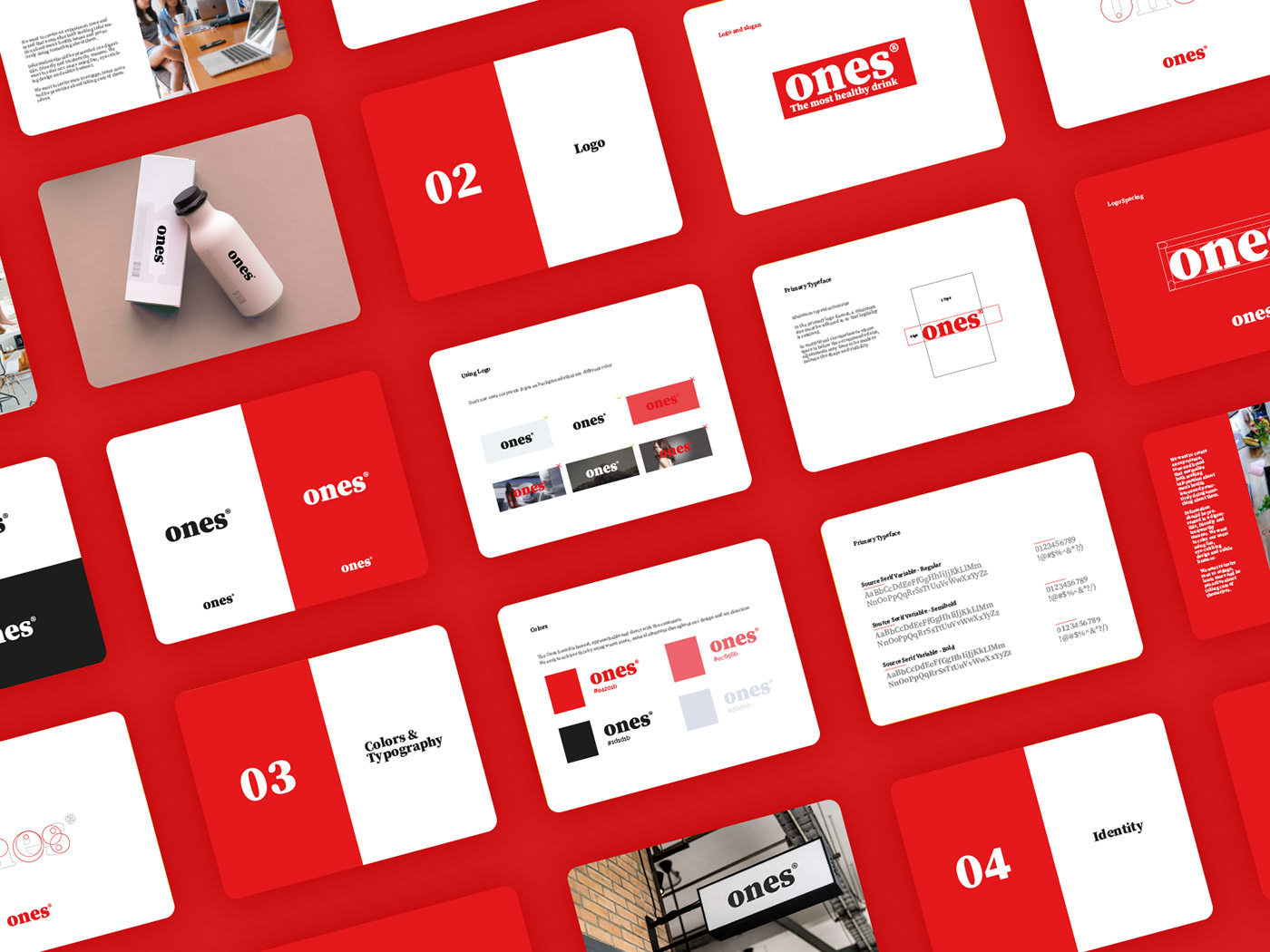
Fonts can be the main element of the brand design. Sometimes it is everything that clients need. For ONES I made something bright and minimalistic, that will be fresh at any time.

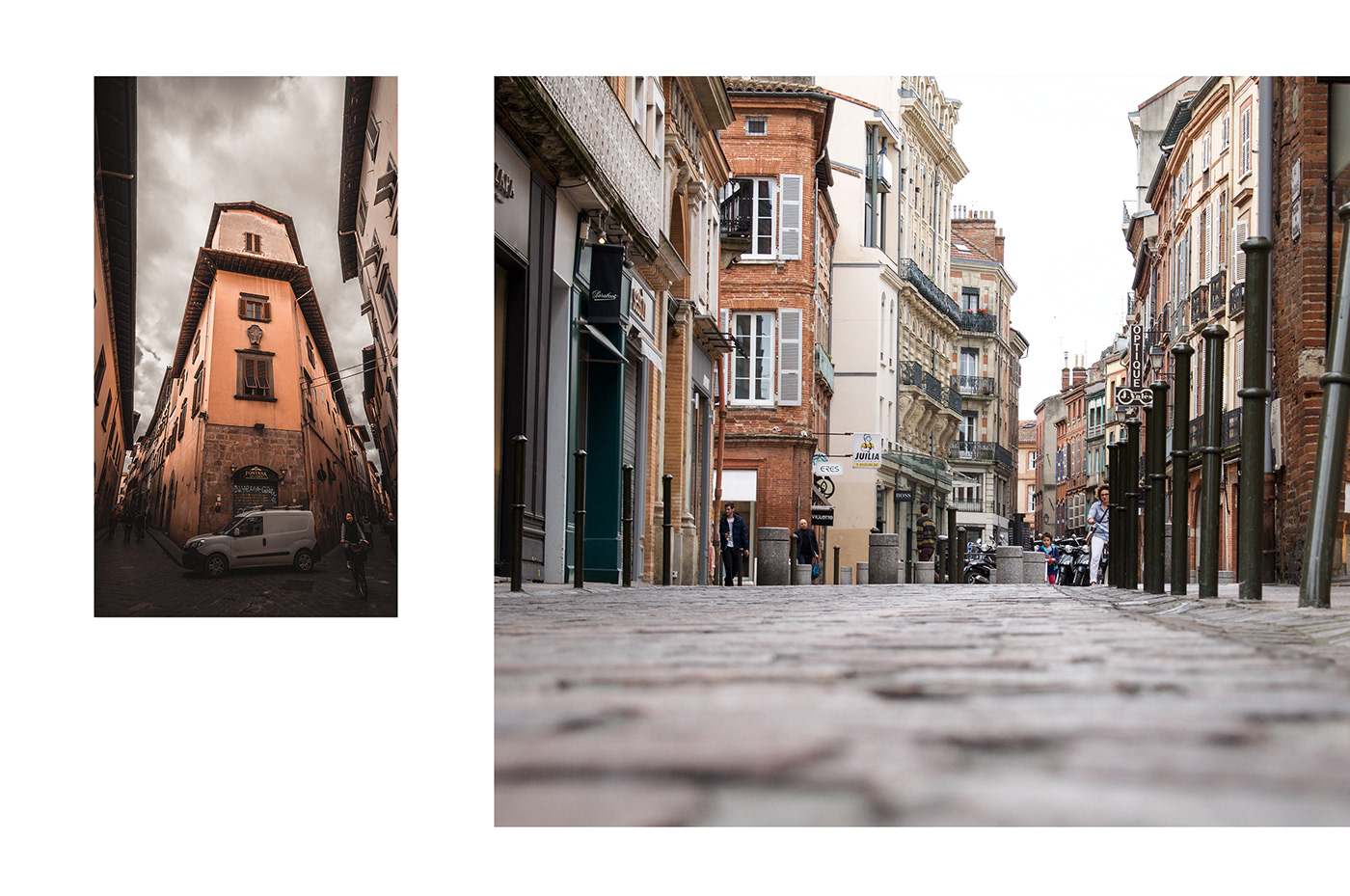
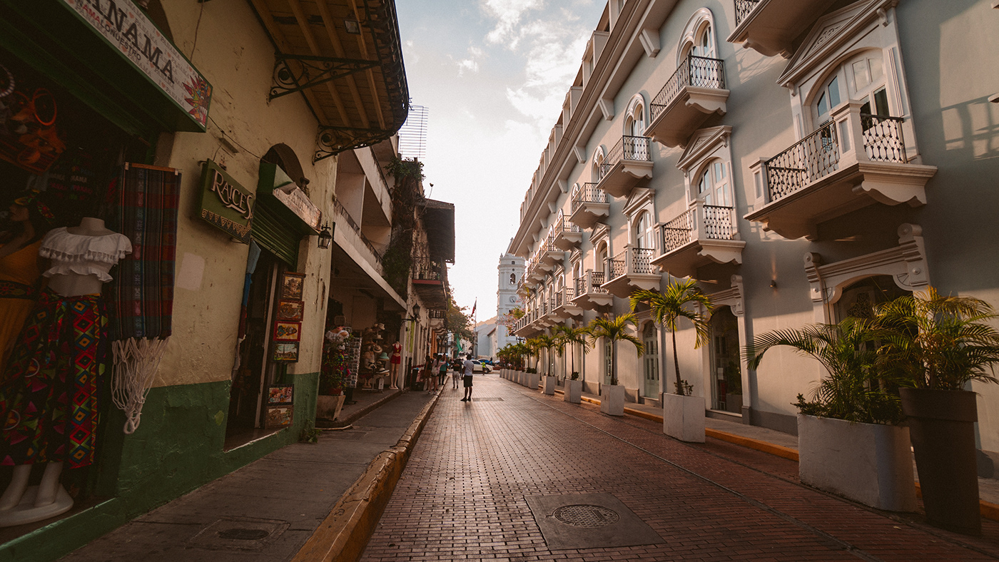
Do you ever notice that color of the architecture is really different? So city architecture is the one thing that can give a lot of inspiration. Here a few picture that gave me a needed mood.
ONES is a brand of natural drinks that provides people ages 16-50, who care about their health. The product is positioned as the best among healthy drinks. The essence of the company is that they position their product as “clean”. Based on this, we made a simple and bright design of packaging without rainbow colors


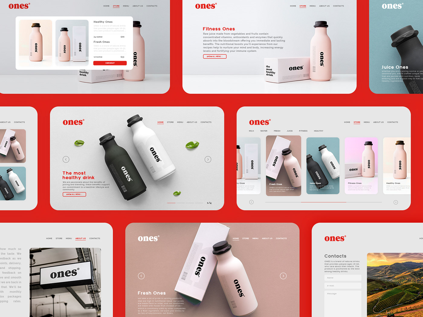
Here is the website for ONES. The main page immediately demonstrates the packaging of the product and nothing more, as in the composition of the drinks. The headers and active buttons are colored in red as the key color of the logo. A light gray texture, in harmony with the pairing concept of packaging, is taken as the main background. Nobody wants to read a lot of text information. Consumer wants to know only about product thats why long story should be short. I tried to use a minimum of text, so a maximum of space was used for the graphic part.

Open to new projects, clients and collabs
Design by Golodyaev Sergey.
© All rights reserved.
© All rights reserved.
