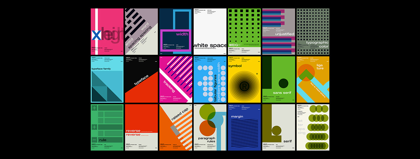
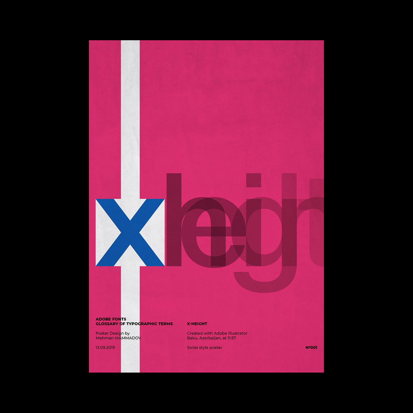
x-height
Traditionally, x-height is the height of the lowercase letter x. It is also the height of the body of lowercase letters in a font, excluding the ascenders and descenders. Some lower-case letters that do not have ascenders or descenders still extend a little bit above or below the x-height as part of their design. The x-height can vary greatly from typeface to typeface at the same point size.
Traditionally, x-height is the height of the lowercase letter x. It is also the height of the body of lowercase letters in a font, excluding the ascenders and descenders. Some lower-case letters that do not have ascenders or descenders still extend a little bit above or below the x-height as part of their design. The x-height can vary greatly from typeface to typeface at the same point size.
word spacing
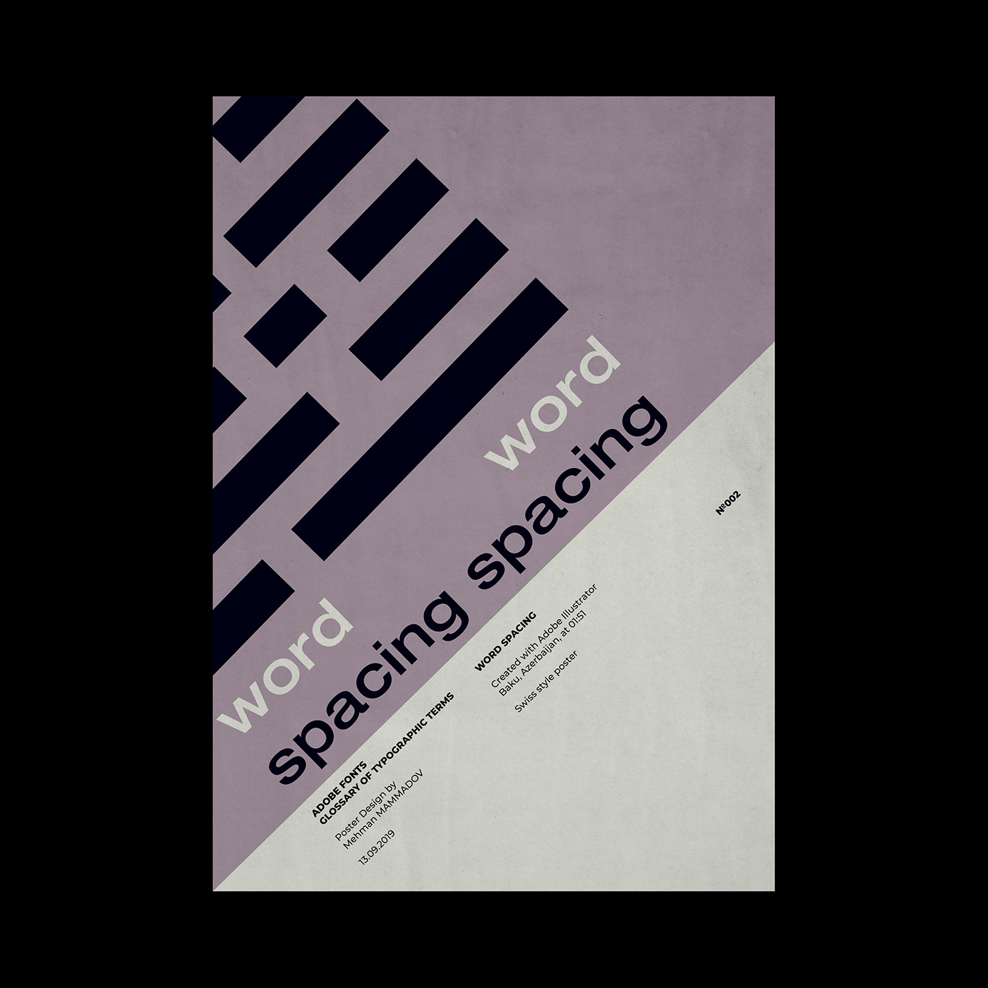
Adjusting the average distance between words to improve legibility or to fit a block of text into a given amount of space.
Adjusting the average distance between words to improve legibility or to fit a block of text into a given amount of space.
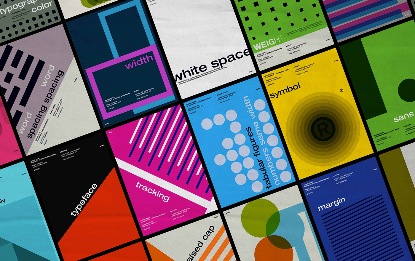
width
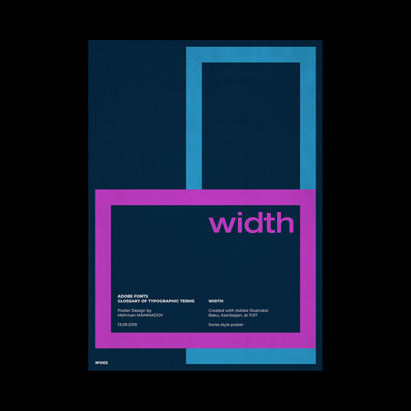
One of the possible variations of a typeface within a type family, such as condensed or extended.
One of the possible variations of a typeface within a type family, such as condensed or extended.
white space
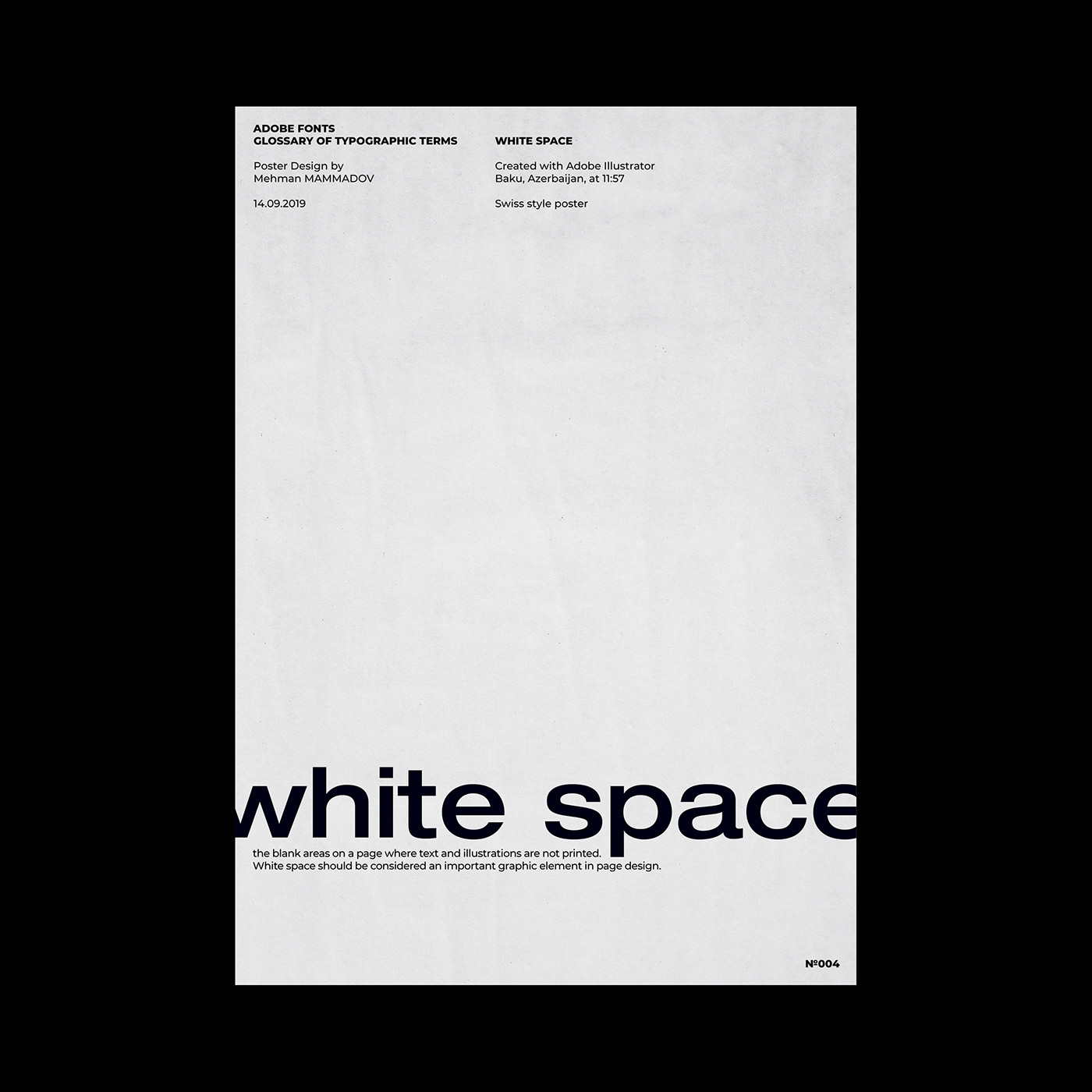
The blank areas on a page where text and illustrations are not printed. White space should be considered an important graphic element in page design.
The blank areas on a page where text and illustrations are not printed. White space should be considered an important graphic element in page design.
weight
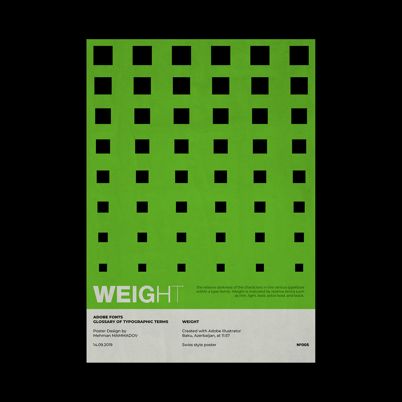
The relative darkness of the characters in the various typefaces within a type family. Weight is indicated by relative terms such as thin, light, bold, extra-bold, and black.
The relative darkness of the characters in the various typefaces within a type family. Weight is indicated by relative terms such as thin, light, bold, extra-bold, and black.
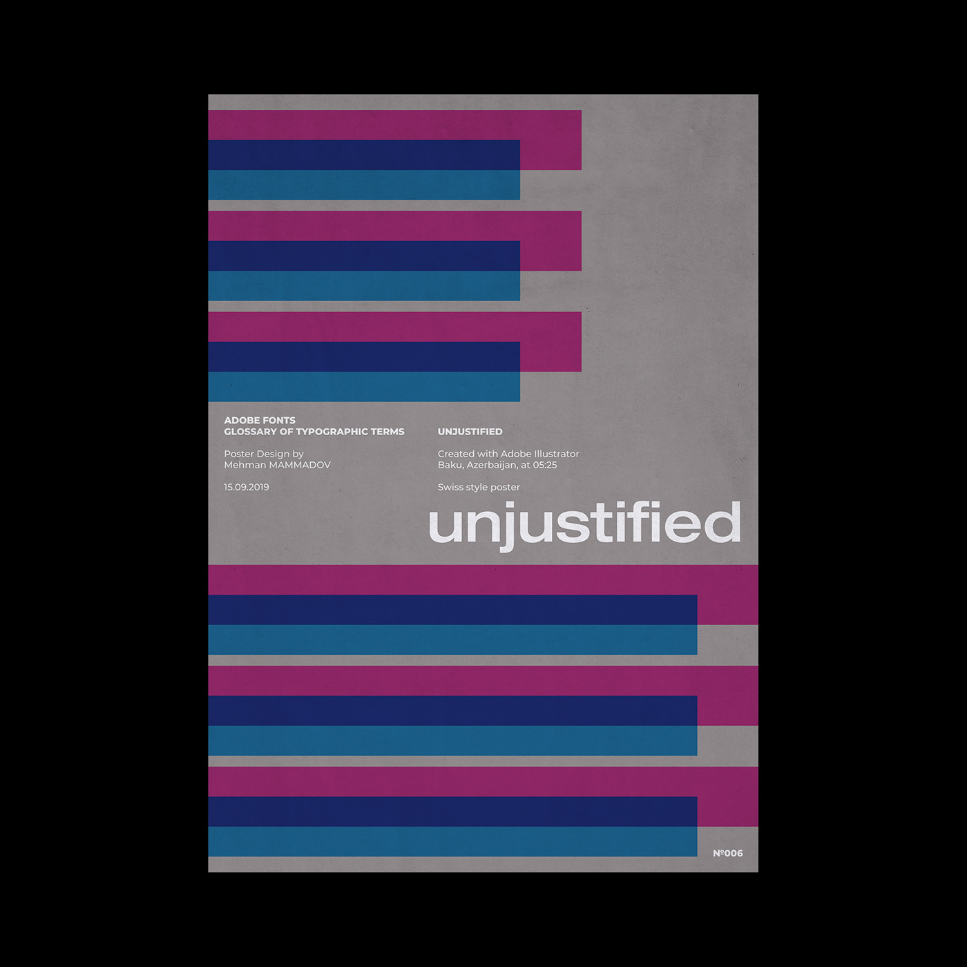
unjustified
Depending on alignment, this term refers to text which is set flush left, flush right, or centered.
Depending on alignment, this term refers to text which is set flush left, flush right, or centered.

typographic color
The apparent blackness of a block of text. Color is a function of the relative thickness of the strokes that make up the characters in a font, as well as the width, point size, and leading used for setting the text block.
The apparent blackness of a block of text. Color is a function of the relative thickness of the strokes that make up the characters in a font, as well as the width, point size, and leading used for setting the text block.
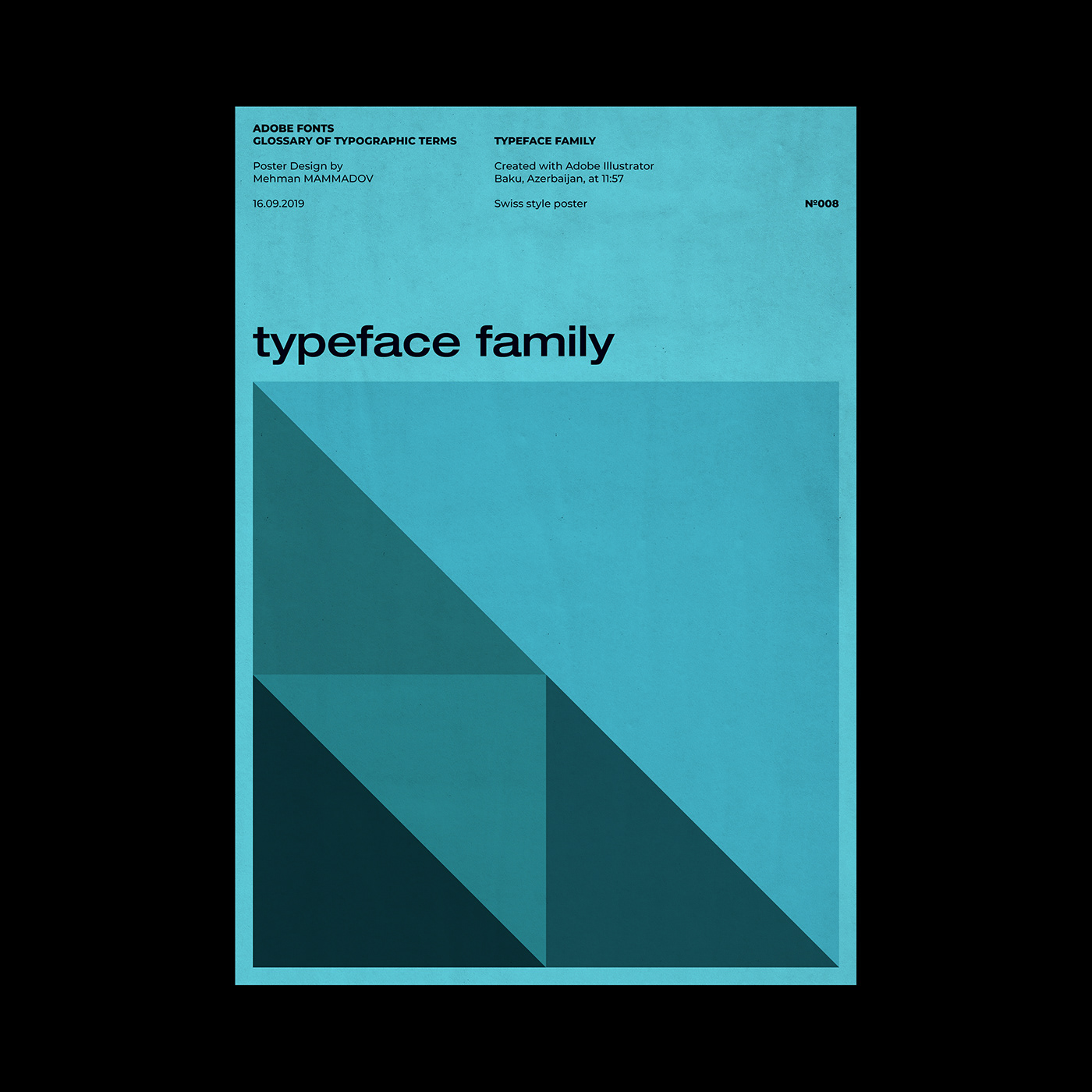
typeface family
Also known as family. The collection of faces that were designed together and intended to be used together. For example, the Garamond font family consists of roman and italic styles, as well as regular, semibold, and bold weights. Each of the style and weight combinations is called a face.
Also known as family. The collection of faces that were designed together and intended to be used together. For example, the Garamond font family consists of roman and italic styles, as well as regular, semibold, and bold weights. Each of the style and weight combinations is called a face.
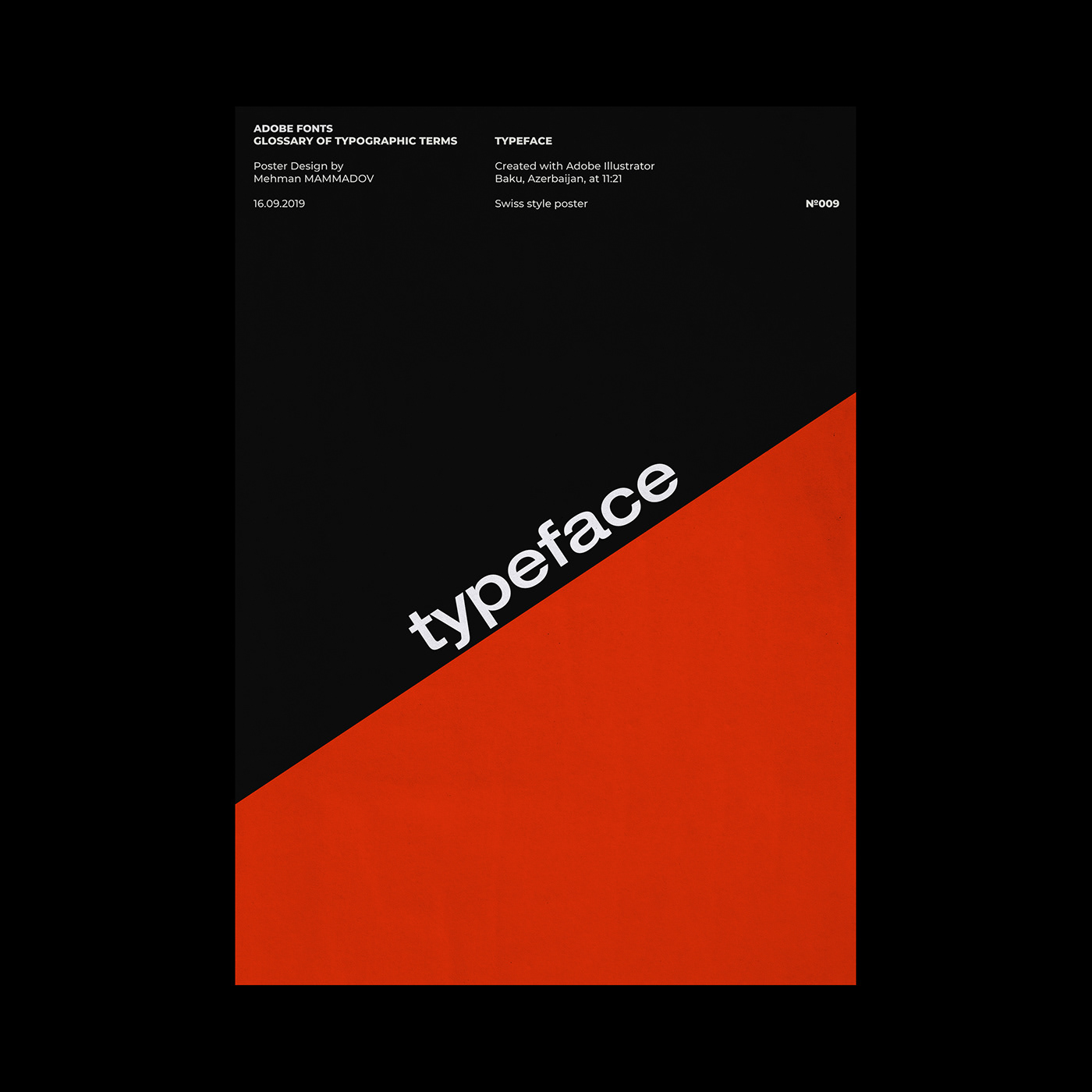
typeface
The letters, numbers, and symbols that make up a design of type. A typeface is often part of a type family of coordinated designs. The individual typefaces are named after the family and are also specified with a designation, such as italic, bold or condensed.
The letters, numbers, and symbols that make up a design of type. A typeface is often part of a type family of coordinated designs. The individual typefaces are named after the family and are also specified with a designation, such as italic, bold or condensed.
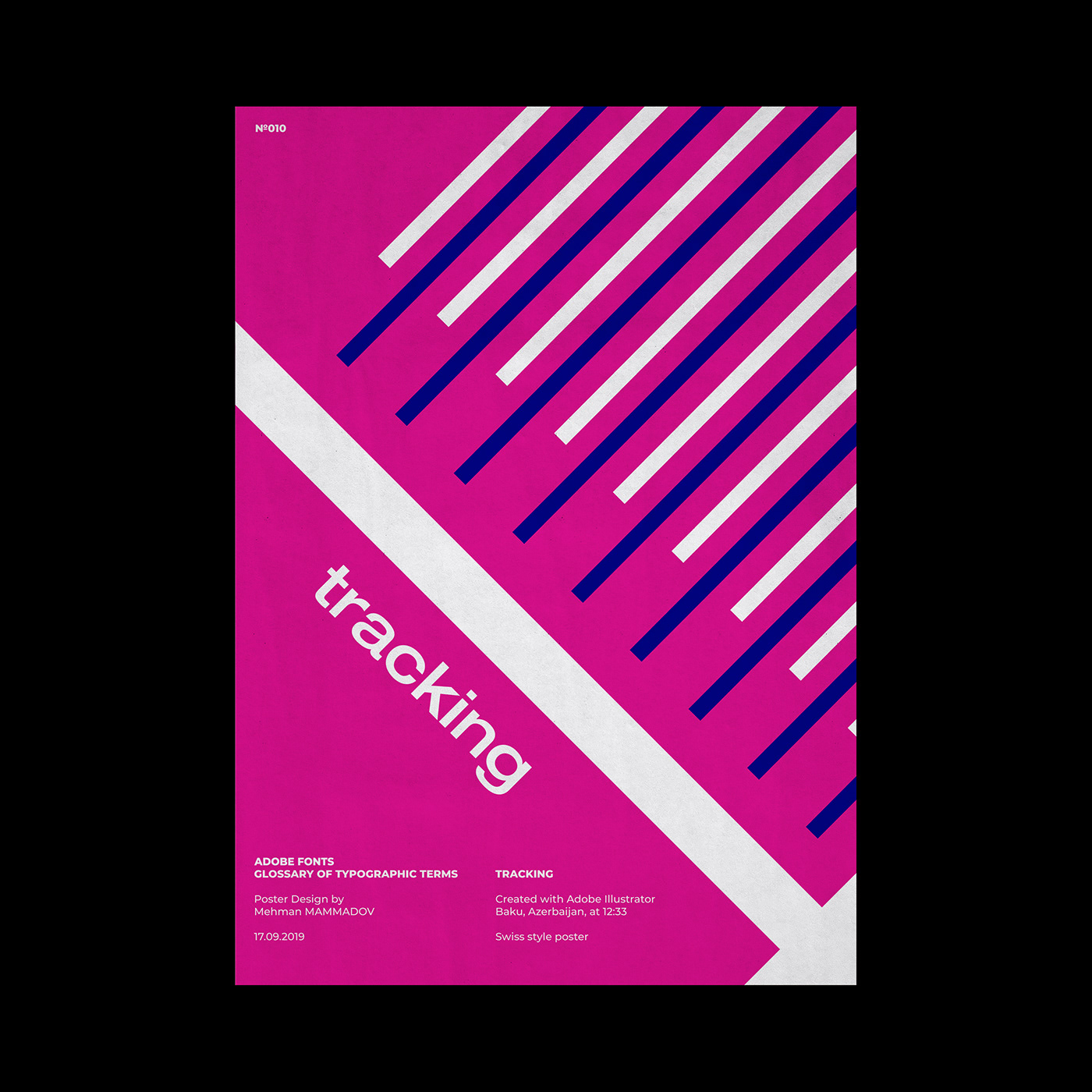
tracking
The average space between characters in a block of text. Sometimes also referred to as letterspacing.
The average space between characters in a block of text. Sometimes also referred to as letterspacing.
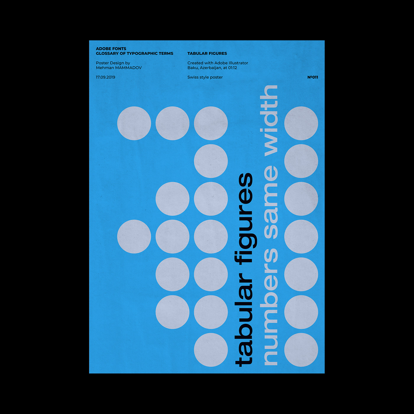
tabular figures
Numerals that all have the same width. This makes it easier to set tabular matter.
Numerals that all have the same width. This makes it easier to set tabular matter.

symbol
A category of type in which the characters are special symbols rather than alphanumeric characters.
A category of type in which the characters are special symbols rather than alphanumeric characters.
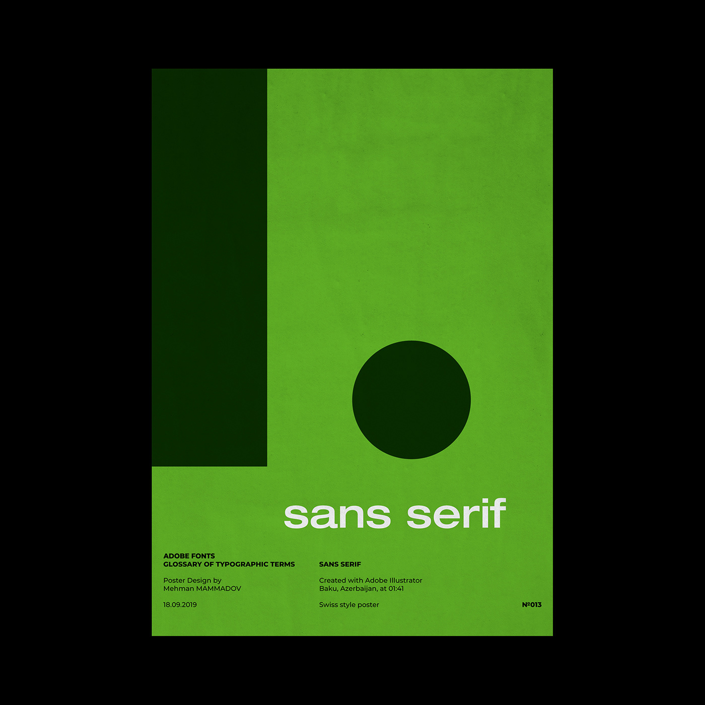
sans serif
A type face that does not have serifs. Generally a low-contrast design. Sans serif faces lend a clean, simple appearance to documents.
A type face that does not have serifs. Generally a low-contrast design. Sans serif faces lend a clean, simple appearance to documents.
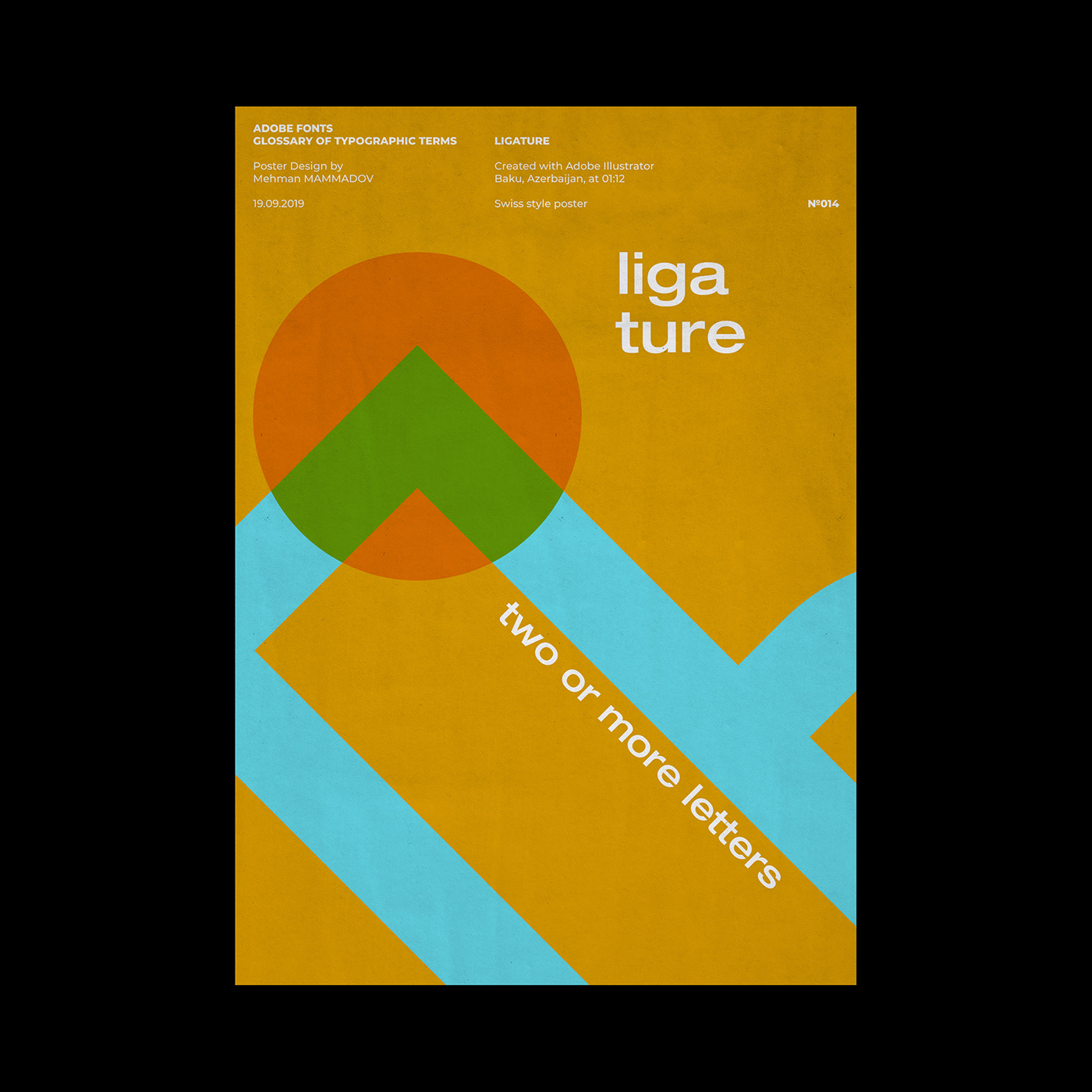
ligature
Two or more letters tied together into a single letter. In some typefaces, character combinations such as fi and fl overlap, resulting in an unsightly shape. The fi and fl ligatures were designed to improve the appearance of these characters. Letter combinations such as ff, ffl and ffi are available in all Adobe OpenType Pro fonts and selected Adobe OpenType Standard fonts.
Two or more letters tied together into a single letter. In some typefaces, character combinations such as fi and fl overlap, resulting in an unsightly shape. The fi and fl ligatures were designed to improve the appearance of these characters. Letter combinations such as ff, ffl and ffi are available in all Adobe OpenType Pro fonts and selected Adobe OpenType Standard fonts.
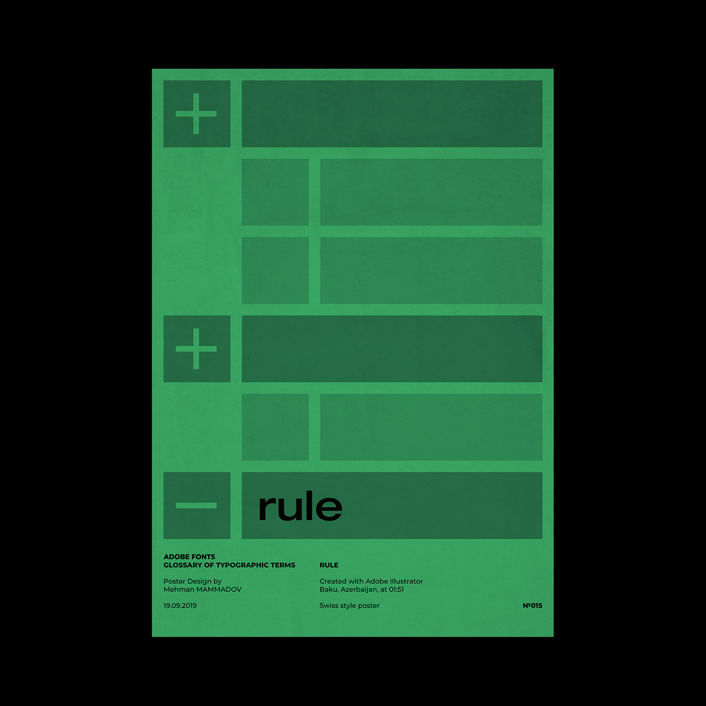
rule
A solid or dashed graphic line in documents used to separate the elements of a page. Rules and other graphic devices should be used sparingly, and only for clarifying the function of other elements on the page.
A solid or dashed graphic line in documents used to separate the elements of a page. Rules and other graphic devices should be used sparingly, and only for clarifying the function of other elements on the page.
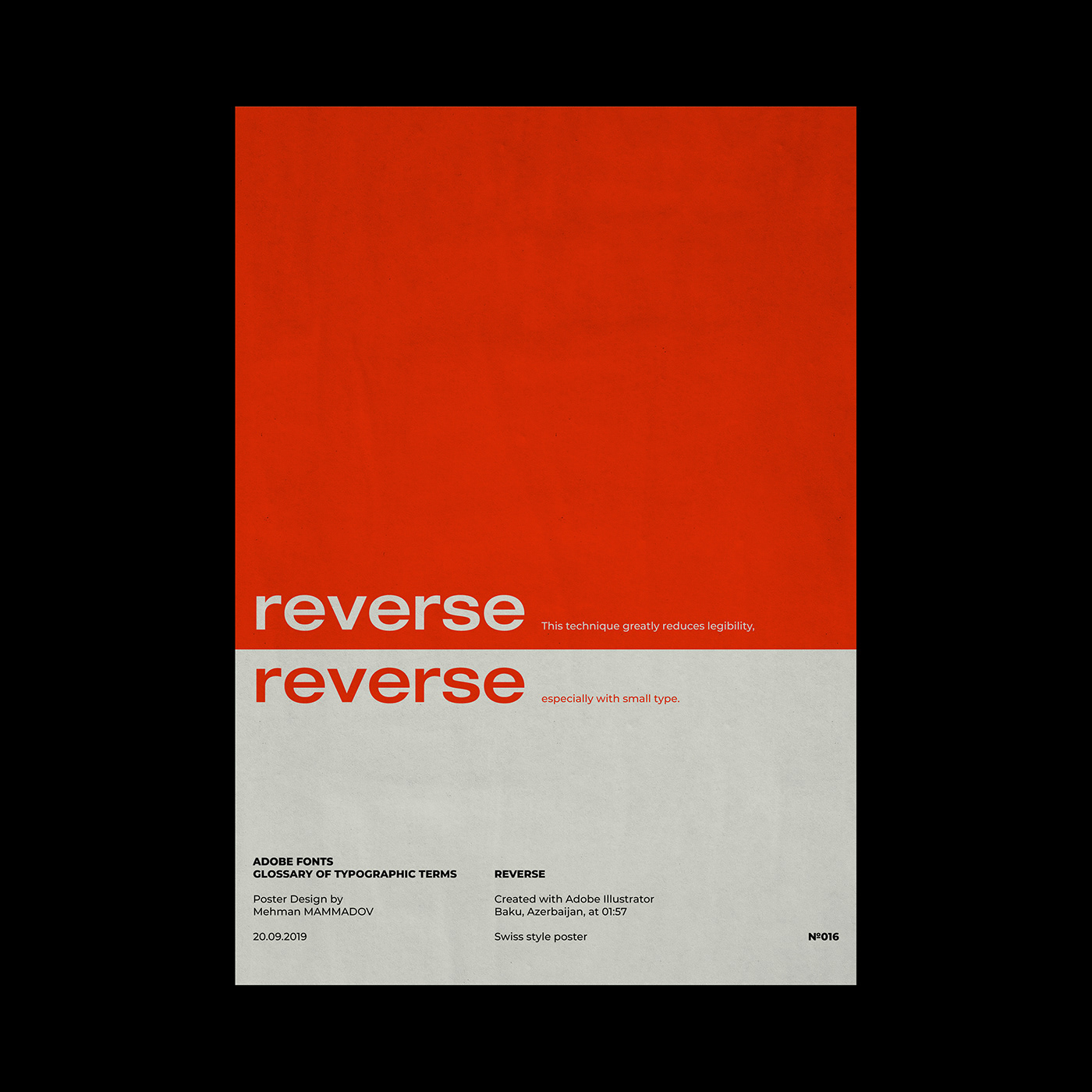
reverse
The technique of printing white or light-colored text on a black or dark background for emphasis. This technique greatly reduces legibility, especially with small type.
The technique of printing white or light-colored text on a black or dark background for emphasis. This technique greatly reduces legibility, especially with small type.
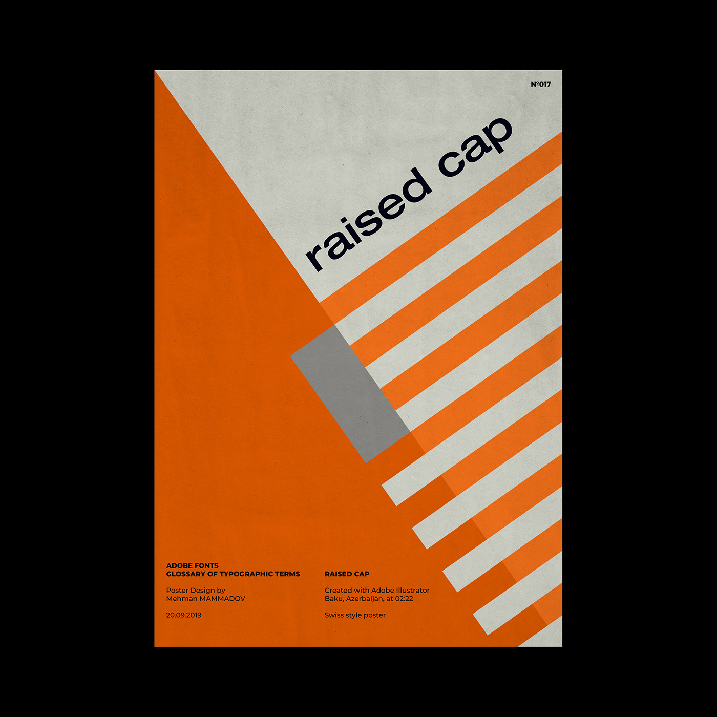
raised cap
A design style in which the first capital letter of a paragraph is set in a large point size and aligned with the baseline of the first line of text. Compare to a drop cap.
A design style in which the first capital letter of a paragraph is set in a large point size and aligned with the baseline of the first line of text. Compare to a drop cap.
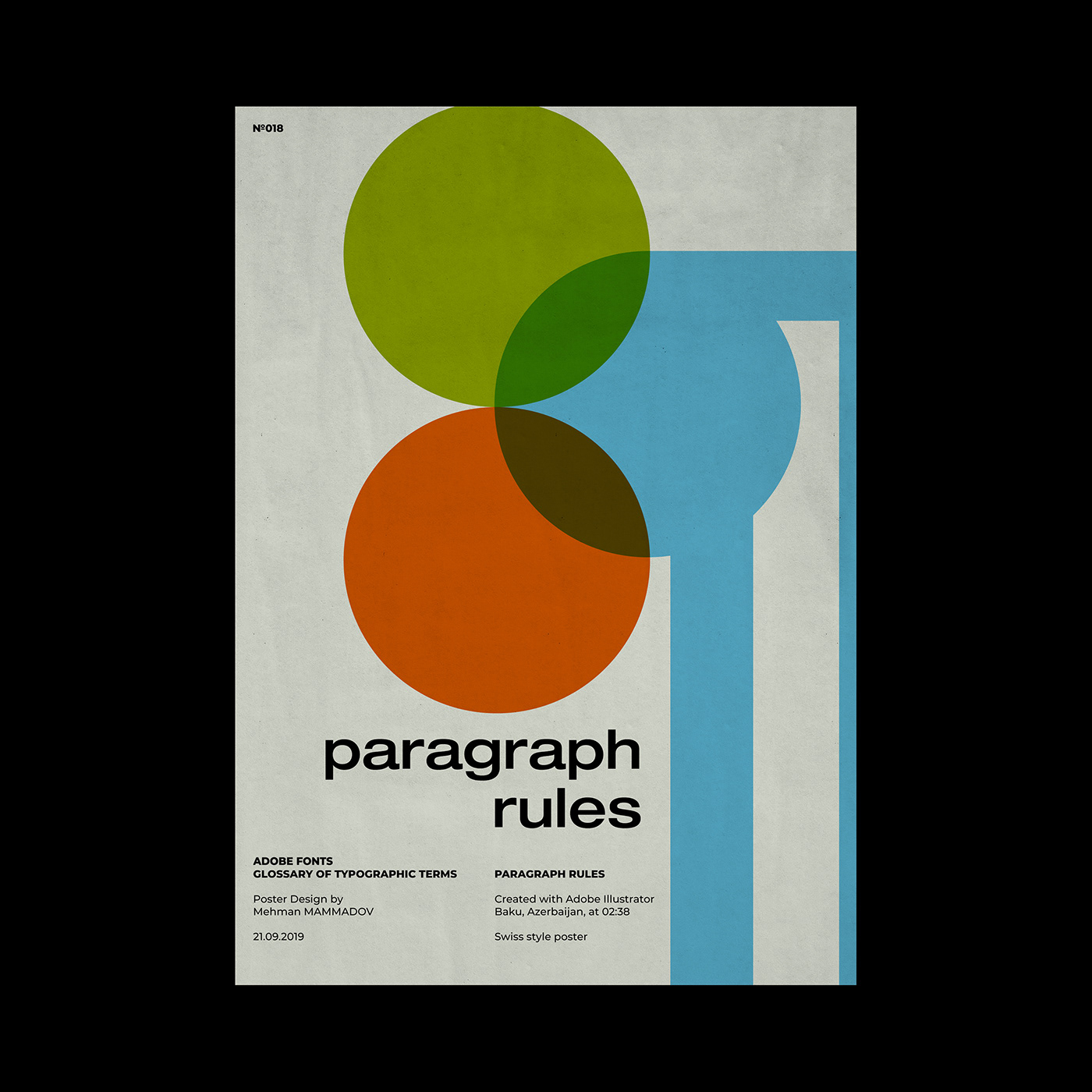
paragraph rules
Graphic lines associated with a paragraph that separate blocks of text. Rules are commonly used to separate columns and isolate graphics on a page. Some desktop publishing programs allow paragraph styles to be created that include paragraph rules above and/or below the paragraph.
Graphic lines associated with a paragraph that separate blocks of text. Rules are commonly used to separate columns and isolate graphics on a page. Some desktop publishing programs allow paragraph styles to be created that include paragraph rules above and/or below the paragraph.
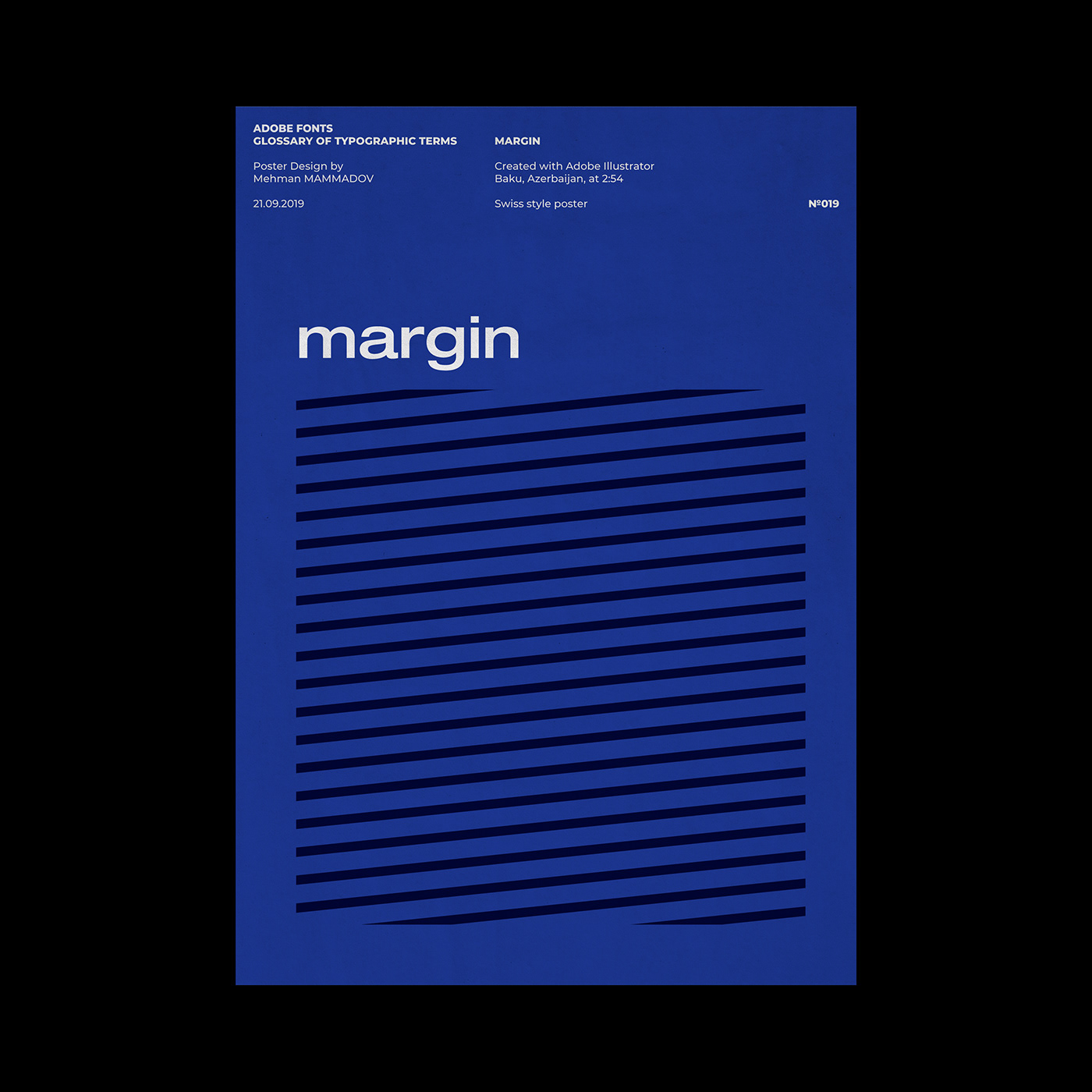
margin
The white spaces around text blocks. Margins typically need to be created on the edges of a page, since most printers can't print to the very edge. White space also makes a document look better and easier to read.
The white spaces around text blocks. Margins typically need to be created on the edges of a page, since most printers can't print to the very edge. White space also makes a document look better and easier to read.
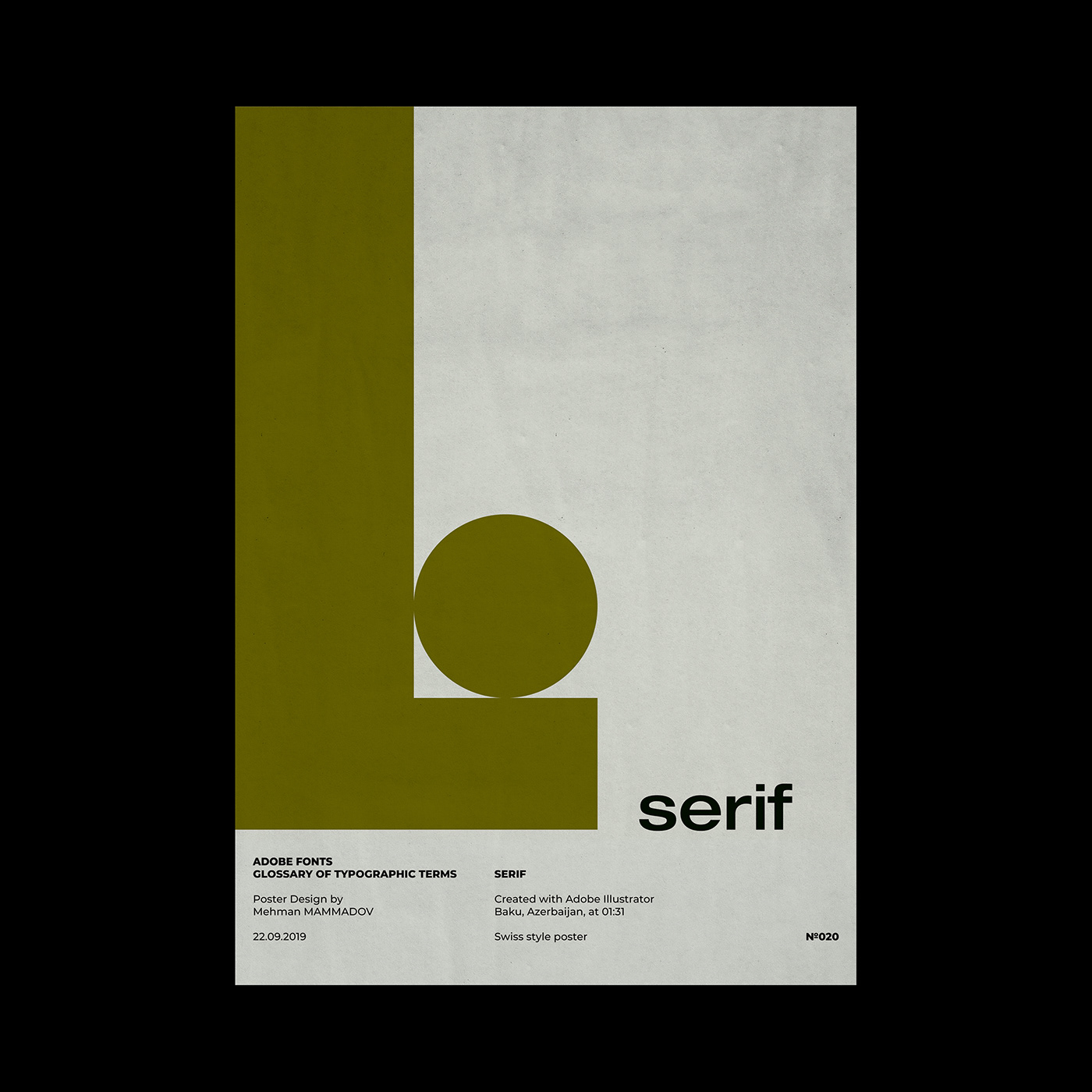
serif
Small decorative strokes that are added to the end of a letter's main strokes. Serifs improve readability by leading the eye along the line of type.
Small decorative strokes that are added to the end of a letter's main strokes. Serifs improve readability by leading the eye along the line of type.
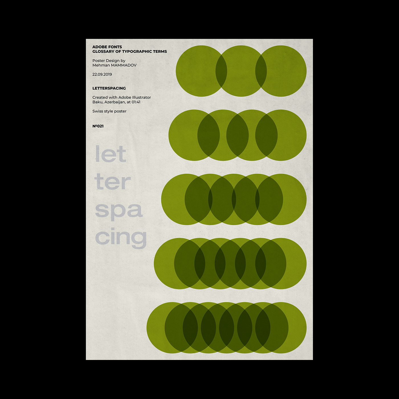
letterspacing
Adjusting the average distance between letters in a block of text to fit more or less text into the given space or to improve legibility. Kerning allows adjustments between individual letters; letterspacing is applied to a block of text as a whole. Letterspacing is sometimes referred to as tracking or track kerning.
Adjusting the average distance between letters in a block of text to fit more or less text into the given space or to improve legibility. Kerning allows adjustments between individual letters; letterspacing is applied to a block of text as a whole. Letterspacing is sometimes referred to as tracking or track kerning.