


Opplev is a fictional product-line of flavoured honeys. The different flavours are raspberry, blackcurrant and lemon. We wanted to design surprising and fresh packaging not utilising the standard visual tropes of honey, such as the hexagon, bees, flowers and swash type. The only reference to these elements is the logo of Honningcentralen, the producer.
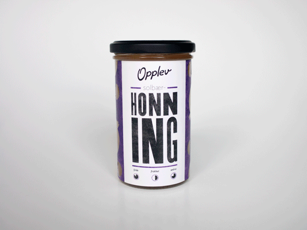
Stands out. The key design elements are a bold title spelling honey, a logo for the
product-line Opplev, stencilled shapes of the different fruit flavours, and taste wheels. The
aim was to make packaging that stands clearly out from all other honey jars in the market.
The colored fields and the black type is textured using acetone
product-line Opplev, stencilled shapes of the different fruit flavours, and taste wheels. The
aim was to make packaging that stands clearly out from all other honey jars in the market.
The colored fields and the black type is textured using acetone

Three flavours. The different flavours are raspberry, blackcurrant and lemon.
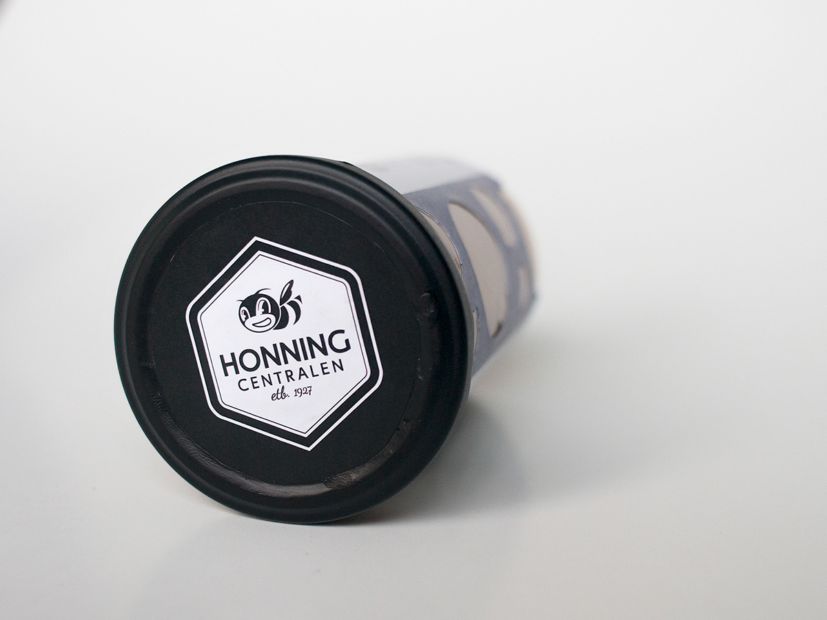
Company logo. The jar lids feature our redesigned version of Honningcentralen's logo.

Flavour wheels. Each variety has flavour wheels indicating what they taste like.

Shelf presence. With a clear typographic hierarchy and a very
different expression,the jars stand out in the shelves.
different expression,the jars stand out in the shelves.


