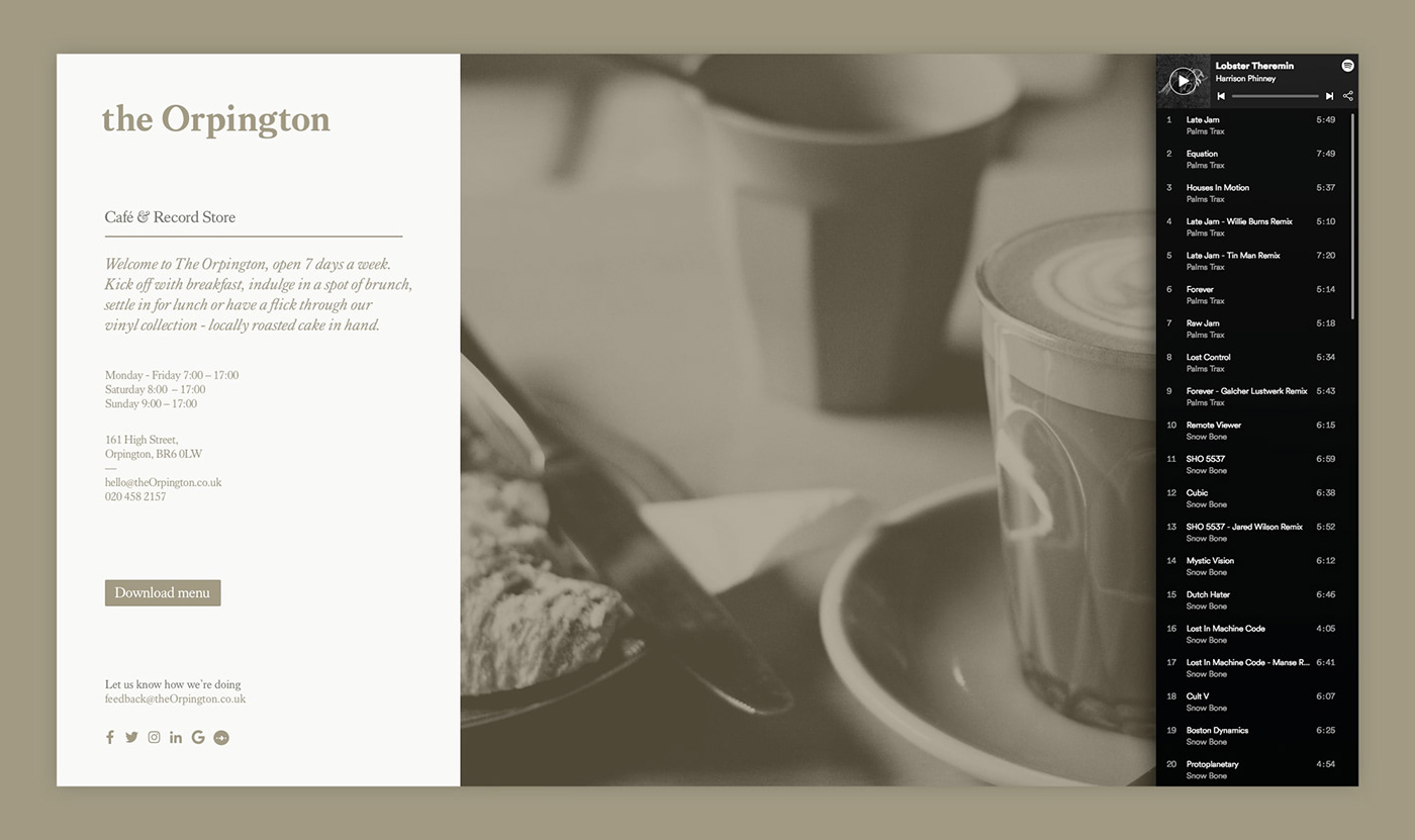
Scott approached us to help turn his dream of a Café & Record Store into reality
Having led the operations of some of the UK’s leading restaurant brands, the time had come for Scott Buckle to open his first very own venture in Orpington, London.
Having led the operations of some of the UK’s leading restaurant brands, the time had come for Scott Buckle to open his first very own venture in Orpington, London.

Taking reference from the local chicken breed of the same name, The Orpington was born, incorporating a smile-in-the-mind logo using the egg shape within the ‘O’.


We developed a colour palette inspired by the Black, Lavender and Buff varieties of Orpington chickens, with a contemporary serif font helping to create a more premium feel.
A brand was hatched.