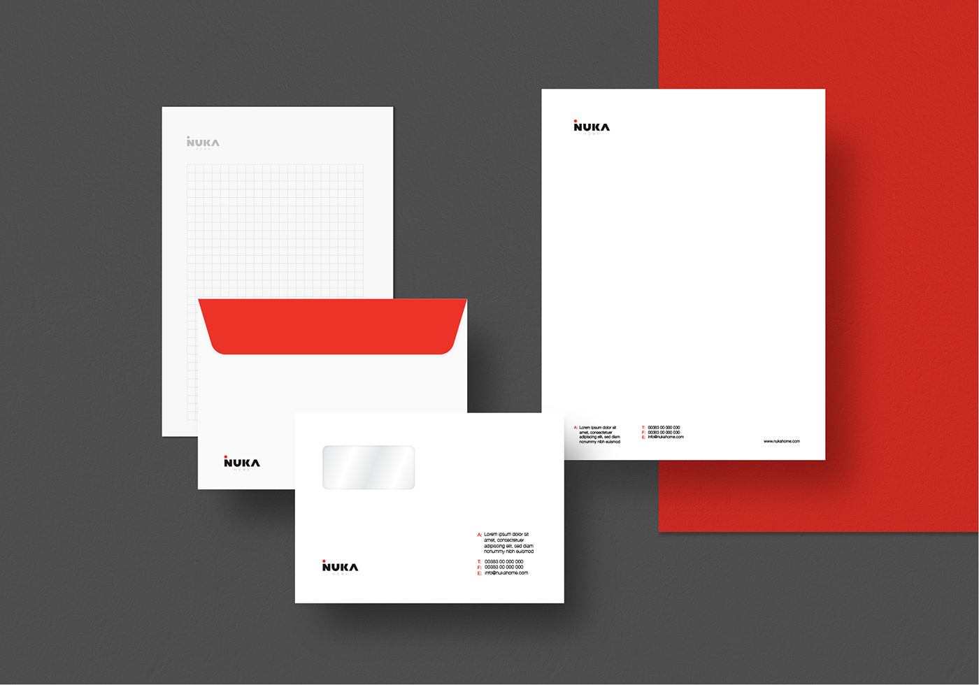
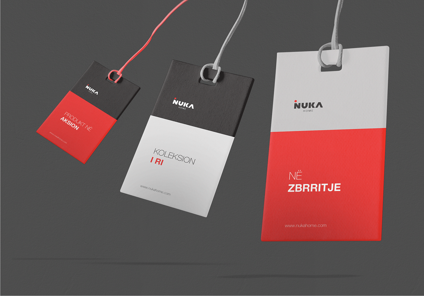
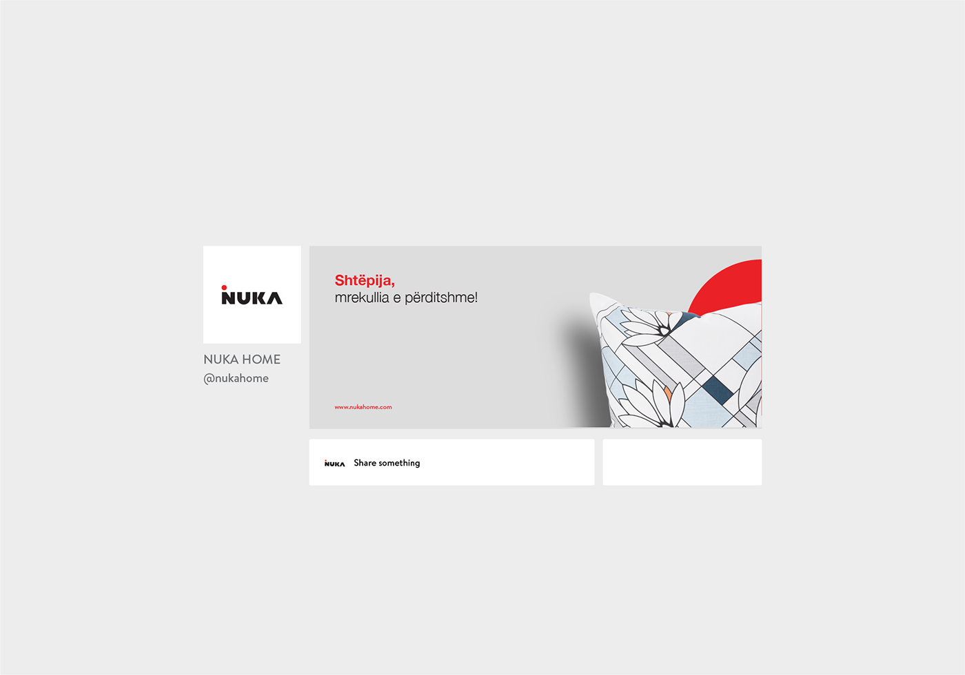
Redesigned Logo for “Nuka” company based in Kosova.
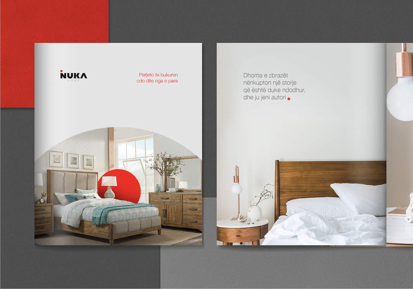
The redesigned logo below is made for a company named “NUKA” based in Kosova. Established in 1952, “NUKA” offers a wide selection of top quality home accessories and decorations; from Carpets, Curtains, Kitchen accessories to everything for a better everyday life. Creating a rebrand for a company that is in trade for more than 67 years made us even more excited for the result that was waiting for us.
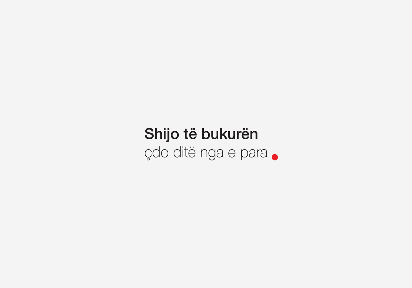
Our aim was not to create a new ideology yet to give the brand freshness, elegance and nevertheless clear visualisation of who they are, all incorporated well within a single line.
We knew from the very beginning that the name NUKA itself was catchy and memorable so we just wanted to create a stronger recognition. Therefore we focused on business-name “NUKA”.
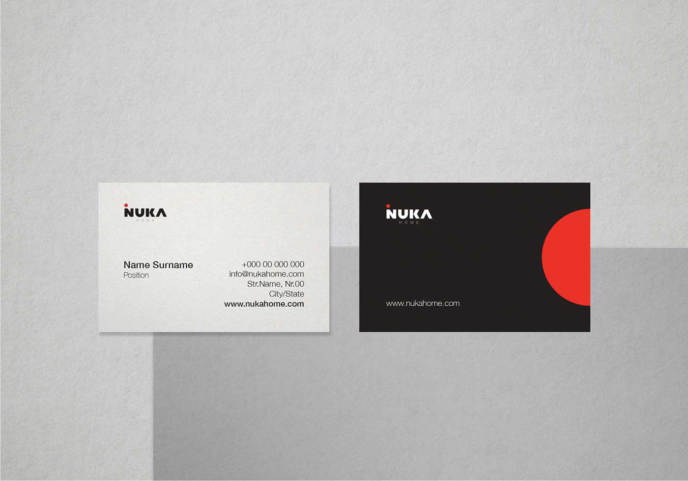
We capitalized the name NUKA by giving a special typographic treatment.
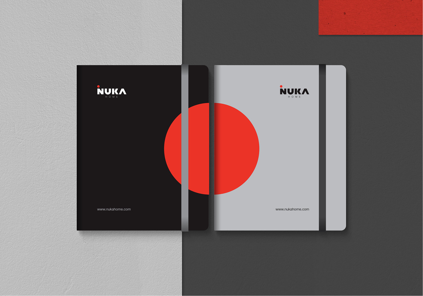
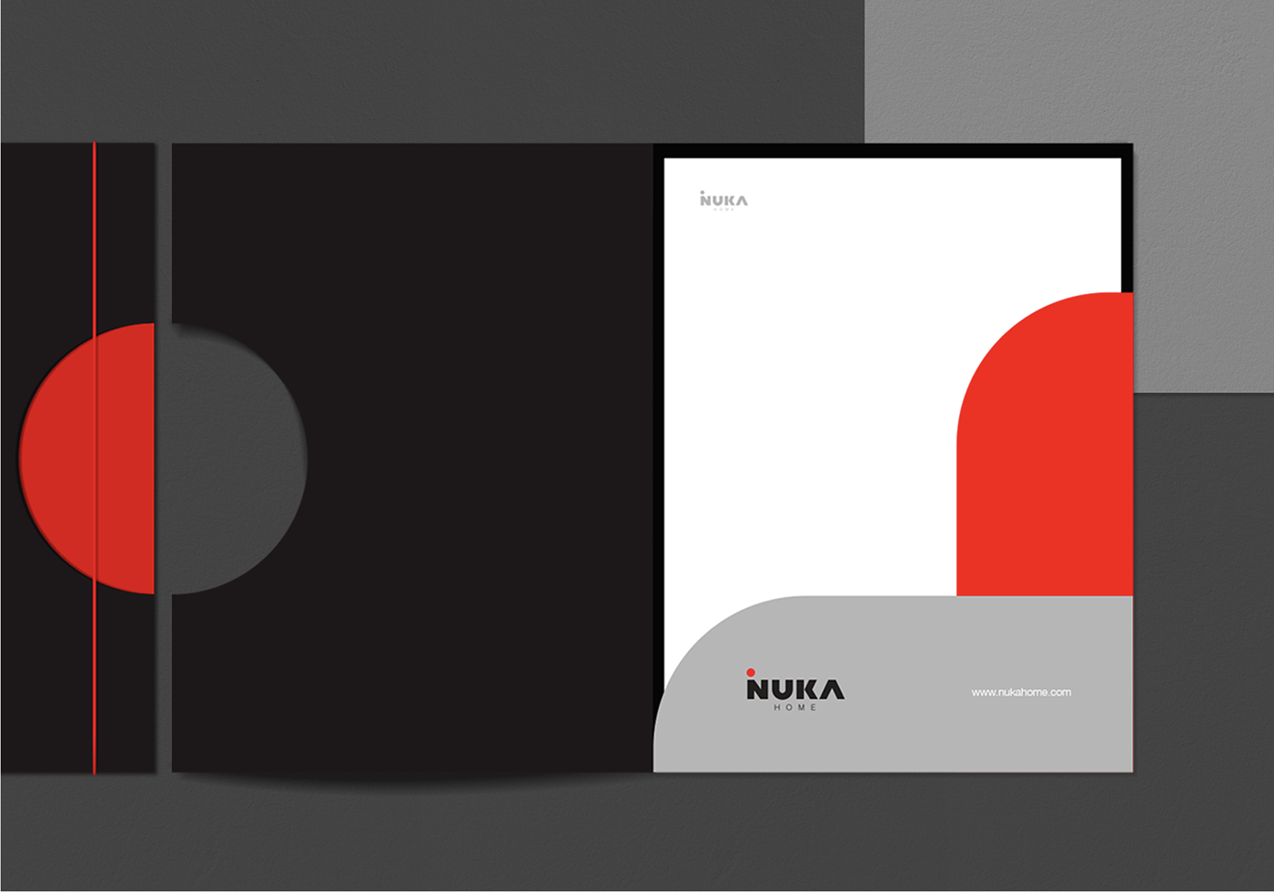
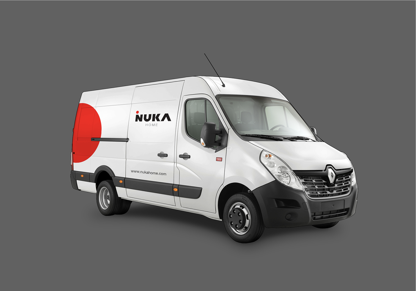
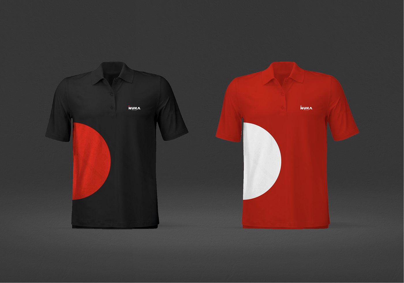
We incorporated a unique “A” letter that create a mesmerizing detail within the word itself, at the same time the logo build up even more character. The red-dot in upper part has a special emotional meaning for the company and for this reason it stayed stoical.
The Red and Black combination make a strong contrast furthermore they transmit power, strength, sophistication, seriousness. For this reason we did not find necessary to make any changes while they suit perfectly the golden triangle of NUKA’s ideology - Confident, Elegant and Prestigious.
Hence, by fusing a simple graphic treatment we managed to make a significant transformation that gave an elegant spirit, at the same time it stayed all in line with their past identity.
The redesigned logo below is made for a company named “NUKA” based in Kosova. Established in 1952, “NUKA” offers a wide selection of top quality home accessories and decorations; from Carpets, Curtains, Kitchen accessories to everything for a better everyday life. Creating a rebrand for a company that is in trade for more than 67 years made us even more excited for the result that was waiting for us.
Our aim was not to create a new ideology yet to give the brand freshness, elegance and nevertheless clear visualisation of who they are, all incorporated well within a single line.
We knew from the very beginning that the name NUKA itself was catchy and memorable so we just wanted to create a stronger recognition. Therefore we focused on business-name “NUKA”.
We capitalized the name NUKA by giving a special typographic treatment.
We incorporated a unique “A” letter that create a mesmerizing detail within the word itself, at the same time the logo build up even more character. The red-dot in upper part has a special emotional meaning for the company and for this reason it stayed stoical.
The Red and Black combination make a strong contrast furthermore they transmit power, strength, sophistication, seriousness. For this reason we did not find necessary to make any changes while they suit perfectly the golden triangle of NUKA’s ideology - Confident, Elegant and Prestigious.
Hence, by fusing a simple graphic treatment we managed to make a significant transformation that gave an elegant spirit, at the same time it stayed all in line with their past identity.